Form Design
How to create optimal forms for healthcare professionals
Introduction
A form is a set of related input fields that record information in a structured, repeatable manner. When used well, forms are an intuitive way for users to enter and edit data while completing key tasks like scheduling, billing, and documenting care, and their consistent output makes it easier to analyze data. When used incorrectly, however, forms can be onerous and confusing.
This page introduces Forge’s form design components and best practices to create thoughtful, efficient forms.
Key takeaways
- Forms are useful but should be as efficient and thoughtful as possible.
- Use Forge’s form containers to create responsive, full-featured forms.
- Choose the input fields you need for your design, and then decide how to lay them out.
- Write clear, concise copy that guides users through your form.
Form basics
Forms are everywhere on the internet: account setups, logins, payment flows, feedback requests, surveys, and more. Some forms are elegant and intuitive, while others are unnecessarily long and error prone.
To create optimal forms:
- Ask only for data that you need. If the data is crucial, set the field as required.
- Provide clear labels and instructions to minimize data entry errors.
- Keep related inputs together. Use typography and visual design elements to create sections, subsections, and steps that help users navigate your form.
- Make data entry as easy as possible: use the right component for the data you need and build in helpful features like automatic capitalization and formatting.
Form components
Containers
Forge has 3 components that make up the structure of forms:
- Form is a parent container with options for spacing, styling, and controls. It’s a wrapper around the native HTML
<form>element that dictates the appearance and behavior of required input fields and sets the overall form density. - FormField is a container for input field components (see table). It’s more granular than Form, giving each input field a label, hint text, and room for error messaging; it also specifies when a field is required. FormField can set the same parameters as Form for each input field and, when used within Form, can override its parent settings.
- MultiField provides a responsive layout for related input fields that should appear in the same row. It can be controlled in the same way as FormField.
Input fields
Forge’s input field components are built for use in forms. Each has a designated use and, when used together, can meet most data entry needs.
| Component | Enables users to |
|---|---|
| Checkbox | Select a single option or indicate confirmation |
| CheckboxButton | Select and deselect multiple options from a group of buttons |
| DateInput | Type a date or select it from a popup calendar |
| Input | Enter and edit short pieces of information |
| Multiselect | Enter data by typing to filter options in a predefined list and then selecting 1+ items |
| RadioButton | Select a single option from 2+ mutually exclusive options, represented as a group of buttons |
| RadioGroup | Choose a single option from 2+ mutually exclusive options |
| ReadOnlyInput | View content that can’t be edited but helps them enter data |
| Select | Enter data by selecting an option from a predefined list |
| SelectionList | Enter data by selecting 1+ options from a predefined list |
| SingleSelect | Enter data by typing to filter options in a predefined list and then selecting a single item |
| Textarea | Enter and edit freeform text that’s longer than what’s recommended for Input |
| ToggleSwitch | Choose between 2 opposite states, like on/off or enabled/disabled |
| Typeahead | Enter and edit data more efficiently using suggested text |
Designing forms
The 3 container components make Forge forms highly modular. Most design choices are built in, but there are several component settings you can customize to fit your use case. Considerations include:
Layout
Columns
Most forms should use a single-column layout. Research shows that single-column forms are easier for users to navigate and complete. This format can display multiple related fields in a row and is well-suited for heavy data entry. It’s also the best form structure for mobile interfaces, making it an excellent choice when designing for both desktop and mobile users.
Two-column layouts should be used only in desktop applications and only in these situations:
- More than 25 input fields must be displayed on a single screen.
- Completing the form requires users to refer to previously entered information.
- Input fields can be grouped under a header, and the groups don’t have to be in sequential order.
Labels
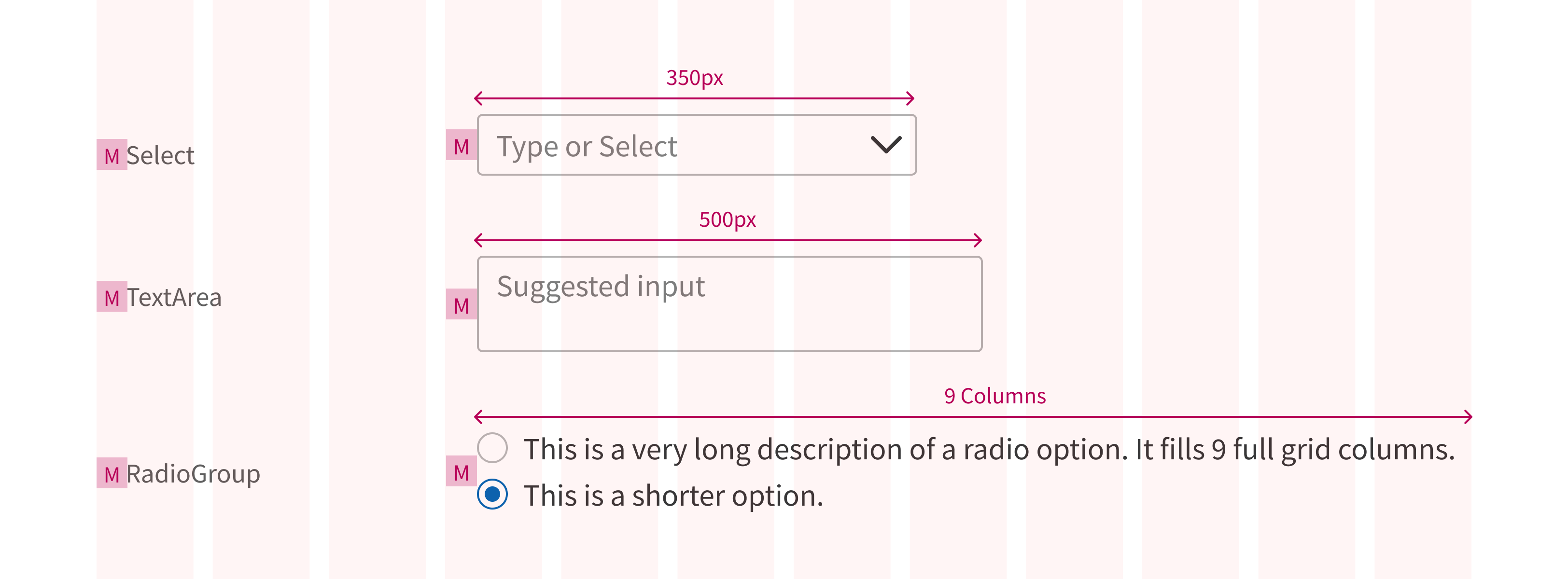
Form field labels are placed to the left of their inputs by default. The spacing between label and input is based on the Forge Grid. By default, the label occupies the first 3 columns. Input widths vary but can be set to fill the remaining 9-column width. This grid division can be customized in the FormField that contains your input. Label and input both get 16px of left padding automatically.
In viewports under 640px (Forge’s medium breakpoint):
- Labels are automatically placed above their corresponding input field instead of to the left.
- The input spans the full 12-column width and resizes responsively.
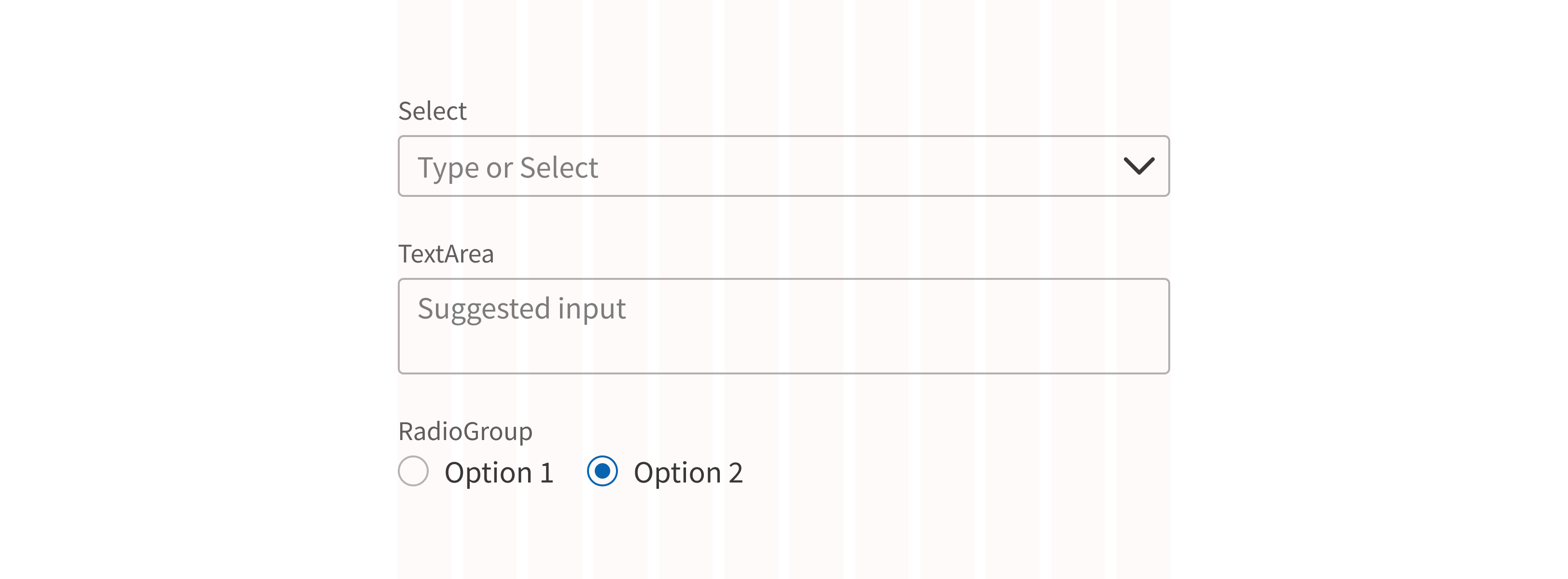
Form can be set to always place labels above their input. For viewports wider than 640px, either left or top placement is acceptable; choose the option that works best for your use case.
Input width
The default max width for most input fields is 350px, with a few exceptions:
- Textarea is set to 500px.
- In SelectionList, RadioGroup, and other similar components, input field width is determined by the longest piece of content.
Input field width can be set to a specific value to accommodate fields with a known character count (like a credit card or Social Security number) but should never be less than 48px. For data with an unknown character count, always use the default width.
Density
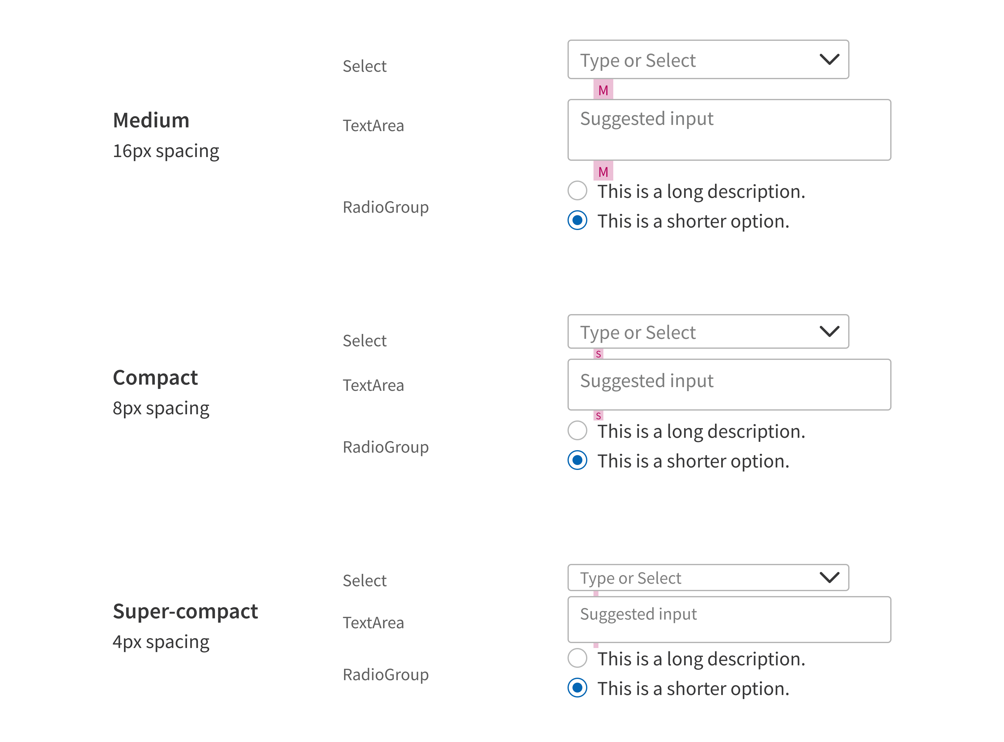
Forge provides 3 layout density options for forms: medium (default), compact, and super-compact (includes smaller font). Density is set at the Form level.
For more information, see Form.
Required fields
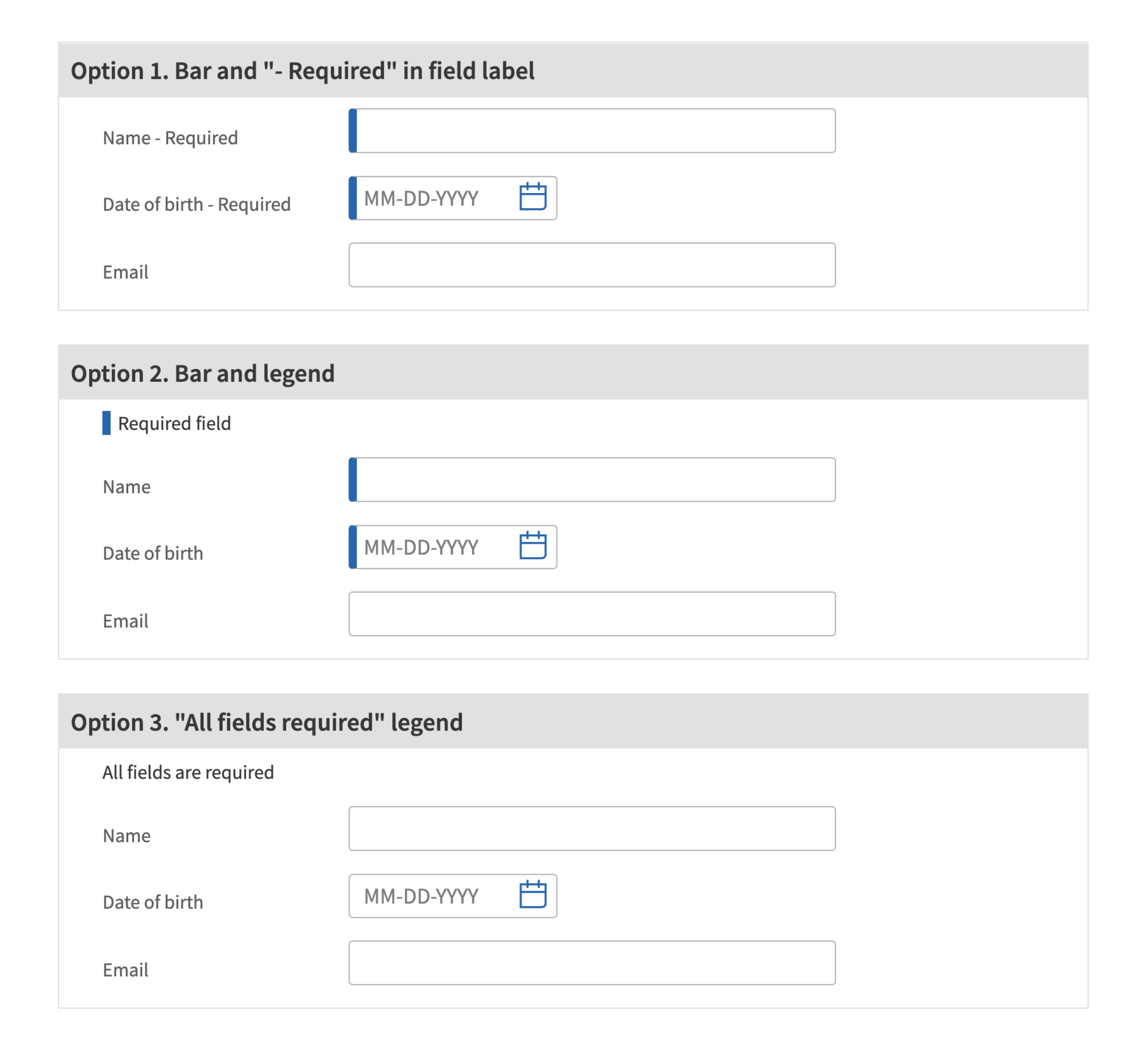
Forge offers 3 display options for required form fields.
For more information, see Form.
Form errors
Forge forms can include input validation (code that checks user-entered data for errors). Any issues are communicated in the interface, along with a recommended fix. Implementation often includes:
- Checking that required fields have data in them
- Confirming that data is in the correct format (e.g., a new password meets system requirements, an email address is formatted correctly)
- Blocking form submission until errors are resolved
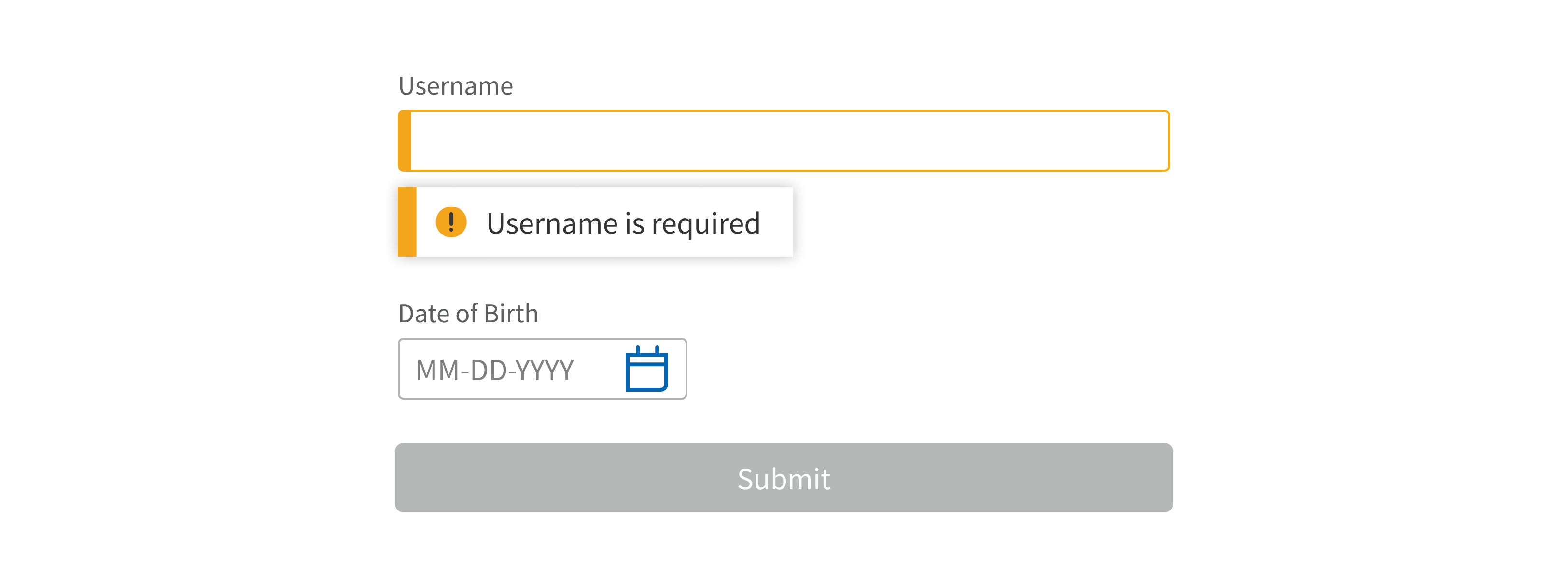
FormField doesn’t have built-in input validation. Teams must implement this themselves. For details, see FormField’s Developer tips.
Any FormField that uses input validation should have a corresponding form error message in case something goes wrong. It should be short, clear, specific, and easy to understand. The message should describe the problem. For example:
- “Patient name is required”
- “Email address should be in this format: name@domain.com”
- “This file is too big to upload (maximum size is 25 MB)”
For help writing error messages, see Content.
Action button
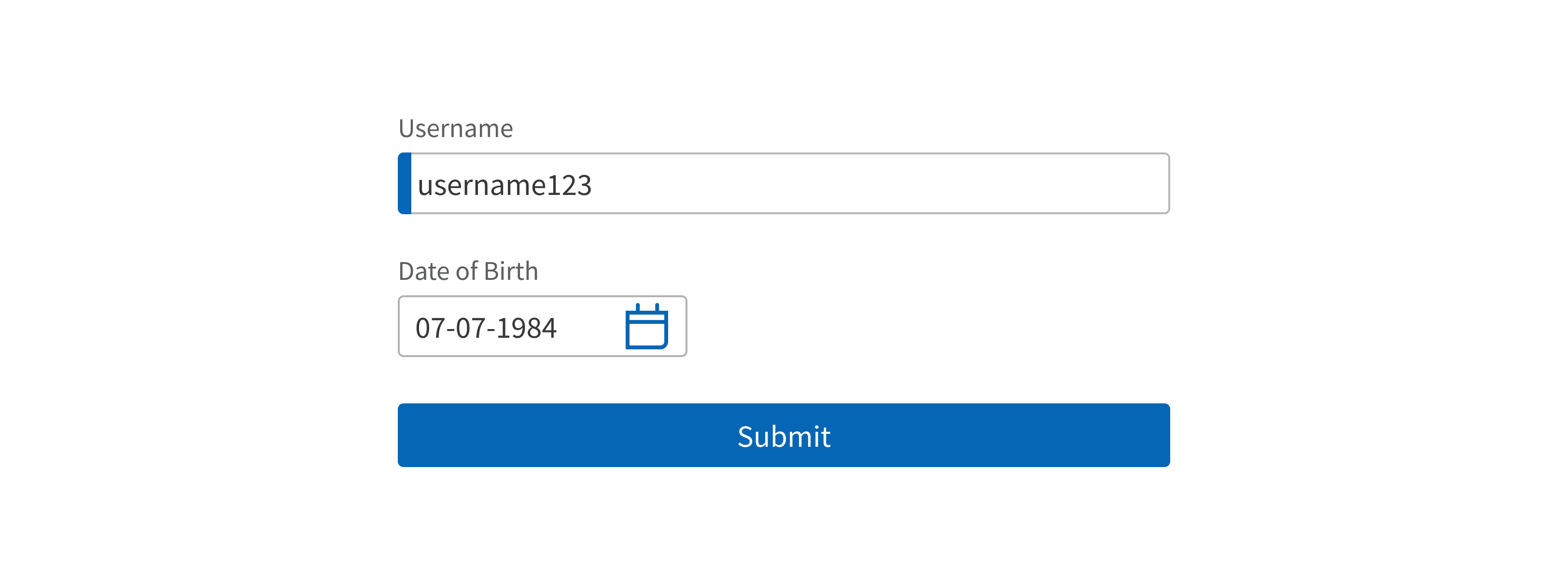
Form includes a primary Button for submitting the form when complete (“Submit”). This button appears at the bottom of the Form, left aligned with the left side of the inputs (not the labels). You can replace the default button with your own set of buttons or remove the button entirely.
Content in forms
Introductory text
Any introductory text at the top of the form should provide helpful context and instruction: “Before you begin, find the 5-digit authorization code. You’ll need to enter this code several times during the certification process.”
Don’t describe what’s obvious from looking at the form: “Complete all required fields and click Continue.”
Labels
When writing form field labels, look for repetitive information that can be removed from the labels and incorporated in a Heading instead. For example, the labels “Patient name”, “Patient address”, and “Patient phone” could be changed to “Name”, “Address”, and “Phone” in a section under the heading “Patient Contact Information”.
Use sentence case for labels: “Date of service”, not “Date of Service”
Hint text
Hint text (optional) is displayed below the input field. Use this for very short instructions about the input. For example:
- “Maximum file size is 25 MB”
- “Numbers and dashes only; no letters”
Placeholder text
Placeholder text (optional) is displayed inside the input field. It shouldn’t duplicate the label text. Use this to help users enter data correctly or use the input effectively. For example:
- Input placeholder text can show the expected data format: “e.g., name@domain.com”
- Multiselect placeholder text can tell users how to enter data: “- Type or select patient names -”
Submit button
The default Button text is “Submit”. You can change this to fit your use case (“Save Settings”). Form includes the option to swap in your own custom Buttons.
Start Button text with a verb, like “Save” or “Submit”. Use title case (“Save Changes”, not “Save changes”).
Additional copy
Most Forge input field components include options for additional copy, like placeholder text. For specific guidance, click a component in the table above and read the Content section.
Error messages appear when a field is completed incorrectly or a required field is overlooked. For help writing error messages, see Content.
Resources
- Disproving Best Practices: The One- vs. Two-Column Form Test: https://blog.hubspot.com/marketing/one-vs-two-column-form-conversion-test
- Website Forms Usability: Top 10 Recommendations: https://www.nngroup.com/articles/web-form-design/
- Designing More Efficient Forms: Structure, Inputs, Labels and Actions: https://uxplanet.org/designing-more-efficient-forms-structure-inputs-labels-and-actions-e3a47007114f
- Label Placement in Forms: https://www.uxmatters.com/mt/archives/2006/07/label-placement-in-forms.php