SelectionList
A list where users select 1+ options.
The Basics
What it is
SelectionList enables users to enter data by selecting 1+ options from a predefined list. This limits users to a specific set of options and increases the predictability of the data users enter.
How it works
- The user clicks or activates the option’s checkbox or clicks anywhere in the row to select the option.
- Once selected, the user deselects it by clicking or activating the option’s checkbox again or clicking anywhere in the row.
- The user’s selections usually aren’t saved until they take another action, like using a button (“Submit”).
When to use
- To ask users to select 1+ options from a list
- For short lists that can appear directly on the page, reducing the number of clicks
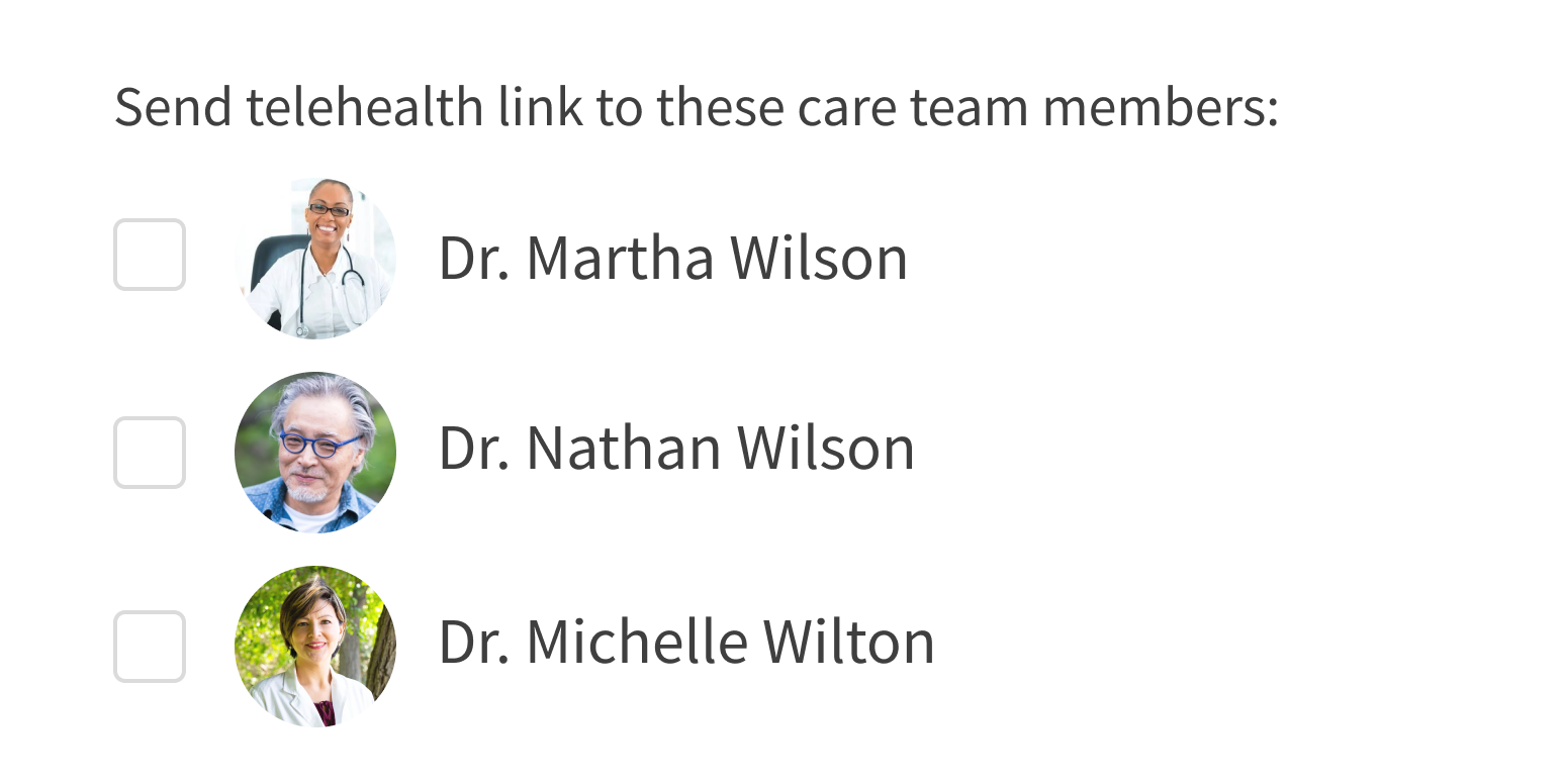
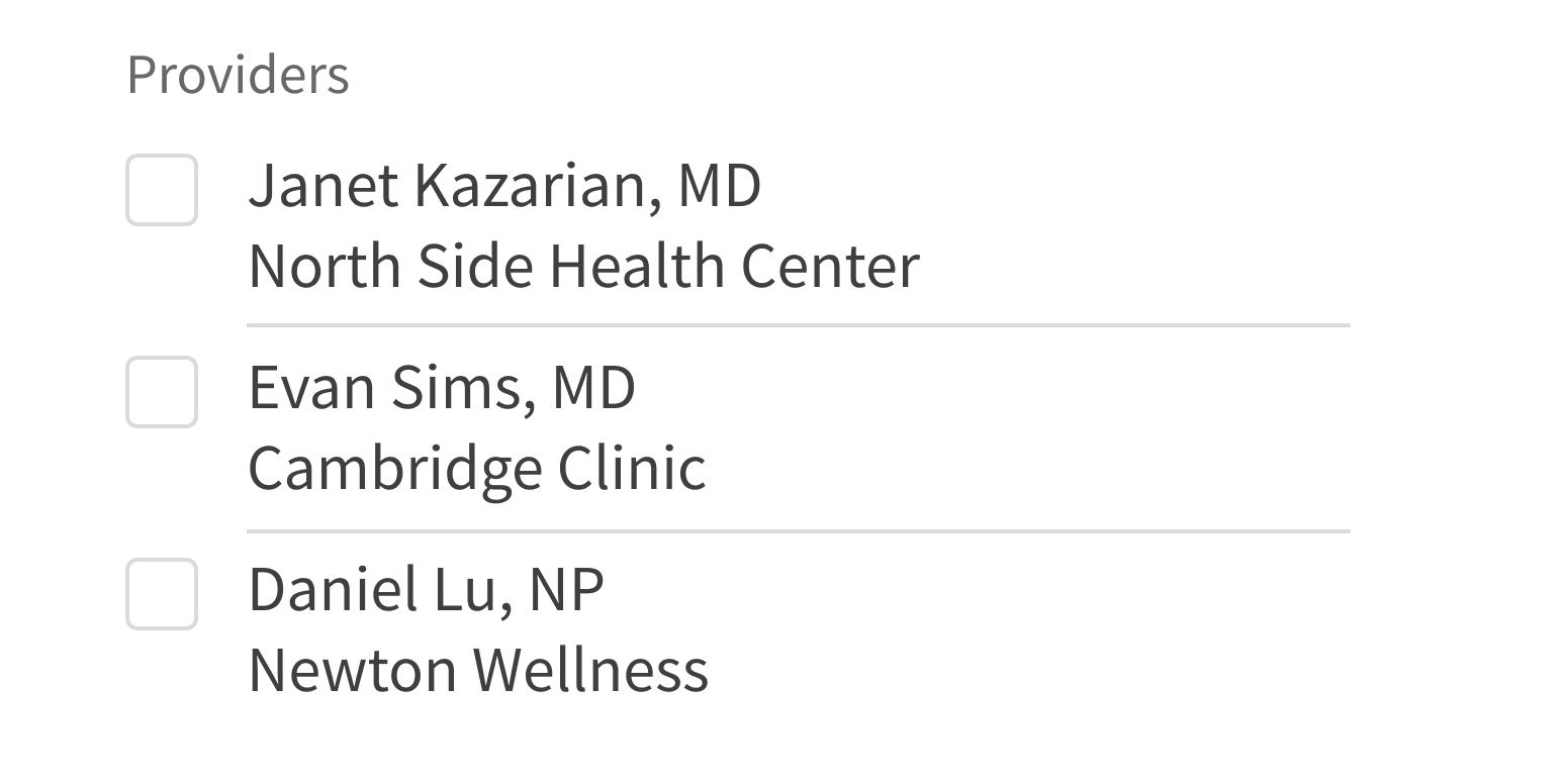
- To include a helpful visual element in a list, like images of providers or medications
When not to use
- For long lists that would take up too much vertical space on the page
- For lists where only one selection is allowed
What to use instead
Use RadioGroup if users can select only one option.
Use Multiselect if the list of options will take up too much vertical space.
How to use
SelectionList contains individual options users can select. By default, each option is a line of text. You can add other elements, like icons or images, but since the entire row is clickable, these elements should not be interactive.
Include visual elements if they help differentiate options.
Include any other interactive elements in the list of options.
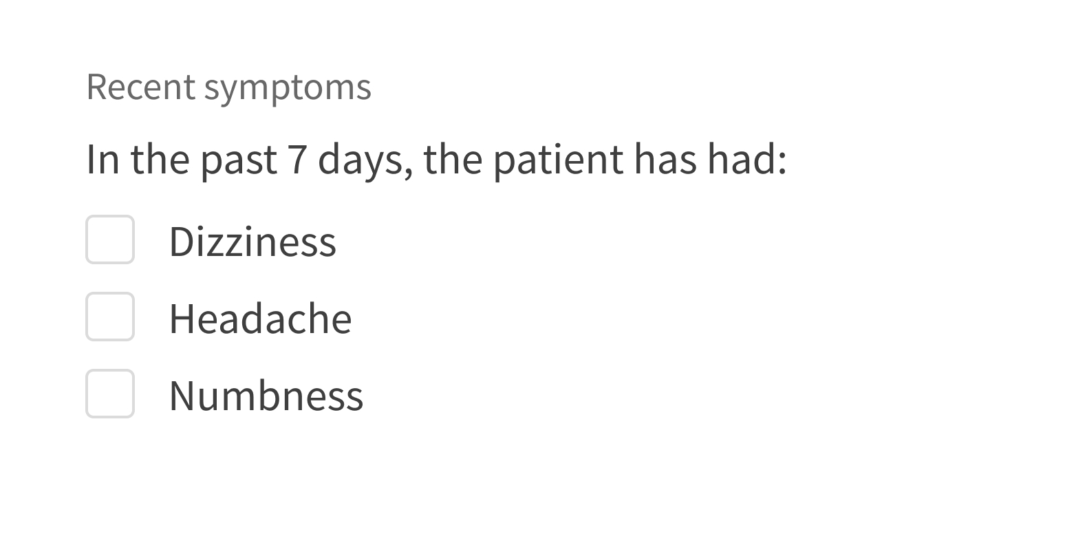
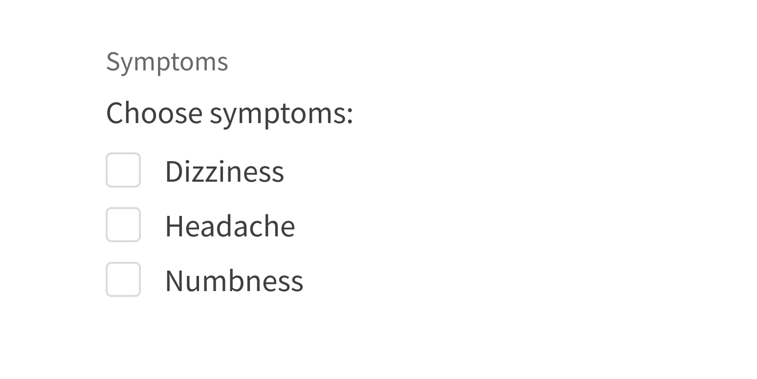
An optional description appears above the list options. It acts as a prompt or statement about the list. It’s separate from the form label and should not be used in place of a label. It’s actually coded as the HTML element <legend> for accessibility reasons (see this WebAIM article).
Use a description when context is helpful.
Use a description if it’s redundant or unnecessary.
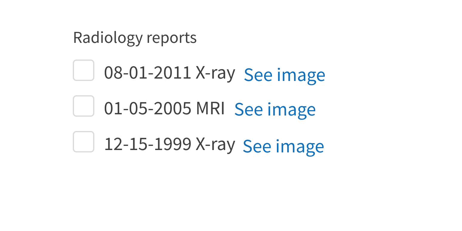
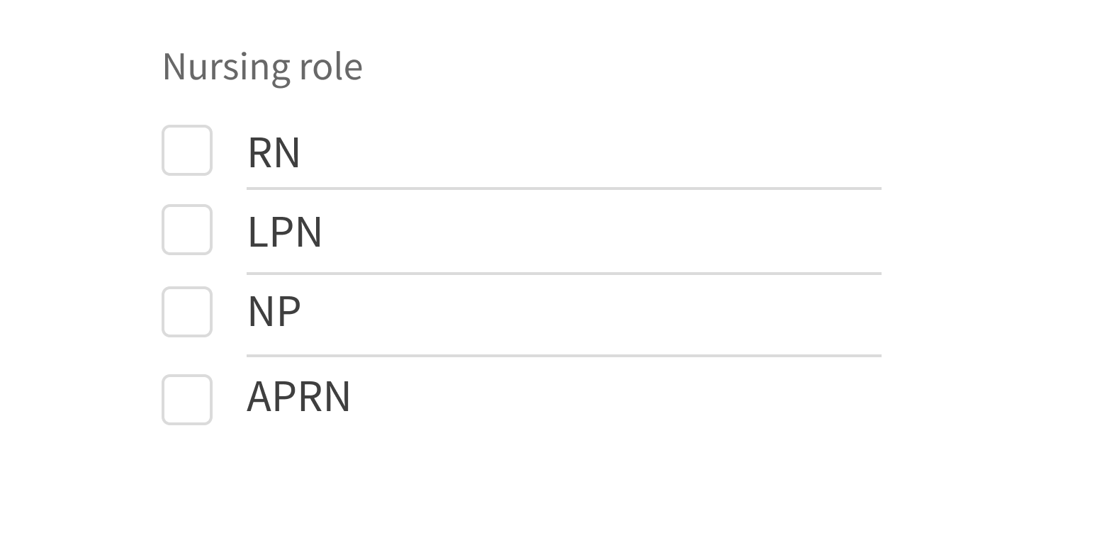
The options in a SelectionList can be separated using gray lines as dividers.
Use dividers when options have multiple lines of text.
Use dividers with short text, as it introduces visual clutter.
Style
Design details
Item alignment
In text-only options, the option text is top-aligned with the matching checkbox. When the text wraps, the top of the text box remains in the same location.
For more complex options (such as those with images or icons), discuss alignment with the developer.
Required fields
Forge offers 3 options to indicate required form fields. See Form for details.
Spacing and size
The height of this component and the vertical space around it vary according to the form layout (i.e., medium, compact, super-compact). See Form for details.
Placement and hierarchy
No additional information for this component.
Content
Use sentence case for description text. If also using a label, make sure that the label and description work well together. For example:
- Label: “Symptoms”
- Description: “Which symptoms have you had in the past week?”
Use sentence case for option text (“Abdominal pain”, not “Abdominal Pain”).
Demos
Coding
Developer tips
SelectionList can be used on its own or as an input in FormField. For its options list, it takes either a list of SelectionListItem components as its children or an options array prop, the same way that Select and RadioGroup do. Using options is less verbose, but its list items can only be text. SelectionListItem can take any content as its children.
Value structure
SelectionList takes as its value an object mapping the uniqueKey of its list items to boolean values. If the options prop was used to generate the list items, the value property for each item in options is used to create that item's uniqueKey.
For example, if your list contains items A, B, and C, and only B should be checked, set value (or defaultValue if you’re using SelectionList as an uncontrolled component) to this:
{'A': false,'B': true,'C': false,}
Similarly, SelectionList calls onChange with an event object, where event.target.value is a map of keys to boolean values like the one above.
Required fields
Use the required prop to mark SelectionList as required.
Forge offers 3 options to indicate required form fields. When using Form with this component, set Form’s requiredVariation prop. See Form for details.
Repository
Implementation links
SelectionList directory in Bitbucket
SelectionListItem directory in Bitbucket
Implementation details
It is strongly recommended to familiarize yourself with the Forge source code. While this documentation is a best effort to document the intent and usage of a component, sometimes some features only become clear when looking at the source code. Also, looking at Forge's source code may help identify and fix bugs in either your application or Forge itself.
Storybook files
Forge maintains at least one storybook file per component. While the primary audience for these files is typically the Forge team, these storybook files may cover usages of the component not covered by a demo. The storybook for the latest version of forge can be found at go/forge-storybook-lts.
Testing library
Forge strongly encourages using testing-library to write tests for your application.
"The more your tests resemble the way your software is used, the more confidence they can give you."
If you're having trouble testing a Forge component using testing-library, it would be a good idea to see how Forge tests its own components. For the most part, Forge tries to use screen.getByRole as much as it can, as that API provides the best feedback on a11y compliance. Forge discourages the use of document.querySelector and screen.getByTestId as both APIs encourage using implementation details to test your component, and discourage adding roles to your component.
With that being said, many of Forge's components were not built with accessibility in mind. These components do break the recommendations listed above.
Import statements
In Nimbus applications
athenaOne serves the Forge bundle independently from your application's bundle. Importing Forge components directly from '@athena/forge' takes advantage of this feature.
import { SelectionList, SelectionListItem } from '@athena/forge'
In standalone applications
Importing components using the exact path to the module takes advantage of webpack's tree shaking feature. Webpack will include only that module and its dependencies.
import SelectionList from '@athena/forge/SelectionList';import SelectionListItem from '@athena/forge/SelectionListItem';
To use this import guidance, Typescript applications must use typescript >= 4.7.3, and should add this setting to their tsconfig.json file:
{"compilerOptions": {"moduleResolution": "Node16",}}
If this setting doesn't work for your application, use this import statement instead:
import SelectionList from '@athena/forge/dist/SelectionList';import SelectionListItem from '@athena/forge/dist/SelectionListItem';