ToggleSwitch
ToggleSwitch is a control for turning something on and off.
The Basics
What it is
ToggleSwitch is a selector that lets users choose between 2 opposite states, like on/off or enabled/disabled. It includes an interactive switch and optional text that describes the current state. It’s commonly used for settings and preferences.
How it works
- ToggleSwitch can be set to either on or off by default when it first loads. Screen readers announce the switch’s current state.
- To change state, the user clicks the switch or presses Enter or Space.
- The circle slides to the opposite side of the control, and the color changes. If used, the description text changes to describe the new state, and screen readers announce the new state.
- The timing for when changes take effect depends on how ToggleSwitch is used:
- When used on a page without buttons (like a settings or preferences page), ToggleSwitch changes should take effect instantly.
- When used on a page or in a form with buttons, ToggleSwitch changes should take effect when the primary button (usually Submit or Save) is activated.
When to use
- For on/off settings and preferences
- For changes that users don’t need to review or confirm
When not to use
- For yes/no questions or statements, like “I’d like to receive email alerts”
- For selecting a single option from a binary list, like “Adult/Pediatric” (because ToggleSwitch’s states should be equivalent to on/off)
- For choosing between 2 unrelated or distantly related options
What to use instead
Use Checkbox for yes/no questions or statements.
Use RadioButton to ask users to select a single option from a list.
Use CheckboxButton for users to easily toggle multiple related options.
How to use
ToggleSwitch is designed for users to turn things on and off. The most common use cases are:
- Setting a value and saving it (either instantly, or as part of a form with a Save button)
- Showing/hiding UI functionality, like toggling to reveal a set of optional inputs or to switch between a free text area and a set of structured inputs
In keeping with UX best practices, these settings typically take effect as soon as the switch is activated. One exception is when ToggleSwitch is used in a form with other input fields.
Sizes
ToggleSwitch is available in 3 sizes:
- Small is best for condensed formats, like within DataTable
- Medium (default) is best for desktop experiences.
- Large is better for small screens and mobile experiences, because its bigger size makes it easier to tap.
Tips for use in forms
ToggleSwitch can be used as a standalone component or with Form and FormField. Form provides a consistent, responsive layout, and FormField adds features like labels, error message handling, and hint text.
When used in forms, ToggleSwitch settings should not be applied as soon as the switch is activated, because forms usually include a Save or Submit button. It would be confusing for the ToggleSwitch setting to be applied immediately, while the rest of the form data isn’t submitted until users activate the button.
The only time ToggleSwitch should take effect immediately in a form is when it shows or hides fields in the form, like toggling between free text and a structured set of inputs.
Style
Design details
No additional information for this component.
Placement and hierarchy
No additional information for this component.
Content
ToggleSwitch is typically used with both:
- Label text that indicates what the switch controls
- Optional description text that shows the switch’s current state
Label
ToggleSwitch’s label explains what the switch controls. The text can describe an action (“Show billing codes”) or simply name the setting (“Dark mode”). Try reading this text aloud, followed by “on or off”. If it doesn’t make sense, consider rewriting.
Label text should be placed to the left of the switch and use sentence case (“Show editing options”, not “Show Editing Options”).
Description
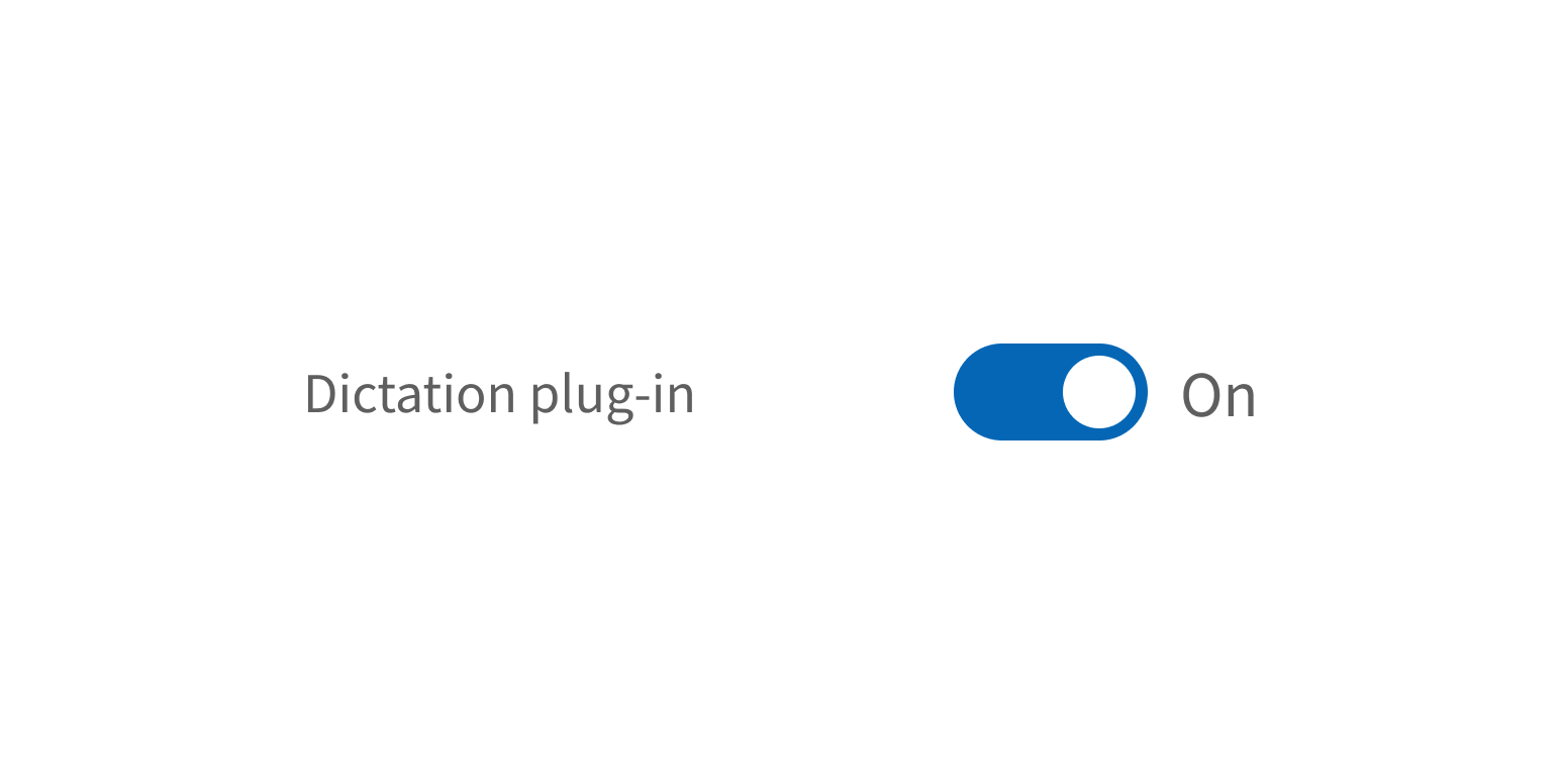
Description text conveys ToggleSwitch’s current state. This text is optional, but for maximum clarity, include it whenever possible. The description should be a pair of short, opposing adjectives in sentence case, like:
- “On/Off”
- “Active/Inactive”
- “Enabled/Disabled”
- “Visible/Hidden”
Include description text that conveys the switch’s current state.
Use the description for user instructions.
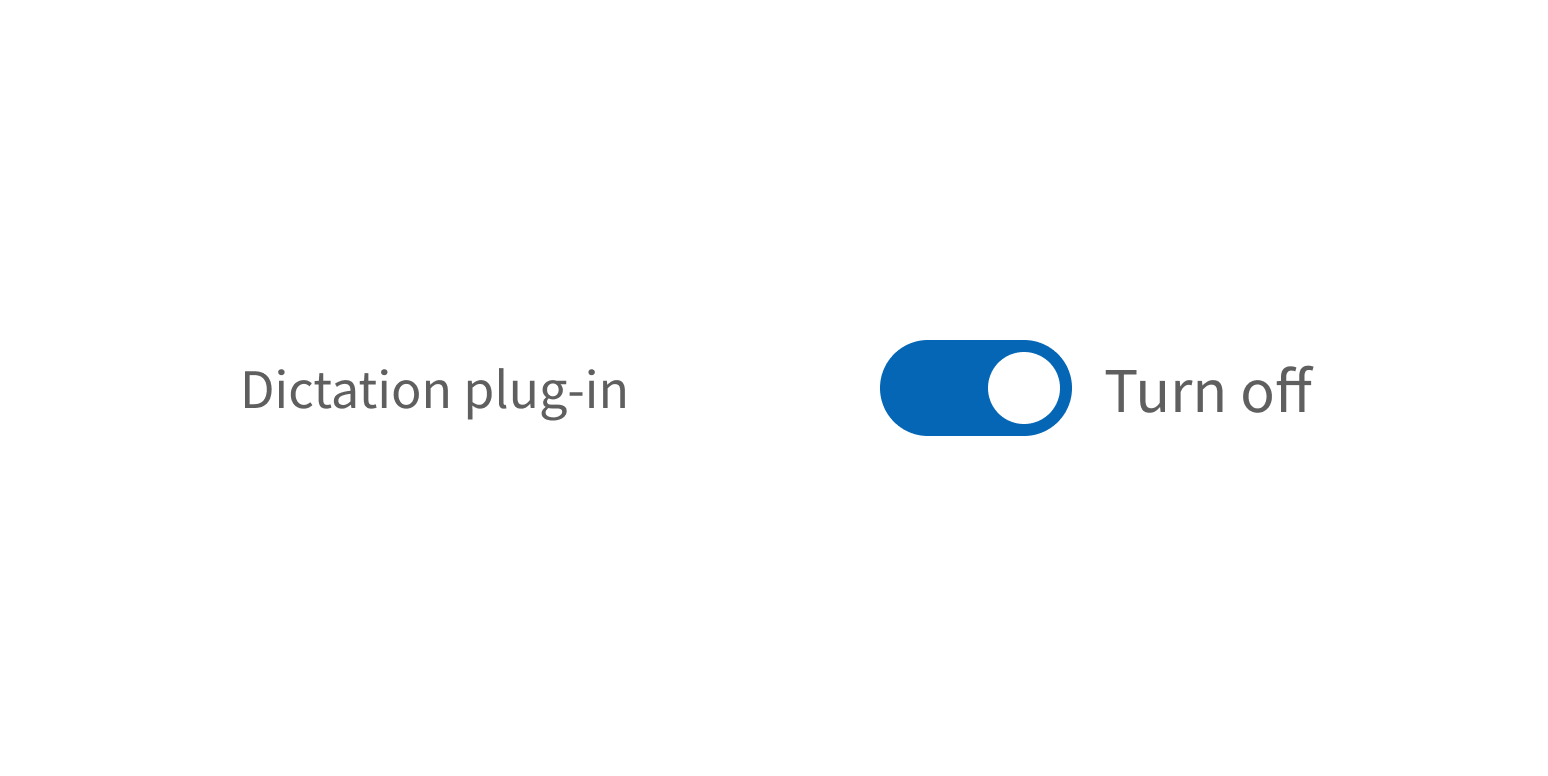
The description is displayed to the right of the switch by default, but it can be set to appear on the left instead (between the label text and the switch itself).
Demos
Coding
Developer tips
ToggleSwitch can be used on its own or in FormField for additional features, like field labels and error messaging. If using ToggleSwitch as a standalone component, add your own label text to the left of the switch, as described in the Content section.
Under the hood, this component uses an HTML button with the ARIA switch role. The button contains a div, which is used to style the switch position and, if the descriptions prop is used, also contains a dynamic HTML label that changes value to match the switch’s state.
Controlled vs. uncontrolled
To use ToggleSwitch as a controlled component, set the checked prop. To set the default toggle state but allow ToggleSwitch to control its own state (uncontrolled), use the defaultChecked prop instead.
Repository
Implementation links
ToggleSwitch directory in Bitbucket
Implementation details
It is strongly recommended to familiarize yourself with the Forge source code. While this documentation is a best effort to document the intent and usage of a component, sometimes some features only become clear when looking at the source code. Also, looking at Forge's source code may help identify and fix bugs in either your application or Forge itself.
Storybook files
Forge maintains at least one storybook file per component. While the primary audience for these files is typically the Forge team, these storybook files may cover usages of the component not covered by a demo. The storybook for the latest version of forge can be found at go/forge-storybook-lts.
Testing library
Forge strongly encourages using testing-library to write tests for your application.
"The more your tests resemble the way your software is used, the more confidence they can give you."
If you're having trouble testing a Forge component using testing-library, it would be a good idea to see how Forge tests its own components. For the most part, Forge tries to use screen.getByRole as much as it can, as that API provides the best feedback on a11y compliance. Forge discourages the use of document.querySelector and screen.getByTestId as both APIs encourage using implementation details to test your component, and discourage adding roles to your component.
With that being said, many of Forge's components were not built with accessibility in mind. These components do break the recommendations listed above.
Import statements
In Nimbus applications
athenaOne serves the Forge bundle independently from your application's bundle. Importing Forge components directly from '@athena/forge' takes advantage of this feature.
import { ToggleSwitch } from '@athena/forge'
In standalone applications
Importing components using the exact path to the module takes advantage of webpack's tree shaking feature. Webpack will include only that module and its dependencies.
import ToggleSwitch from '@athena/forge/ToggleSwitch';
To use this import guidance, Typescript applications must use typescript >= 4.7.3, and should add this setting to their tsconfig.json file:
{"compilerOptions": {"moduleResolution": "Node16",}}
If this setting doesn't work for your application, use this import statement instead:
import ToggleSwitch from '@athena/forge/dist/ToggleSwitch';