Resolution, Grid, Spacing, and Layout
Screen sizes and how to use grid and spacing in page layout
Introduction
The Forge grid dictates the horizontal and vertical relationship between and within web page sections, and how the layout varies by window size. Spacing guidelines provide consistent positioning between page sections and among components. Used together, a grid framework with consistent spacing establishes information hierarchy and predictable structure that set the foundation for a consistent, familiar user experience.
This page introduces the building blocks of the Forge grid, rows and columns, and explains how to use them to lay out content. It also documents our suggested screen sizes, space constants and provides guidelines for combining the grid, spacers, and components to create responsive layouts for user interfaces.
Key takeaways
- The Forge grid regulates the hierarchy and arrangement of web page sections, and how they behave in different viewports.
- Space constants apply to the smallest scale of UX design, dictating the number of pixels between single elements on the page.
- Combined, these 2 elements have a profound impact on how users experience and interact with page content.
- To implement the Forge grid and space constants, developers should use CSS and Sass variables.
- Desktop designs should be optimized for 1920x1080 resolutions.
- When considering alternate desktop screen sizes, the minimum resolution suggested for design consideration is 1024x764.
Grid basics
Grids are a powerful tool for creating web pages that resize fluidly for the best layout on different devices. This fluidity is a cornerstone of responsive web design, and it relies on breakpoints, or set viewport widths.
- When the page renders, it uses CSS to display the content in the layout that best fits the available width.
- If users resize the window, and the viewport width hits a breakpoint, the layout refreshes automatically to accommodate the new width. This can involve changing container shapes, rearranging page sections, or even hiding some content completely.
Mobile-friendly sites often use fluid layouts to automatically rearrange content for the best user experience on different devices without having to code multiple versions of the page. For example:
- Desktops often display content sections horizontally.
- Mobile phones often stack the content sections vertically.
Screen Size
For desktop apps, Forge designs should be optimized to 1920x1080 resolution screens. This size should be used as a reference size for all screen states and workflow illustrations.
Designers may consider how designs will appear in popular alternate resolutions such as 1280x720 or 1024x764. The minimum resolution suggested for design consideration is 1024x764. Designers should work with developers and use breakpoint guidelines to determine how elements will resize to alternate screen sizes.
Breakpoints
Forge has 5 breakpoints:
- Small: viewports narrower than 640px (mobile devices)
- Medium: viewports between 640 and 1024px (tablets in portrait mode)
- Large: viewports between 1024 and 1200px (tablets in landscape mode and laptops)
- XLarge: viewports between 1200 and 1440px (laptops and desktops)
- XXLarge: viewports over 1440px (desktops)

Rows and columns
Forge’s Grid consists of 2 components: GridRow and GridCol. Each GridRow is divided into columns: 12 equal vertical sections that span the full available width. The content is then laid out inside GridRow, using GridCol to define how many columns the content should span. A GridRow can contain one or more GridCols.

Consider this example desktop page layout:
- A lefthand navigation panel, defined by a GridCol that spans 3 columns across (out of the total 12)
- The main body of content, defined by a GridCol that takes up the remaining 9 columns
On narrow, mobile screens, a lefthand navigation panel doesn’t work well, so in small viewports, the page layout might change to:
- The main body of content, now defined by a GridCol that takes up the full width of the page, 12 of 12 columns across
- An overflow menu that contains the navigation content, which is hidden until users tap to open it
Example of responsive layout
Space constants
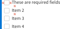
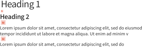
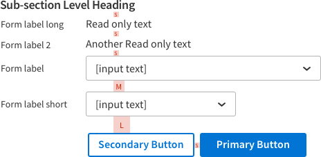
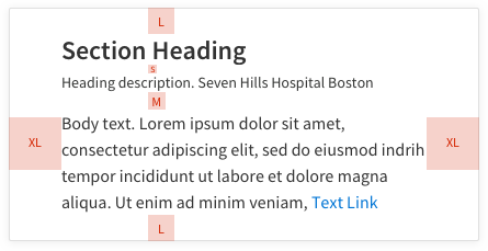
Forge has 6 space constants that are based on UI design best practices and screen density considerations. They mainly come in multiples of 8 and help create a predictable rhythm across all athenahealth apps.

Forge components and patterns are built using these space constants, as shown below. For visual consistency and efficient development, we recommend using Forge components as designed and avoiding custom spacing.
| Name | Value | Label | Usage | Examples |
|---|---|---|---|---|
| Extra small | 4px | XS | Use for elements that are closely related |
|
| Small | 8px | S | Use to separate parts of a component |
|
| Medium | 16px | M | Use to separate components within a group |
|
| Large | 24px | L | Use to divide groups of content |
|
| Extra large | 40px | XL | Use to divide large content sections |
|
| Extra extra large | 64px | XXL | Largest spacing unit possible; use for custom layout |
|
Space constant examples
| Use case | Example | Spacers |
|---|---|---|
| Heading and description |  | XS |
| Button |  | S |
| Checkbox |  | S |
| Heading and divider line |  | S |
| Headings and text |  | S, M |
| Form |  | S, M, L |
| Card |  | S, M, L, XL |
If Forge components don’t fit your use case as designed, contact us on Teams to discuss options.
Page layout
Use the Forge grid and space constants together to lay out content for new page designs as follows:
- Place common elements like a top or left nav to start defining the overall page layout. For example, a persistent left nav might occupy the leftmost 2-3 columns of the grid.
- If it makes sense for some content blocks to appear next to each other in the main content area, place and size them according to relative priority. This sets the number of grid columns for each section.
- Divide the main page content into high-level sections and subsections to establish discrete groups of related information.

- Use XL spacers to create separation between the highest-level groups (level 1).
- Use L spacers to visually group the next largest sections (level 2).
- Use M, S, and XS spacers within each group to create logical subsections of more closely related elements (level 3).
- Review the page for any sections that seem out of place or separated from related sections.
- [Optional] For a responsive design, create a narrower artboard (usually 375px wide, following mobile design best practices) and rearrange your content blocks for the best mobile experience. This helps developers set behavior at different breakpoints.

Information density
Information density refers to how close page elements are to each other. Consider how users will interact with the page or component to determine the best density for your design.
Moderate density layouts
Forge is designed for moderate density layouts. For most users, these layouts provide enough information in a single view, but not so much that it’s crowded or overwhelming. For moderate density layouts, use the default version of our components.
High density layouts
Use a higher density layout for use cases that require more content to fit in a single view, or when users need to browse and interact with a large amount of content, like repetitive data entry or analyzing a large dataset.
To achieve higher density:
- Use the more compact versions of Table or Form (combined with default versions of other components).
- Use smaller space constants between sections.
- Remove any column offsets that create additional white space between grid columns and use gutters instead.
Don’t:
- Reduce the size of Forge components or decrease the spacing within components.
- Decrease the line height. Forge uses 1.2px line height by default, and using less makes content harder to read.
- Decrease the size of icons below 16px (see the Icons page for specifications).
If you make adjustments to increase density, make sure your design maintains these minimum target sizes:
- For non-touch UIs: 24px clickable target
- For touch devices: 48px tappable target
CSS classes and Sass variables
To use Sass variables related to spacing and layout, import these files:
// Access Forge Sass variables@use '@athena/forge/sass/forge-abstracts';// Access Foundation mixins like breakpoint@use'@athena/forge/sass/_vendor/foundation-sites/scss/util/util' as forge-util;
Implementing breakpoints
Breakpoints are the set points at which the layout refreshes automatically to fit the new width, to provide the best user experience for that viewport. Forge defines several breakpoints you can use to create responsive layouts:
smallfor viewports narrower than 640px (mobile devices)mediumfor viewports between 640 and 1024px (tablets in portrait mode)largefor viewports between 1024 and 1200px (tablets in landscape mode and laptops)xlargefor viewports between 1200 and 1440px (laptops and desktops)xxlargefor viewports over 1440px wide (desktops)
To implement a breakpoint, use the breakpoint mixin. This wraps a media query around your desired styles so that they appear only on certain screen sizes.
// medium breakpoint example@include forge-util.breakpoint(medium) {// desired styles}
Javascript constants
Layout constants can be imported from @athena/forge-shared
import { layout } from @athena/forge-shared
Resources
- Gestalt Theory for UX Design: Principle of Proximity: https://uxplanet.org/gestalt-theory-for-ux-design-principle-of-proximity-e56b136d52d1
- Space in Design Systems: https://medium.com/eightshapes-llc/space-in-design-systems-188bcbae0d62
- The Power of Empty Space in UI Design: https://uxplanet.org/https-medium-com-viktorija-bachvarova-the-power-of-empty-space-in-uidesign-14f14f8b203
- A Comprehensive Introduction to Grids in Web Design: https://webdesign.tutsplus.com/articles/a-comprehensive-introduction-to-grids-in-web-design--cms-26521
- Defining Breakpoints: https://ui.dev/rwd/strategy/page-layout/defining-breakpoints
- A Complete Guide to Flexbox: https://css-tricks.com/snippets/css/a-guide-to-flexbox/
Utilities
The utility classes map to certain CSS properties and are applied with the highest level of specificity. You can use them to override default component styling without having to resort to custom CSS or inline styles.
Padding
| Class | Sass | Description |
|---|---|---|
| map-get(forge-abstracts.$global-padding, none) | Sets the specified padding to none |
| map-get(forge-abstracts.$global-padding, xsmall) | Sets the specified padding to xsmall |
| map-get(forge-abstracts.$global-padding, small) | Sets the specified padding to the small value |
| map-get(forge-abstracts.$global-padding, medium) | Sets the specified padding to the medium value |
| map-get(forge-abstracts.$global-padding, large) | Sets the specified padding to the large value |
| map-get(forge-abstracts.$global-padding, xlarge) | Sets the specified padding to xlarge |
| map-get(forge-abstracts.$global-padding, xxlarge) | Sets the specified padding to xxlarge |
Margin
| Class | Sass | Description |
|---|---|---|
| map-get(forge-abstracts.$global-margin, none) | Sets the specified margin to none |
| map-get(forge-abstracts.$global-margin, xsmall) | Sets the specified margin to xsmall |
| map-get(forge-abstracts.$global-margin, small) | Sets the specified margin to the small value |
| map-get(forge-abstracts.$global-margin, medium) | Sets the specified margin to the medium value |
| map-get(forge-abstracts.$global-margin, large) | Sets the specified margin to the large value |
| map-get(forge-abstracts.$global-margin, xlarge) | Sets the specified margin to xlarge |
| map-get(forge-abstracts.$global-margin, xxlarge) | Sets the specified margin to xxlarge |
Height and width
| Class | Sass | Description |
|---|---|---|
fe_u_fill--height | n/a | Sets the height to 100% of the parent element |
fe_u_fill--width | n/a | Sets the width to 100% of the parent element |
fe_u_fill--parent | n/a | Sets the height and width to 100% of the parent element |
Flexbox
| Class | Description |
|---|---|
fe_u_flex-container | Sets the element to display: flex |
| Sets justify-content to the respective value when applied to any flex element |
| Sets align-items to the respective value when applied to any flex element |
| Sets align-self to the respective value when applied to any flex element child |
fe_u_flex--shrink | Flex item will only take up the space of its content when applied to any flex element child |
fe_u_flex--grow | Flex item will take up the maximum space it can when applied to any flex element child |