Content
Guidance for writing notifications, alerts, and other interface text
Introduction
This page covers how to write content (also called UI text or microcopy) for athenahealth products. It helps answer questions like, “What should my error message say?” and “What words should go in this button?” It doesn’t include Forge’s formatting conventions, such as capitalization, punctuation, and spelling for specific words; you can find this information in the Style Guide.
Key takeaways
- Strive for clarity and accuracy in your writing.
- Use a consistent, approachable voice and tone.
- Follow a few athenahealth-specific best practices for optimal copy.
- A few UI elements (like error messages and Buttons) have additional guidelines.
- The first step in writing is to just get your ideas out, no matter how messy.
- Then, when you’ve written it all out, it’s much easier to revise and polish your content.
Principles
Content is design. It’s tempting to treat the words in our interfaces as less important than the components themselves, but without clear, accurate, and consistent language, our interfaces will fail. These principles should form the foundation of your product copy:
Clarity
Distill your product communication, messaging, and user experience to the absolute essentials. Pair well-established, standard healthcare terminology with approachable language that’s familiar to users. Avoid athena-speak, tech language, and jargon.
Accuracy
Accuracy builds credibility and trust. Target your writing to present the information that users need in the specific context. Focus on the facts, and make sure the details are correct. Avoid exaggeration, speculation, and ambiguity. Use simple constructions that don’t leave room for misunderstanding. Use terms and phrases consistently across your product to create a clear, cohesive user experience.
Brand-appropriate
Write copy that aligns with athenahealth’s brand voice. We aim to be:
- Credible: We believe in our products and use trustworthy, certain expressions to reflect this.
- Relatable: Because we understand the entire ecosystem, we speak every stakeholder’s language and communicate clearly with everyone.
- Visionary: Our goals are lofty, so we use inspiring language and a future-focused tone.
Naming a product or workflow
When naming a new product or workflow, consider reaching out to the Branding team for help brainstorming.
To get in contact with the branding team, fill out their product naming brief with your product or workflow's details and send your completed brief to their team's email (brand@athenahealth.com![]() ). The team will review your brief and follow up with naming suggestions.
). The team will review your brief and follow up with naming suggestions.
Voice and tone
Even when product copy is very short, it still expresses voice and tone:
- Voice is the personality.
- Tone is how that personality is expressed in different contexts and situations.
For example, people have an overall personality (voice), but they usually sound different when cheering for friends versus apologizing for a mistake (tone).
Our product personality
athenahealth’s brand voice is credible, relatable, and visionary, and our product personality is part of that vision. We like to think of it as your favorite tech support person: the one who’s a real human, not a chatbot or an automated menu. It’s the person who knows how to fix your problem, who answers your questions, and who explains things in a way that you understand. It’s someone you trust and rely on. They know your job is important, so they work quickly and don’t waste your time.
Here’s how your favorite tech support person might communicate and how you can apply this when writing product copy:
| How they communicate | How to apply to copy |
|---|---|
|
|
|
|
|
|
|
|
Best practices
With this foundation in place, follow these best practices as you start writing:
Plain language
Clear copy helps users do their job as easily and as quickly as possible. Like your favorite tech support person, copy should be straightforward and supportive. Don’t distract users with extra words and complex phrases.
We want to sound less like this: It is necessary for users to input the authorization code emailed to them when they first registered on this system.
And more like this: You need the access code from your account setup email.
Use plain language to make your writing clear and accessible. Plain language improves the user experience for everyone, including:
- People whose first language isn’t English
- Multitaskers and people who are frequently interrupted, like doctors, nurses, and front desk staff
- People who have trouble reading or concentrating for a range of reasons, like stress, illness, the environment, or a cognitive condition
To write copy with plain language:
- Aim for a 6th-8th grade reading level (or a 90-60 Flesch Reading Ease score). Use Microsoft Word’s Editor tool to assess and improve readability.
- Read your copy out loud. If you were in a busy emergency room, would everyone understand you? If not, revise your copy to make it clearer.
- Count the syllables in a word. Can you use another word with fewer syllables? Simpler words can help make your writing clearer.
Try these words and phrases for clear, accessible copy:
| Instead of this | Try this |
|---|---|
| Access (v) | Get, be able to get |
| Activate | Start, turn on, begin |
| Cognizant of | Know |
| Confirm | Make sure, be sure |
| Document (n) | Paper, form, record |
| Document (v) | Take notes, record, keep a record |
| Ensure | Make sure, be sure |
| Experience (n) | How things went, what it was like |
| Experiencing | Feeling, having, happening |
| Facilitate | Help, make easier |
| Implement | Start |
| Increase | Raise, go up |
| Inform | Tell, share, show |
| Locate | Find |
| Monitor | Check, watch, keep an eye on |
| Navigate | Go, go to |
| Obtain | Get |
| Reduce | Lower, go down |
| Subsequent to | After |
| Utilize | Use |
| Before |
| If |
| Because, why |
| Although, though, even though / if / when |
| Must, should |
| Can |
| May, might, can, could |
Active voice
athenaOne is action-oriented, and product copy should be, too. The active voice conveys a sense of forward motion that helps users complete tasks, while the passive voice often adds extra words that dilute the point and can confuse users.
The active voice is direct and unconditional: Enter your password and click Log In.
The passive voice is indirect and often conditional (if/when ___, do ___): The Log In button should be clicked when you have correctly entered your password.
The active voice offers several advantages, including:
- Fewer words
- More direct structure
- Clear subject performing the action
Use the active voice for clear, direct copy that helps users complete tasks.
Important information first
Start with the most important words or details. To determine what’s most important, consider:
- Where are users in the workflow?
- What have they just seen or done in previous steps?
- What do they need to know now?
- What’s their mindset at this moment?
Scannable text
Long blocks of text are hard to read, especially on a wide screen. Users don’t read every word on the page: they scan. Make your copy as short as possible. Cut unnecessary words, and don�’t mention anything that’s obvious from the interface or context. For scannable text:
Use bullets and numbered lists
Lists are easier to scan than blocks of text. They increase white space, deliver digestible chunks of information, and encourage you to trim your copy. For help writing lists, see the Style Guide.
Place instructions in context
Instructions at the top of a form should be a few sentences at most. If your form requires more than that, consider using hint text in the form itself where necessary.
Use numerals
Use numerals for all numbers, including those between 1 and 10. Numerals are easier to scan, and they can help make copy shorter.
Exception: It’s OK to spell out one in copy like “Choose one of the following”.
Writing product copy
A few UI elements warrant additional consideration:
Buttons
Buttons are used to take action, so button copy should sound active. Start with a verb: Save, Cancel, Upload File, Edit Medications
Some workflows let users go backward and forward among steps or pages. Write consistent button copy that starts with a verb: Start, Go to Next, Go Back, Submit
Confirmation dialogs
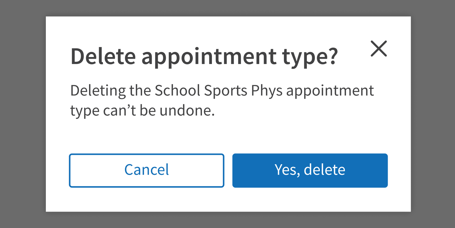
A confirmation dialog asks users to commit to an action that they just initiated. It’s usually an action with consequences, so the confirmation dialog should:
- State the action clearly
- Explain any consequences of taking the action
- Give users two clear options: stop the action or continue it
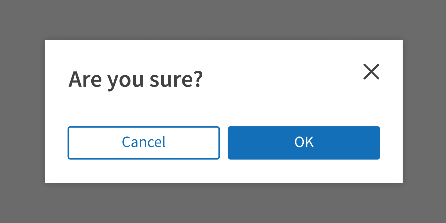
Start with what’s most important: do users want to take this action?
Use clear language that focuses on the action.

Be vague or generic.

Explain what will happen if users take the action. Include any consequences that might not be obvious to users. Write plainly, even bluntly, so users are clear about what will happen.
The standard confirmation dialog buttons are “Cancel” and “OK”. Customize the button text for your use case if it will make the task clearer for users. For example, if you’re asking users to confirm that they want to cancel something, don’t use a “Cancel” button. Write button text that gives users two clear options, such as:
- Stop / Continue
- No, go back / Yes, cancel
Prioritize clarity over brevity in confirmation dialog buttons. It’s OK to add a few words to help make sure that users understand the action they’re confirming:
- Keep File / Delete File
- Keep Patients Separate / Merge Patient Records
Error messages
Error messages should answer these questions:
- What happened? Be clear and specific. For example, if user input doesn’t fit the required format, show the exact format they should use.
- What should the user do next? If possible, suggest a specific action the user can take to resolve the issue or learn more.
- Why did this happen? Explain why the error occurred only if it’s important, will help users resolve the issue, or will diffuse tension. Most of the time, users care more about fixing the problem and finishing their task.
Users may already be frustrated or confused, so focus on the solution:
- Use a helpful tone and plain language that’s easy to understand.
- Make sure instructions include any necessary details, like links, phone numbers, or email addresses.
Avoid:
- Technical jargon
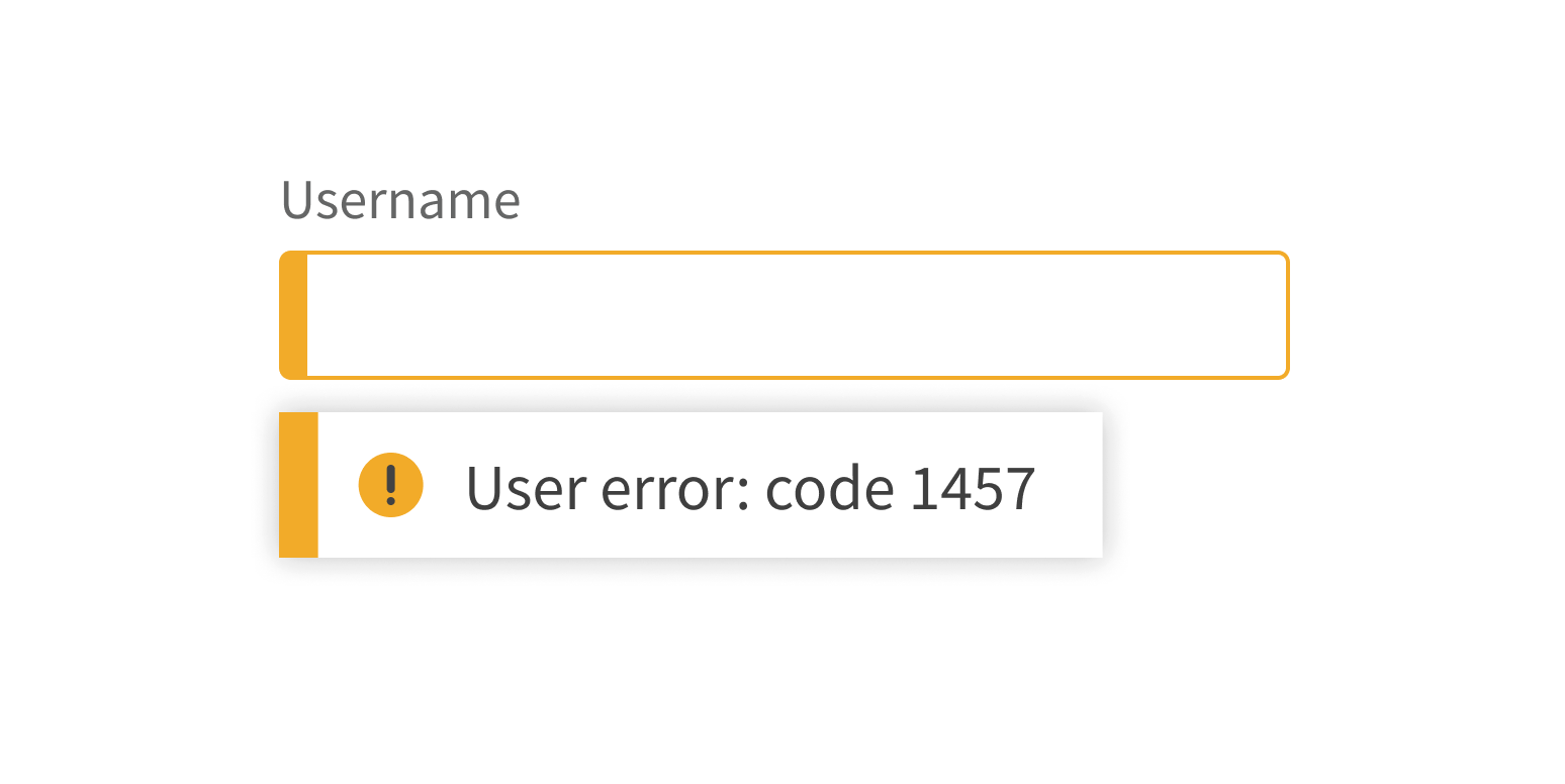
- Diagnostic or error codes (unless it will help users resolve the issue)
- Negative framing
Convey what happened in plain language.

Use technical language or negative framing.

The writing process
Writing product copy can be daunting, especially if writing isn’t your area of expertise. Sometimes it feels like every word is a struggle. Ease into writing with this 3-step process:
1. Start writing
It sounds obvious, but start by simply writing out what you want to say, in any way you can express it, just to get your ideas out. Slang, bullets, misspelled words, way too much text – it’s all OK in this step. The goal is just to capture the important ideas, not to write polished text.

To stay in the flow of writing, use a placeholder string for any details you don’t know instead of stopping to look them up. Use a string of characters like *** or TKTK that you can search for later; they won’t appear in your final copy. You can also use brackets [ ] or highlighting to make it easy to see what you need to fill in.

In this first step, don’t spend time searching for the perfect words. This can interrupt your flow and distract you from the ideas you’re trying to express. For now, just pick words that are good enough or use a placeholder string.
2. Revise
Your ideas are out of your head and written down. Nice job! Now you can go back and edit them.
In this step, revise your words to fit your use case. Fill in missing details, refine your word choice, and look for ways to make it shorter. Check for clarity:
- Read it out loud. Does your copy sound right for your users?
- Ask colleagues for feedback. Is anything confusing, unclear, or missing?
Check the Forge Style Guide for usage, formatting, and punctuation guidance. Apply any product-specific guidelines that your team uses.
Thorough revision usually takes a few rounds. Revise your copy, set it aside, and come back to it later with fresh eyes. What can you fine tune to make it clearer, more direct, and as helpful as possible for users?
After some revision:

After even more revision:

3. Finalize
The writing and editing are done. Do a final read, examining your copy for typos and spelling errors. Double-check your text against the style guide and make sure it meets the guidelines for product copy. Once that’s done, it’s ready for use in your design.

Resources
- The Rise (and Role) of Content Design: https://uxwritinghub.com/the-rise-of-content-design/
- What Does a UX Writer Actually Do?: https://careerfoundry.com/en/blog/ux-design/ux-writing-what-does-a-ux-writer-actually-do/
- Working with UX Writers in Figma: https://www.youtube.com/watch?v=pEpwOzPU1zY
- How to Work with a Content Designer: https://www.flutterwave.design/how-to-work-with-a-content-designer/
- Plain Language Is for Everyone, Even Experts: https://www.nngroup.com/articles/plain-language-experts/
- Why Web Users Scan Instead of Reading: https://www.nngroup.com/articles/why-web-users-scan-instead-reading/
- Show Numbers as Numerals When Writing for Online Readers: https://www.nngroup.com/articles/web-writing-show-numbers-as-numerals
- Confirmation Dialogs Can Prevent User Errors – If Not Overused: https://www.nngroup.com/articles/confirmation-dialog/
- Microsoft Writing Style Guide: https://docs.microsoft.com/en-us/style-guide/welcome/
Utilities
- Free AI-powered writing analysis: https://www.grammarly.com/
- Title case converter: https://titlecase.com/
- Microsoft Word readability and level statistics: https://support.microsoft.com/en-us/office/get-your-document-s-readability-and-level-statistics-85b4969e-e80a-4777-8dd3-f7fc3c8b3fd2#ID0EBDD=Microsoft_365