SingleSelect
A dropdown list where users select a single option.
The Basics
What it is
SingleSelect enables users to enter data by selecting an option from a predefined list. They can also type to filter the list of options. This limits users to a specific set of options and increases the predictability of the data users enter. SingleSelect is often used in forms.
How it works
- The user clicks or focuses on SingleSelect, which makes it active.
- A Forge dropdown appears, listing all available options.
- Typing in the field filters the list of options.
- When the user hovers on an option, it’s highlighted.
- When the user clicks an option, it appears in the field as text, and the dropdown closes.
- If the user types a full text string in the field and there are no matching options, “No options found” appears.
- Selections are generally not saved until another action is taken (typically by using a button, like “Submit”).
When to use
- To ask users to select a single option from a list
- For long lists that would take up too much vertical space on the page
When not to use
- For short lists that can appear directly on the page, reducing the number of clicks
- For lists where multiple selections are allowed
What to use instead
Use Multiselect for a similar component that allows multiple selections.
Use RadioGroup to display all list options on the page.
Use Menu for navigation and filtering via dropdown menu.
How to use
SingleSelect can be used as a standalone component, but it’s better when used with Form and FormField. Form provides a consistent, responsive layout, and FormField adds features like labels, error message handling, and hint text.
Filtering the options list
Typing in the field automatically displays a filtered list of options that match the input. This helps users find specific options in long lists (e.g., typing “hyper” to narrow down a long list of diagnoses).
The filtering function compares the input to the text and value for every option in the list and displays the matches. For example, if an option's text is “Tylenol” and its value is “acetaminophen”, then the input “ace” is a match. If the input doesn't match anything in the list, “No options found” appears below the field.
Loading the options list
The dropdown options list can be loaded synchronously or asynchronously.
- Synchronous (on page load)
- Use for predefined lists that don’t change often.
- Loads at the same time as the rest of the page, so that when the component is activated, it displays the full list of options immediately.
- As users start typing in the field, matches appear instantly.
- Lists with hundreds or thousands of entries can slow down page load significantly.
- Asynchronous (after page load)
- Use for lists that are hosted elsewhere and change more frequently.
- Loads when users start typing (default) or when the component is activated.
- As users start typing in the field, “Loading...” appears, followed by matches.
- Reduces initial page load time but can also make the component feel slow as it searches the full list of options for matches.
- Can show a short list of predefined options when the dropdown is first opened, before users start typing. For example, a SingleSelect with hundreds of medications can first display the top 5 frequently prescribed meds.
- Once users enter text into the field, the predefined options disappear.
Clearing user selection
SingleSelect can be set to include a Close icon inside the field, to the right of the selected option. When pressed, this resets the field to its placeholder value.
Tips for use in forms
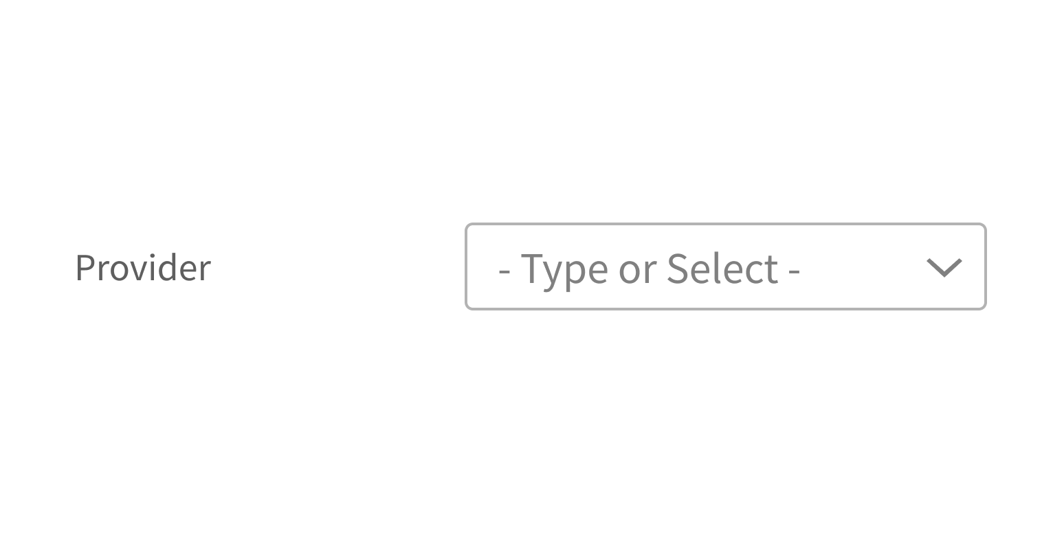
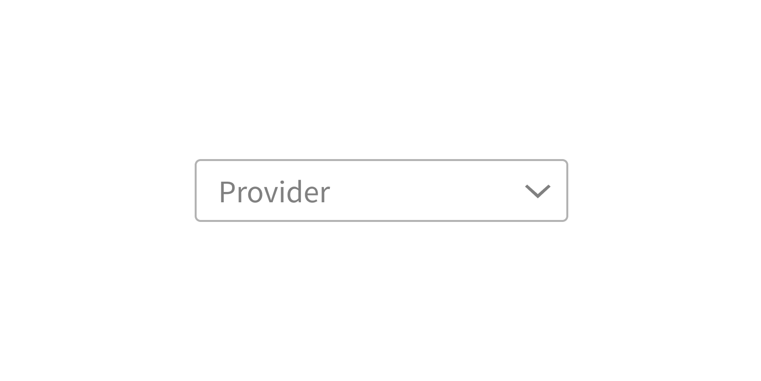
With FormField, the label appears to the left of SingleSelect by default. The label indicates the type of data users are being asked to select (“Provider”).
Placeholder text appears inside the field before the user has interacted with it and offers short instructions for how to use the component.
Always use a label with SingleSelect, and don’t use its placeholder text as a label. This is an accessibility best practice.
Use a label to indicate what data users should enter.
Use placeholder text as a label.
Style
Design details
Required fields
Forge offers 3 options to indicate required form fields. See Form for details.
Spacing and size
The height of this component and the vertical space around it vary according to the form layout (i.e., medium, compact, super-compact). See Form for details.
Placement and hierarchy
No additional information for this component.
Content
There’s no maximum length for option text. When a long option is selected and added to the input field, it’s automatically truncated to one line of text. Use sentence case for option text (“Abdominal pain”, not “Abdominal Pain”).
Use sentence case for label text (“Schedule manager”, not “Schedule Manager”).
Use sentence case for placeholder text. It defaults to “- Type or Select -”, but you can change it to reflect the content of your list (“- Type or select patient name -”).
If no options match the input, “No options found” appears. You can change this to reflect the content of your list (“No patients found”).
If loading the options list asynchronously, “Loading...” appears at the top of the list by default, but you can change this to reflect the content of your list (“Loading patients…”).
Demos
Coding
Developer tips
SingleSelect uses the react-select library. Any props not used by SingleSelect (see Props table) are passed down to react-select. It can be used on its own or as an input in FormField.
Known issue with dropdown
The react-select library has a known dropdown issue, where the dropdown remains at a fixed position if the parent container has a scrollbar independent from the rest of the window. This can occur when using the CSS property overflow:auto. Until this is fixed, we suggest using the disablePortal prop as a workaround, unless you’re using SingleSelect in Lightbox or Modal (this workaround isn’t suitable for these 2 components).
Asynchronous usage
- Filtering
- When loading options asynchronously, SingleSelect doesn’t automatically handle option filtering (matching the user input string to option text and values). You must build this into the
loadAsyncOptionsfunction. See the Demos for an example of option filtering for asynchronous use.
- When loading options asynchronously, SingleSelect doesn’t automatically handle option filtering (matching the user input string to option text and values). You must build this into the
- Loading options on input vs. loading options on mount
- By default, SingleSelect doesn’t load options until users start typing in the input field. To display options before user input (on click or focus), use the
initialAsyncOptionsprop. - You can provide
initialAsyncOptionswith a predefined set of options to display or setinitialAsyncOptionsto{true}, which tells SingleSelect to load options on mount using the function provided to theloadAsyncOptionsprop.
- By default, SingleSelect doesn’t load options until users start typing in the input field. To display options before user input (on click or focus), use the
Caching
SingleSelect sets the cacheOptions prop to {true} by default. This causes the component to cache the options that are loaded for each unique input. Set this prop to {false} to disable caching. To maintain good application performance, pay attention to the size of your cache. cacheOptions continues to cache loaded options until the prop's value changes; it can be reset or altered manually at any time.
Required fields
Use the required prop to mark SingleSelect as required.
Forge offers 3 options to indicate required form fields. When using Form with this component, set Form’s requiredVariation prop. See Form for details.
Repository
Implementation links
SingleSelect directory in Bitbucket
Implementation details
It is strongly recommended to familiarize yourself with the Forge source code. While this documentation is a best effort to document the intent and usage of a component, sometimes some features only become clear when looking at the source code. Also, looking at Forge's source code may help identify and fix bugs in either your application or Forge itself.
Storybook files
Forge maintains at least one storybook file per component. While the primary audience for these files is typically the Forge team, these storybook files may cover usages of the component not covered by a demo. The storybook for the latest version of forge can be found at go/forge-storybook-lts.
Testing library
Forge strongly encourages using testing-library to write tests for your application.
"The more your tests resemble the way your software is used, the more confidence they can give you."
If you're having trouble testing a Forge component using testing-library, it would be a good idea to see how Forge tests its own components. For the most part, Forge tries to use screen.getByRole as much as it can, as that API provides the best feedback on a11y compliance. Forge discourages the use of document.querySelector and screen.getByTestId as both APIs encourage using implementation details to test your component, and discourage adding roles to your component.
With that being said, many of Forge's components were not built with accessibility in mind. These components do break the recommendations listed above.
Import statements
In Nimbus applications
athenaOne serves the Forge bundle independently from your application's bundle. Importing Forge components directly from '@athena/forge' takes advantage of this feature.
import { SingleSelect } from '@athena/forge'
In standalone applications
Importing components using the exact path to the module takes advantage of webpack's tree shaking feature. Webpack will include only that module and its dependencies.
import SingleSelect from '@athena/forge/SingleSelect';
To use this import guidance, Typescript applications must use typescript >= 4.7.3, and should add this setting to their tsconfig.json file:
{"compilerOptions": {"moduleResolution": "Node16",}}
If this setting doesn't work for your application, use this import statement instead:
import SingleSelect from '@athena/forge/dist/SingleSelect';