Button
An interactive element that enables users to take action.
The Basics
What it is
Buttons are used for actions that help users advance or complete workflows (e.g., adding a medication to a patient’s chart). Buttons can also execute transactions (e.g., signing an order) or navigate between pages (e.g., “Go Home”).
Button has 3 variants:
- Primary: Contains the most important call to action, like Submit or Save.
- Secondary: Used for less prominent actions, like Back, Cancel, or Reset.
- Tertiary: Used for the least prominent actions, like the Close icon.
How it works
- The user clicks Button or uses the Space bar or Enter key to activate it.
- Button triggers the action.
- If the optional loading spinner is used:
- It appears and animates, showing that the action is underway.
- It disappears when the action is completed.
- When the action is completed, the user may be taken to a new page, or they may stay on the current page.
When to use
- To prompt users to take actions that move them through a workflow
- To ask users to save or submit information
When not to use
- For interactions that don’t trigger an action, like selecting an option
- To link to another page or section from within a paragraph: use the HTML anchor element
<a>
What to use instead
Use ComboButton to group multiple buttons as a single element.
Use CheckboxButton to ask users to select 1 or more options.
Use RadioButton to ask users to select a single option.
How to use
Variants
Button has 3 variants. Each one includes default text styling, colors, and interaction patterns:
- Primary Buttons represent the most important (“primary”) call to action. They get users’ attention and encourage them to take actions that advance or complete workflows (e.g., Save, Next, Submit). Only use 1 per Button group or page section.
- Secondary Buttons are used for less prominent actions, like Back, Cancel, or Reset. Use as many as needed for your use case.
- Tertiary Buttons are the third and lowest tier of button. Use them for the least prominent actions or when an icon alone can communicate the Button’s purpose (e.g., the Close icon). Don’t use too many in a row; tertiary Buttons don’t have a border, so it might not be visually clear where one ends, and another begins.
Sizes
Each variant is available in all sizes. Choose a size based on your use case:
- Tiny: Best for very small or narrow containers like a sidebar or Popover.
- Small: Use if the standard size feels too large for your design.
- Standard (default; also called “medium”): Recommended for most use cases.
- Large: Ideal for increasing the tappable area in mobile-optimized experiences.
Options
- Disabled: Displays the Button as disabled when users must meet a requirement (like filling out a form) before activating the Button.
- Full width: Makes the Button as wide as its parent container instead of its label.
- Use this option when Button’s width should be fluid, as in a layout based on Grid.
- Don’t use this option with tertiary Buttons, because they don’t have a border or background color to indicate the target area.
- Icon (standard and large Buttons only): Conveys the Button’s purpose. Make sure to use Forge icons according to their prescribed usage.
- Loading spinner (standard and large Buttons only): Displays a small ProgressIndicator after the Button is activated to show that the action is underway.
Button groups
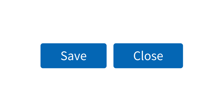
A page can have more than 1 primary Button, but a section should not have multiple primary Buttons; this makes it unclear which action is most important. If your use case requires multiple Buttons in the same section, consider one of these options (instead of using multiple primary Buttons):
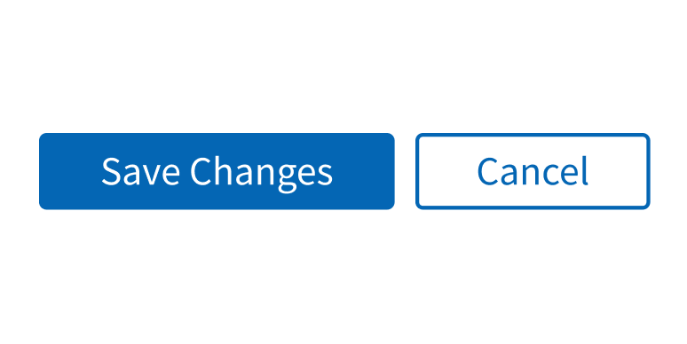
- Use a primary Button and a secondary Button.
- Use a primary Button and a combination of secondary and tertiary Buttons.
Group a single primary Button with other Button variants.
Place 2 primary Buttons next to each other.
Hierarchy
Button variants have a specific order of importance and prominence:
- Primary: Most important, most prominent
- Secondary: Less important, less prominent
- Tertiary: Least important, least prominent
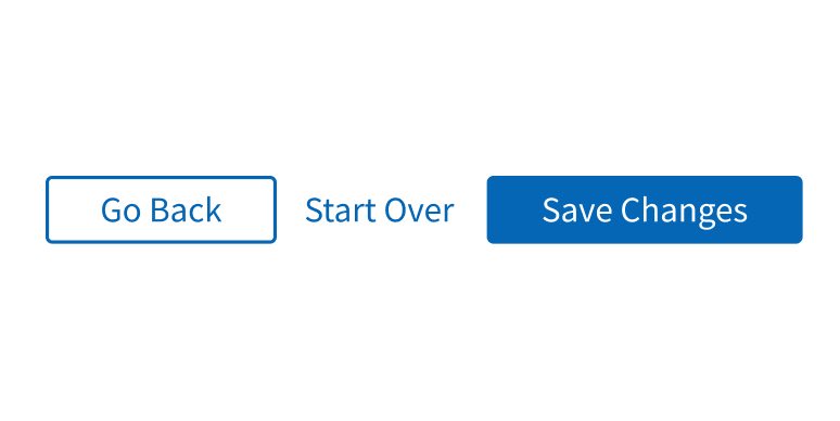
A group of Buttons can display the variants in either order:
- Descending: primary, secondary, tertiary
- Ascending: tertiary, secondary, primary
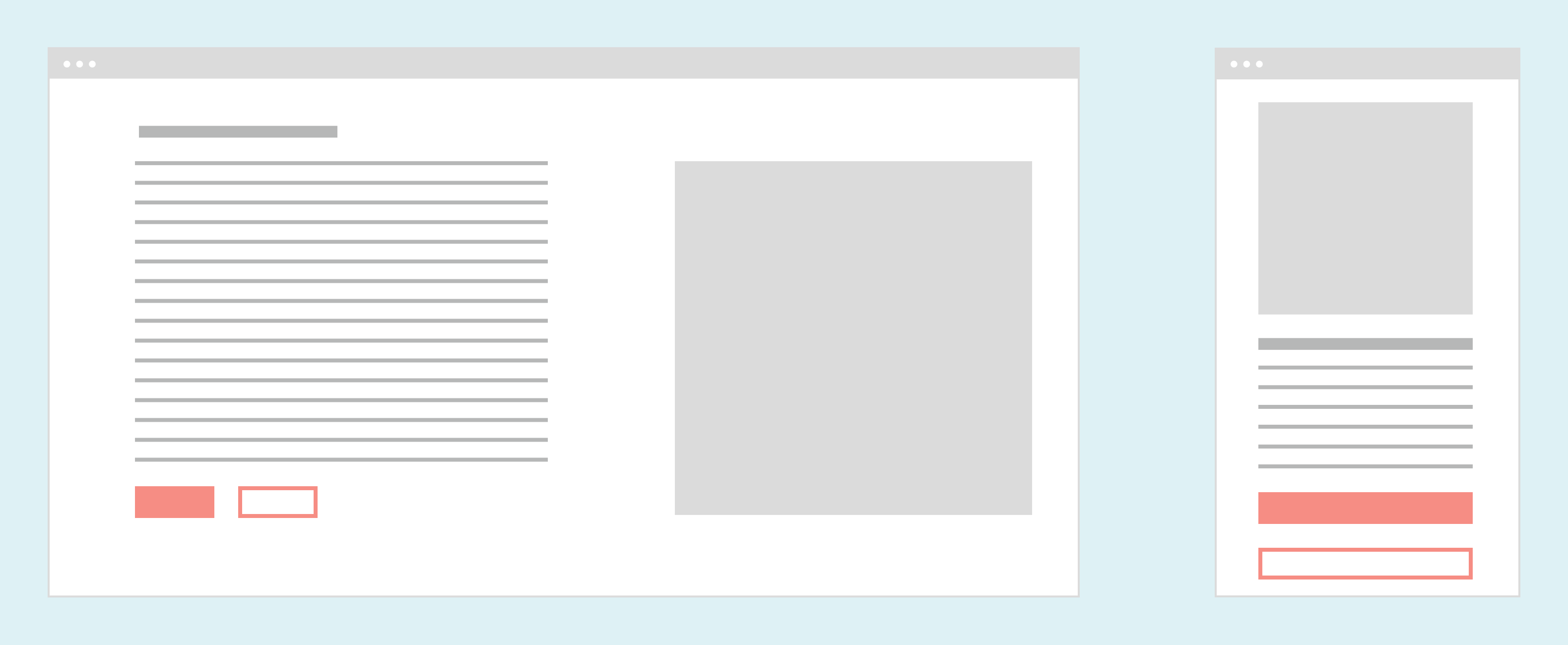
If the width of the viewport is smaller than the width of the Button group, we recommend stacking multiple Buttons vertically. This responsive behavior isn’t built in. You must implement this to make the stacking happen automatically.
Stacked Buttons should always appear in descending order, with the primary Button at the top, followed by any secondary Buttons, and then any tertiary Buttons.
Arrange multiple Buttons in either descending or ascending order.
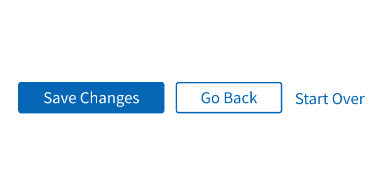
Display multiple Buttons out of their correct order.
Style
Design details
The Button size you choose affects its font size and padding, and therefore, the height and width of the element. In addition:
- Width is set automatically based on the length of the Button copy.
- A full-width Button spans the width of the parent container.
Placement and hierarchy
When used in a Form, single Buttons and Button groups are left-aligned with the left side of the main input fields.
Content
Label
Start Button text with a verb (Edit, View, Save) and keep it short (1-2 words). Use title case (“Confirm Appointment”, not “Confirm appointment”). Button text can have formatting applied, like bold and italics.
Button includes an optional icon, which appears to the left of any text inside the Button. Button can also contain only an icon and no text (e.g., just the Print icon). See Icons to find out if yours requires a label.
If users might not understand what your icon-only Button is for, include a Tooltip that explains its purpose.
For help writing Button copy, see Content.
Referring to Buttons in page copy
Sometimes other text on the page refers to a Button. For example, an error message might instruct users to click a Button to solve a problem. When writing text that refers to a Button:
- Use bold text in title case (“Click Log In”, not “Click log in”).
- Don’t use the word “button” (“Click Log In”, not “Click the Log In button”).
- Exception: It’s OK to use the word “button” in cases where the copy might be confusing without it (e.g., a page with several elements with similar names, where users need to be directed to a specific Button).
- Use the words “click” or “tap” (“Click Log In”, not “Hit Log In”).
For help referring to Buttons in page copy, see the Style Guide.
Loading spinner
Button can include a ProgressIndicator (more specifically, the small circular indeterminate variant). It appears inside the Button, to the left of any text and optional icon, and it indicates that the action is underway. This is especially useful when the Button action affects only part of the page: without the spinner, it might look like nothing happened when users clicked the Button.
Dynamic Button text that reflects the process status can be a great complement to the loading spinner, especially for processes that take more than a few seconds.
For example, a “Save Medications” Button label could:
- Display the loading spinner and “Saving...” on click
- Hide the spinner and display “Saved” when the process is complete
To use the loading spinner, your team must implement code to show/hide the spinner according to the process status. Your team would also need to implement any dynamic Button text.
Demos
Coding
Developer tips
Buttons vs. links
Buttons and links have different purposes:
- The <button> element is for actions, like submitting a form.
- The <a> (link) element is for taking users somewhere, like another page or a specific spot on the current page. Using the right element is necessary not only for semantically correct HTML but for enabling native browser accessibility features.
But what if the design calls for a Button that acts like a link? For example, you might have a Button that says, “Go to Home Page”, but all it does is take users to the home page. That’s link behavior, not Button behavior.
The Button component is built to handle this case. Set the useLink prop to 'true' to make Button render as an <a> element in the code. It looks like a button, but it has the correct HTML underneath. Set the href prop to the destination URL. We recommend this approach for any Button where the only action is changing the web page URL. You can also use this approach to open links in new tabs.
This affects keyboard controls. When useLink='true', users can trigger the Button only with the Enter key (unlike regular Buttons, which can be triggered with the Space bar or Enter key). You must provide a value to href, though, or the Button can’t receive keyboard focus.
Button type
The type prop is used for setting the <button> HTML type attribute. The default value is 'button'. If your Button is in a form, you can also use these types:
- 'submit' for submitting the form
- 'reset' for resetting the inputs back to their original settings (useful for clearing a form)
This prop works for Buttons, not links. It doesn’t apply if useLink='true', and the Button is rendering as an <a> element in the code.
Disabled Buttons
The disabled prop lets you set Button as disabled in a way that supports accessibility. When disabled='true', a disabled class and the ARIA tag aria-disabled='true' are applied to the Button. This way, visually impaired users can still tab to the Button and be told that it’s disabled. The HTML disabled attribute would prevent that. A11y-101 has more information about disabled and aria-disabled.
Repository
Implementation links
Implementation details
It is strongly recommended to familiarize yourself with the Forge source code. While this documentation is a best effort to document the intent and usage of a component, sometimes some features only become clear when looking at the source code. Also, looking at Forge's source code may help identify and fix bugs in either your application or Forge itself.
Storybook files
Forge maintains at least one storybook file per component. While the primary audience for these files is typically the Forge team, these storybook files may cover usages of the component not covered by a demo. The storybook for the latest version of forge can be found at go/forge-storybook-lts.
Testing library
Forge strongly encourages using testing-library to write tests for your application.
"The more your tests resemble the way your software is used, the more confidence they can give you."
If you're having trouble testing a Forge component using testing-library, it would be a good idea to see how Forge tests its own components. For the most part, Forge tries to use screen.getByRole as much as it can, as that API provides the best feedback on a11y compliance. Forge discourages the use of document.querySelector and screen.getByTestId as both APIs encourage using implementation details to test your component, and discourage adding roles to your component.
With that being said, many of Forge's components were not built with accessibility in mind. These components do break the recommendations listed above.
Import statements
In Nimbus applications
athenaOne serves the Forge bundle independently from your application's bundle. Importing Forge components directly from '@athena/forge' takes advantage of this feature.
import { Button } from '@athena/forge'
In standalone applications
Importing components using the exact path to the module takes advantage of webpack's tree shaking feature. Webpack will include only that module and its dependencies.
import Button from '@athena/forge/Button';
To use this import guidance, Typescript applications must use typescript >= 4.7.3, and should add this setting to their tsconfig.json file:
{"compilerOptions": {"moduleResolution": "Node16",}}
If this setting doesn't work for your application, use this import statement instead:
import Button from '@athena/forge/dist/Button';