Typeahead
A field where users enter and edit data more efficiently using suggested text.
The Basics
What it is
Typeahead is a field that anticipates what users are typing while they’re typing it. Users type a few characters, and a list of possible matches appears. Users select an item in the list, saving time and keystrokes. If there’s no match for what users are typing, they can enter freeform text.
How it works
- The user clicks or focuses on Typeahead, which makes it active.
- While the field is active, the user can enter and edit data in it.
- As the user types characters, the application searches a reference list for words or phrases that match what they’re typing. By default, this search starts as soon as the user types the first character, but you can set the minimum number of characters required.
- Search results appear in a dropdown list. The list updates continuously as the user types. Screen readers announce available suggestions when they appear on the screen.
- To select an option, the user clicks it in the list or uses the arrow keys + Enter.
- If there's no match, the user finishes typing the entire word or phrase to enter their information.
When to use
- To request data that’s predictable but could be unique
- To help users enter long words that are annoying to type or easy to misspell
- To quickly filter a long list of options, like medications
When not to use
- For data entry that limits options to a short, predefined list, like US states.
- For search functionality. Typeahead is intended solely for data entry. To build a search experience, start with the Input component and leverage a third-party plugin (like Algolia) for the rest of the functionality.
What to use instead
Use Select to make users choose from a predefined list (no option to enter free text).
Use Multiselect to enable users to choose multiple options in a predefined list.
Use Input for data other than text or for search functionality.
How to use
Typeahead can be used as a standalone component, but it’s better when used with Form and FormField. Form provides a consistent, responsive layout, and FormField adds features like labels, error message handling, and hint text.
Label
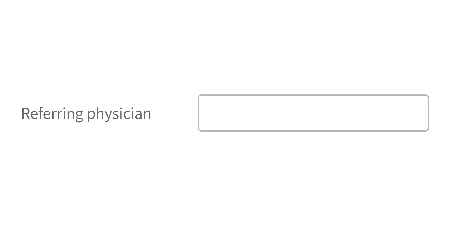
With FormField, the label appears to the left of Typeahead by default and indicates the type of information users should enter (“Provider”).
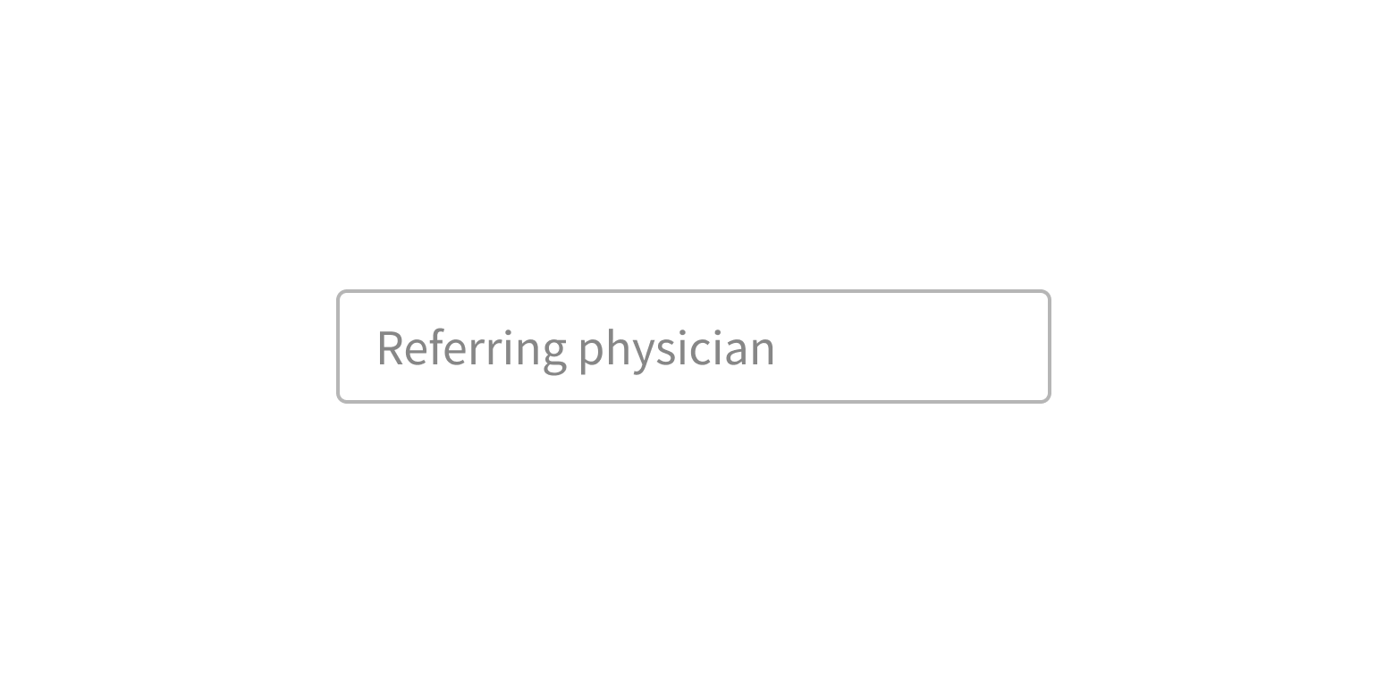
Placeholder text appears in the field before users interact with it and offers short instructions or an example of the required format.
Always include a label with Typeahead. Never use placeholder text as a label, because placeholder text disappears when users interact with the field. This is often a problem for users who are multitasking, tabbing quickly through a form, or have cognitive issues.
Use a label to indicate the type of information users should enter.
Use placeholder text as a label.
Placeholder text
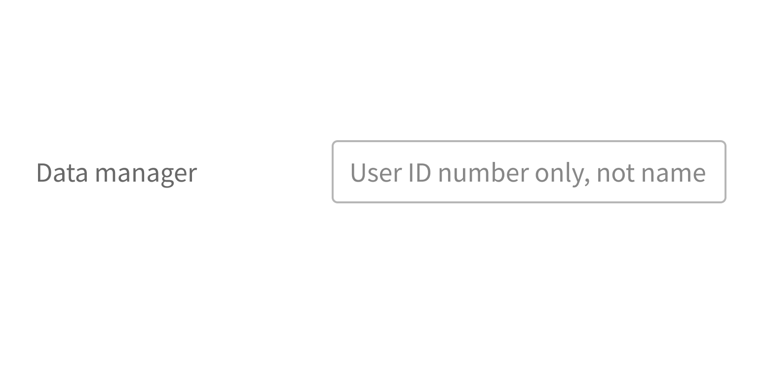
Use placeholder text only when guidance will make it easier for users to complete a task. Placeholder text shouldn’t duplicate the label text.
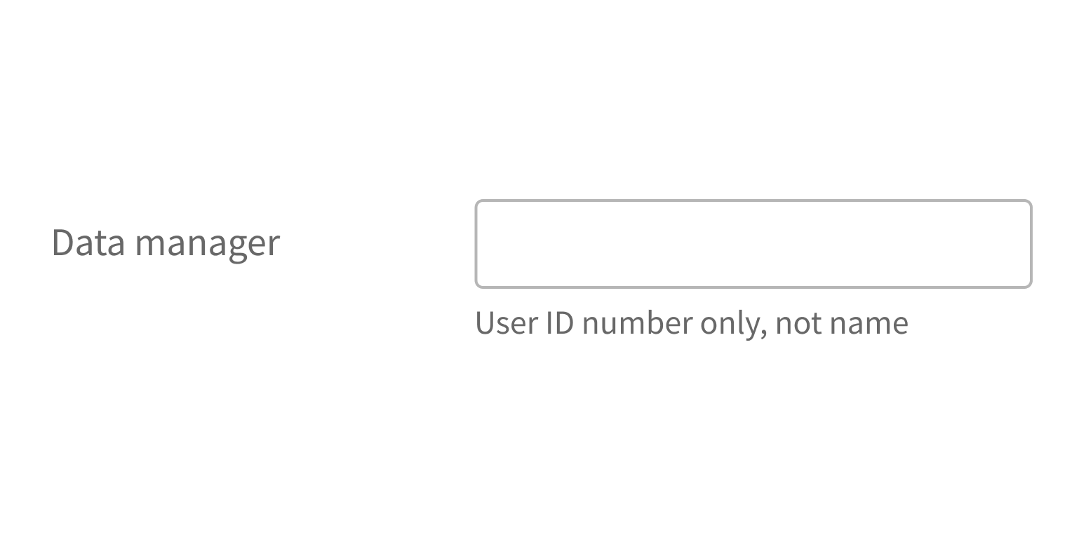
If the information you’d like to use as placeholder text is required to complete the task, make it hint text instead. Hint text appears below the Typeahead field, so it’s always visible.
- Hint text is an option when using Typeahead in FormField.
- If using Typeahead by itself, hint text must be coded separately.
Include helpful hints or tips as hint text.
Use placeholder text for important instructions.
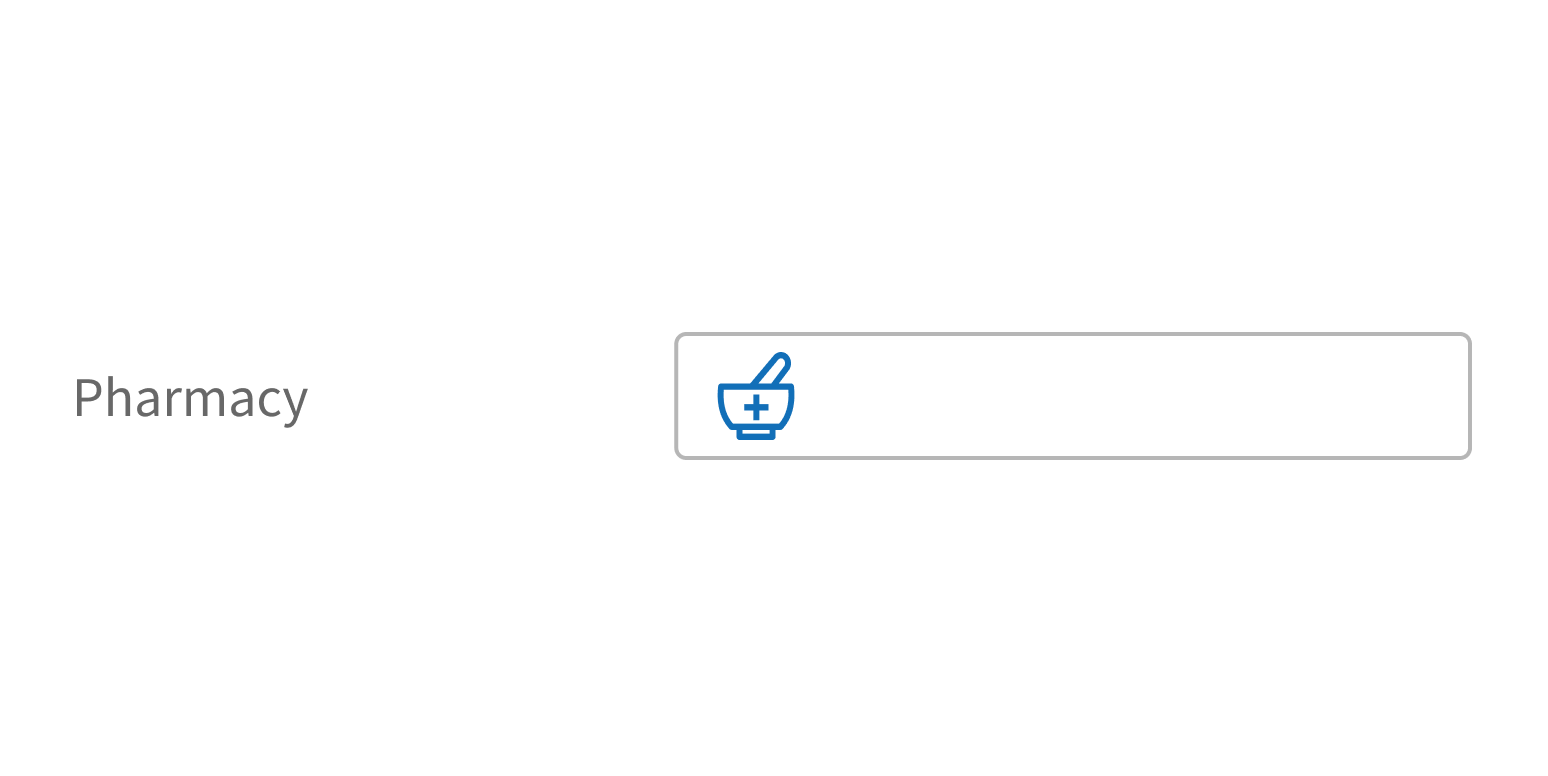
Use with an icon
Typeahead can include an icon in the field, aligned left, to indicate the type of information users should enter.
Choose an icon that matches the information type.
Use an arbitrary or confusing icon.
Character count
You can set the number of characters required before Typeahead displays suggestions. By default, suggestions appear as soon as users start typing. If there are more than 100 suggestions, set a minimum of 3 characters to improve performance and help users enter data quickly.
Style
Design details
Required fields
Forge offers 3 options to indicate required form fields. See Form for details.
Spacing and size
The height of this component and the vertical space around it vary according to the form layout (i.e., medium, compact, super-compact). See Form for details.
Placement and hierarchy
No additional information for this component.
Content
Use sentence case for label text (“Patient name”, not “Patient Name”).
Use sentence case for any placeholder text. For general use, we recommend, “Start typing to see options”, but you can customize this to fit your use case (“Start typing to see medications”).
Demos
Coding
Developer tips
Typeahead is based on React Autosuggest. When possible, Forge uses third-party libraries, but they must still meet Forge design standards and present a unified API. Only the functionality described in the Forge documentation is officially supported for this component, even if an underlying third-party API is still usable.
String matching behavior
Typeahead’s string matching behavior can be customized:
- Matching string location in list items:
- Default: Match list items that contain the input string anywhere in the text.
- Customize it: Change this to match only items that begin with the input string by setting the
matchPos='start'prop.
- Case sensitivity:
- Default: Case insensitive (for example, the string “Alzheimer's” also matches “alzheimer's”).
- Customize it: Change this to case sensitive by setting the
ignoreCase=falseprop.
- Number of characters users must type before suggestions appear:
- Default: One character.
- Customize it: Change this by setting the
minQueryLengthprop.
Options and suggestions
Typeahead expects options or suggestions to be passed as an array of either strings or objects with a value property. options is the set of all possible pre-filtered values to display in the dropdown. suggestions is the set of values to display currently and should already have been filtered. Set one or the other, not both.
List display
Both the options and suggestions props populate the list below the input field. For uncontrolled components, use options, and for controlled components, use suggestions. If suggestions is used, the list is displayed immediately, unless alwaysRenderSuggestions is set to {false}.
Use the minQueryLength prop in conjunction with options to display the list only after users have entered a certain number of characters.
Updating suggestions updates the dropdown while open, but updating options does not.
Screen readers
If using Typeahead as a controlled component, provide the suggestionsAnnouncement prop to expose available suggestions to screen readers.
Filtering
By default, in uncontrolled mode, Typeahead performs a string match between the entered text and the options. For other filtering methods, pass a custom function to the filterOptions prop.
Unused props from React Autosuggest
Typeahead doesn’t use some React Autosuggest properties (mostly related to creating sections in the suggestion list): multiSection, renderSectionTitle, getSectionSuggestions, and getSuggestionValue.
Async suggestions
Typeahead expects suggestions to be set synchronously when onSuggestionsFetchRequested or onSuggestionsClearRequested is called. At this time, there’s no option to load it asynchronously.
Required fields
Use the required prop to mark Typeahead as required.
Forge offers 3 options to indicate required form fields. When using Form with this component, set Form’s requiredVariation prop. See Form for details.
Repository
Implementation links
Typeahead directory in Bitbucket
Implementation details
It is strongly recommended to familiarize yourself with the Forge source code. While this documentation is a best effort to document the intent and usage of a component, sometimes some features only become clear when looking at the source code. Also, looking at Forge's source code may help identify and fix bugs in either your application or Forge itself.
Storybook files
Forge maintains at least one storybook file per component. While the primary audience for these files is typically the Forge team, these storybook files may cover usages of the component not covered by a demo. The storybook for the latest version of forge can be found at go/forge-storybook-lts.
Testing library
Forge strongly encourages using testing-library to write tests for your application.
"The more your tests resemble the way your software is used, the more confidence they can give you."
If you're having trouble testing a Forge component using testing-library, it would be a good idea to see how Forge tests its own components. For the most part, Forge tries to use screen.getByRole as much as it can, as that API provides the best feedback on a11y compliance. Forge discourages the use of document.querySelector and screen.getByTestId as both APIs encourage using implementation details to test your component, and discourage adding roles to your component.
With that being said, many of Forge's components were not built with accessibility in mind. These components do break the recommendations listed above.
Import statements
In Nimbus applications
athenaOne serves the Forge bundle independently from your application's bundle. Importing Forge components directly from '@athena/forge' takes advantage of this feature.
import { Typeahead } from '@athena/forge'
In standalone applications
Importing components using the exact path to the module takes advantage of webpack's tree shaking feature. Webpack will include only that module and its dependencies.
import Typeahead from '@athena/forge/Typeahead';
To use this import guidance, Typescript applications must use typescript >= 4.7.3, and should add this setting to their tsconfig.json file:
{"compilerOptions": {"moduleResolution": "Node16",}}
If this setting doesn't work for your application, use this import statement instead:
import Typeahead from '@athena/forge/dist/Typeahead';