CheckboxButton
An interactive element where users select multiple options from a group of buttons.
The Basics
What it is
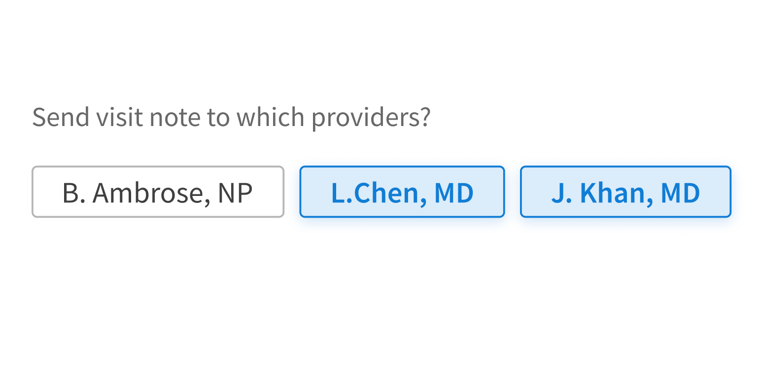
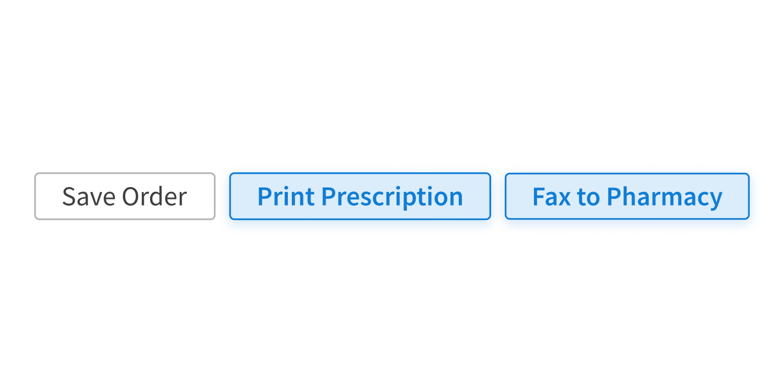
CheckboxButton is an interactive element that enables users to select and deselect multiple options from a group of buttons. It’s like SelectionList but horizontal and more tappable.
How it works
- The user clicks or activates an option’s button in CheckboxButton, which selects the option and makes it active. The button style changes to selected.
- The user can deselect an option by clicking or activating the same button again. The button changes back to its default style.
- The user’s selections usually aren’t saved until they take another action, like using a button (“Submit”).
When to use
- To ask users to select one or more options in a horizontal layout
- To provide a more tappable user experience on mobile devices
- To set filters or select values from a list of options
- For lists of options that are up to 3 words long
When not to use
- For lists of options that are more than 3 words long
- For lists with so many options that users need to filter them
What to use instead
Use RadioButton if users can select only 1 option.
Use SelectionList for lists with checkboxes to select options.
Use ToggleSwitch for instant on/off states.
How to use
Despite its appearance and name, CheckboxButton doesn’t function as a “button” in the usual sense: it’s used to set filters or select values from a list of options. Its button form is more visual and tappable, but behind the scenes, it works like SelectionList.
Use CheckboxButton for users to select one or more options.
Use CheckboxButton for any other actions.
Style
Design details
CheckboxButton groups are displayed horizontally by default. On screens smaller than 640px, they automatically stack vertically.
Placement and hierarchy
No additional information for this component.
Content
Use sentence case for button text:
- “Asthma”, not “asthma”
- “White coat”, not “White Coat”
Demos
Coding
Developer tips
A CheckboxButton is rendered as an input of type checkbox, not as a button.
The row of checkboxes transforms into a column when the div containing them isn’t wide enough. When this happens, the stacked CheckboxButtons might be too wide, so it’s important to consider the width threshold at which the stacked formation goes into effect. Use CSS styles to adjust the width if necessary.
The only difference between largeWhenStacked={true} and largeWhenStacked={false} is that when largeWhenStacked={true}, the class “fe_c_checkbox-button—large" shows up in the parent div when the buttons switch to their stacked configuration.
Repository
Implementation links
CheckboxButton directory in Bitbucket
Implementation details
It is strongly recommended to familiarize yourself with the Forge source code. While this documentation is a best effort to document the intent and usage of a component, sometimes some features only become clear when looking at the source code. Also, looking at Forge's source code may help identify and fix bugs in either your application or Forge itself.
Storybook files
Forge maintains at least one storybook file per component. While the primary audience for these files is typically the Forge team, these storybook files may cover usages of the component not covered by a demo. The storybook for the latest version of forge can be found at go/forge-storybook-lts.
Testing library
Forge strongly encourages using testing-library to write tests for your application.
"The more your tests resemble the way your software is used, the more confidence they can give you."
If you're having trouble testing a Forge component using testing-library, it would be a good idea to see how Forge tests its own components. For the most part, Forge tries to use screen.getByRole as much as it can, as that API provides the best feedback on a11y compliance. Forge discourages the use of document.querySelector and screen.getByTestId as both APIs encourage using implementation details to test your component, and discourage adding roles to your component.
With that being said, many of Forge's components were not built with accessibility in mind. These components do break the recommendations listed above.
Import statements
In Nimbus applications
athenaOne serves the Forge bundle independently from your application's bundle. Importing Forge components directly from '@athena/forge' takes advantage of this feature.
import { CheckboxButton } from '@athena/forge'
In standalone applications
Importing components using the exact path to the module takes advantage of webpack's tree shaking feature. Webpack will include only that module and its dependencies.
import CheckboxButton from '@athena/forge/CheckboxButton';
To use this import guidance, Typescript applications must use typescript >= 4.7.3, and should add this setting to their tsconfig.json file:
{"compilerOptions": {"moduleResolution": "Node16",}}
If this setting doesn't work for your application, use this import statement instead:
import CheckboxButton from '@athena/forge/dist/CheckboxButton';