MultiField
A row of related inputs with form features.
The Basics
What it is
MultiField provides a responsive layout for a row of related inputs. Grouping related inputs together saves vertical space and helps users enter data. It’s similar to FormField: where FormField provides a responsive vertical layout, MultiField provides a responsive horizontal layout.
How it works
- The user clicks or focuses on any input in MultiField, which makes that input active.
- While an input is active, the user can enter and edit data in it.
- The user navigates between inputs.
- If one input fails validation, an error message for that input appears below.
- When finished, the user navigates away from the MultiField.
When to use
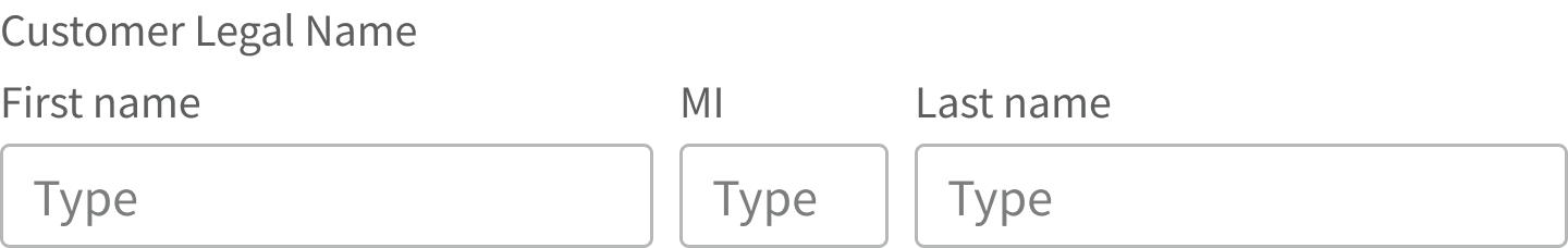
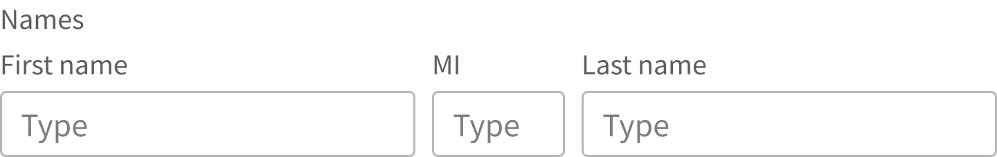
MultiField is for pieces of information that are related to each other and also meaningful on their own, such as:
- The fields for a patient’s name: First name, Middle initial, Last name
- Data points about a location: City, State, ZIP code
When not to use
MultiField isn’t the right choice for pieces of information that mean something together but lose meaning when separated, such as:
- Height, broken into 2 inputs: feet and inches
- Weight, broken into 2 inputs: lb and oz
- Social Security number, broken into 3 inputs separated by dashes
Also, don’t use MultiField:
- Inside FormField, which already has its own set of labels, error messages, and hint text
- To group unrelated inputs in order to save space
- For a range of dates: Start date, End date
What to use instead
Use Input for data fields that aren't closely related.
Use FormField for a responsive vertical layout.
Use DateRangeInput to input a range of dates: Start date, End date.
How to use
Labels and hint text
MultiField offers 2 kinds of label: one for the group, and an individual label for each input. Group labels aren’t always necessary, but individual labels are strongly encouraged.
Use a unique group label when appropriate.
Use a group label that’s redundant or confusing.
MultiField can display a single hint text message below the row of inputs. The individual fields don’t have their own hint text.
Error messages
MultiField supports separate error messages for each input. These messages appear below the row of inputs, aligned to the left. If there are multiple error messages, each message sits on a separate line, in the order of the corresponding inputs (left to right).
If the inputs wrap, all error messages appear below the last input. This can make it hard for users to know which input caused the error.
Arrange related inputs in a single row.
Use so many inputs that they wrap on screens <640px wide.
Required fields
MultiField can include both required and optional fields. For example, when requesting a patient’s first name, middle initial, and last name, the first and last name inputs can be required, while the middle initial input is optional.
Style
Design details
The spacing between inputs in MultiField defaults to 8px, but it can be customized. Keep inputs close together so it’s clear that they’re a group.
Spacing and size
The height of this component and the vertical space around it vary according to the form layout (i.e., medium, compact, super-compact). See Form for details.
Placement and hierarchy
No additional information for this component.
Content
Use sentence case for label text (“Patient name”, not “Patient Name”).
Use sentence case for any placeholder text. If providing an example, use “e.g.,” as an introduction. For example:
- Email address: “e.g., person@email.com”
Use sentence case for any hint text. It should apply to the whole MultiField, not just one of the inputs.
Demos
Coding
Developer tips
MultiField supports multiple inputs in the same row. The fields prop expects an array of objects, where each object is similar to the props supported by FormField. This is because the inputs behave as if each were in its own FormField. Each has its own labelText, value, onChange, and so on. Apart from this, the API is similar to FormField. The props table shows which props are input-specific and which apply to the entire row.
Type Validation
MultiField offers an "opt-in" approach to typing. One can utilize MultiField in either "Strict" or "Flexible" mode.
Strict Mode
- MultiField accepts a variety of prop signatures; specifically, up to five tuple types. These positional arguments correspond to the item at the respective index of the
fieldsarray. - For Example,
<MultiField<SelectProps, InputProps, CheckBoxProps> fields={fields} ... />would enforce typing as follows: fields[0] would be subject toSelectProps; fields[1] would be subject toInputProps; and fields[2] would be subject toCheckBoxProps, and so on for up to five possible items. Importantly, for afieldsarray that contains more than 5 items, those additional fields will be rendered, but this strict typing will not be available.
Flexible Mode
- Simply do not provide any prop signatures and strict typing will not be explicitly enforced. However, even in the absence of positional arguments, MultiField will infer the type of a
fieldfrom the value (i.e., the component) supplied to itsinputAsprop. So, even in Flexible Mode, type safety will still be provided where possible.
Input widths
Fitting multiple inputs in a single row can require greater control over input widths. When determining the widths, keep 2 things in mind:
- Don’t let inputs wrap on any supported viewport. When the inputs wrap, all error messages appear below the last input. This makes it hard for users to match the errors to their corresponding inputs.
- The width of the input determines how much space its label has before it wraps. For very small inputs, use short labels.
To set the width of an input (and its label), you can add a class with the className prop within fields and target it in CSS.
Alternately, you can set a style prop in the fields object to set the width inline (see first demo).
fields = {[{labelText: 'MI',id: 'middleInitial',style: { width: '5ch' },},]}
Hint text
MultiField shows only a single line of hint text, so all props related to hint text are at the top level, not in the fields array.
ReduxMultiField component
Redux features were removed in Forge 3, including the 3 Redux-based components: ReduxForm, ReduxFormField, and ReduxMultiField (see the FAQ for details). Forge 3 still supports the use of Redux. Teams can use the separate package forge-redux-form.
Required fields
Individual fields within MultiField can be marked as required. Use the required prop on the individual fields provided in the fields prop. Set the required prop on the MultiField itself to apply required styling to the overall component (e.g., to style the text label).
Forge offers 3 options to indicate required form fields. When using Form with this component, set Form’s requiredVariation prop; it is then passed down to the individual fields. See Form for details.
Repository
Implementation links
MultiField directory in Bitbucket
Implementation details
It is strongly recommended to familiarize yourself with the Forge source code. While this documentation is a best effort to document the intent and usage of a component, sometimes some features only become clear when looking at the source code. Also, looking at Forge's source code may help identify and fix bugs in either your application or Forge itself.
Storybook files
Forge maintains at least one storybook file per component. While the primary audience for these files is typically the Forge team, these storybook files may cover usages of the component not covered by a demo. The storybook for the latest version of forge can be found at go/forge-storybook-lts.
Testing library
Forge strongly encourages using testing-library to write tests for your application.
"The more your tests resemble the way your software is used, the more confidence they can give you."
If you're having trouble testing a Forge component using testing-library, it would be a good idea to see how Forge tests its own components. For the most part, Forge tries to use screen.getByRole as much as it can, as that API provides the best feedback on a11y compliance. Forge discourages the use of document.querySelector and screen.getByTestId as both APIs encourage using implementation details to test your component, and discourage adding roles to your component.
With that being said, many of Forge's components were not built with accessibility in mind. These components do break the recommendations listed above.
Import statements
In Nimbus applications
athenaOne serves the Forge bundle independently from your application's bundle. Importing Forge components directly from '@athena/forge' takes advantage of this feature.
import { MultiField } from '@athena/forge'
In standalone applications
Importing components using the exact path to the module takes advantage of webpack's tree shaking feature. Webpack will include only that module and its dependencies.
import MultiField from '@athena/forge/MultiField';
To use this import guidance, Typescript applications must use typescript >= 4.7.3, and should add this setting to their tsconfig.json file:
{"compilerOptions": {"moduleResolution": "Node16",}}
If this setting doesn't work for your application, use this import statement instead:
import MultiField from '@athena/forge/dist/MultiField';