Checkbox
An interactive element where users select a single option.
The Basics
What it is
Checkbox is an interactive element that enables users to select a single option or indicate confirmation (e.g., opt in to email marketing).
How it works
- The user clicks or activates the option’s checkbox or clicks its description to select the option or indicate confirmation.
- The user can deselect the option or remove confirmation by clicking or activating the option's checkbox again or clicking the description again.
- The user’s selection usually isn’t saved until they take another action, like using a button (“Submit”).
When to use
- To ask users to select a single option
- To request confirmation in a form or user settings flow
When not to use
- For a list of related checkboxes
- For a user preference that should be applied instantly
What to use instead
Use SelectionList for a vertical layout of 2+ checkbox options.
Use CheckboxButton for a horizontal layout of 2+ options.
Use ToggleSwitch for instant on/off settings.
How to use
Checkbox can be used as a standalone component, but it's better when used with Form and FormField. Form provides a consistent, responsive layout, and FormField adds features like labels, error message handling, and hint text.
Checkbox includes the interactive checkbox element and a description. Both the checkbox and the entire description can be clicked to select or deselect the option. This expands the clickable area, making the component more user friendly.
Saving user selections
In most cases, use a secondary action (like a “Next”, “Save”, or “Submit” button) to save user selections.
In certain cases, user selections have a real-time impact on the workflow. For example, billing flows often include a Checkbox option like “Ship to a different address”, which shows or hides an additional address field. Use this dynamic behavior only where it's a necessary part of the workflow.
Tips for use in forms
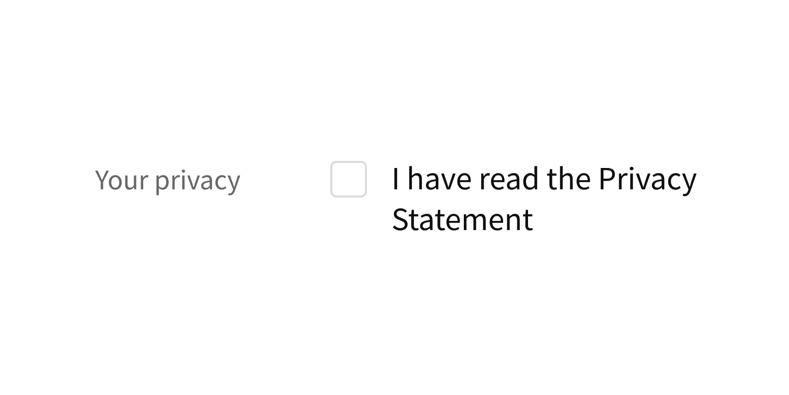
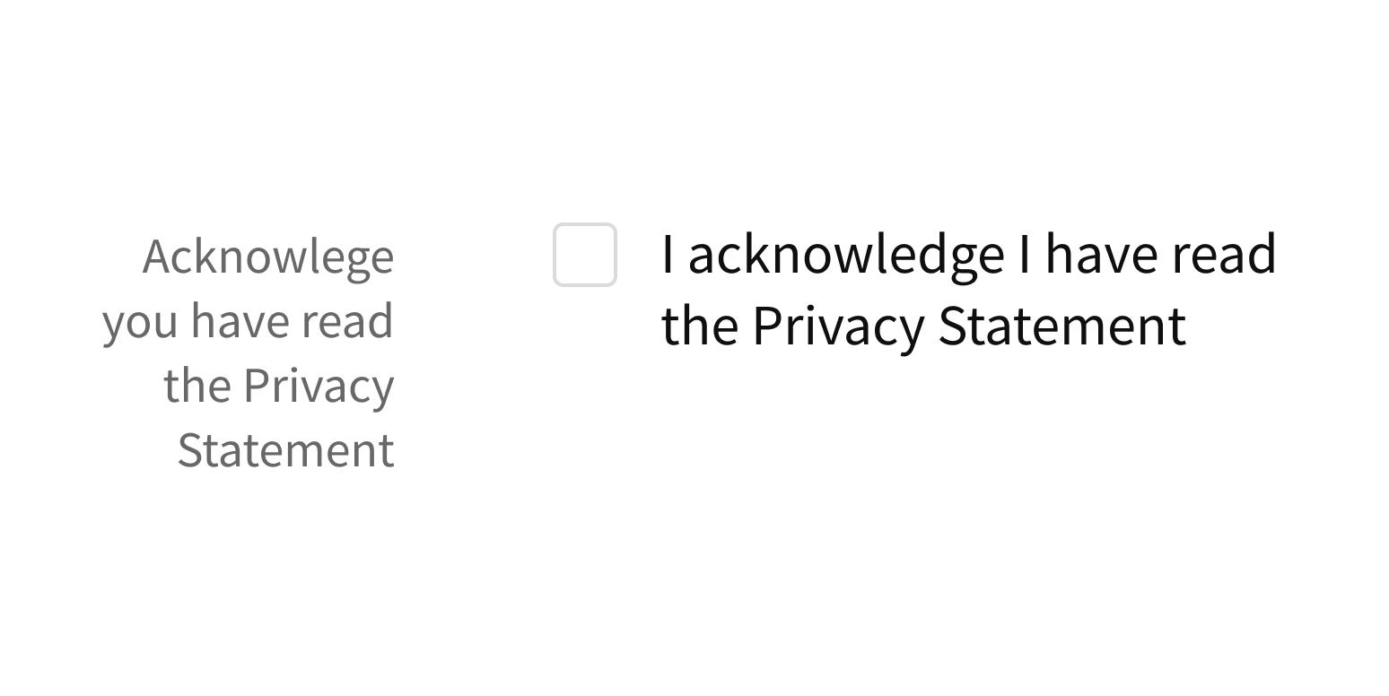
When used with FormField, a label appears to the left of Checkbox. Label text should complement the option description but not repeat it.
Write label text that’s distinct from the description.

Write label and description text that together are repetitive or confusing.

Style
Design details
Required fields
Forge offers 3 options to indicate required form fields. See Form for details.
Spacing and size
The height of this component and the vertical space around it vary according to the form layout (i.e., medium, compact, super-compact). See Form for details.
Placement and hierarchy
No additional information for this component.
Content
Description text should be the name of the option (“Coughing”) or the statement that users are confirming (“I’d like to sign up for the athenahealth newsletter.”). Use sentence case (e.g., "Show procedure codes", not “Show Procedure Codes”).
Demos
Coding
Developer tips
This component was designed to have a consistent cross-browser appearance by using a CSS pseudo-element overlaying the HTML checkbox input element. The hidden input element is still used for all checkbox functions to maintain accessibility.
Required fields
Use the required prop to mark the Checkbox as required.
Forge offers 3 options to indicate required form fields. When using Form with this component, set Form’s requiredVariation prop. See Form for details.
Repository
Implementation links
Checkbox directory in Bitbucket
Implementation details
It is strongly recommended to familiarize yourself with the Forge source code. While this documentation is a best effort to document the intent and usage of a component, sometimes some features only become clear when looking at the source code. Also, looking at Forge's source code may help identify and fix bugs in either your application or Forge itself.
Storybook files
Forge maintains at least one storybook file per component. While the primary audience for these files is typically the Forge team, these storybook files may cover usages of the component not covered by a demo. The storybook for the latest version of forge can be found at go/forge-storybook-lts.
Testing library
Forge strongly encourages using testing-library to write tests for your application.
"The more your tests resemble the way your software is used, the more confidence they can give you."
If you're having trouble testing a Forge component using testing-library, it would be a good idea to see how Forge tests its own components. For the most part, Forge tries to use screen.getByRole as much as it can, as that API provides the best feedback on a11y compliance. Forge discourages the use of document.querySelector and screen.getByTestId as both APIs encourage using implementation details to test your component, and discourage adding roles to your component.
With that being said, many of Forge's components were not built with accessibility in mind. These components do break the recommendations listed above.
Import statements
In Nimbus applications
athenaOne serves the Forge bundle independently from your application's bundle. Importing Forge components directly from '@athena/forge' takes advantage of this feature.
import { Checkbox } from '@athena/forge'
In standalone applications
Importing components using the exact path to the module takes advantage of webpack's tree shaking feature. Webpack will include only that module and its dependencies.
import Checkbox from '@athena/forge/Checkbox';
To use this import guidance, Typescript applications must use typescript >= 4.7.3, and should add this setting to their tsconfig.json file:
{"compilerOptions": {"moduleResolution": "Node16",}}
If this setting doesn't work for your application, use this import statement instead:
import Checkbox from '@athena/forge/dist/Checkbox';