Textarea
A field where users enter and edit long text segments.
The Basics
What it is
Textarea is a field where users enter and edit freeform text, like a note or comment, that’s longer than what’s recommended for Input.
How it works
- The user clicks or focuses on Textarea, which makes it active.
- While the field is active, the user can enter and edit data in it.
- If the number of lines exceeds the height of Textarea, it increases in height automatically.
- When finished, the user navigates away from Textarea.
When to use
- To request long text, such as sentences or paragraphs
When not to use
- For data that should be stored in separate pieces instead of a long chunk of freeform text, like a mailing address
- For data that’s less than a sentence long, especially if it’s one of these data types: short text, number, email, password, search, telephone, time, or URL
- For data that’s easier for users to enter by selecting an item in a predefined list, like US states
What to use instead
Use Input for data that’s less than a sentence long.
Use Typeahead to enable suggestions while typing.
How to use
Textarea can be used as a standalone component, but it’s better when used with Form and FormField. Form provides a consistent, responsive layout, and FormField adds features like labels, error message handling, and hint text.
Label
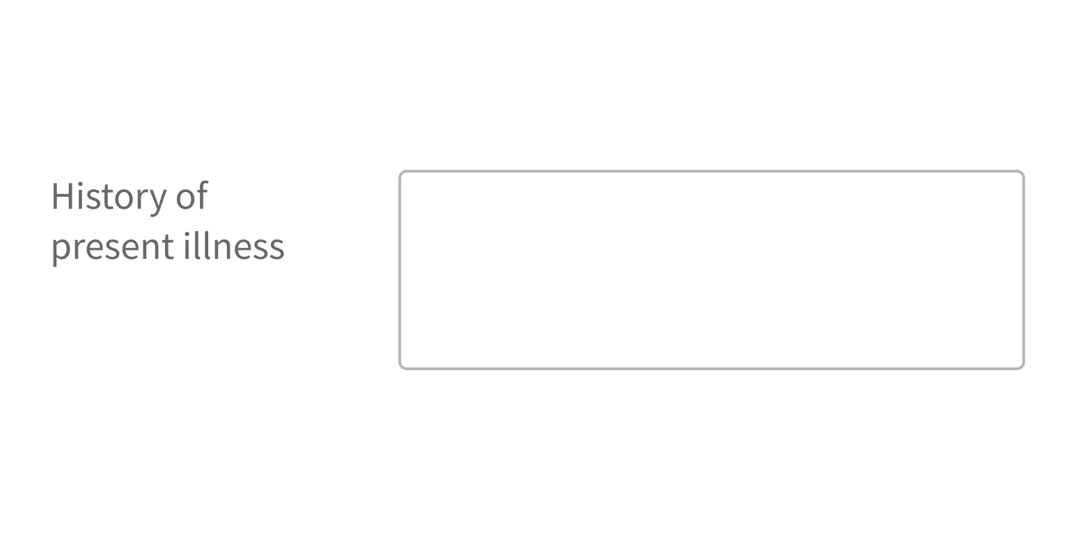
With FormField, the label appears to the left of Textarea by default and indicates the type of information users should enter (“Suggestions”).
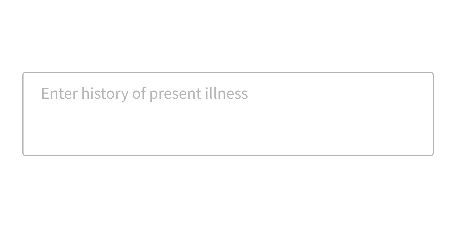
Placeholder text appears in the field before users interact with it and offers short instructions or an example of the required format.
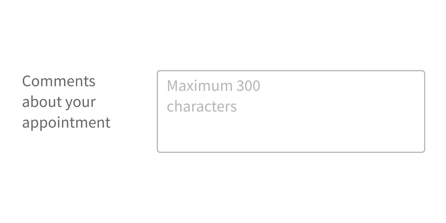
Always include a label with Textarea. Never use placeholder text as a label, because placeholder text disappears when users interact with the field. This is often a problem for users who are multitasking, tabbing quickly through a form, or have cognitive issues.
Use a label to indicate the type of information users should enter.

Use placeholder text as a label.

Placeholder text
Use placeholder text only when guidance will make it easier for users to complete a task. Placeholder text shouldn’t duplicate the label text.
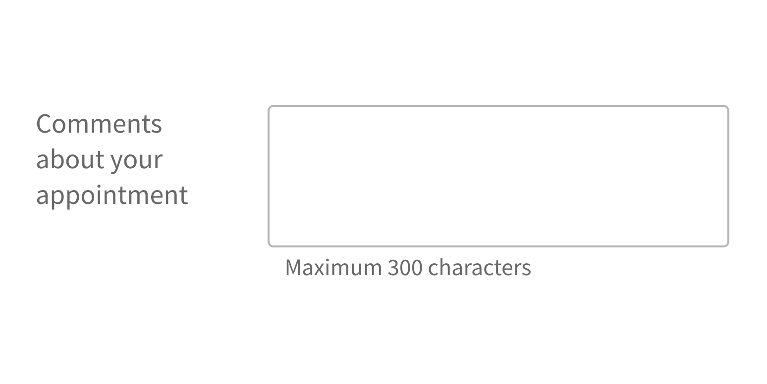
If the information you’d like to use as placeholder text is required to complete the task, make it hint text instead. Hint text appears below the Textarea field, so it’s always visible.
- Hint text is an option when using Textarea in FormField.
- If using Textarea by itself, hint text must be coded separately.
Include helpful hints or tips as hint text.

Use placeholder text for important instructions.

Style
Design details
Required fields
Forge offers 3 options to indicate required form fields. See Form for details.
Spacing and size
The height of this component and the vertical space around it vary according to the form layout (i.e., medium, compact, super-compact). See Form for details.
Placement and hierarchy
No additional information for this component.
Content
Use sentence case for label text (“Patient name”, not “Patient Name”).
Use sentence case for any placeholder text. Because Textarea is for longer text, we recommend giving an example of the type of information users might enter. For instance, if using Textarea for comments about a provider visit, the placeholder text could be “e.g., My wait time was acceptable, My expectations were met, etc.”.
Demos
Coding
Developer tips
Known issue
If Textarea is mounted while it or its parent is set to display: none, you may notice a bug where Textarea is only one line tall until the window is resized or text is entered in the field. This happens because we use DOM measurement to determine the proper height.
To avoid this bug, use a ref to call Textarea’s grow() method when Textarea becomes visible to make sure it’s resized to the correct height.
Required fields
Use the required prop to mark Textarea as required.
Forge offers 3 options to indicate required form fields. When using Form with this component, set Form’s requiredVariation prop. See Form for details.
Repository
Implementation links
Textarea directory in Bitbucket
Implementation details
It is strongly recommended to familiarize yourself with the Forge source code. While this documentation is a best effort to document the intent and usage of a component, sometimes some features only become clear when looking at the source code. Also, looking at Forge's source code may help identify and fix bugs in either your application or Forge itself.
Storybook files
Forge maintains at least one storybook file per component. While the primary audience for these files is typically the Forge team, these storybook files may cover usages of the component not covered by a demo. The storybook for the latest version of forge can be found at go/forge-storybook-lts.
Testing library
Forge strongly encourages using testing-library to write tests for your application.
"The more your tests resemble the way your software is used, the more confidence they can give you."
If you're having trouble testing a Forge component using testing-library, it would be a good idea to see how Forge tests its own components. For the most part, Forge tries to use screen.getByRole as much as it can, as that API provides the best feedback on a11y compliance. Forge discourages the use of document.querySelector and screen.getByTestId as both APIs encourage using implementation details to test your component, and discourage adding roles to your component.
With that being said, many of Forge's components were not built with accessibility in mind. These components do break the recommendations listed above.
Import statements
In Nimbus applications
athenaOne serves the Forge bundle independently from your application's bundle. Importing Forge components directly from '@athena/forge' takes advantage of this feature.
import { Textarea } from '@athena/forge'
In standalone applications
Importing components using the exact path to the module takes advantage of webpack's tree shaking feature. Webpack will include only that module and its dependencies.
import Textarea from '@athena/forge/Textarea';
To use this import guidance, Typescript applications must use typescript >= 4.7.3, and should add this setting to their tsconfig.json file:
{"compilerOptions": {"moduleResolution": "Node16",}}
If this setting doesn't work for your application, use this import statement instead:
import Textarea from '@athena/forge/dist/Textarea';