Interruption Design
How to alert users without overwhelming them
Introduction
In the world of UX, “interruption” sounds like a bad word: it could imply user frustration, falling conversion rates, or negative NPS. Yet there are times when an interruption is a good thing: to communicate that a task was completed, a process ran successfully, an issue caused an error, or a test result indicates that a patient is at risk. In these cases, interruptions – whether big or small – are an effective way to get users’ attention.
This page introduces Forge’s alert types and explains how to pair them with interruption components to notify and alert users when something happens that they need to know about.
Key takeaways
- Interruptions are meant to notify, warn, alert, prompt acknowledgment, or provide status updates to users.
- Overuse or improper design can cause confusion or alert fatigue, so interruptions deserve careful consideration.
- To design better interruptions, consider the message intent, map it to the right level of interruption, and then choose the Forge component for that level.
About interruption design
There are 3 key factors to good interruption design:
- The right information
- At the right time
- With the right level of intensity

If any of these factors are misaligned, it can cause unintended consequences for users, including alert fatigue. This occurs when an interface or user flow has so many warning messages or pop-ups that users are eventually desensitized, causing them to pay less attention or overlook key notifications. This is especially important in healthcare, because alert fatigue can affect patient safety.
To craft better interruptions and prevent alert fatigue, your interruption design should be:
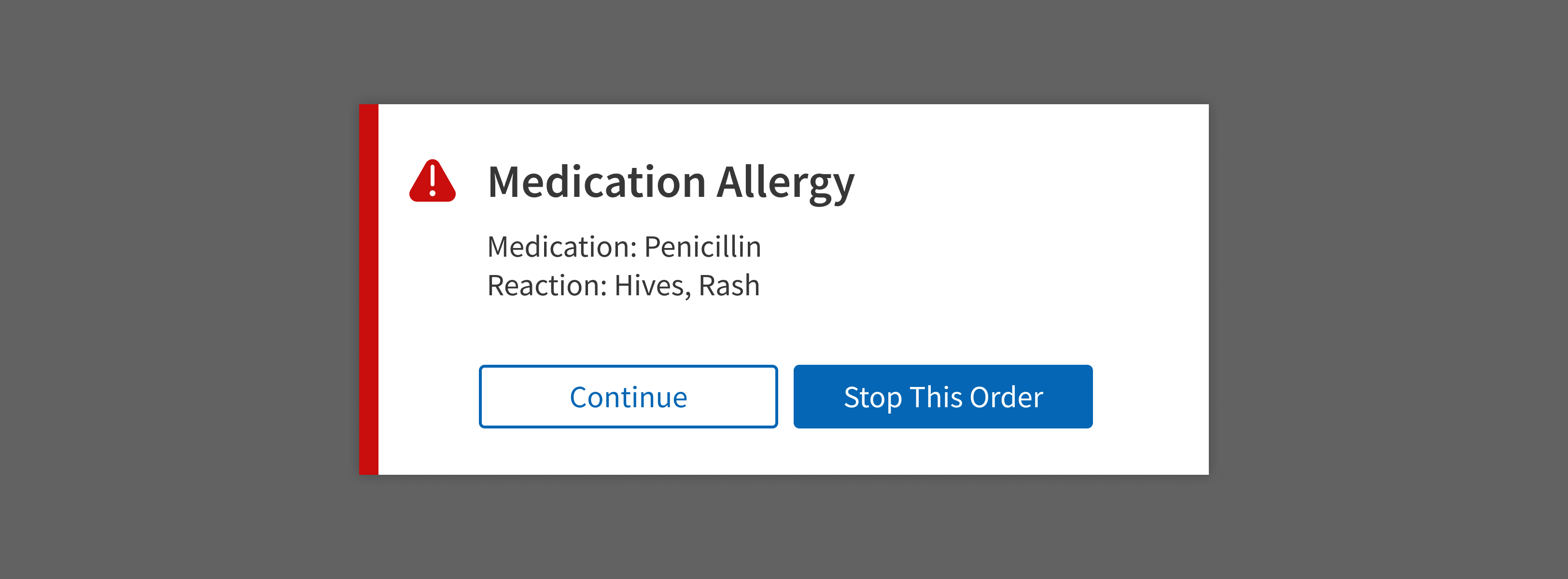
- Appropriately interruptive: Match the level of interruption with the level of urgency. If it’s important for users to stop what they’re doing and take immediate action, use a Modal.
- Informative: Interruptions should communicate what happened and suggest a solution, when possible. For example, an error message should explain the issue and provide a path to resolve it quickly, like a call-to-action Button.
- Efficient: The content of the interruption message should be precise and brief. Use numbers, dates, and short phrases to help users understand the message quickly. Use Forge alert colors and icons to catch users’ attention and provide semantic meaning.
- Noticeable: When possible, interruptions should be placed near the problem. Except for Lightbox and Modal, interruptions shouldn’t keep users from interacting with other elements on the page.
- Multidimensional: Good interruption design uses a combination of color, placement, timing, frequency, and component choice to communicate effectively.
- Consistent: Use visual and interaction patterns consistently across products for a clear user experience. For example, if one area uses red text and an alert icon to call attention to abnormal vitals, do the same in other areas. Using a different pattern (like a banner) for the same type of information could confuse or distract users.
Designing interruptions
When designing interruptions, think about what could go wrong (or right!) in your user flow. What messages should be communicated as interruptions?
For each message, consider these factors:
- How severe are the consequences of not responding to an alert: minor, moderate, or critical?
- How quickly should users react to the message: no action required, follow up later, or immediate action required?
- How long should the message be visible: a few moments, or until users take action?
- What does the message apply to: is it general, or is it related to a specific part of the page?
- Who will (or might) see the message: providers, staff, or patients?
Interruption levels
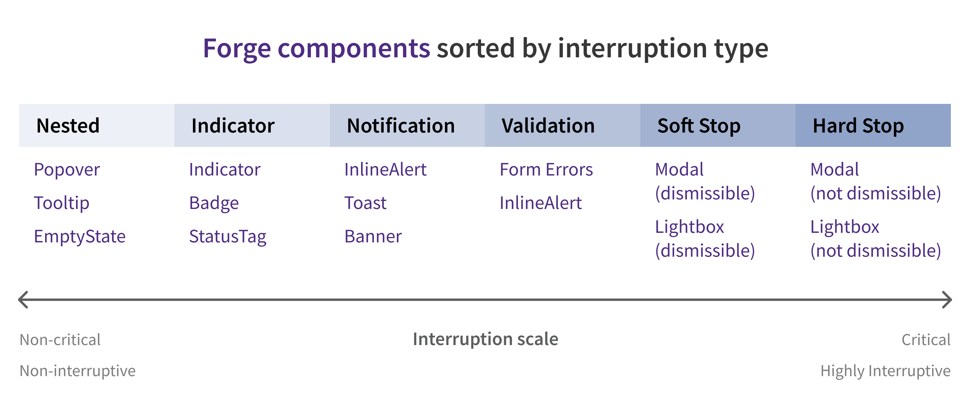
Once you’ve determined the range of messages your use case requires, consider how important it is that users see or interact with each one. Interruptions can be grouped and ranked by how disruptive they are; each interruption level is appropriate for a certain setting. Determine where each of your interruption messages fall on the scale.

Forge interruption components correspond to an approximate location on the interruption scale. Use the interruption level that you determined for each message to help you choose the right Forge component.

Interruption components
Forge interruption components are built to notify, warn, alert, prompt user acknowledgement, or provide status updates to users. The table is sorted by how disruptive each component is, from passive to disruptive.
| Component | Description |
|---|---|
| EmptyState | A notification that appears when no data or content is available |
| Indicator | A small dot that draws attention to a new, unread, recently updated, or otherwise noteworthy individual item on the page |
| Badge | A visual indicator that displays the number of new or updated items associated with an element on the page |
| Tooltip | A small floating container that displays helpful text when users hover or focus on an element |
| Popover | A floating overlay that displays information to help users complete a task |
| StatusTag | A pill-shaped container that displays the status, category, or another aspect of an item |
| InlineAlert | A non-blocking inline notification that displays a message and draws attention to a specific part of the screen |
| Form error* | A notification that draws attention to a problem with user-entered data in an input field |
| Banner | A notification or message that appears inline and notifies users of an issue or status that affects an app, page, or section |
| Toast | A temporary notification triggered by user actions or system updates that floats above page content before dismissing itself |
| Lightbox | A large container that pops up over the page, forcing users to acknowledge or interact with its content (usually long content or multi-step workflows) |
| Modal | A small container that pops up over the page, forcing users to acknowledge or interact with its contents (usually alerts, confirmation requests, or very short forms) |
* Form error isn’t a Forge component, but it’s included with Form and FormField.
After choosing a component for your message, use alert type and tone of voice to dial the strength of the interruption up or down.
Alert types
Forge has 4 alert types: Info, Success, Attention, Critical. Each alert type and its corresponding color should be used only as described below.
Match the tone of your message to the situation, component, and alert type:
- For informational messages, use friendly, helpful language.
- For critical messages, be stern and direct.
| Name | Color | Description | Usage | Example |
|---|---|---|---|---|
| Info |
| General tips and helpful information that might not require user action | Health insights, an explanation of a Medicare abbreviation | “PCMH stands for Patient-Centered Medical Home.” |
| Success |
| A confirmation message when a task or action has been completed | Action completed, content saved | “Your selections have been saved.” |
| Attention |
| An error or alert that the user should be aware of, typically requiring user action | Missing required fields, mild clinical warnings | “Screening overdue” |
| Critical |
| Reserved for the highest risk and most severe issues, like patient safety or a business problem that could affect the customer’s financial health | Moderate or severe clinical warnings, a financial issue that would result in lost Medicare payments | “Conflict with patient allergy: ASPIRIN” |
For help writing messages, see Content.
Product-specific interruptions
These general guidelines aim to cover the basics for all athenahealth products. Ask your PO or another designer on your team if your product uses specific interruption patterns.
In particular, teams working on clinical applications should refer to established interruption design patterns, such as:
- The Drug-Drug Interaction (DDI) Alert scheme
- The Emergency Severity Index guidelines (hospital and ER settings)
All teams are welcome to consult with athenahealth’s patient safety team about any questions, concerns, specific instructions, or additional guidelines related to patient safety.
Resources
- Indicators, Validations, and Notifications: Pick the Correct Communication Option: https://www.nngroup.com/articles/indicators-validations-notifications/
- How to Design Interruptions: https://medium.com/microsoft-design/how-to-design-interruptions-b93c0c667e6f
- How to Design Notifications for Better UX: https://uxplanet.org/how-to-design-notifications-for-better-ux-6fb0711be54d
- Alert Fatigue: https://psnet.ahrq.gov/primers/primer/28/alert-fatigue
- Emergency Severity Index (ESI): A Triage Tool for Emergency Departments: https://www.ahrq.gov/professionals/systems/hospital/esi/index.html