Modal
A container that pops up over the page, forcing users to acknowledge or interact with its contents.
The Basics
What it is
A Modal is a dialog window that contains alerts, confirmation requests, or very short forms. While active, it prevents users from interacting with the rest of the page.
Modal is ideal for displaying important information (like a warning about deleting files), but it also disrupts workflows. Overuse of Modal contributes to alert fatigue, so use it sparingly.
How it works
- Modal opens when the user clicks a button or link, or when a system event occurs (like the user leaving the page).
- Modal appears above a darkened overlay or scrim that blocks the content below. This reduces visual clutter and focuses user attention.
- To interact with the Modal, the user reads its contents (this can be done using the Tab key) and/or completes a brief task.
- To close the Modal, the user clicks the primary button (usually OK or Done).
- In some cases, the user can click the Close icon in the upper right corner, click outside the Modal, or press Esc to close the Modal.
When to use
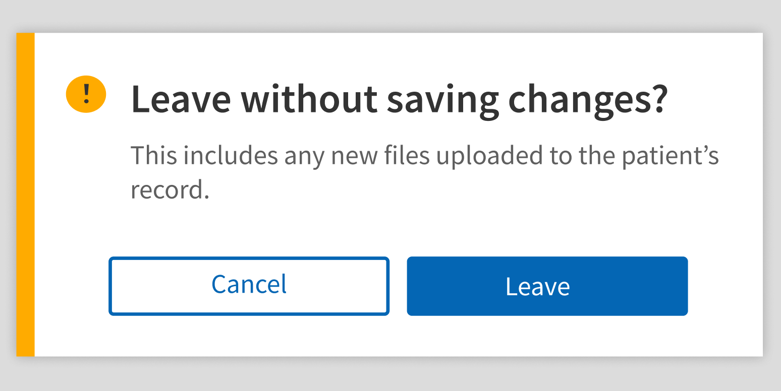
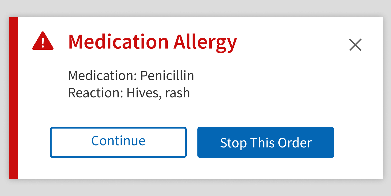
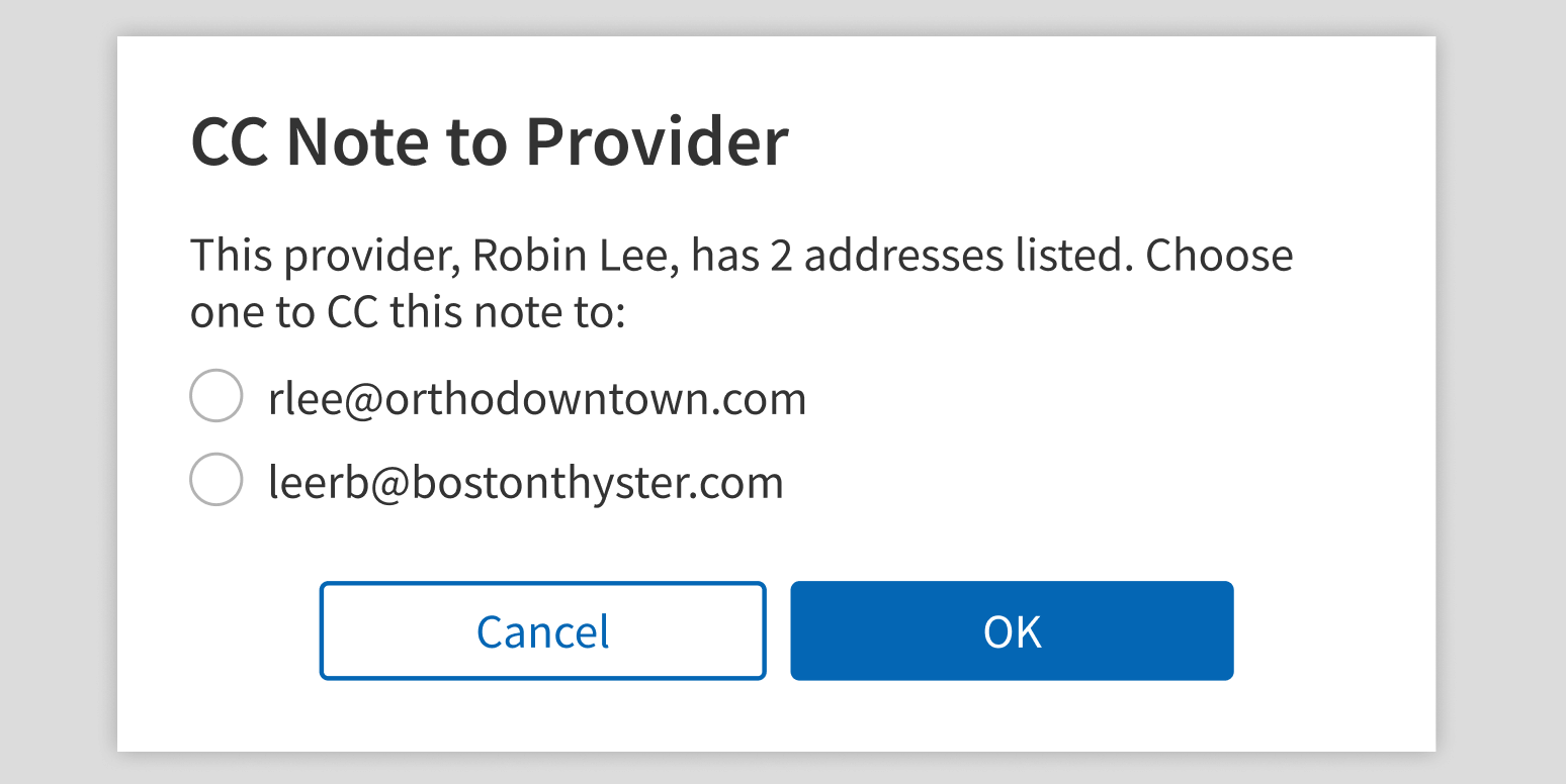
- For alerts (like errors or warnings) or a potentially hazardous situation (like a drug interaction)
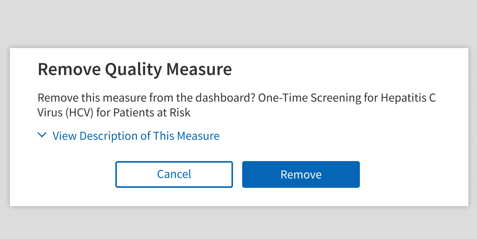
- To ask users to confirm that they want to take a destructive or permanent action (like deleting data)
- To gather required information in a very short form (3 or fewer items)
When not to use
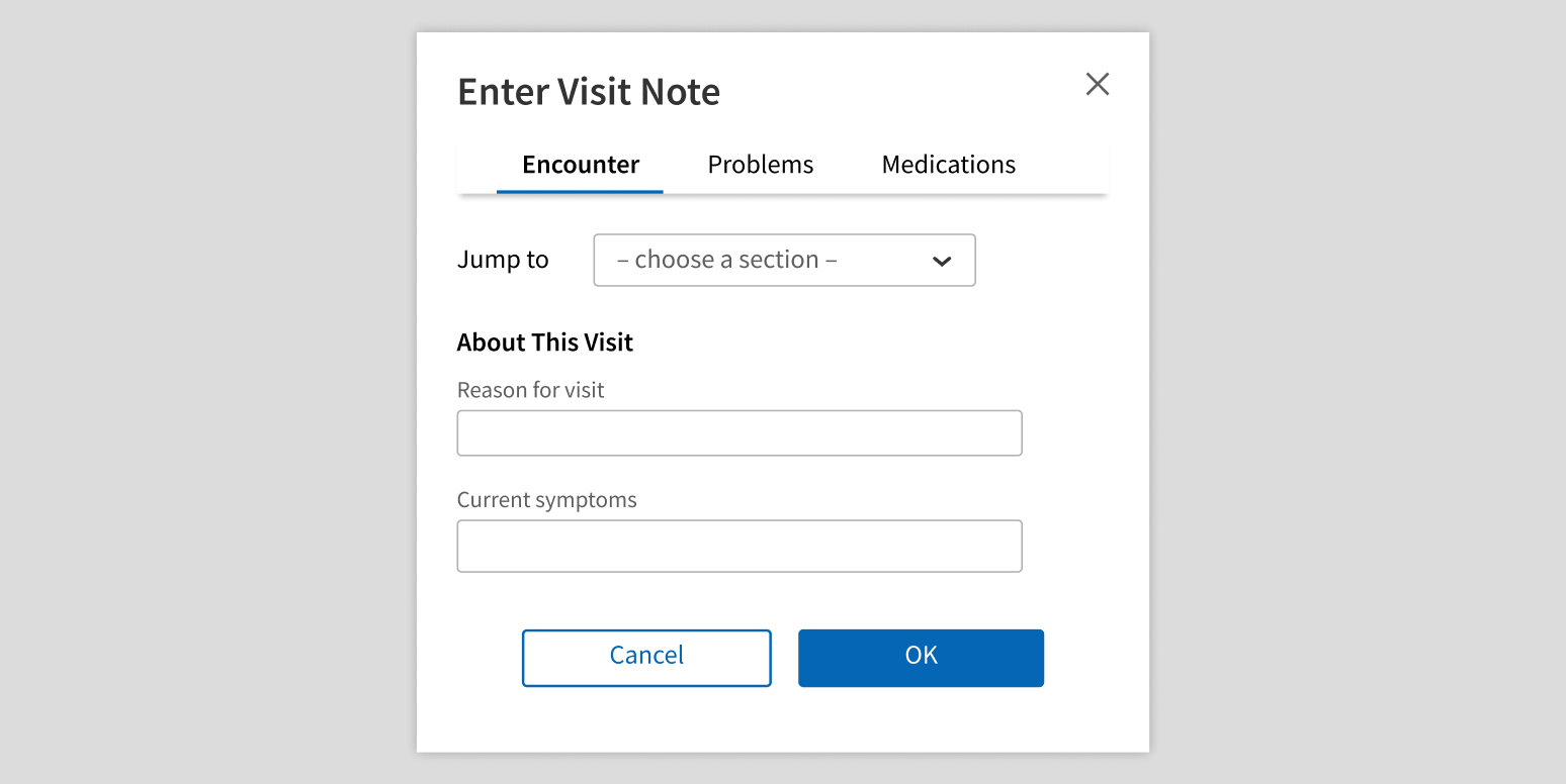
- For long or complex forms
- For more than 3 paragraphs of content
- Repeatedly in the same workflow or on the same page
What to use instead
Use Lightbox for forms with more than 3 fields or longer, scrollable content.
Use Toast for lower-priority notifications, like confirmations and success messages.
Use Popover for helpful information that doesn’t block users.
How to use
Modal is great for displaying important information that users must acknowledge, but it’s also very disruptive, so use it sparingly. Avoid workflows that use Modal repeatedly.
Force users to interact with an important Modal.
Let users close an important Modal without interacting with it.
Have only 1 Modal open at a time.
Launch a Modal in a Modal.
Keep it simple with minimal text and interactive elements.
Use navigation elements or workflow components.
Style
Design details
Modal has 3 width options:
- Small (default): 440px wide
- Medium: 500px wide
- Large: 600px wide
Height is calculated automatically based on the contents.
Placement and hierarchy
Modal is centered horizontally and vertically on the page, floating above both the page content and the scrim or overlay.

Content
Header
This is the title of the dialog and the first content users see, so it should indicate why the Modal appeared. Use title case for header text (e.g., “Edit Details”).
The header can be the only copy in a Modal (for instance, “Delete this file?” followed by OK and Cancel buttons). In this scenario, use sentence case for the header text.
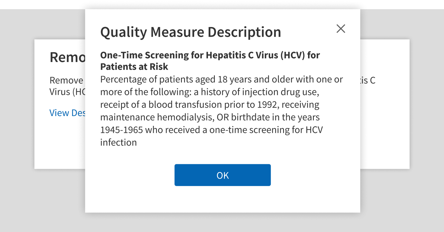
Body
This is the dialog content. Effective Modals are informative and concise. Content should not require scrolling, even on short screens.
Footer
Modals convey important information or prompt user action. Use a primary button with a clear call to action in the footer. Start button text with a verb, and use title case (e.g., “Save Changes”).
For help writing error messages and confirmation dialogs, see Content.
Demos
Coding
Developer tips
Modal and Lightbox look similar, but Modal has an alertType prop, and Lightbox doesn’t. This means Modal can be styled for alert use cases, like errors or warnings.
Closing
Modal doesn’t close itself. Its parent is responsible for setting the show prop to {false} in the onHide and onPrimaryClick callback functions.
onPrimaryClick is called when the primary button is clicked. onHide is called for all other interactions that should close the Modal (e.g., clicking the overlay). Therefore, implementing the close functionality within onHide is required.
Some important workflows require users to click a button in the Modal instead of just clicking the overlay or the Close button (for example, acknowledging a drug allergy). Set disableClose to {true} to prevent users from closing the Modal via the Close button or clicking the overlay. This prevents the callback passed to the onHide prop from firing. If implementing this, be careful not to set includeButtonRow to {false}, because this could leave users with no way to close the Modal.
z-index
Modal's grey background has a z-index of 1000. If there is other content in the same iframe that is in front of the grey background, then add a className to the Modal, and use that className to set a higher z-index
Repository
Implementation links
Implementation details
It is strongly recommended to familiarize yourself with the Forge source code. While this documentation is a best effort to document the intent and usage of a component, sometimes some features only become clear when looking at the source code. Also, looking at Forge's source code may help identify and fix bugs in either your application or Forge itself.
Storybook files
Forge maintains at least one storybook file per component. While the primary audience for these files is typically the Forge team, these storybook files may cover usages of the component not covered by a demo. The storybook for the latest version of forge can be found at go/forge-storybook-lts.
Testing library
Forge strongly encourages using testing-library to write tests for your application.
"The more your tests resemble the way your software is used, the more confidence they can give you."
If you're having trouble testing a Forge component using testing-library, it would be a good idea to see how Forge tests its own components. For the most part, Forge tries to use screen.getByRole as much as it can, as that API provides the best feedback on a11y compliance. Forge discourages the use of document.querySelector and screen.getByTestId as both APIs encourage using implementation details to test your component, and discourage adding roles to your component.
With that being said, many of Forge's components were not built with accessibility in mind. These components do break the recommendations listed above.
Import statements
In Nimbus applications
athenaOne serves the Forge bundle independently from your application's bundle. Importing Forge components directly from '@athena/forge' takes advantage of this feature.
import { Modal } from '@athena/forge'
In standalone applications
Importing components using the exact path to the module takes advantage of webpack's tree shaking feature. Webpack will include only that module and its dependencies.
import Modal from '@athena/forge/Modal';
To use this import guidance, Typescript applications must use typescript >= 4.7.3, and should add this setting to their tsconfig.json file:
{"compilerOptions": {"moduleResolution": "Node16",}}
If this setting doesn't work for your application, use this import statement instead:
import Modal from '@athena/forge/dist/Modal';