EmptyState
A notification that appears when no data or content is available.
The Basics
What it is
EmptyState is a content element used when there’s no data or content available to the user. It can also be used for some workflow starting or stopping points, such as warnings about restricted access or notifications about batch processes that take a long time to run. EmptyState explains why the page section is empty and can suggest what to do next. While these situations can be handled solely with copy, EmptyState is a more user-friendly combination of illustration, messaging, and a potential solution.
EmptyState often includes user actions for suggested next steps, but other than this, it’s display-only and not interactive.
How it works
- EmptyState appears on page load, after a user action or after an automated page or section refresh.
- The illustration, message, and actions vary, depending on the reason for the empty state.
- The user reads the message and can:
- Use one of the (optional) buttons to take the suggested action
- Decide on their own what to do next, possibly prompted by the message (e.g., close the browser tab, click a different button in the UI, get the permission required for access)
When to use
- To fill the empty space on a page that lacks data (so users don’t think there’s a bug)
- To tell users how to add or surface data on the page
- To explain why the page or section is empty
- To introduce a new feature that hasn’t populated a section with data yet
When not to use
- For errors that aren’t related to empty content (e.g., if the user overlooked a required field in a form)
- For decorative content in a situation that isn’t related to an empty state (like a homepage announcement or onboarding new users)
- For 404 (page not found) or 505 (server problem) error pages
- For temporary empty states while content is loading or rendering (it’s confusing to read an empty state message and then see content suddenly appear)
What to use instead
Use Banner to communicate common user errors.
Use Loader for pages or sections with short loading times.
Use ProgressIndicator for pages or sections with long loading times.
How to use
Types
EmptyState has several types that cover a range of use cases:
- Not Found: This search produced no results. Use when the user has actively searched for something. If the space is empty because the user hasn’t used the feature yet, use the Start List type instead.
- No Filter Data: There’s no data to show based on the filters the user selected. If the space is empty because the user hasn’t used the feature yet, use the Start List type instead.
- Start List: An area of the page is empty because it hasn’t been populated yet (e.g., a worklist with no tasks, a file list with no files, a table without a query). Use to encourage the user to add items, search, or enter a query.
- Tasks Complete: The user just completed their final task or tasks in a worklist. Use to congratulate the user on finishing their work.
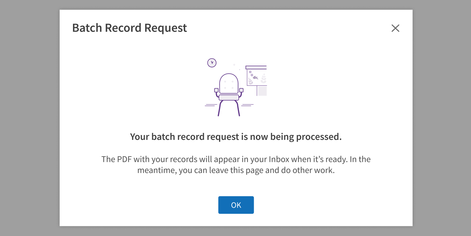
- Extended Wait: The user just started a process that takes a long time and runs separately from the page (like a batch process that appears in the inbox when complete). There’s no reason for the user to wait on the page; they can leave and do other work.
- Restricted: Access to this page or feature is restricted. The user doesn’t have the permissions required.
- Timed Out: The user needs to login again to see content. Their session has timed out.
Each type includes an illustration, default text, and buttons that provide consistent messaging for common data and content issues. We chose illustrations that support each use case. We may update or replace these illustrations in the future (based on branding changes, user feedback, etc.). For these reasons, we recommend:
Use the type that matches your use case.
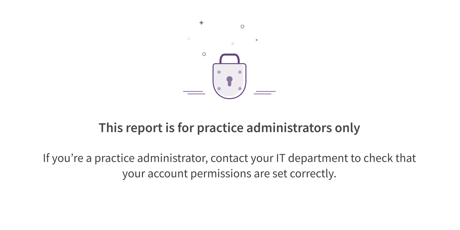
Choose a type for its image.
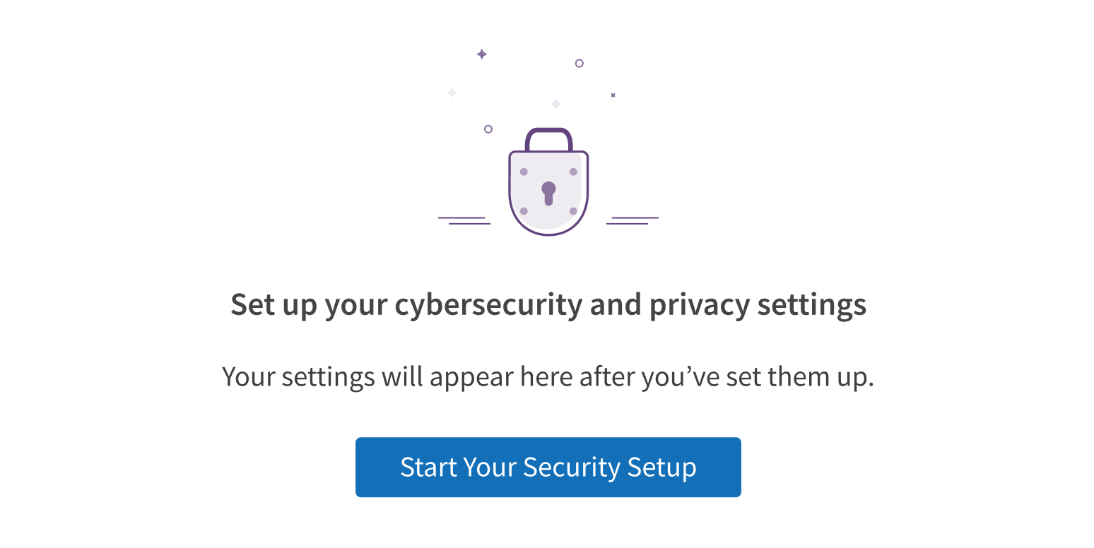
If none of these types match your use case, you can use EmptyState without specifying a type. When no type is specified, EmptyState displays the default illustration and no text.
Customization
EmptyState provides 2 spaces for text (a headline and detail text) and 2 optional buttons. Customize text and calls to action to suit the content, workflow, or page. You can use EmptyState without an illustration, but don’t alter or replace the component’s built-in images.
Tailor the text to your use case.
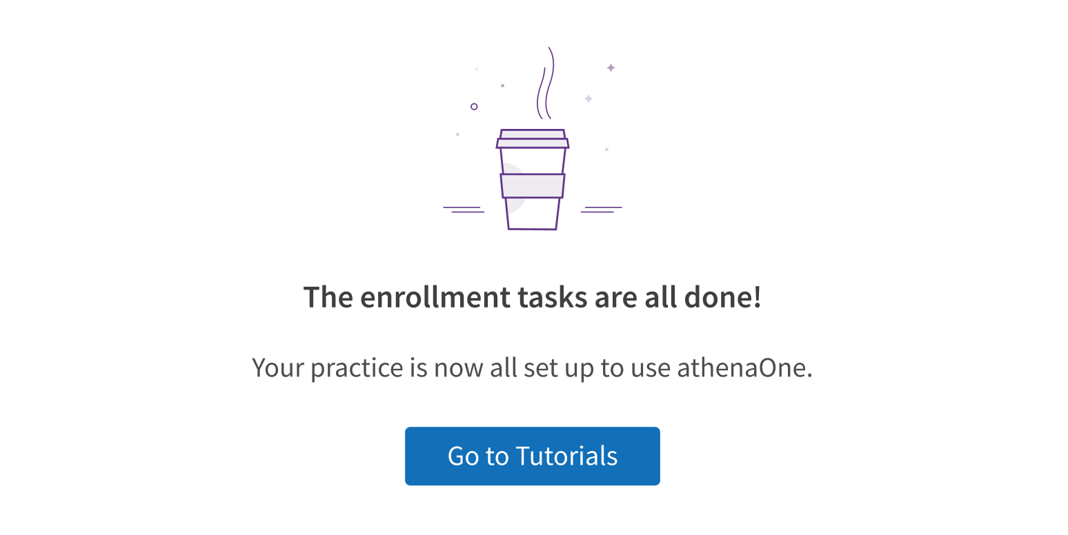
Alter or replace the illustration.
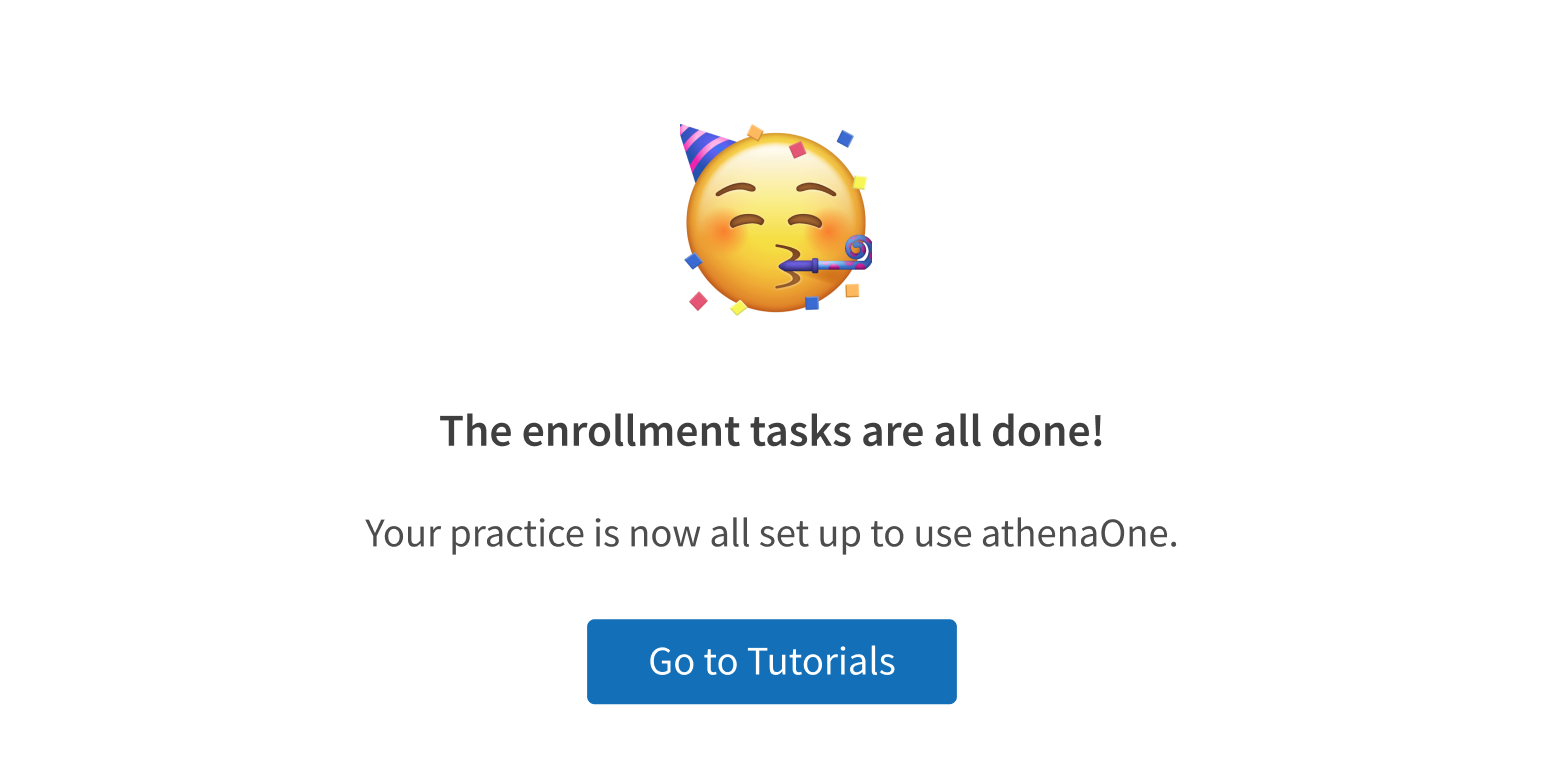
Notification vs. alert
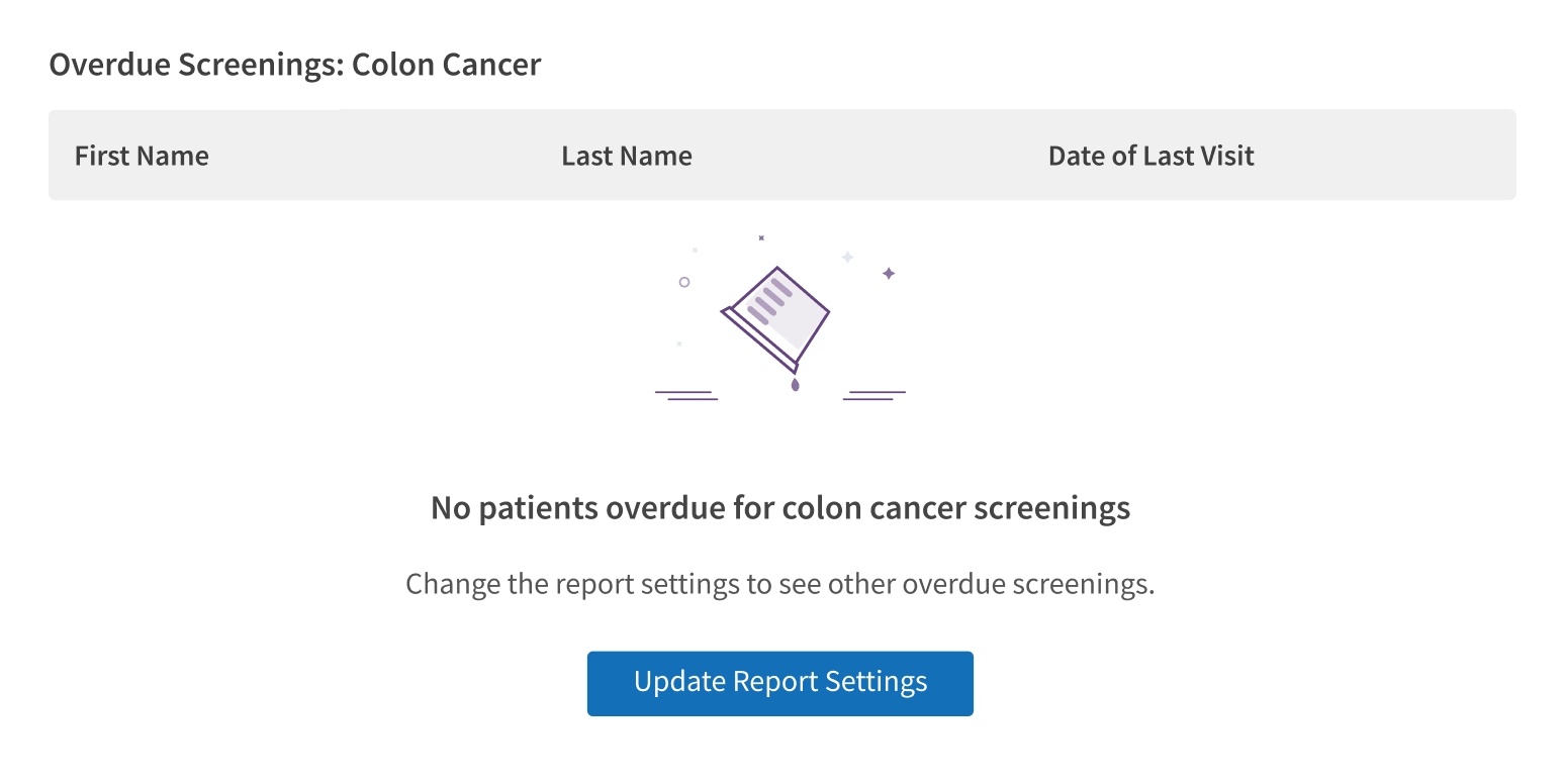
EmptyState is a passive notification, not an alert. Use it on pages and in page sections, like a full-width table or a dashboard section.
Use EmptyState in page sections.
Trigger a Modal or a Banner solely to display EmptyState.
User actions
EmptyState explains why the page or section is empty and can suggest what the user should do next. Use these suggestions as text for the optional buttons. If using 2 buttons, the secondary action should return the user to “safety” (“Go back”).
Style
Design details
On screens smaller than 640px, EmptyState’s headline text is still displayed, but its detail text is automatically hidden.
Placement and hierarchy
EmptyState’s alignment depends on its location. In a section that’s smaller than the viewport:
- EmptyState is centered horizontally and vertically in the section container.
- This applies to dashboards, application home pages, and other pages built from multiple sources that load content at different times.
In a section that’s full width:
- EmptyState is centered horizontally in the section.
- When the page scrolls, the illustration and message scroll with it.
- This applies to full-width content like tables and charts.

Content
Text
EmptyState types get you started with default text, but you should customize it to fit your use case. Writing text for EmptyState is similar to writing error messages: the user has hit a dead end in the workflow (or in some cases, is starting a new workflow), and the goal is to explain the situation and help them move forward. For help writing error messages and notifications, see Content.
As you customize EmptyState text for your use case, keep these points in mind:
- EmptyState requires a headline.
- Detail text is optional. If using it, make sure that the headline can stand alone, because on screens smaller than 640px, detail text is automatically hidden.
- The text in EmptyState is plain text (no links or formatting).
- Use sentence case for headline and detail text (“No search results”, not “No Search Results”).
- The headline can have a period at the end, but it isn't required. Consider using an exclamation point to encourage or congratulate users.
- EmptyState can display text only (no illustration).
- It cannot display only the illustration (text is required).
- Don’t alter or replace the illustration.
Buttons and user actions
EmptyState’s message should suggest an action the user can take as a next step. Consider the next logical user action. It might be to return to the home page, or it could be something outside the app, like calling a supervisor.
Use EmptyState’s buttons to help users take that action, when possible. EmptyState includes optional primary and secondary buttons:
- Use the primary button for an action that will populate the empty area with data (“Search Again”, “Add a Medication”) or resolve the workflow dead end (“Request File Access”, “Refresh the Page”, “Go to Home Page” if no other actions are possible). This button can be used by itself, without using a secondary button.
- Use the secondary button to return the user to a previous page, the home page, or a page where they can start other work. This button is also optional but must be paired with a primary button when used.
Use title case for button text (“Add a Diagnosis”, not “Add a diagnosis”).
If your use case is complex and the action can’t be presented in a single button, use the text to describe what the user should do next (“Use the file upload tool, above”).
In empty areas where content could be added, consider whether it’s appropriate to encourage users to add that content (with EmptyState text like “Upload your files here”). This depends on the workflow. For example:
- Yes: worklists, forms for uploading supporting documentation
- No: lists of blocked or banned users, sections of the patient chart where file uploads are possible but not required (and encouraging file uploads could cause confusion about whether files are required)
Voice and tone
Keep your text conversational and avoid jargon (“what you searched for” instead of “search parameters”). Avoid expressions that are overly casual and chatty, like “Oops” or “Uh-oh”. Use the word “Sorry” for big inconveniences only (“Sorry, this feature has been deactivated” but not “Sorry, no search results”).
Avoid negative phrasing that sounds like the user has done something wrong or bad. Focus on the positive, especially when encouraging use of a certain feature. Be descriptive rather than blaming, and emphasize what’s possible instead of what’s missing:
- “No results for this search”, not “Your search failed”
- “This file requires permission to access”, not “You’re not allowed to access this file”
- “Uploaded files will appear here”, not “No files uploaded”
Demos
Coding
Developer tips
All the elements in each type can be overwritten by changing the relevant prop to a custom value. They can also be removed by setting the prop to null.
The primary and secondary buttons for each type don’t have any functionality out of the box. You need to pass props to the buttons via primaryButtonProps and secondaryButtonProps to add click handlers or to make the buttons function as links.
If you need a third CTA button, or you need something other than a primary and secondary button, you can use the buttonRow prop and pass any valid JSX. This is technically possible, but please reach out to the Forge team before making design changes like this (so we can review your designs and learn about potential new use cases).
Repository
Implementation links
EmptyState directory in Bitbucket
Implementation details
It is strongly recommended to familiarize yourself with the Forge source code. While this documentation is a best effort to document the intent and usage of a component, sometimes some features only become clear when looking at the source code. Also, looking at Forge's source code may help identify and fix bugs in either your application or Forge itself.
Storybook files
Forge maintains at least one storybook file per component. While the primary audience for these files is typically the Forge team, these storybook files may cover usages of the component not covered by a demo. The storybook for the latest version of forge can be found at go/forge-storybook-lts.
Testing library
Forge strongly encourages using testing-library to write tests for your application.
"The more your tests resemble the way your software is used, the more confidence they can give you."
If you're having trouble testing a Forge component using testing-library, it would be a good idea to see how Forge tests its own components. For the most part, Forge tries to use screen.getByRole as much as it can, as that API provides the best feedback on a11y compliance. Forge discourages the use of document.querySelector and screen.getByTestId as both APIs encourage using implementation details to test your component, and discourage adding roles to your component.
With that being said, many of Forge's components were not built with accessibility in mind. These components do break the recommendations listed above.
Import statements
In Nimbus applications
athenaOne serves the Forge bundle independently from your application's bundle. Importing Forge components directly from '@athena/forge' takes advantage of this feature.
import { EmptyState } from '@athena/forge'
In standalone applications
Importing components using the exact path to the module takes advantage of webpack's tree shaking feature. Webpack will include only that module and its dependencies.
import EmptyState from '@athena/forge/EmptyState';
To use this import guidance, Typescript applications must use typescript >= 4.7.3, and should add this setting to their tsconfig.json file:
{"compilerOptions": {"moduleResolution": "Node16",}}
If this setting doesn't work for your application, use this import statement instead:
import EmptyState from '@athena/forge/dist/EmptyState';