Color
How to use Forge’s color palettes
Introduction
In product design, color draws user attention to important information and then instantly conveys context about that information through consistent use of semantic meaning. The Forge color palette reflects athenahealth’s brand and adheres to best practices for accessibility and interface design.
The guidance for using Forge colors in your product is straightforward, but it’s important to follow it consistently for a cohesive user experience.
Key takeaways
- Forge has several color palettes, each for a different purpose.
- Use each color palette for its designated purpose to create a consistent user experience.
- Forge uses semantic color names for clear communication between designers and developers.
- To implement Forge colors, use Sass maps, not CSS.
Principles
To create a consistent user experience, Forge has created guiding principles to define how color should be used. When designing with color, treat these principles as rules to follow:
-
Embrace our neutral palette: Before adding secondary colors to a design, generously utilize the neutral colors in the Forge palette. In our streamlined EHRM, we rely on our neutrals to create a consistent experience that is balanced, easy to parse, and does not distract our users. Overuse of color incurs biological fatigue over time and can make communication less clear by co-opting attention.
-
Explore alternative signifiers: Instead of relying solely on color, explore other methods of semantically categorizing information. Utilize an inverse neutral palette, modified stroke weight, or other pattern breaking visual changes to convey divergent content before resorting to color alone.
-
Prioritize contrast: Place a strong emphasis on contrast when using color. Ensure that color combinations provide sufficient contrast to enhance readability and accessibility. Be conservative with color usage to prioritize contrast.
-
Always dual-code: When using color semantically, always dual-code by combining color with other visual elements, such as icons or labels, to ensure content belonging to a semantic or symbolic group is clearly understood. color alone to indicate a status or characteristic requires effort from users and is not inclusive to users with color processing differences.
- Establish consistency: Use color consistently in local areas of your application, especially when used to communicate information like status or interactivity. To maintain consistency, stick to the same semantic color associations within a localized context and always dual-code. This consistency creates a cohesive and intuitive user experience. In this context, local can be defined as application areas which a user will either:
- View on the same screen
- Access within the same workflow
- Repetitively navigate between within less than 90 seconds
About
We chose our color palette carefully, with these considerations:
- Accessibility: athenahealth products must meet certain accessibility standards, including contrast ratios specified by the Web Content Accessibility Guidelines (WCAG) 2.1 for text and background color combinations. Forge colors are Level AA compliant for text when used in proper combinations. NOTE: Per WCAG recommendations 'text or images of text that are part of an inactive user interface component, that are pure decoration, that are not visible to anyone, or that are part of a picture that contains significant other visual content, have no contrast requirement.'
- Meaning: Forge employs color sparingly and deliberately. Forge’s use of color conveys specific, intentional meaning, so no matter the product, screen, or workflow, users can easily understand the colors and their connotations.
- Consistency: Built on athenahealth’s brand colors, the Forge color palette is both familiar to users and flexible to meet a range of product design needs.
The colors and guidance on this page are categorized by use to help you create products that are aesthetically and functionally consistent. For a smooth design-dev handoff, design specifications should always use the semantic color name (like color-interaction, default or orchid-100) instead of hex or RGB values.
$color-interaction ← SASS map name
-
default
#0466B4rgb(4, 102, 180)map-get(forge-abstracts.$color-interaction, default) -
← Semantic name (SASS map key)
← HEX color value← RGB(A) color value← SASS map variable access
Primary palettes
Alert
Semantic category: color-alert
Forge components like InlineAlert, Modal, or Banner present information, messages, and alerts to users. Color helps communicate the type and severity of this information. Use the alert palette only for the corresponding alert types. These colors aren’t interchangeable with similar hues from other palettes.
-
new
#23A1BErgb(35, 161, 190)map-get(forge-abstracts.$color-alert, new) -
success
#118647rgb(17, 134, 71)map-get(forge-abstracts.$color-alert, success) -
info
#9C28B1rgb(156, 40, 177)map-get(forge-abstracts.$color-alert, info) -
** attention
#F3A61Crgb(243, 166, 28)map-get(forge-abstracts.$color-alert, attention) -
*** critical
#CA0D0Drgb(202, 13, 13)map-get(forge-abstracts.$color-alert, critical)
* color-alert, new can only be used as a text color for large font sizes (above 14 pt). It isn’t WCAG 2.1 AA compliant in small sizes against a light background.
** color-alert, attention shouldn’t be used as a text color. It isn’t WCAG 2.1 AA compliant against a light background.
*** color-alert, critical is a restricted color. Use it only for:
- Patient safety issues (anything that could result in patient harm)
- Business issues that could severely affect the financial health of a client (e.g., missing data that could endanger a hospital’s Medicare payments)
Background
Semantic category: color-background
Use background colors to separate discrete sections of a page or to call attention to specific areas like side navigation panels.
-
default
#FFFFFFrgb(255, 255, 255)map-get(forge-abstracts.$color-background, default) -
* dark
#DBDBDBrgb(219, 219, 219)map-get(forge-abstracts.$color-background, dark) -
* light
#E9E9EArgb(233, 233, 234)map-get(forge-abstracts.$color-background, light)
* color-background, dark and color-background, light are WCAG 2.1 AA compliant only when used with color-font, dark, color-font, default, and color-font, muted. Don’t use any other Forge font colors with these backgrounds.
Border
Semantic category: color-border
Use border colors for outlines and dividers that help set page sections apart.
-
default
#B6B7B7rgb(182, 183, 183)map-get(forge-abstracts.$color-border, default) -
dark
#5D5E5Ergb(93, 94, 94)map-get(forge-abstracts.$color-border, dark) -
light
#DBDBDBrgb(219, 219, 219)map-get(forge-abstracts.$color-border, light) -
focus
#0466B4rgb(4, 102, 180)map-get(forge-abstracts.$color-border, focus) -
focus-invert
#D9EBFArgb(217, 235, 250)map-get(forge-abstracts.$color-border, focus-invert)
Brand
Semantic category: color-brand
Use brand colors for global navigation and other branded elements.
-
default
#4E2D82rgb(78, 45, 130)map-get(forge-abstracts.$color-brand, default) -
dark
#302049rgb(48, 32, 73)map-get(forge-abstracts.$color-brand, dark) -
light
#71579Brgb(113, 87, 155)map-get(forge-abstracts.$color-brand, light)
Font
Semantic category: color-font
Product copy must be legible and accessible. Use the font palette with Forge’s Typography guidelines for clear, compliant text.
-
default
#373738rgb(55, 55, 56)map-get(forge-abstracts.$color-font, default) -
dark
#000000rgb(0, 0, 0)map-get(forge-abstracts.$color-font, dark) -
muted
#5D5E5Ergb(93, 94, 94)map-get(forge-abstracts.$color-font, muted) -
* light
#7C7D7Drgb(124, 125, 125)map-get(forge-abstracts.$color-font, light) -
** disabled
#B6B7B7rgb(182, 183, 183)map-get(forge-abstracts.$color-font, disabled) -
invert
#FFFFFFrgb(255, 255, 255)map-get(forge-abstracts.$color-font, invert)
* color-font, light isn’t WCAG 2.1 AA compliant in most conditions. It’s compliant only when used in font-size, large, font-size, xlarge, or font-size, xxlarge on color-background, light or color-background, default. Given these constraints, use color-font, light for placeholder text only.
** color-font, disabled is WCAG 2.1 AA compliant only when used for disabled states. Per WCAG recommendations 'text or images of text that are part of an inactive user interface component, that are pure decoration, that are not visible to anyone, or that are part of a picture that contains significant other visual content, have no contrast requirement.' Don’t use this color for anything else.
Interaction
Semantic category: color-interaction
Use interaction colors for interactive elements like Button or Paginator that move users through workflows and decision points.
-
default
#0466B4rgb(4, 102, 180)map-get(forge-abstracts.$color-interaction, default) -
select
#043961rgb(4, 57, 97)map-get(forge-abstracts.$color-interaction, select) -
select-light
#F0F9FFrgb(240, 249, 255)map-get(forge-abstracts.$color-interaction, select-light) -
hover-dark
#005496rgb(0, 84, 150)map-get(forge-abstracts.$color-interaction, hover-dark) -
hover
#D9EBFArgb(217, 235, 250)map-get(forge-abstracts.$color-interaction, hover) -
* disabled
#B6B7B7rgb(182, 183, 183)map-get(forge-abstracts.$color-interaction, disabled)
* color-interaction, disabled is WCAG 2.1 AA compliant only when used for disabled states. Per WCAG recommendations 'text or images of text that are part of an inactive user interface component, that are pure decoration, that are not visible to anyone, or that are part of a picture that contains significant other visual content, have no contrast requirement.' Don’t use this color for anything else.
Shadow
Semantic category: color-shadow
Shadows provide depth for UI elements like Modal or Tooltip that appear above the underlying page content, and also emphasize other elements like Card or images. Unlike Forge’s other colors, our shadow colors use an alpha channel value to achieve a semi-transparent shadow effect that allows partial view of the elements below.
-
default
#000000, 25% opacityrgba(0, 0, 0, 0.25)map-get(forge-abstracts.$color-shadow, default) -
dark
#000000, 40% opacityrgba(0, 0, 0, 0.4)map-get(forge-abstracts.$color-shadow, dark)
Secondary palette
Principles for secondary use
In the Forge palette, only alert colors are reserved for specific semantic uses. Due to the limited number of colors in the secondary palette, Forge does not reserve secondary colors for specific semantic uses. This means that a color used from the secondary palette to signify ‘cost’ related information can also be used to signify ‘scheduling’ information in a different area of athenaOne.
To successfully use secondary colors in your designs, Forge recommends adhering to the Forge Color Principles of:
- Embracing our neutral palette
- Always dual-coding
- Exploring alternative signifiers
- Establishing consistency
When using secondary colors semantically, Forge recommends reaching out to other designers with the same users as a way to ensure your color selections are cohesive with existing and upcoming designs.
General use
Semantic category: color-secondary
Use this palette for interface elements like pictograms, illustrations, accent backgrounds, and highlights. Each color has a 4-tint ramp that provides a range of colors for accenting and distinguishing elements on the page.
-
pistachio-100
#91D284rgb(145, 210, 132)map-get(forge-abstracts.$color-secondary, pistachio-100) -
pistachio-70
#B2DFA9rgb(178, 223, 169)map-get(forge-abstracts.$color-secondary, pistachio-70) -
pistachio-40
#D3EDCErgb(211, 237, 206)map-get(forge-abstracts.$color-secondary, pistachio-40) -
pistachio-10
#F4FBF3rgb(244, 251, 243)map-get(forge-abstracts.$color-secondary, pistachio-10)
-
yellow-100
#EEC44Frgb(238, 196, 79)map-get(forge-abstracts.$color-secondary, yellow-100) -
yellow-70
#F3D684rgb(243, 214, 132)map-get(forge-abstracts.$color-secondary, yellow-70) -
yellow-40
#F8E7B9rgb(248, 231, 185)map-get(forge-abstracts.$color-secondary, yellow-40) -
yellow-10
#FDF9EDrgb(253, 249, 237)map-get(forge-abstracts.$color-secondary, yellow-10)
-
coral-100
#F68D84rgb(246, 141, 132)map-get(forge-abstracts.$color-secondary, coral-100) -
coral-70
#F9AFA9rgb(249, 175, 169)map-get(forge-abstracts.$color-secondary, coral-70) -
coral-40
#FBD1CErgb(251, 209, 206)map-get(forge-abstracts.$color-secondary, coral-40) -
coral-10
#FEF4F3rgb(254, 244, 243)map-get(forge-abstracts.$color-secondary, coral-10)
-
jungle-100
#1B9587rgb(27, 149, 135)map-get(forge-abstracts.$color-secondary, jungle-100) -
jungle-70
#5FB5ABrgb(95, 181, 171)map-get(forge-abstracts.$color-secondary, jungle-70) -
jungle-40
#A4D5CFrgb(164, 213, 207)map-get(forge-abstracts.$color-secondary, jungle-40) -
jungle-10
#E8F4F3rgb(232, 244, 243)map-get(forge-abstracts.$color-secondary, jungle-10)
-
purple-100
#7B3689rgb(123, 54, 137)map-get(forge-abstracts.$color-secondary, purple-100) -
purple-70
#A372ACrgb(163, 114, 172)map-get(forge-abstracts.$color-secondary, purple-70) -
purple-40
#CAAFD0rgb(202, 175, 208)map-get(forge-abstracts.$color-secondary, purple-40) -
purple-10
#F2EBF3rgb(242, 235, 243)map-get(forge-abstracts.$color-secondary, purple-10)
-
orchid-100
#B4005Brgb(180, 0, 91)map-get(forge-abstracts.$color-secondary, orchid-100) -
orchid-70
#CB4D8Crgb(203, 77, 140)map-get(forge-abstracts.$color-secondary, orchid-70) -
orchid-40
#E199BDrgb(225, 153, 189)map-get(forge-abstracts.$color-secondary, orchid-40) -
orchid-10
#F7E5EFrgb(247, 229, 239)map-get(forge-abstracts.$color-secondary, orchid-10)
-
citron-100
#A7951Drgb(167, 149, 29)map-get(forge-abstracts.$color-secondary, citron-100) -
citron-70
#C1B561rgb(193, 181, 97)map-get(forge-abstracts.$color-secondary, citron-70) -
citron-40
#DCD5A5rgb(220, 213, 165)map-get(forge-abstracts.$color-secondary, citron-40) -
citron-10
#F6F4E8rgb(246, 244, 232)map-get(forge-abstracts.$color-secondary, citron-10)
-
neutral-100
#8A8A8Argb(138, 138, 138)map-get(forge-abstracts.$color-secondary, neutral-100) -
neutral-70
#ADADADrgb(173, 173, 173)map-get(forge-abstracts.$color-secondary, neutral-70) -
neutral-40
#D0D0D0rgb(208, 208, 208)map-get(forge-abstracts.$color-secondary, neutral-40) -
neutral-10
#F3F3F3rgb(243, 243, 243)map-get(forge-abstracts.$color-secondary, neutral-10)
We recommend against using -secondary-100 tints for text backgrounds. If you must, pair these tints with font colors that meet WCAG 2.1 AA contrast requirements:
- For
orchid-100andpurple-100, usecolor-font, invert(#FFFFFF). - For
jungle-100andcitron-100, usecolor-font, dark(#000000). - For all other
-secondary-100tints, usecolor-font, default(#373738).
Secondary colors have many uses, such as:
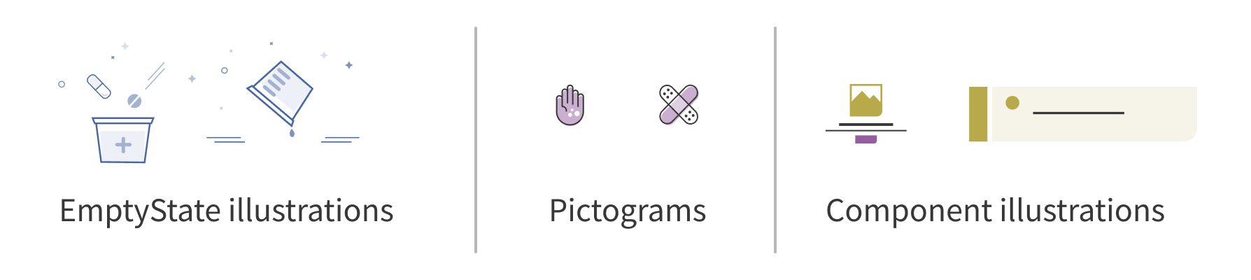
Pictograms, illustrations, and avatars: Forge uses the secondary palette for illustrations in EmptyState and throughout the Forge guide.
Avatar and signpost: Forge uses the secondary palette for emphasis in Avatar and Signpost
Tags: Forge uses the secondary palette for status style Tags in components like DataTable and throughout the Forge guide.
Other components, like Badge, InlineAlert, and Banner, are built on the color-alert palette: don’t use secondary colors in these components.
Accent backgrounds and highlights: The Forge guide also uses secondary colors for accents and highlights. Unlike the color-background palette, which can be used anywhere, the color-secondary palette is for less frequent accents, to subtly draw attention to an element (like Signpost). When using secondary colors to accent backgrounds in content, use the lightest tint (e.g., orchid-10) and check for compliance with WCAG 2.1 AA guidelines.
Data visualization palettes
Principles for data visualization use
To enhance color usage, Forge has guiding principles for using color in data visualizations:
- Only use color to enhance meaning and clarity in data visualizations: Color is most effective when used to enhance a visualization and is more effective for certain types of data vs. others. Not all visualizations need broad color usage.
- Use caution when assigning meaning to a color or set of colors: There is no universal meaning for color: color is culturally bound. When assigning meaning to color, use the same selections for every chart.
General use
Semantic category: color-dataviz
This palette expands the secondary palette to include a full ramp of 10 tints for each color, with a luminance range from 90 to 10. Use these additional tints for data visualization applications, like divergent or sequential data, relationship charts, and trend graphs.
Please note, these colors are NOT WCAG AA standard compliant when used directly next to each other or used without the appropriate background color.
In addition to the expanded tint range, this palette:
- Uses
color-dataviz, grayinstead ofcolor-secondary, neutral. - Includes an additional color,
color-dataviz, mariner. This color is very close tocolor-interaction, default, so use it mainly for categorical data visualization. (EmptyState is an exception: it uses this color for a clean, monochromatic look with the blue Button.)
-
pistachio-dataviz-100
#91D284rgb(145, 210, 132)map-get(forge-abstracts.$color-dataviz, pistachio-100) -
pistachio-dataviz-90
#9CD690rgb(156, 214, 144)map-get(forge-abstracts.$color-dataviz, pistachio-90) -
pistachio-dataviz-80
#A7DB9Drgb(167, 219, 157)map-get(forge-abstracts.$color-dataviz, pistachio-80) -
pistachio-dataviz-70
#B2DFA9rgb(178, 223, 169)map-get(forge-abstracts.$color-dataviz, pistachio-70) -
pistachio-dataviz-60
#BDE4B5rgb(189, 228, 181)map-get(forge-abstracts.$color-dataviz, pistachio-60) -
pistachio-dataviz-50
#C8E8C1rgb(200, 232, 193)map-get(forge-abstracts.$color-dataviz, pistachio-50) -
pistachio-dataviz-40
#D3EDCErgb(211, 237, 206)map-get(forge-abstracts.$color-dataviz, pistachio-40) -
pistachio-dataviz-30
#DEF2DArgb(222, 242, 218)map-get(forge-abstracts.$color-dataviz, pistachio-30) -
pistachio-dataviz-20
#E9F6E6rgb(233, 246, 230)map-get(forge-abstracts.$color-dataviz, pistachio-20) -
pistachio-dataviz-10
#F4FBF3rgb(244, 251, 243)map-get(forge-abstracts.$color-dataviz, pistachio-10)
-
yellow-dataviz-100
#EEC44Frgb(238, 196, 79)map-get(forge-abstracts.$color-dataviz, yellow-100) -
yellow-dataviz-90
#F0CA61rgb(240, 202, 97)map-get(forge-abstracts.$color-dataviz, yellow-90) -
yellow-dataviz-80
#F1D072rgb(241, 208, 114)map-get(forge-abstracts.$color-dataviz, yellow-80) -
yellow-dataviz-70
#F3D684rgb(243, 214, 132)map-get(forge-abstracts.$color-dataviz, yellow-70) -
yellow-dataviz-60
#F5DC95rgb(245, 220, 149)map-get(forge-abstracts.$color-dataviz, yellow-60) -
yellow-dataviz-50
#F7E1A7rgb(247, 225, 167)map-get(forge-abstracts.$color-dataviz, yellow-50) -
yellow-dataviz-40
#F8E7B9rgb(248, 231, 185)map-get(forge-abstracts.$color-dataviz, yellow-40) -
yellow-dataviz-30
#FAEDCArgb(250, 237, 202)map-get(forge-abstracts.$color-dataviz, yellow-30) -
yellow-dataviz-20
#FCF3DCrgb(252, 243, 220)map-get(forge-abstracts.$color-dataviz, yellow-20) -
yellow-dataviz-10
#FDF9EDrgb(253, 249, 237)map-get(forge-abstracts.$color-dataviz, yellow-10)
-
coral-dataviz-100
#F68D84rgb(246, 141, 132)map-get(forge-abstracts.$color-dataviz, coral-100) -
coral-dataviz-90
#F79890rgb(247, 152, 144)map-get(forge-abstracts.$color-dataviz, coral-90) -
coral-dataviz-80
#F8A49Drgb(248, 164, 157)map-get(forge-abstracts.$color-dataviz, coral-80) -
coral-dataviz-70
#F9AFA9rgb(249, 175, 169)map-get(forge-abstracts.$color-dataviz, coral-70) -
coral-dataviz-60
#FABBB5rgb(250, 187, 181)map-get(forge-abstracts.$color-dataviz, coral-60) -
coral-dataviz-50
#FBC6C1rgb(251,198,193)map-get(forge-abstracts.$color-dataviz, coral-50) -
coral-dataviz-40
#FBD1CErgb(251, 209, 206)map-get(forge-abstracts.$color-dataviz, coral-40) -
coral-dataviz-30
#FCDDDArgb(252, 221, 218)map-get(forge-abstracts.$color-dataviz, coral-30) -
coral-dataviz-20
#FDE8E6rgb(253, 232, 230)map-get(forge-abstracts.$color-dataviz, coral-20) -
coral-dataviz-10
#FEF4F3rgb(254, 244, 243)map-get(forge-abstracts.$color-dataviz, coral-10)
-
jungle-dataviz-100
#1B9587rgb(27, 149, 135)map-get(forge-abstracts.$color-dataviz, jungle-100) -
jungle-dataviz-90
#32A093rgb(50, 160, 147)map-get(forge-abstracts.$color-dataviz, jungle-90) -
jungle-dataviz-80
#49AA9Frgb(73, 170, 159)map-get(forge-abstracts.$color-dataviz, jungle-80) -
jungle-dataviz-70
#5FB5ABrgb(95, 181, 171)map-get(forge-abstracts.$color-dataviz, jungle-70) -
jungle-dataviz-60
#76BFB7rgb(118, 191, 183)map-get(forge-abstracts.$color-dataviz, jungle-60) -
jungle-dataviz-50
#8DCAC3rgb(141, 202, 195)map-get(forge-abstracts.$color-dataviz, jungle-50) -
jungle-dataviz-40
#A4D5CFrgb(164, 213, 207)map-get(forge-abstracts.$color-dataviz, jungle-40) -
jungle-dataviz-30
#BBDFDBrgb(187, 223, 219)map-get(forge-abstracts.$color-dataviz, jungle-30) -
jungle-dataviz-20
#D1EAE7rgb(209, 234, 231)map-get(forge-abstracts.$color-dataviz, jungle-20) -
jungle-dataviz-10
#E8F4F3rgb(232, 244, 243)map-get(forge-abstracts.$color-dataviz, jungle-10)
-
purple-dataviz-100
#5B3977rgb(91, 57, 119)map-get(forge-abstracts.$color-dataviz, purple-100) -
purple-dataviz-90
#884A95rgb(136, 74, 149)map-get(forge-abstracts.$color-dataviz, purple-90) -
purple-dataviz-80
#955EA1rgb(149, 94, 161)map-get(forge-abstracts.$color-dataviz, purple-80) -
purple-dataviz-70
#A372ACrgb(163, 114, 172)map-get(forge-abstracts.$color-dataviz, purple-70) -
purple-dataviz-60
#B086B8rgb(176, 134, 184)map-get(forge-abstracts.$color-dataviz, purple-60) -
purple-dataviz-50
#BD9BC4rgb(189, 155, 196)map-get(forge-abstracts.$color-dataviz, purple-50) -
purple-dataviz-40
#CAAFD0rgb(202, 175, 208)map-get(forge-abstracts.$color-dataviz, purple-40) -
purple-dataviz-30
#D7C3DCrgb(215, 195, 220)map-get(forge-abstracts.$color-dataviz, purple-30) -
purple-dataviz-20
#E5D7E7rgb(229, 215, 231)map-get(forge-abstracts.$color-dataviz, purple-20) -
purple-dataviz-10
#F2EBF3rgb(242, 235, 243)map-get(forge-abstracts.$color-dataviz, purple-10)
-
orchid-dataviz-100
#B4005Brgb(180, 0, 91)map-get(forge-abstracts.$color-dataviz, orchid-100) -
orchid-dataviz-90
#BB1A6Brgb(187, 26, 107)map-get(forge-abstracts.$color-dataviz, orchid-90) -
orchid-dataviz-80
#C3337Crgb(195, 51, 124)map-get(forge-abstracts.$color-dataviz, orchid-80) -
orchid-dataviz-70
#CB4D8Crgb(203, 77, 140)map-get(forge-abstracts.$color-dataviz, orchid-70) -
orchid-dataviz-60
#D2669Drgb(210, 102, 157)map-get(forge-abstracts.$color-dataviz, orchid-60) -
orchid-dataviz-50
#D980ADrgb(217, 128, 173)map-get(forge-abstracts.$color-dataviz, orchid-50) -
orchid-dataviz-40
#E199BDrgb(225, 153, 189)map-get(forge-abstracts.$color-dataviz, orchid-40) -
orchid-dataviz-30
#E9B3CErgb(233, 179, 206)map-get(forge-abstracts.$color-dataviz, orchid-30) -
orchid-dataviz-20
#F0CCDErgb(240, 204, 222)map-get(forge-abstracts.$color-dataviz, orchid-20) -
orchid-dataviz-10
#F7E5EFrgb(247, 229, 239)map-get(forge-abstracts.$color-dataviz, orchid-10)
-
citron-dataviz-100
#A7951Drgb(167, 149, 29)map-get(forge-abstracts.$color-dataviz, citron-100) -
citron-dataviz-90
#B0A034rgb(176, 160, 52)map-get(forge-abstracts.$color-dataviz, citron-90) -
citron-dataviz-80
#B8AA4Argb(184, 170, 74)map-get(forge-abstracts.$color-dataviz, citron-80) -
citron-dataviz-70
#C1B561rgb(193, 181, 97)map-get(forge-abstracts.$color-dataviz, citron-70) -
citron-dataviz-60
#CABF78rgb(202, 191, 120)map-get(forge-abstracts.$color-dataviz, citron-60) -
citron-dataviz-50
#D3CA8Ergb(211, 202, 142)map-get(forge-abstracts.$color-dataviz, citron-50) -
citron-dataviz-40
#DCD5A5rgb(220, 213, 165)map-get(forge-abstracts.$color-dataviz, citron-40) -
citron-dataviz-30
#E5DFBBrgb(229, 223, 187)map-get(forge-abstracts.$color-dataviz, citron-30) -
citron-dataviz-20
#EDEAD2rgb(237, 234, 210)map-get(forge-abstracts.$color-dataviz, citron-20) -
citron-dataviz-10
#F6F4E8rgb(246, 244, 232)map-get(forge-abstracts.$color-dataviz, citron-10)
-
gray-dataviz-100
#6D6E6Frgb(109, 110, 111)map-get(forge-abstracts.$color-dataviz, gray-100) -
gray-dataviz-90
#7C7D7Drgb(124, 125, 125)map-get(forge-abstracts.$color-dataviz, gray-90) -
gray-dataviz-80
#8A8B8Crgb(138, 139, 140)map-get(forge-abstracts.$color-dataviz, gray-80) -
gray-dataviz-70
#A3A4A4rgb(163, 164, 164)map-get(forge-abstracts.$color-dataviz, gray-70) -
gray-dataviz-60
#A7A8A9rgb(167, 168, 169)map-get(forge-abstracts.$color-dataviz, gray-60) -
gray-dataviz-50
#B6B7B7rgb(182, 183, 183)map-get(forge-abstracts.$color-dataviz, gray-50) -
gray-dataviz-40
#CBCBCBrgb(203, 203, 203)map-get(forge-abstracts.$color-dataviz, gray-40) -
gray-dataviz-30
#D3D3D4rgb(211, 211, 212)map-get(forge-abstracts.$color-dataviz, gray-30) -
gray-dataviz-20
#E2E2E2rgb(226, 226, 226)map-get(forge-abstracts.$color-dataviz, gray-20) -
gray-dataviz-10
#F2F2F2rgb(242, 242, 242)map-get(forge-abstracts.$color-dataviz, gray-10)
-
mariner-dataviz-100
#4666A4rgb(70, 102, 164)map-get(forge-abstracts.$color-dataviz, mariner-100) -
mariner-dataviz-90
#5975ADrgb(89, 117, 173)map-get(forge-abstracts.$color-dataviz, mariner-90) -
mariner-dataviz-80
#6B85B6rgb(107, 133, 182)map-get(forge-abstracts.$color-dataviz, mariner-80) -
mariner-dataviz-70
#7E94BFrgb(126, 148, 191)map-get(forge-abstracts.$color-dataviz, mariner-70) -
mariner-dataviz-60
#90A3C8rgb(144, 163, 200)map-get(forge-abstracts.$color-dataviz, mariner-60) -
mariner-dataviz-50
#A3B291rgb(163, 178, 209)map-get(forge-abstracts.$color-dataviz, mariner-50) -
mariner-dataviz-40
#B5C2DArgb(181, 194, 218)map-get(forge-abstracts.$color-dataviz, mariner-40) -
mariner-dataviz-30
#C8D1E4rgb(200, 209, 228)map-get(forge-abstracts.$color-dataviz, mariner-30) -
mariner-dataviz-20
#DAE0EDrgb(218, 224, 237)map-get(forge-abstracts.$color-dataviz, mariner-20) -
mariner-dataviz-10
#EDF0F6rgb(237, 240, 246)map-get(forge-abstracts.$color-dataviz, mariner-10)
Selecting colors for data visualizations
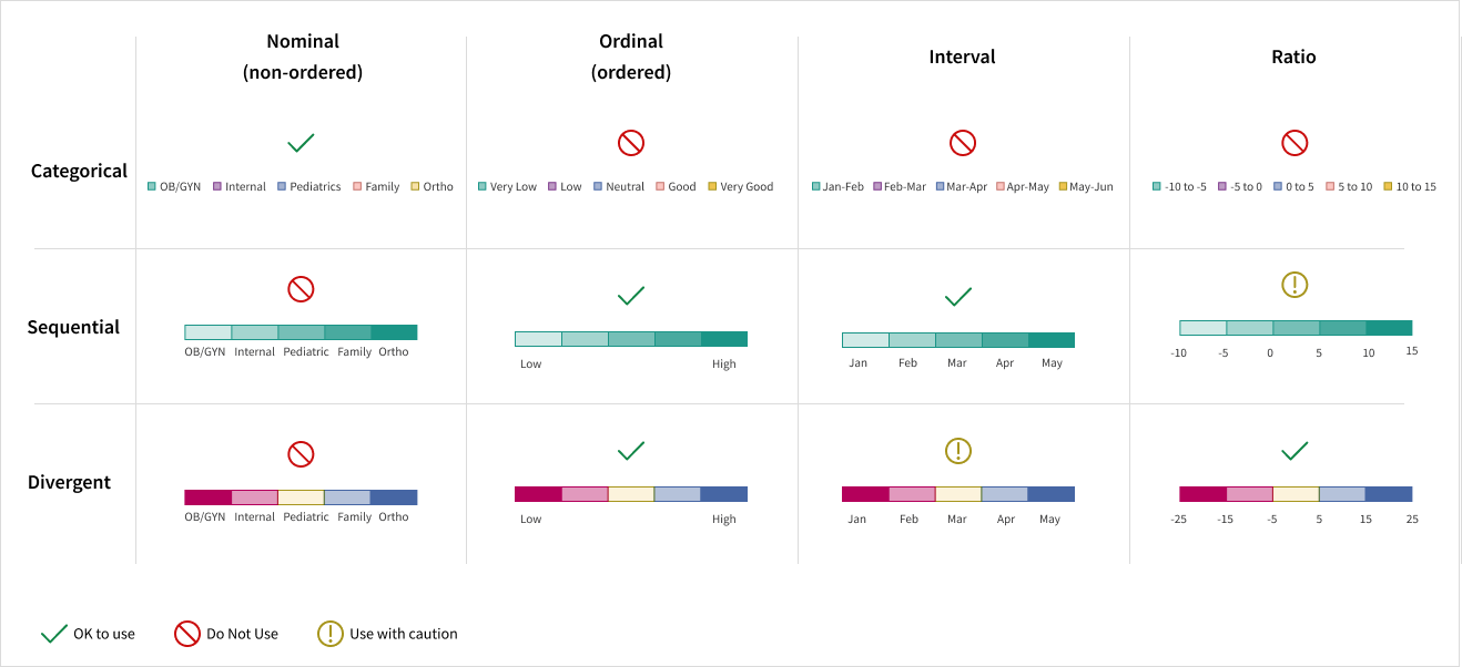
Consider two aspects of representing data with color:
- The type of data being represented (nominal, ordinal, interval, ratio)
- The scale being used to represent it (categorical, sequential, divergent).
The table below provides recommendations for using color to address both of these aspects.
Use color to convey meaning
Use caution when assigning meaning to a color or set of colors. Consider these guidelines when using color to convey meaning:
- There is no universal meaning for color: color is culturally bound.
- Reserve specific colors for specific categorical data used throughout a dashboard. For example, use the same hues for North, South, East, West on every chart.
- Reserve specific colors to highlight or emphasize data, and consistently apply those colors for that purpose throughout every visualization.
Use color sparingly
Most visualizations will be monochrome, reserving colors to emphasize data that needs users’ attention.
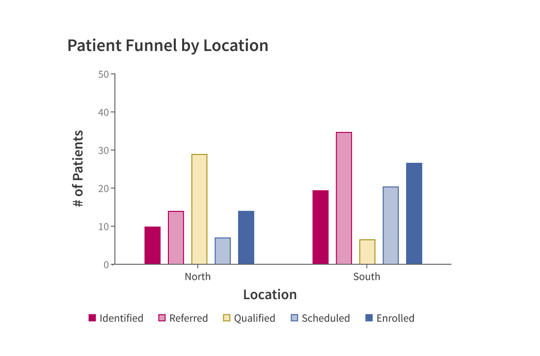
Use a muted color for all data. Reserve a saturated color to call attention when needed.
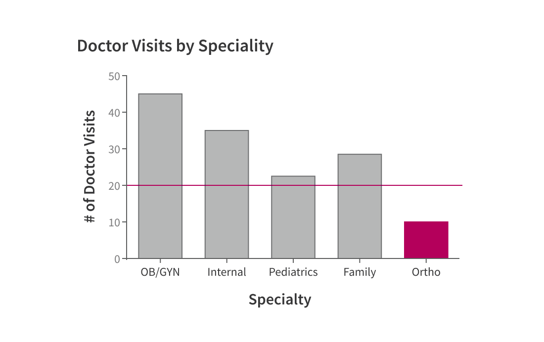
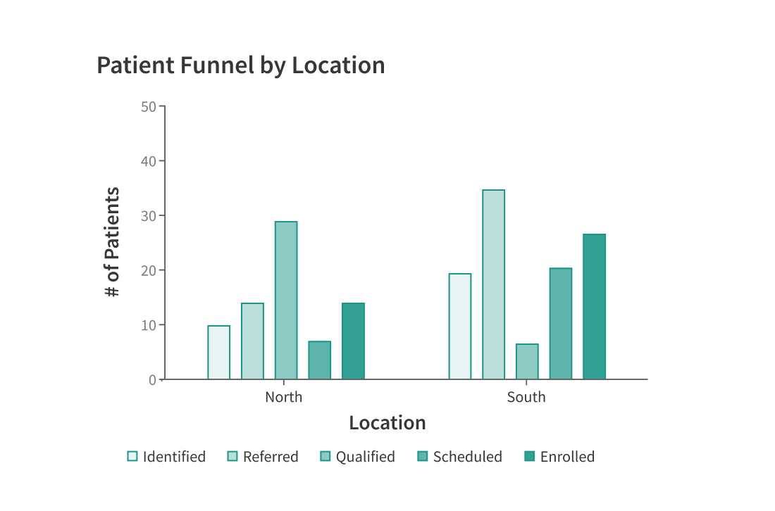
Use color if it serves no purpose. Coloring bars provides no extra info and is distracting.
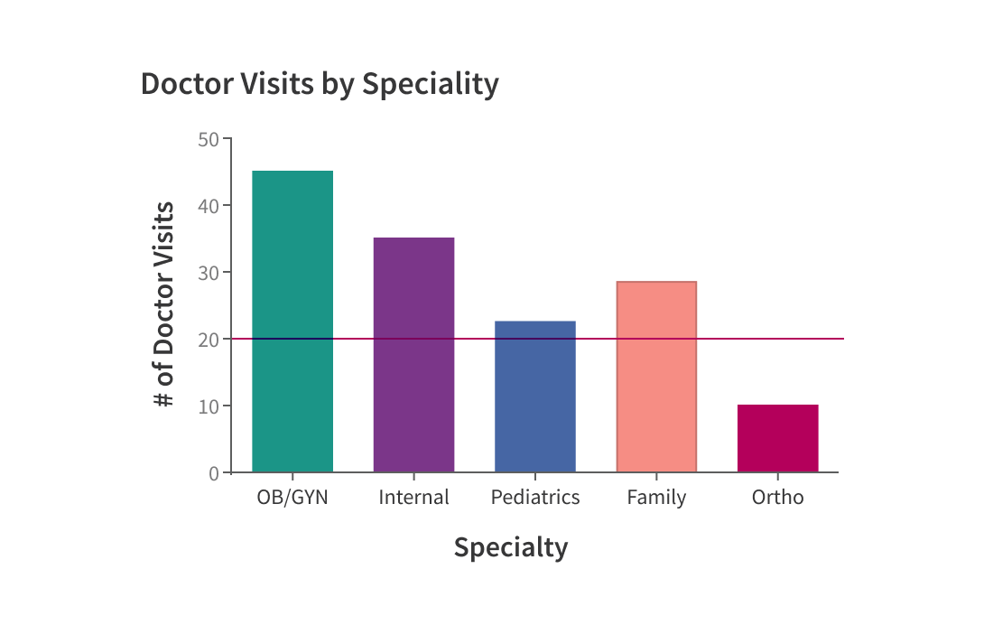
Reserve color (color hue) to distinguish among nominal categories of data
Use color hues to distinguish among nominal categories of data.
Use color value for unrelated categories of data (nominal data type).
Use five or fewer colors for nominal categories.
Use five or fewer consistent colors to associate individual data among multiple sets of data.
Use more than five colors to represent categories to ensure readability.
Use color values to emphasize ordinality (a progression) of data.
Use a range of color values within the same hue to convey a progression (for ordinal and interval data) or divergence (for ordinal and ratio data) within data sets. Limit the range to five values.
Use a sequence of values within a single hue to emphasize a data set’s natural order.
Use color hues to visualize data that has an inherent sequence (ordinal or ratio).
Developer implementation
Hex and RGB values on this page are for reference only. Don’t hard code hex or RGB values in CSS style rules: this creates CSS styles that are easy to break and hard to maintain. Instead, use the below tools:
Recoloring with CSS
Sass color maps are the best way to specify Forge colors in CSS. Use the Sass map-get function:
// Access Forge Sass variables@use '@athena/forge/sass/forge-abstracts';.my-pill-box {border: 1px solid map-get(forge-abstracts.$color-border, default);}
If the Forge team changes the underlying color values, Sass color maps will use the new values, so you won’t have to update your code to use the new colors. However, if the Forge team deletes a color, the map-get will silently fail, returning nothing. It's for this reason that deleting colors is done with extreme caution, and is documented in the breaking change section of Forge's release notes.
Recoloring with Javascript
Forge builds its design tokens and exports them in @athena/forge-shared. In particular, getSemanticColor() accepts a hyphenated string in the form of category-name, and returns the appropriate RGB value.
Resources
- Sass documentation: https://sass-lang.com/documentation
Utilities
Related Sass variables:
$color-alert$color-background$color-border$color-brand$color-font$color-interaction$color-shadow$color-secondary$color-dataviz