Tooltip
A small floating container that displays helpful text on hover or focus.
The Basics
What it is
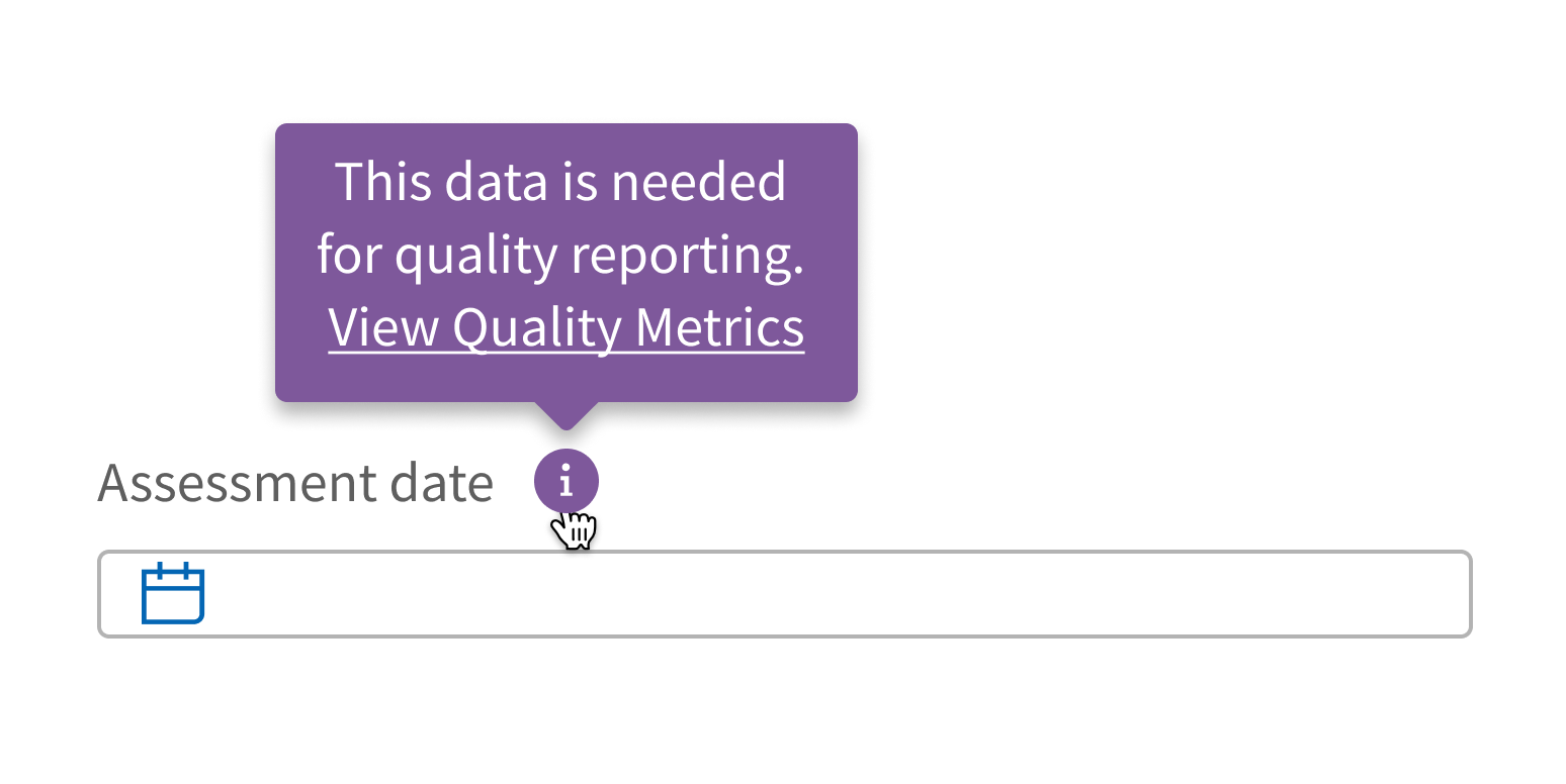
Tooltip provides context for an item. It’s often used to display a hint or definition as users hover over an element.
How it works
- Tooltip is attached to an element on the page, like an information icon, link, or piece of text.
- Hovering or focusing on the element makes Tooltip appear.
- Tooltip contains text only.
- Moving the cursor or changing focus away from the element hides Tooltip.
When to use
- To provide clarifying information, like the meaning of an acronym, that helps users complete a task
- To give additional information, like a keyboard shortcut for a button
- To share useful tips and tricks
When not to use
Tooltip appears only when users hover or focus on an element. This means users don’t always see a Tooltip’s information, so don’t use Tooltip:
- For important information required to complete a task
- For error messages or alerts
Additionally, don’t use Tooltip:
- For text longer than a sentence
- For links or other interactive elements
What to use instead
Use Popover if your content is a paragraph or longer, or to include a link to another page.
Use Modal if you want to include interactive elements, like form fields and buttons.
How to use
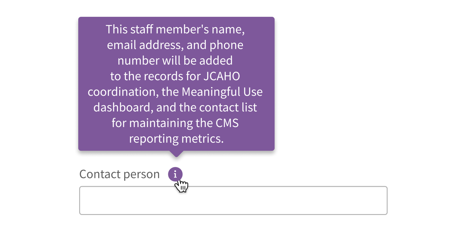
Keep it short. Aim for one sentence at most.
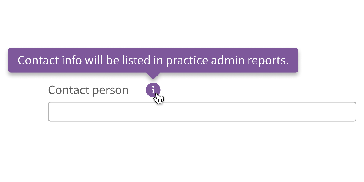
Write lengthy content for your Tooltip.
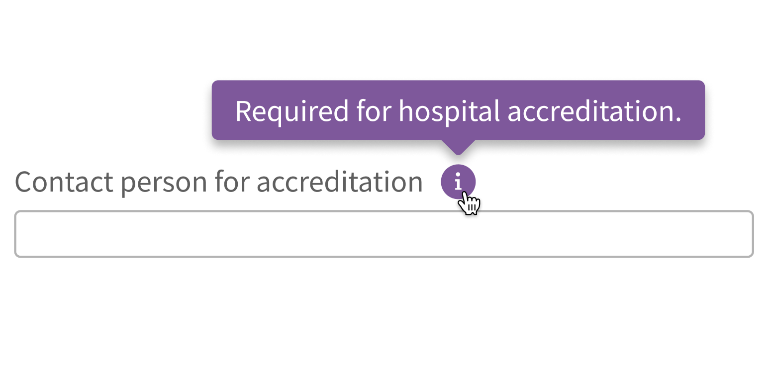
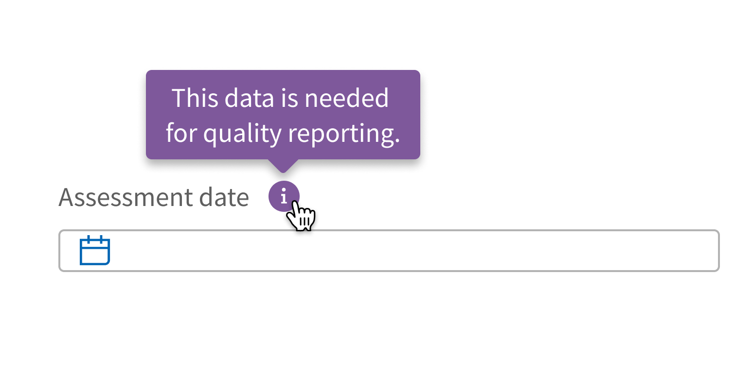
Use for information that’s helpful but not required to complete the task.

Use for information that’s important for users to know.
Use text only.
Use interactive elements, like buttons or links.
Style
Design details
No additional information for this component.
Placement and hierarchy
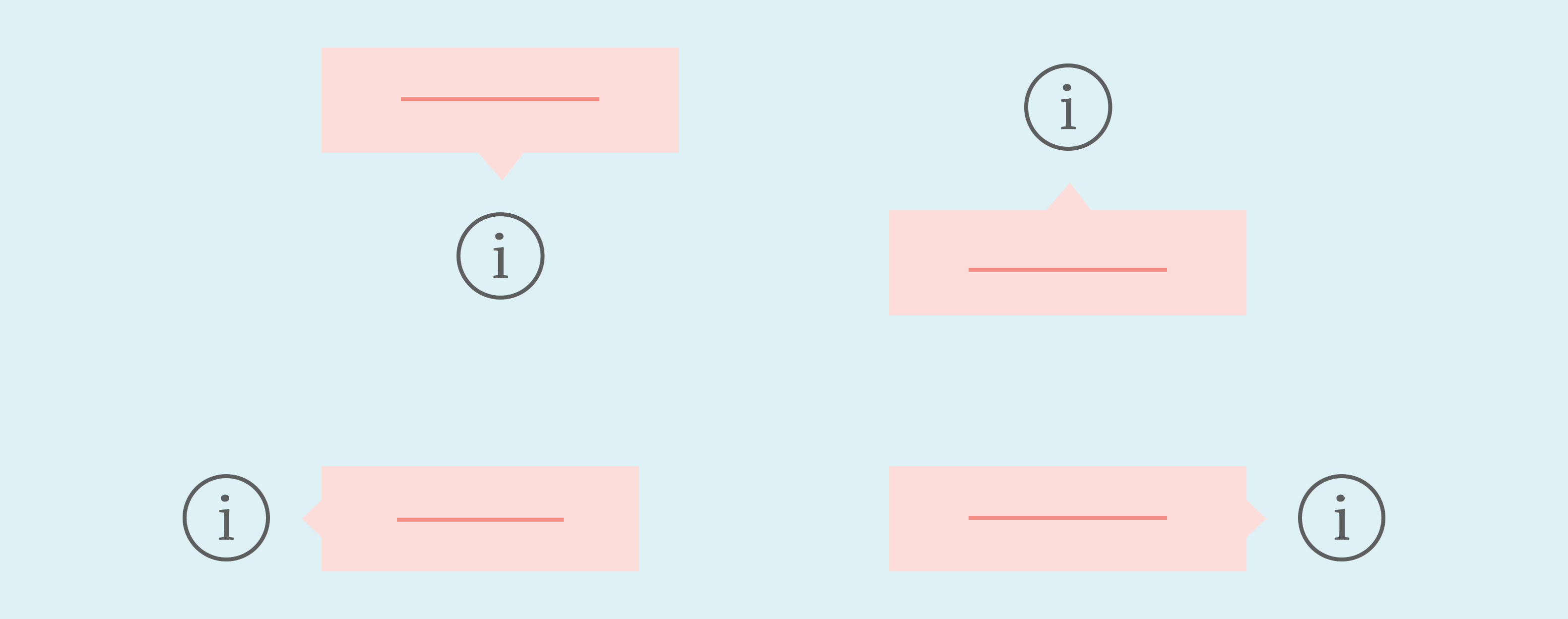
Tooltip appears above an element by default. It can be set to appear below or to the left or right instead, to ensure that it’s visible in the viewport.
Unless it’s disabled, Tooltip’s arrow is centered:
- Horizontally if Tooltip appears above or below an element
- Vertically if Tooltip appears to the left or right of an element
A single Tooltip can be applied to several elements. Let’s say you have a group of checkboxes and want a Tooltip to appear when you hover over any of them. In this case, the arrow is centered either:
- Horizontally on the widest element’s width
- Vertically on the total height
If Tooltip senses that it will appear partially or fully outside of the viewport, it automatically adjusts its placement to the opposite side so that it’s fully visible.
Content
Tooltip is intended for short text. It can contain custom markup, which allows for formatting text and adding small icons. Customize content sparingly.
Case
Use sentence case for Tooltip (“Required for accreditation”, not “Required for Accreditation”).
Screen readers
When Tooltip is visible, screen readers announce the focused element, pause, and then read the Tooltip text. For example, let’s say a link with the text “HPI” has an attached Tooltip with the text “History of present illness”. Screen readers announce this as, “Visited, Link, HPI: History of present illness".
Demos
Coding
Developer tips
Tooltip can have any number of children, which lets you apply the same single Tooltip to a group of elements. Hovering over any of the children triggers Tooltip. All Tooltip children are wrapped in an inline-block element for the purpose of determining Tooltip placement. This can cause some unintended positioning issues when used in display: flex elements.
To control when Tooltip is triggered instead of relying on hover, set showTip. Never set showTip={true} on first render because the placement will be wrong if layout hasn't completed yet.
Tooltip’s text prop is not limited to strings and will render any valid React node. This allows Tooltip to display custom content, such as formatted text.
Repository
Implementation links
Tooltip directory in Bitbucket
Implementation details
It is strongly recommended to familiarize yourself with the Forge source code. While this documentation is a best effort to document the intent and usage of a component, sometimes some features only become clear when looking at the source code. Also, looking at Forge's source code may help identify and fix bugs in either your application or Forge itself.
Storybook files
Forge maintains at least one storybook file per component. While the primary audience for these files is typically the Forge team, these storybook files may cover usages of the component not covered by a demo. The storybook for the latest version of forge can be found at go/forge-storybook-lts.
Testing library
Forge strongly encourages using testing-library to write tests for your application.
"The more your tests resemble the way your software is used, the more confidence they can give you."
If you're having trouble testing a Forge component using testing-library, it would be a good idea to see how Forge tests its own components. For the most part, Forge tries to use screen.getByRole as much as it can, as that API provides the best feedback on a11y compliance. Forge discourages the use of document.querySelector and screen.getByTestId as both APIs encourage using implementation details to test your component, and discourage adding roles to your component.
With that being said, many of Forge's components were not built with accessibility in mind. These components do break the recommendations listed above.
Import statements
In Nimbus applications
athenaOne serves the Forge bundle independently from your application's bundle. Importing Forge components directly from '@athena/forge' takes advantage of this feature.
import { Tooltip } from '@athena/forge'
In standalone applications
Importing components using the exact path to the module takes advantage of webpack's tree shaking feature. Webpack will include only that module and its dependencies.
import Tooltip from '@athena/forge/Tooltip';
To use this import guidance, Typescript applications must use typescript >= 4.7.3, and should add this setting to their tsconfig.json file:
{"compilerOptions": {"moduleResolution": "Node16",}}
If this setting doesn't work for your application, use this import statement instead:
import Tooltip from '@athena/forge/dist/Tooltip';