Popover
A floating overlay that displays information to help users complete a task.
The Basics
What it is
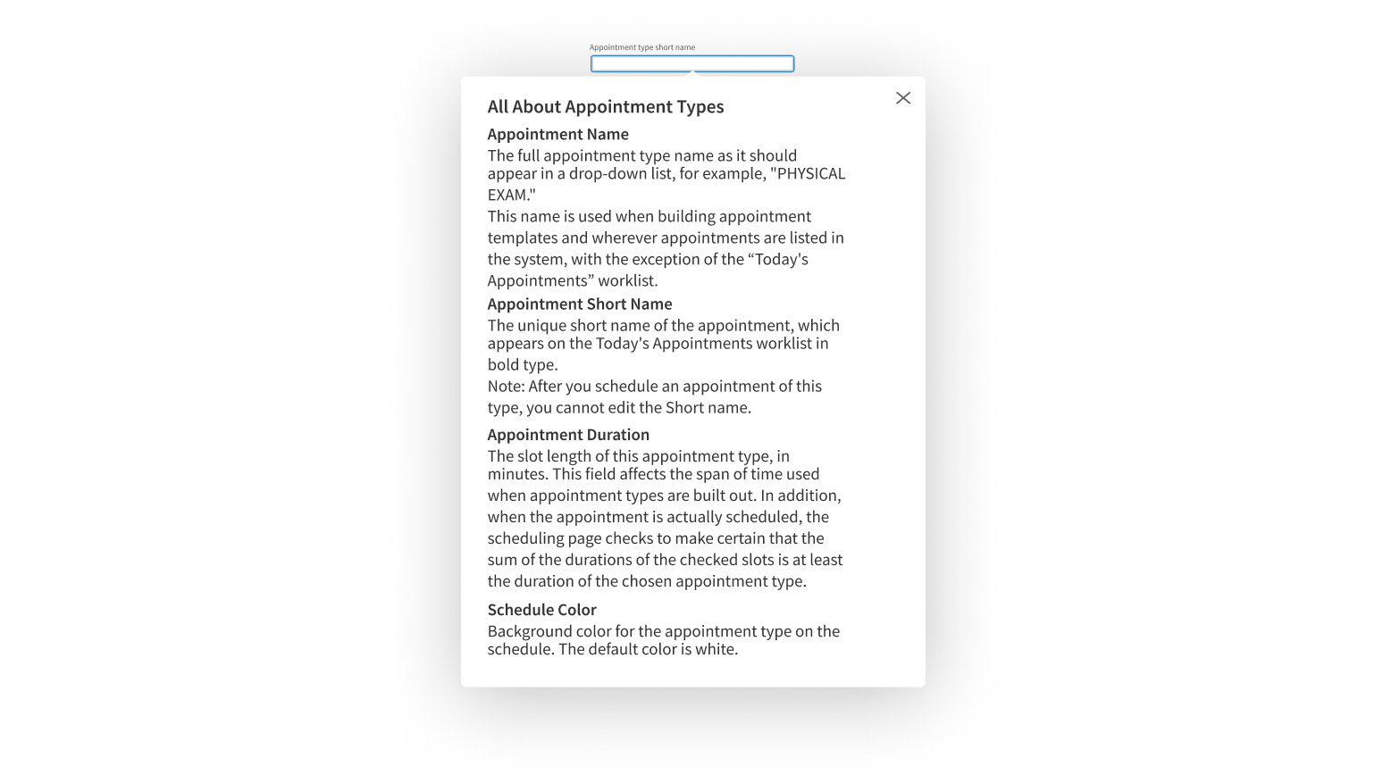
Popover appears over the main content on the page. It provides helpful information that doesn't need to appear on the page itself. It’s often used for long helper text or contextual instructions that don't need to be visible until users focus on a specific page element.
How it works
- The user clicks an element on the page, like a link, button, or form field, which activates Popover.
- Popover opens next to the clicked element.
- Popover contains text, like helper text, short instructions, or a link that opens in a new browser tab.
- The user clicks the Close icon in the upper right corner or presses the Esc key to close Popover.
When to use
- To help users complete a task
- To provide additional information
- To give users the option to visit another page to learn more
When not to use
- For additional information that’s longer than 2 short paragraphs
- For actions or steps in a workflow
What to use instead
Use Tooltip if the information is very short and not required to complete the task.
Use Modal to present a short form or to focus users’ attention with an overlay.
Use Lightbox to display long content.
How to use
Use Popover to display additional information that helps users complete a task.
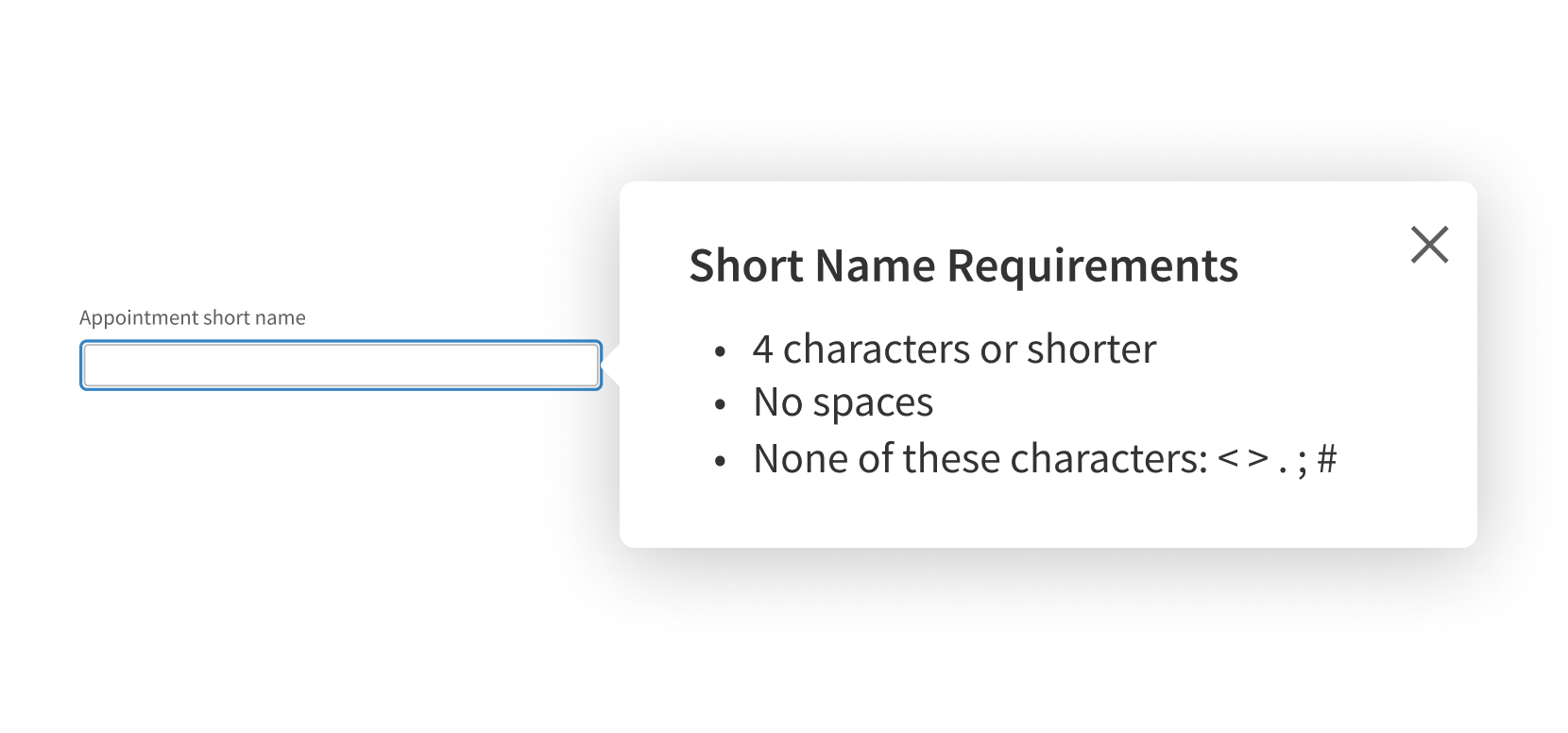
Use for information that should be part of the page itself.
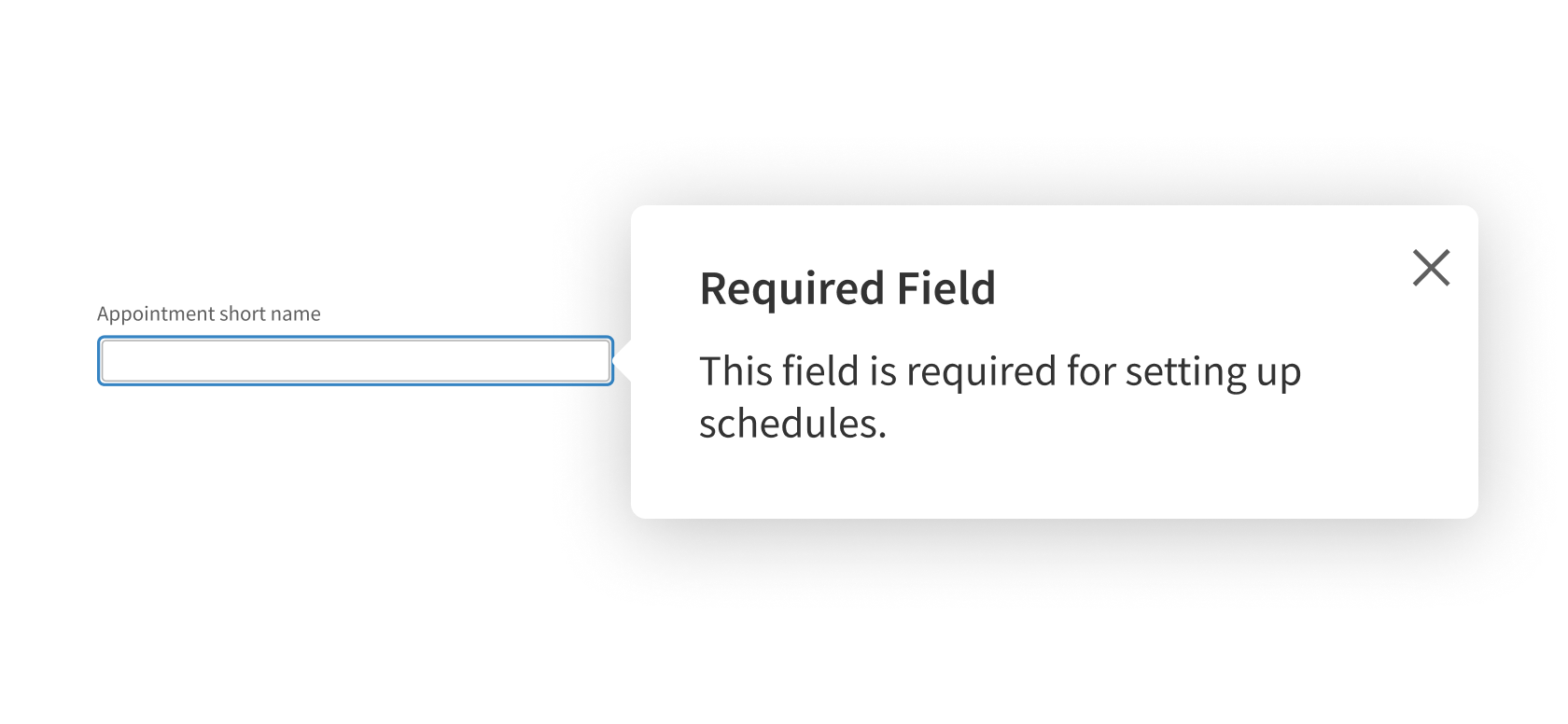
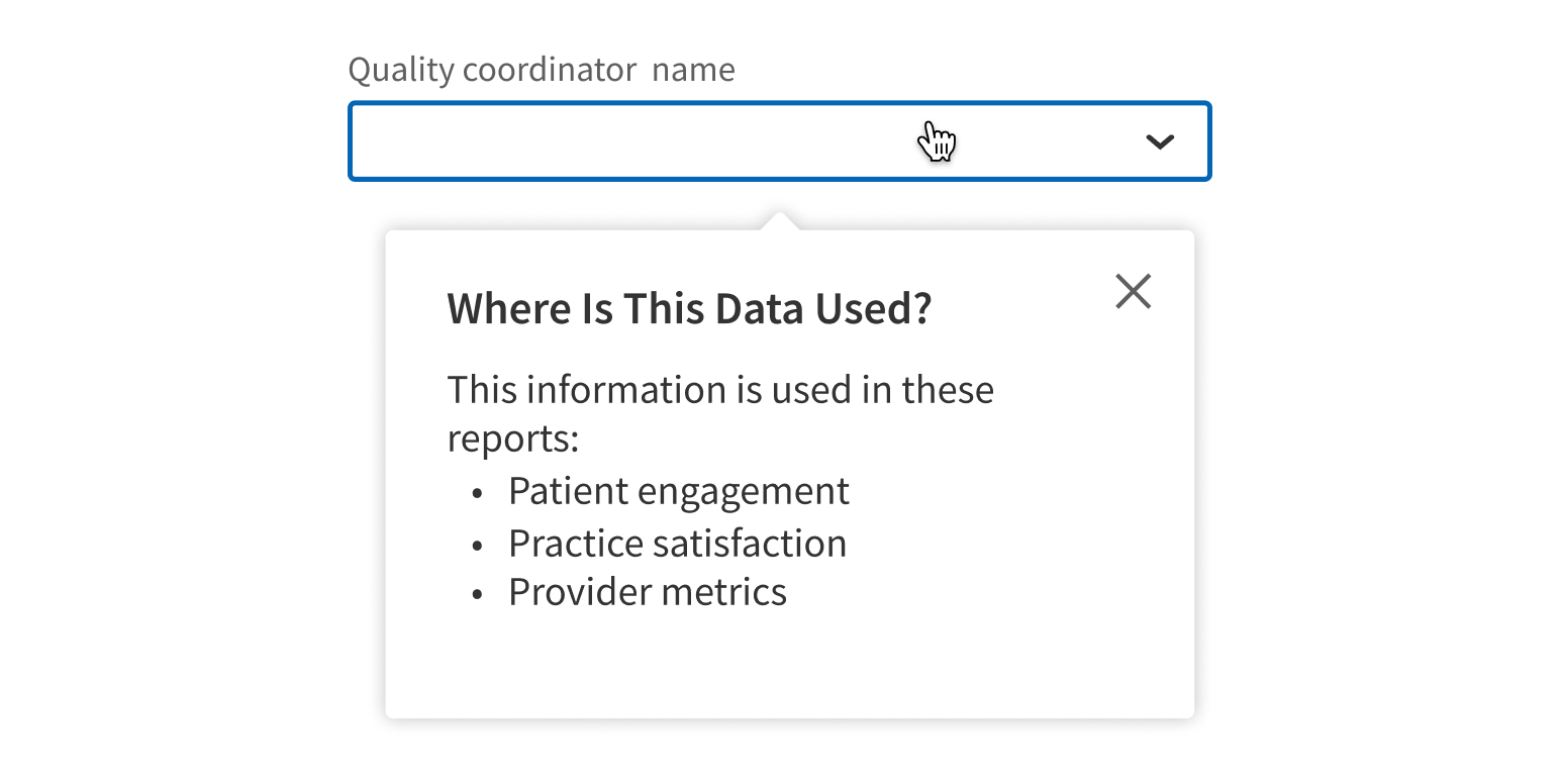
Use for hint text, “Learn more” links, or other informative content.
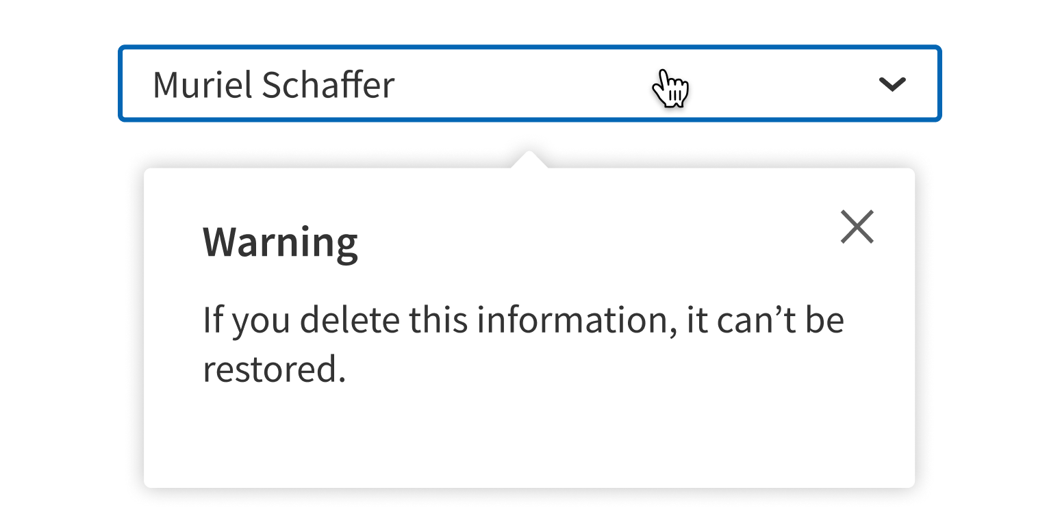
Use for alerts, warnings, or other messages that require users’ focused attention.
Link to a page with more information where appropriate.
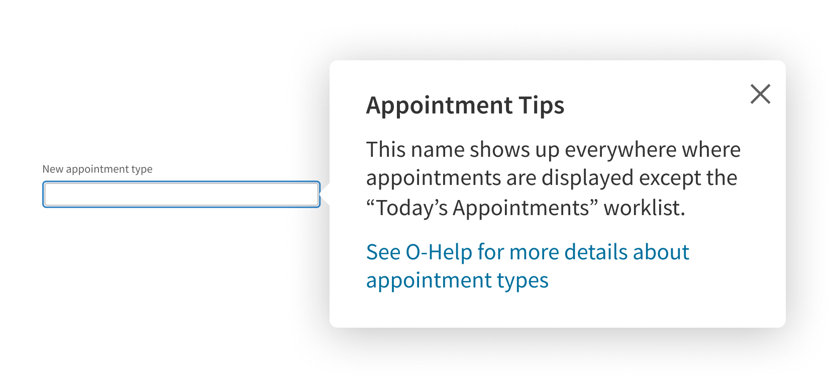
Use any interactions besides links.
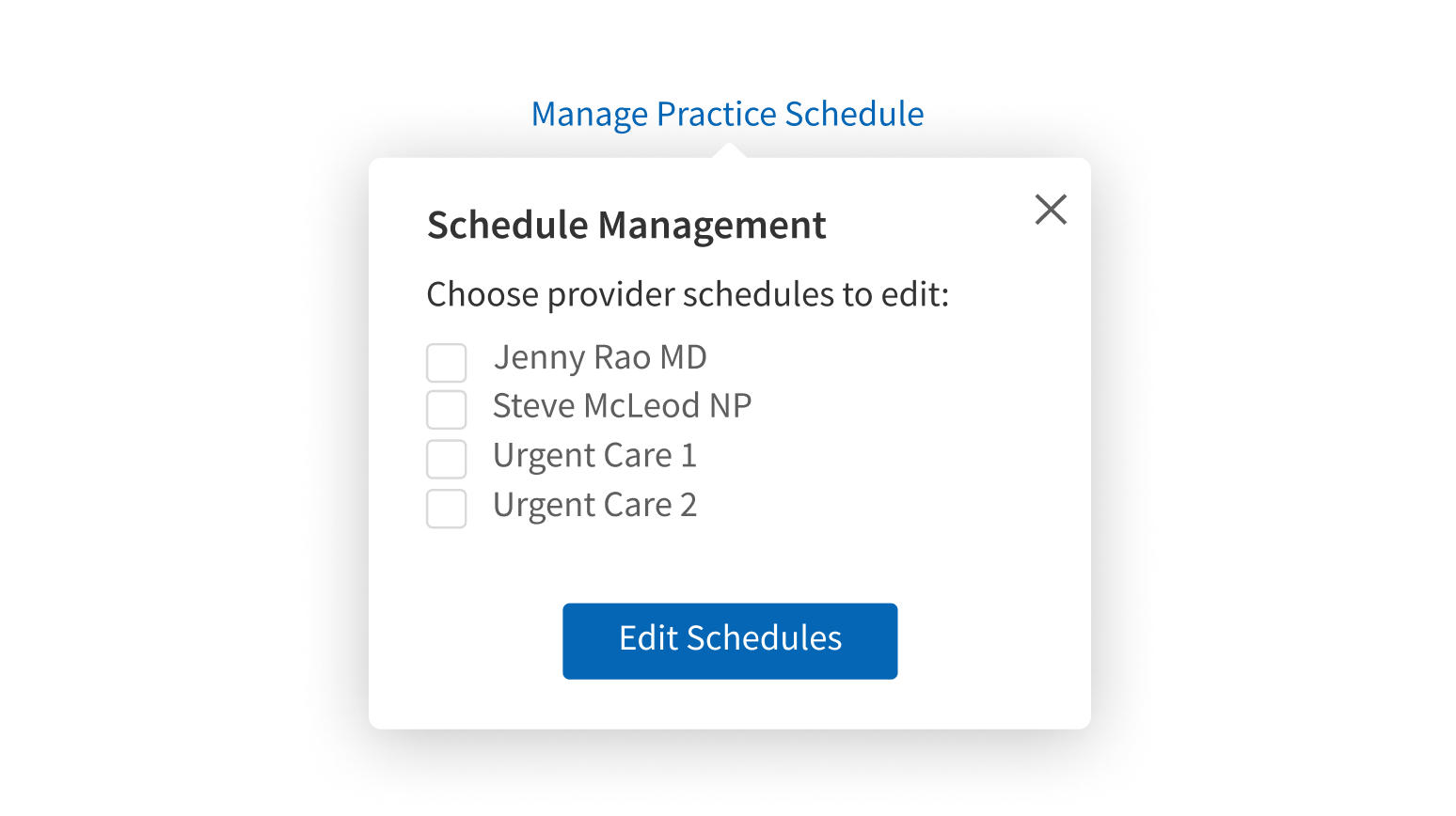
Style
Design details
No additional information for this component.
Placement and hierarchy
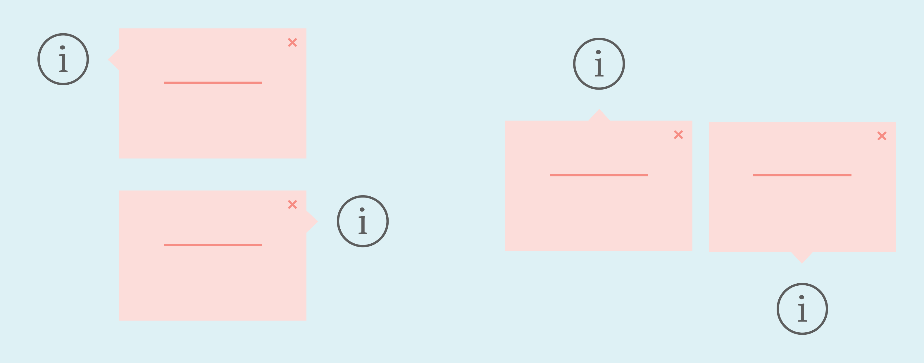
Popover appears to the right of the trigger element by default. It can be set to appear above, below, or to the left instead. On screens less than 640px wide, Popover content appears below the trigger by default or above if it would be outside the viewport.
Content
Be concise and informative.
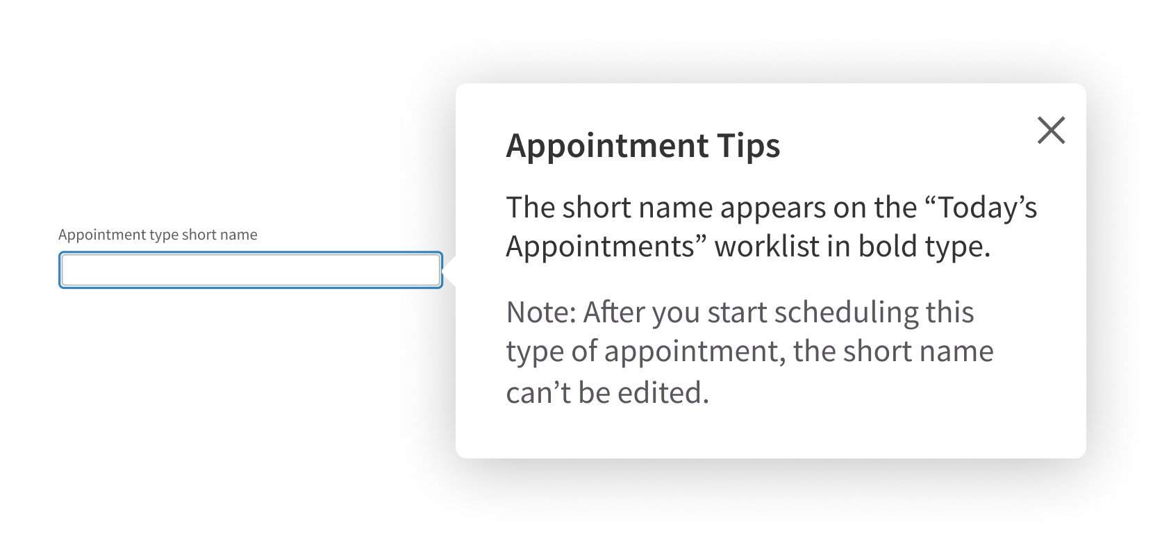
Include more than a heading and two short paragraphs.
Case
Use title case for Popover heading text (“Setup Tips”, not “Setup tips”). Use sentence case for body text.
Screen readers
When users click Popover’s trigger element, screen readers read all text that's part of the element, including button, link, and alt text. When Popover is activated, screen readers read the full content.
Alt text
If the trigger element is an icon or doesn’t already contain text, add alt text so screen readers introduce the Popover correctly.
Demos
Coding
Developer tips
Closing
For users to close Popover by clicking outside it, you need to code an additional hook. Any links inside Popover (e.g., to an article or FAQ) should be set to open in a new tab using target="_blank".
Placement
On screens less than 640px wide, Popover defaults to appear below the trigger element. For screens wider than 640px, the position can be configured using the placement prop.
Keyboard use
When Popover is opened, user focus should be placed on the first focusable element. Popover can be closed using the Esc key or the Close icon in the top right corner. User focus should be placed back on the trigger when Popover is closed.
Repository
Implementation links
Popover directory in Bitbucket
Implementation details
It is strongly recommended to familiarize yourself with the Forge source code. While this documentation is a best effort to document the intent and usage of a component, sometimes some features only become clear when looking at the source code. Also, looking at Forge's source code may help identify and fix bugs in either your application or Forge itself.
Storybook files
Forge maintains at least one storybook file per component. While the primary audience for these files is typically the Forge team, these storybook files may cover usages of the component not covered by a demo. The storybook for the latest version of forge can be found at go/forge-storybook-lts.
Testing library
Forge strongly encourages using testing-library to write tests for your application.
"The more your tests resemble the way your software is used, the more confidence they can give you."
If you're having trouble testing a Forge component using testing-library, it would be a good idea to see how Forge tests its own components. For the most part, Forge tries to use screen.getByRole as much as it can, as that API provides the best feedback on a11y compliance. Forge discourages the use of document.querySelector and screen.getByTestId as both APIs encourage using implementation details to test your component, and discourage adding roles to your component.
With that being said, many of Forge's components were not built with accessibility in mind. These components do break the recommendations listed above.
Import statements
In Nimbus applications
athenaOne serves the Forge bundle independently from your application's bundle. Importing Forge components directly from '@athena/forge' takes advantage of this feature.
import { Popover } from '@athena/forge'
In standalone applications
Importing components using the exact path to the module takes advantage of webpack's tree shaking feature. Webpack will include only that module and its dependencies.
import Popover from '@athena/forge/Popover';
To use this import guidance, Typescript applications must use typescript >= 4.7.3, and should add this setting to their tsconfig.json file:
{"compilerOptions": {"moduleResolution": "Node16",}}
If this setting doesn't work for your application, use this import statement instead:
import Popover from '@athena/forge/dist/Popover';