Banner
A notification or message that appears inline at the top of a page or section.
The Basics
What it is
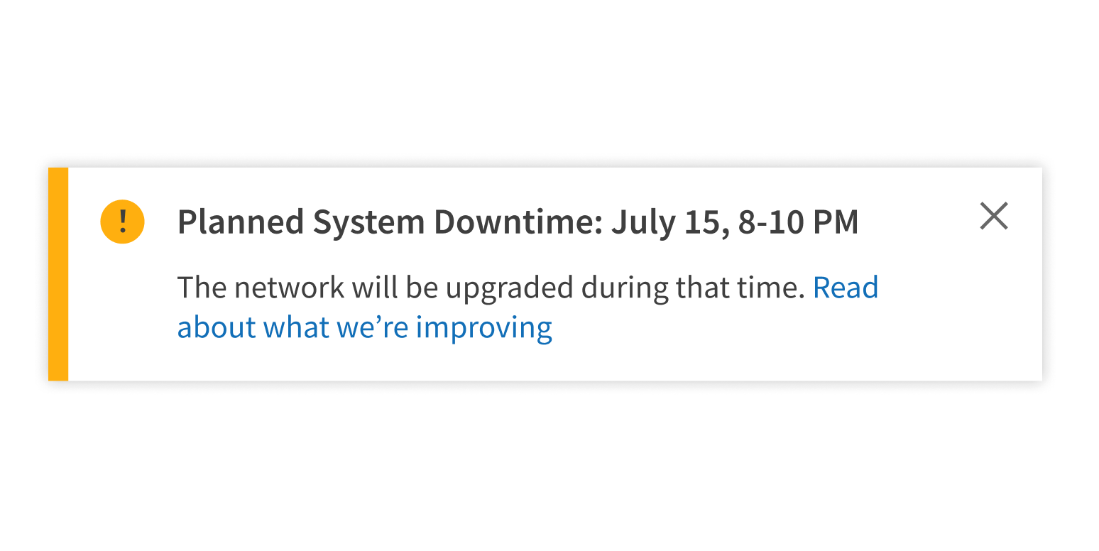
Banner notifies users of an issue or status that affects an app, page, or section. It can be used to communicate all Forge alert types.
How it works
- Banner appears on page load or after the user takes a specific action, like submitting a form.
- It appears inline (not overlapping any content) at the top of the page or at the top of a section, if a more targeted notification is appropriate.
- Banner contains text and can include a link, usually to a page where users can learn more or resolve errors.
- Once the user has read or interacted with the content in Banner, it can be dismissed using the (optional) Close icon.
When to use
- To communicate an issue or status that affects an app, page, or section
- To draw attention to an issue that isn’t related to a specific task
- To confirm an event, like successfully submitting a form
When not to use
- For critical alerts or warnings that users must acknowledge
- For frequent notifications, because too many Banners cause alert fatigue
What to use instead
Use Modal to interrupt users and force them to acknowledge a message or complete a task.
Use InlineAlert for lower-level notifications or to draw attention to an element on the page.
Use Toast for temporary, self-dismissing notifications triggered by user actions.
How to use
Include a link when appropriate.
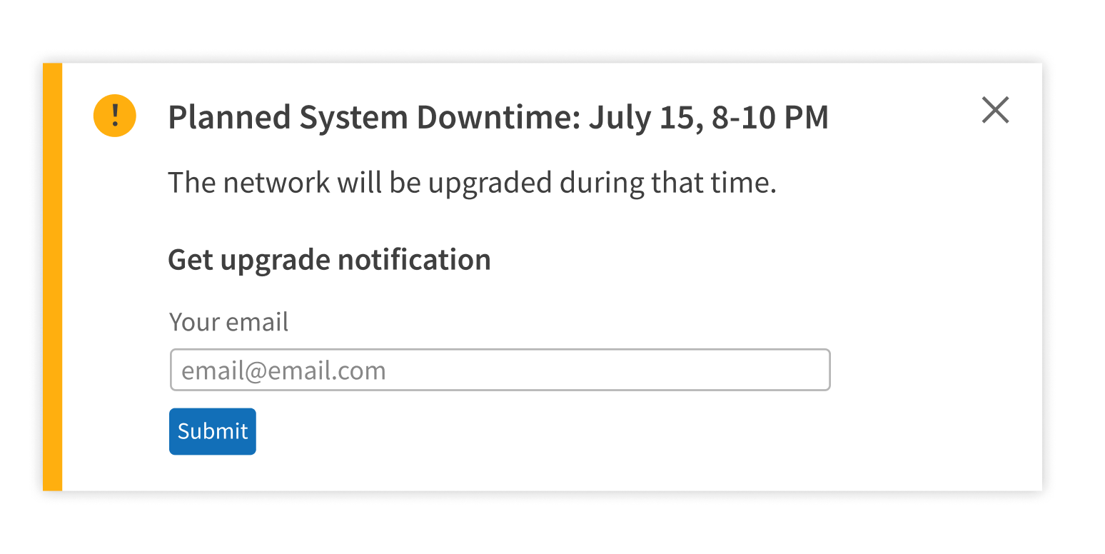
Use any elements besides text and links.
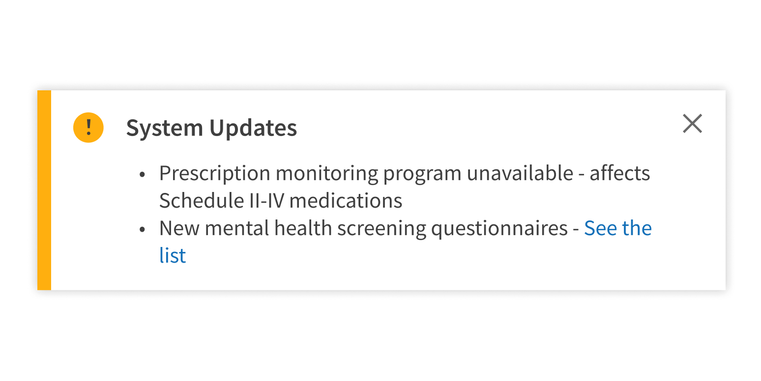
Use multiple Banners at the same time.
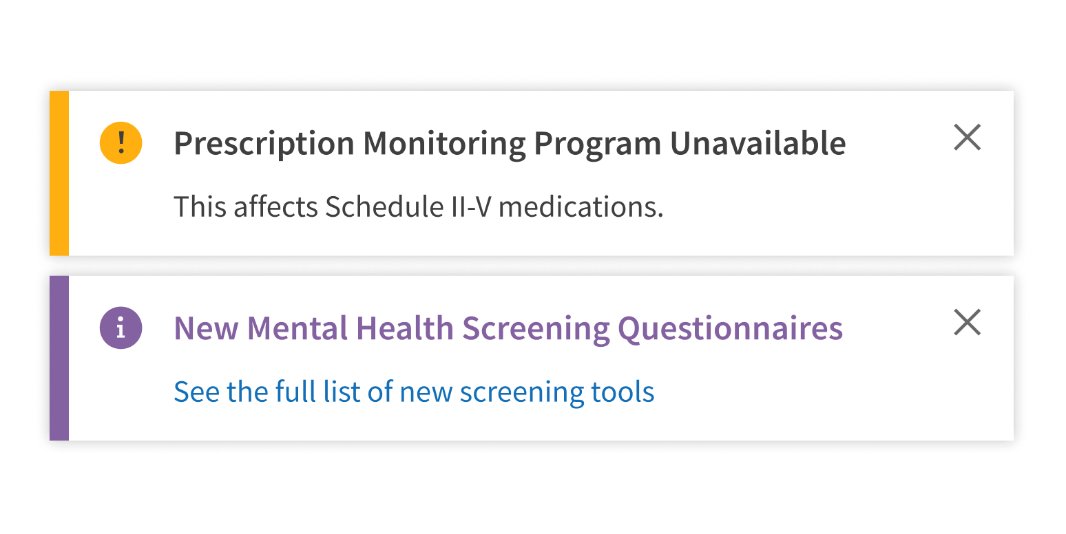
Use one Banner to group unrelated messages.
Style
Design details
No additional information for this component.
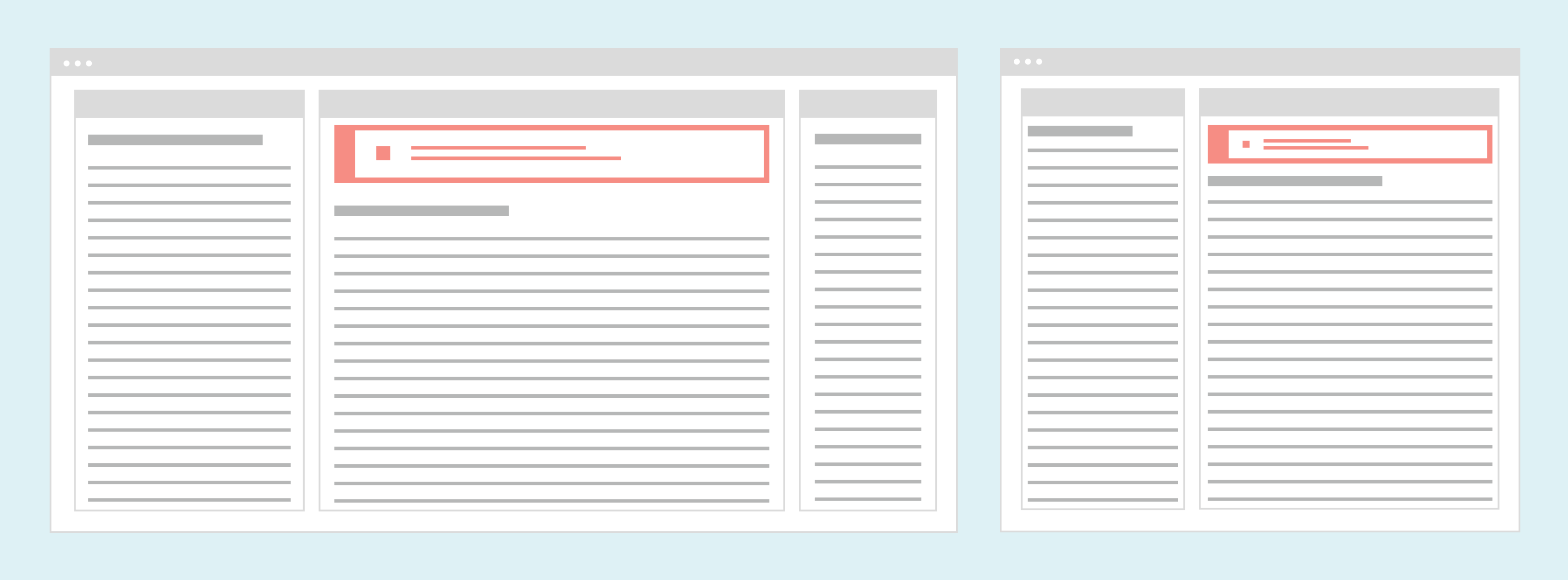
Placement and hierarchy
A page-level Banner sits below the global navigation at the top of the page and header, but not above any left-hand sidebar. Banner resizes fluidly with the page body area.
A section-level Banner sits at the top of the relevant section’s content and spans the full width of the parent container.
Content
Case
Use title case for Banner heading text (“Security Update”, not “Security update”). Use sentence case for body text.
Alert types
Match the Banner alert type to the message content:
- Informational (default): General tips and helpful information
- Success: A confirmation or success message
- Attention: An error or alert, typically asking users to take action
- Error messages should explain what happened and how to resolve the issue.
- Critical: Limited use. Reserved for:
- Patient safety issues
- Other extremely important issues, like a business problem that could affect the client’s financial health
For help writing Banner message content, see Content.
Demos
Coding
Developer tips
Banner content
Use the BannerItem subcomponent to implement Banner children. This ensures proper layout and spacing. All Banner features (e.g., the alert, Close icon, header text) can be customized by changing props on the Banner or BannerItem.
Closing
Banner can be set so that users can dismiss it using the Close icon, but you must implement the code that handles this action.
To do this, use the onHide prop to make the Close icon appear. The onHide prop handles whatever actions happen after the Banner is closed. Use Banner in conjunction with the ShowHide component for a smooth onClose transition.
Repository
Implementation links
BannerItem directory in Bitbucket
Implementation details
It is strongly recommended to familiarize yourself with the Forge source code. While this documentation is a best effort to document the intent and usage of a component, sometimes some features only become clear when looking at the source code. Also, looking at Forge's source code may help identify and fix bugs in either your application or Forge itself.
Storybook files
Forge maintains at least one storybook file per component. While the primary audience for these files is typically the Forge team, these storybook files may cover usages of the component not covered by a demo. The storybook for the latest version of forge can be found at go/forge-storybook-lts.
Testing library
Forge strongly encourages using testing-library to write tests for your application.
"The more your tests resemble the way your software is used, the more confidence they can give you."
If you're having trouble testing a Forge component using testing-library, it would be a good idea to see how Forge tests its own components. For the most part, Forge tries to use screen.getByRole as much as it can, as that API provides the best feedback on a11y compliance. Forge discourages the use of document.querySelector and screen.getByTestId as both APIs encourage using implementation details to test your component, and discourage adding roles to your component.
With that being said, many of Forge's components were not built with accessibility in mind. These components do break the recommendations listed above.
Import statements
In Nimbus applications
athenaOne serves the Forge bundle independently from your application's bundle. Importing Forge components directly from '@athena/forge' takes advantage of this feature.
import { Banner, BannerItem } from '@athena/forge'
In standalone applications
Importing components using the exact path to the module takes advantage of webpack's tree shaking feature. Webpack will include only that module and its dependencies.
import Banner from '@athena/forge/Banner';import BannerItem from '@athena/forge/BannerItem';
To use this import guidance, Typescript applications must use typescript >= 4.7.3, and should add this setting to their tsconfig.json file:
{"compilerOptions": {"moduleResolution": "Node16",}}
If this setting doesn't work for your application, use this import statement instead:
import Banner from '@athena/forge/dist/Banner';import BannerItem from '@athena/forge/dist/BannerItem';