Lightbox
A large container that pops up over the page, forcing users to acknowledge or interact with its contents.
The Basics
What it is
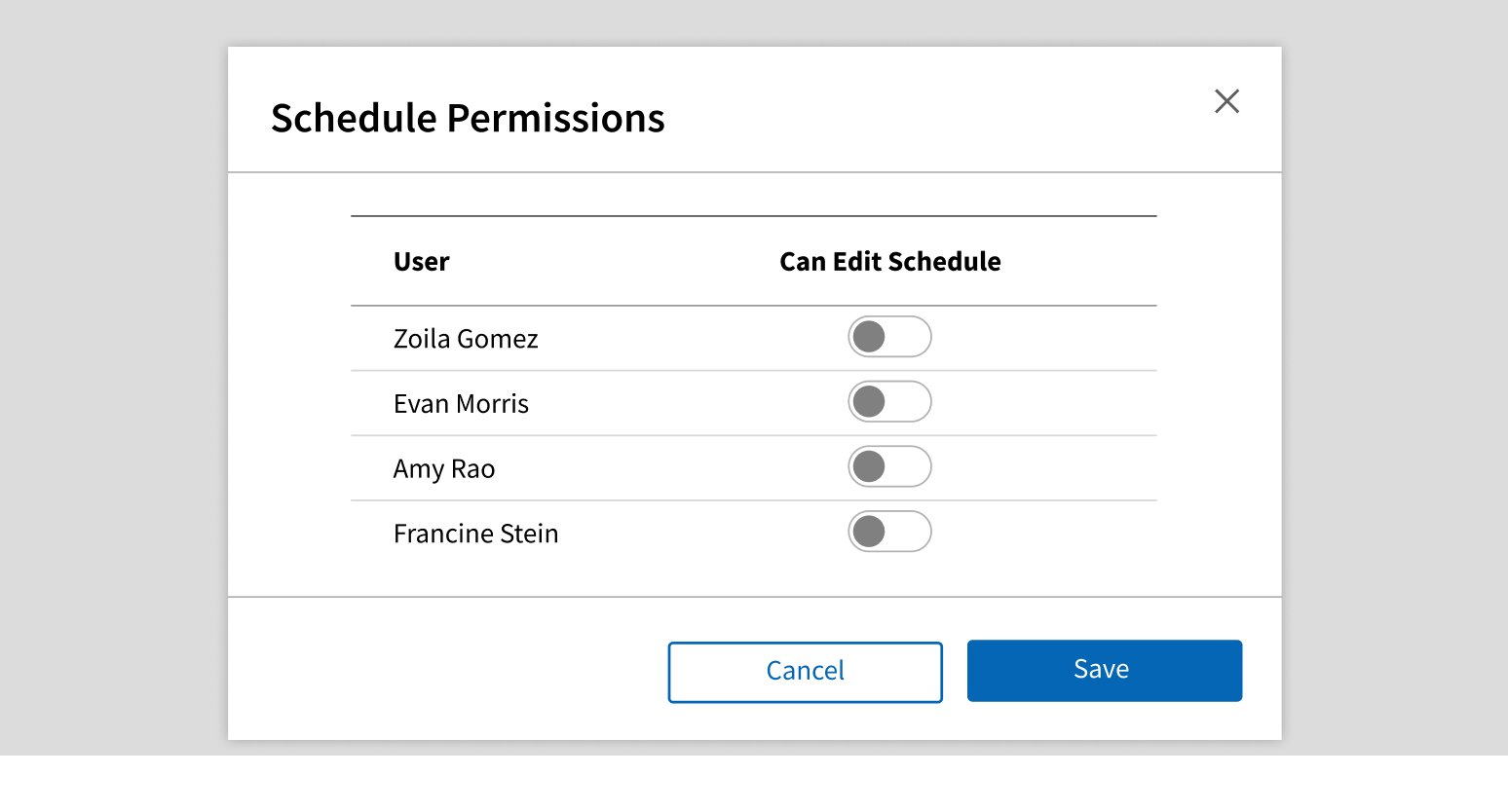
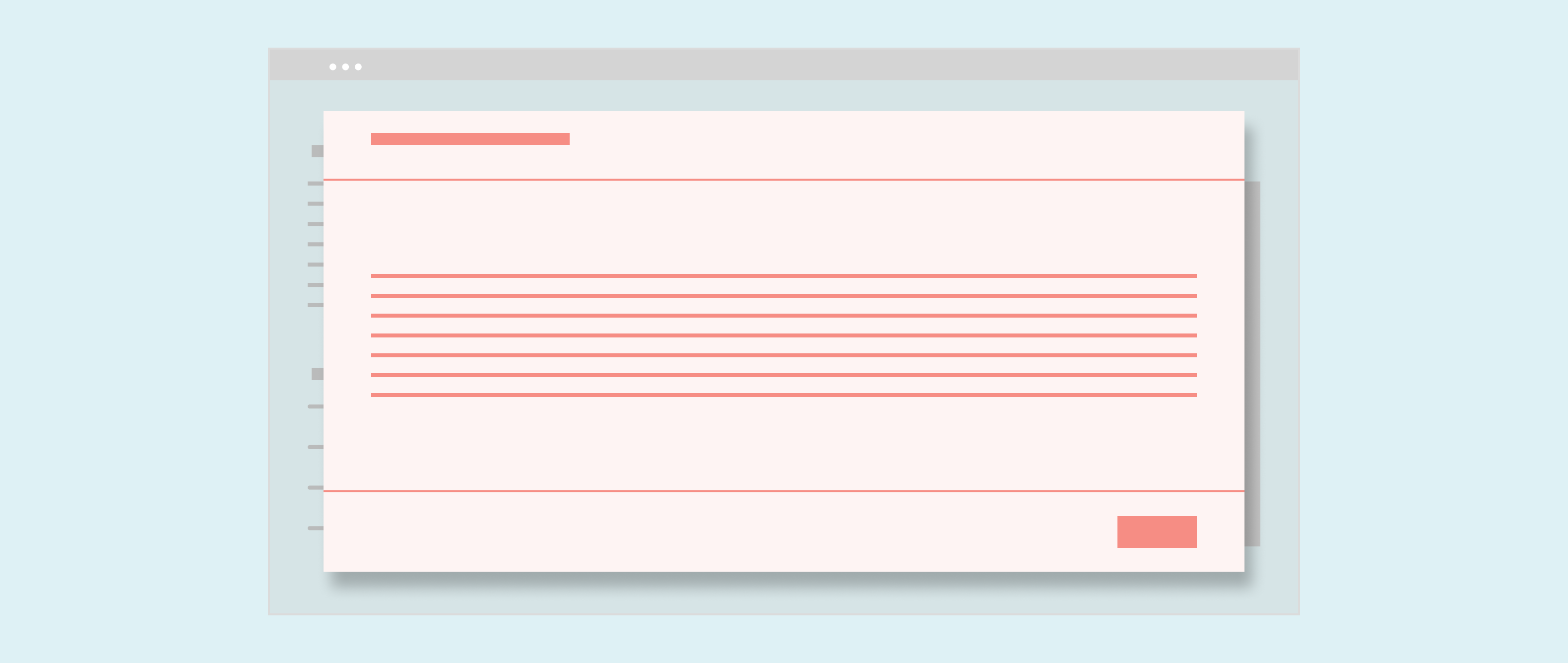
Lightbox is a large dialog window containing workflows, long content, or images. While active, it prevents users from interacting with the rest of the page.
Lightbox is ideal for presenting important information (like terms and conditions), but it also disrupts workflows. Overuse of Lightbox contributes to alert fatigue, so use it sparingly.
How it works
- Lightbox opens when the user clicks a button or link.
- Lightbox appears above a darkened overlay or scrim that blocks the content below. This reduces visual clutter and focuses user attention.
- To interact with the Lightbox, the user reads its contents (this can be done using the Tab key) and/or completes a workflow.
- To close the Lightbox, the user clicks the primary button (usually OK or Done).
- In some cases, the user can click the Close icon in the upper right corner, click a button like Cancel or Back in the footer, press Esc, or click outside the Lightbox to close it.
When to use
- To ask users to complete a workflow, without displaying a new page
- For long content that doesn’t fit in a Modal
- To show videos or enlarged images on the page
When not to use
- For long workflows where user input will be lost if Lightbox is closed (use a separate web page instead)
- For short alerts
- For confirmation requests
- Repeatedly in the same workflow or on the same page
What to use instead
Use Modal for alerts, confirmation requests, forms with 3 or fewer fields, and other short content.
Use ShowHide to reveal additional content without blocking the page.
Use Popover for helpful information that doesn’t block users.
How to use
Lightbox lets users complete short workflows without having to go to a new page, but it’s also very disruptive, so use it sparingly. Avoid workflows that use Lightbox repeatedly.
For workflows that present more complex data but need to keep users on the page, consider using the left-panel. Static, reference information should be presented on the left and areas with user action should be displayed on the right.
Have only 1 Lightbox open at a time.
Launch a Lightbox in a Lightbox.
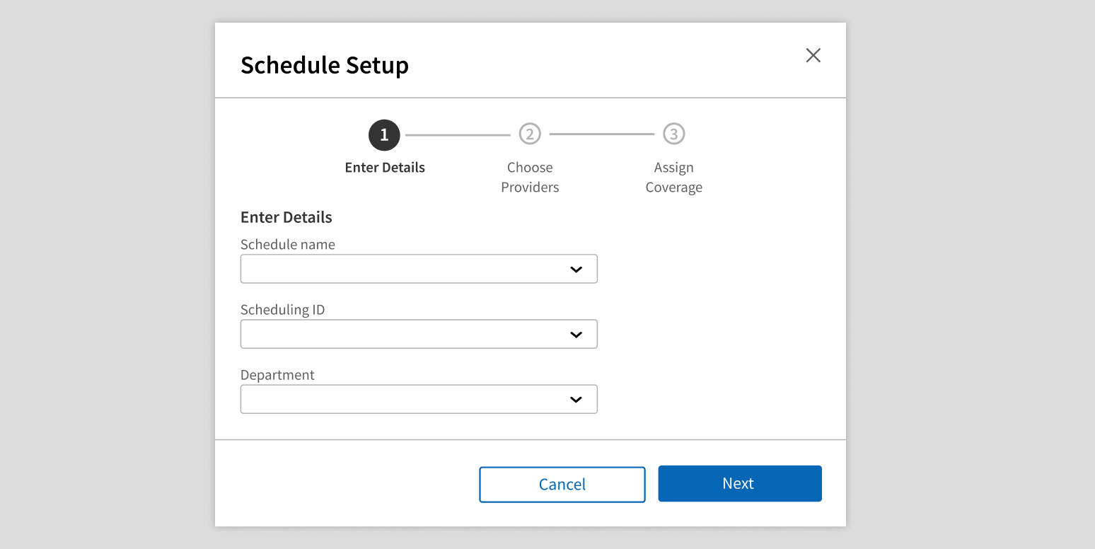
Use Stepper or ProgressIndicator in Lightbox for short flows.
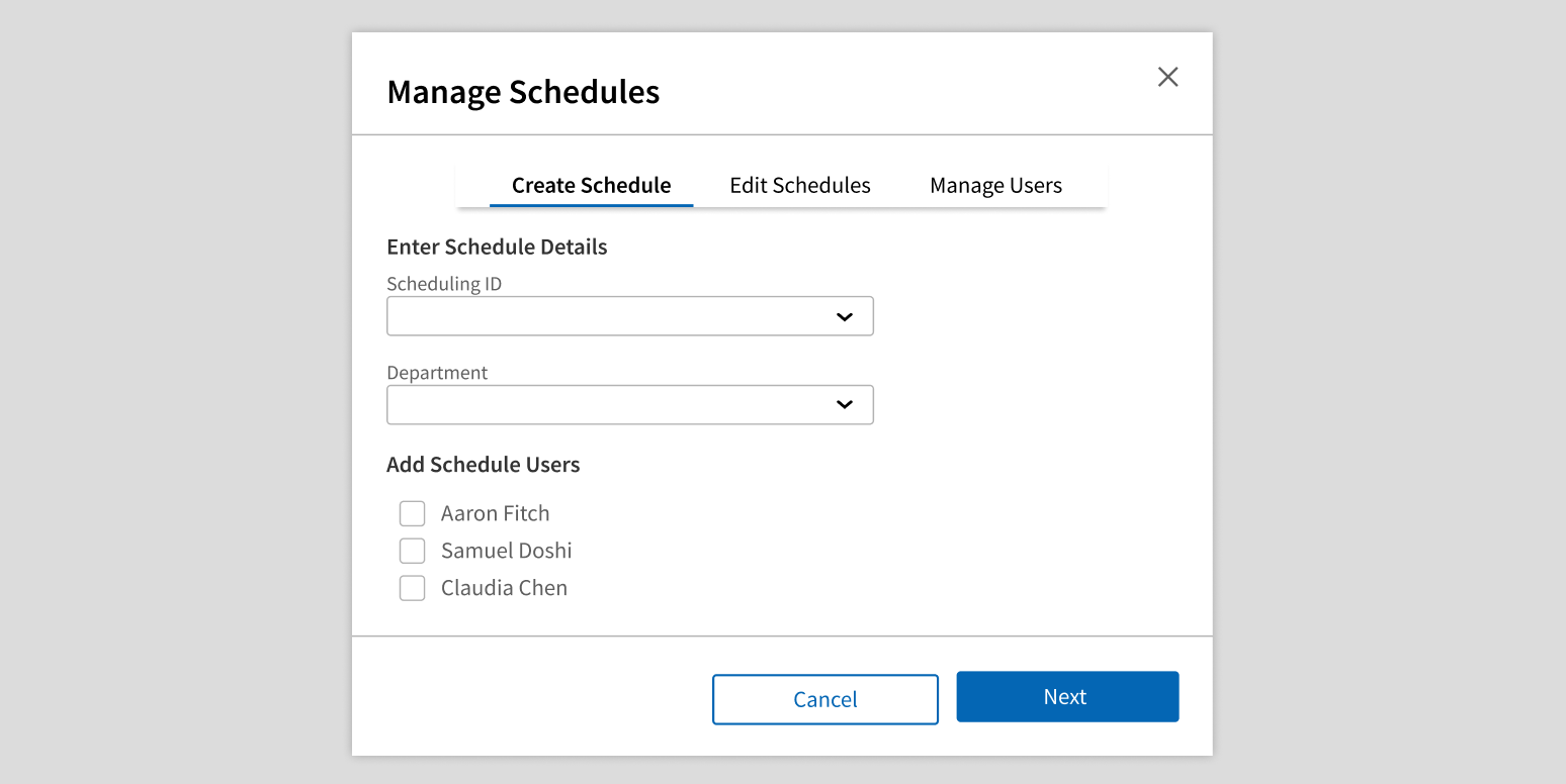
Use Tabs or Menu in Lightbox: use a separate page for flows this complex.
Style
Design details
Lightbox has 3 width options:
- Medium (default): 600px wide
- Large: 800px wide
- Full: 90% of the width of the browser window
Height is calculated automatically based on the contents.
Please note: Left panel is only available for Large and Full widths to ensure the panel is readable.
Placement and hierarchy
Lightbox is centered horizontally and vertically on the page, floating above both the page content and the scrim or overlay.
Content
Header
This is the title of the dialog and the first content users see, so it should indicate why the Lightbox appeared. Use title case for header text (e.g., “Edit Details”).
When using Lightbox for a short workflow or other user action, header text should reflect the action, not the content. For example:
- Button or link label: “Add questions from library”
- Lightbox header: “Add Questions from Library”, not “Question Library”
The header can also include up to 2 icon-only Buttons. These don’t have labels, so they should represent actions that are clear from just the icon itself (like the Print icon or the Email icon). Don’t use these icon-only Buttons to complete the workflow or close the window. If you use these buttons, test your layout on the smallest screen size your use case supports.
You can also set a secondary header for the left panel. The left panel header should give more insight into the data inside the left panel body, and should not be the primary header.
Body
This is the dialog content or workflow. It can contain a range of content, including images, forms, and long copy. Lightbox has more space to work with than Modal, but it’s still best to keep the content clear and concise. Avoid content that requires scrolling.
When using the left panel, the right-side body should focus on user actions while the left body should provide supporting information. Any interactive elements should be solely in the right-side body.
Footer
By default, the footer contains a single primary call to action button that completes the workflow. This action closes Lightbox and returns users to the page. The footer is optional but recommended.
If your use case requires additional buttons or other footer customization, create your own custom footer in the body instead. Any additional buttons should be secondary.
Start button text with a verb, and use title case (e.g., “Save Changes”).
Demos
Coding
Developer tips
Closing
Lightbox doesn’t close itself. Its parent is responsible for setting the show prop to {false} in the onPrimaryClick and onHide callback functions.
onPrimaryClick is called when the primary button is clicked. onHide is called for all other interactions that should close Lightbox (e.g., clicking the overlay). You must implement the close functionality in onHide.
Some important workflows require users to click a button in the Lightbox instead of just clicking the overlay or the Close button. Set disableClose to {true} to prevent users from closing the Lightbox via the Close button or clicking the overlay. In this case, onHide isn’t necessary, and you don’t need to implement close functionality inside it.
Footer
The footer comes with a single Button that can be customized with primaryButtonText and onPrimaryClick props. If your use case requires additional buttons or other customization, you need to implement a custom footer in the body.
z-index
Lightbox's grey background has a z-index of 1000. If there is other content in the same iframe that is in front of the grey background, then add a className to the Lightbox, and use that className to set a higher z-index
Repository
Implementation links
Lightbox directory in Bitbucket
Implementation details
It is strongly recommended to familiarize yourself with the Forge source code. While this documentation is a best effort to document the intent and usage of a component, sometimes some features only become clear when looking at the source code. Also, looking at Forge's source code may help identify and fix bugs in either your application or Forge itself.
Storybook files
Forge maintains at least one storybook file per component. While the primary audience for these files is typically the Forge team, these storybook files may cover usages of the component not covered by a demo. The storybook for the latest version of forge can be found at go/forge-storybook-lts.
Testing library
Forge strongly encourages using testing-library to write tests for your application.
"The more your tests resemble the way your software is used, the more confidence they can give you."
If you're having trouble testing a Forge component using testing-library, it would be a good idea to see how Forge tests its own components. For the most part, Forge tries to use screen.getByRole as much as it can, as that API provides the best feedback on a11y compliance. Forge discourages the use of document.querySelector and screen.getByTestId as both APIs encourage using implementation details to test your component, and discourage adding roles to your component.
With that being said, many of Forge's components were not built with accessibility in mind. These components do break the recommendations listed above.
Import statements
In Nimbus applications
athenaOne serves the Forge bundle independently from your application's bundle. Importing Forge components directly from '@athena/forge' takes advantage of this feature.
import { Lightbox } from '@athena/forge'
In standalone applications
Importing components using the exact path to the module takes advantage of webpack's tree shaking feature. Webpack will include only that module and its dependencies.
import Lightbox from '@athena/forge/Lightbox';
To use this import guidance, Typescript applications must use typescript >= 4.7.3, and should add this setting to their tsconfig.json file:
{"compilerOptions": {"moduleResolution": "Node16",}}
If this setting doesn't work for your application, use this import statement instead:
import Lightbox from '@athena/forge/dist/Lightbox';