Card
A container for content elements related to a shared concept.
The Basics
What it is
Card displays content and actions related to a single concept or item. It can contain images, video, text, buttons, and links. Cards are great for displaying collections: their consistent shape allows them to tile easily and scale responsively.
By default, Card isn’t interactive, but it can contain interactive elements. It also has a clickable variation, where the entire Card acts an oversized button or link.
How it works
- Card displays a range of content, including static images and text, embedded videos, and forms.
- The user engages with any interactive elements right in the Card, while on the page.
In the clickable variation:
- Hovering displays Card’s hover state.
- Clicking displays Card’s pressed state and:
- Triggers the action (if Card is acting as a button)
- Opens the relevant page or section (if Card is acting as a link)
- If Card contains other buttons or links in the button row, the user can activate them independently, without triggering the clickable Card.
When to use
- To summarize a single concept or item (like key information about a provider’s office) in a concise, self-contained element
- To display a collection or group of items at the same level of hierarchy (in a set of multiple Cards)
- To display links to other pages on a dashboard or home page
When not to use
- For information that should be condensed and easy to scan, because Card takes up a lot of space
- As an easy way to separate content areas on a web page, when a simple <div> would work
- When a List with dividers would suffice, because Card’s additional UI elements add unnecessary visual complexity
What to use instead
Use List to show items in a condensed view that’s easy to scan.
Use DataTable to show items in a view that’s easy to scan and sort.
Use Accordion to display related content in a vertical list.
How to use
A single Card represents a single concept or item and can be used by itself. To represent multiple concepts or items, use multiple Cards. Card tiles easily, making it a great choice for representing a collection or group, like:
- Upcoming appointments in a schedule
- Links to patient education resources
- Representations of inpatient rooms
Use a single Card to represent a single item or concept.
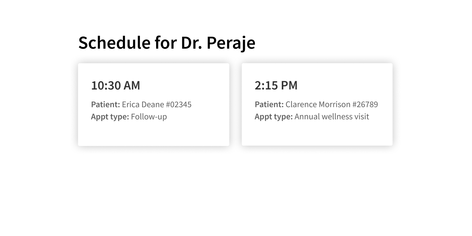
Group multiple items or concepts in a single Card.
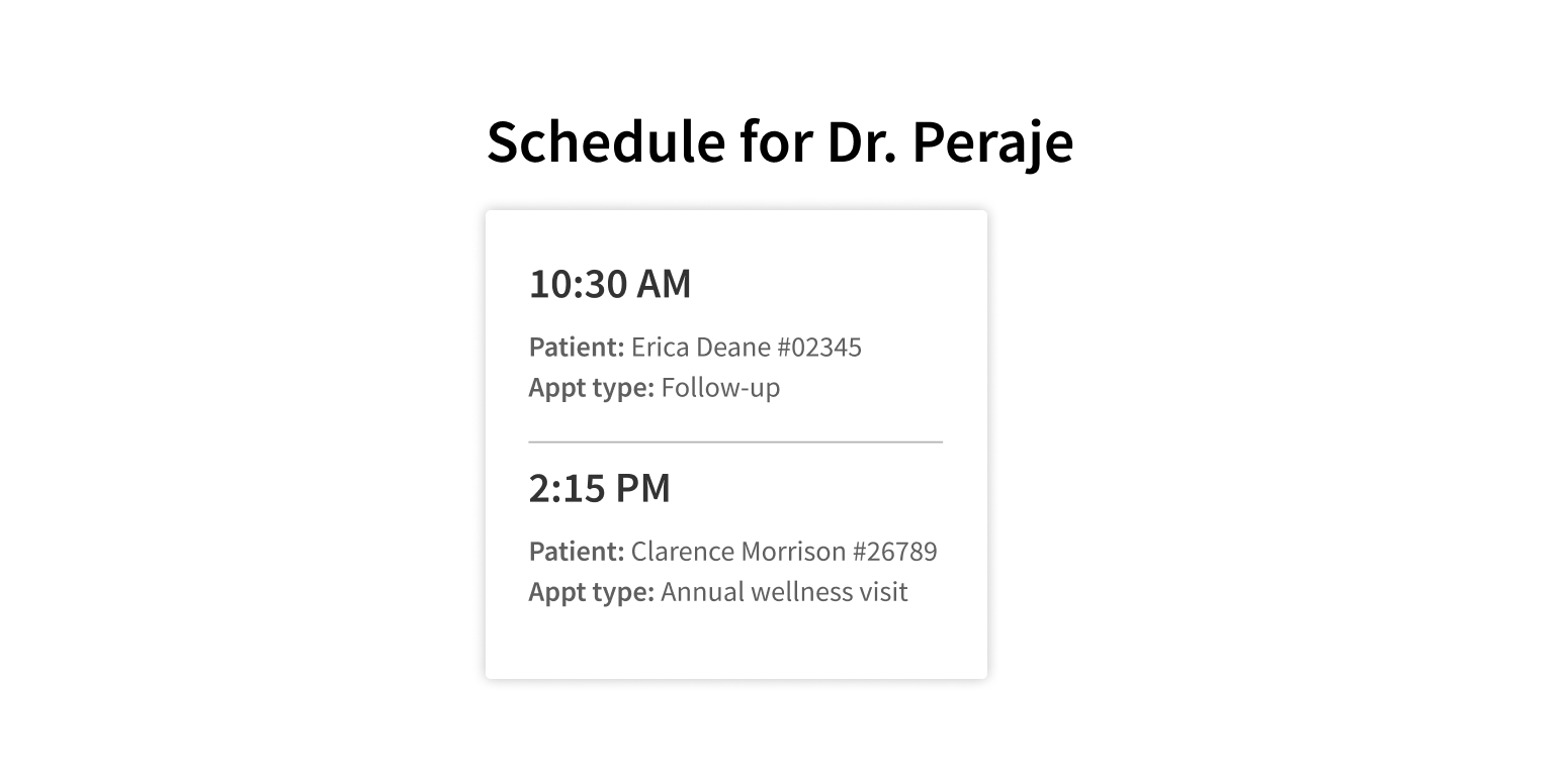
Use a different pattern to represent nested items or concepts. Don’t put a Card in a Card.
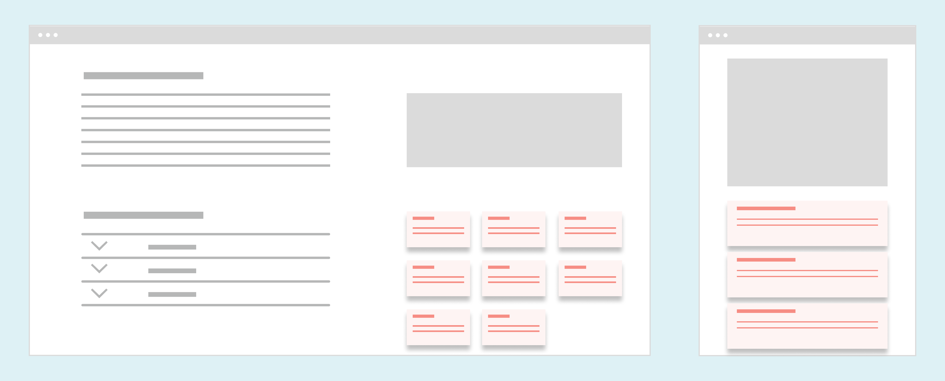
Card has several content areas, making it a very flexible component:
- Media slot: Area at the top for a visual element like an image, video, or other graphic element. This content is full width, even with Card’s default padding.
- Heading: Text that summarizes what the card represents. You can also include a heading description, which can serve as a subheading or elaborate on the heading.
- Body: The main content area. In a clickable Card, this should not contain interactive elements (because they conflict with the clickable behavior).
- Button row: Area at the bottom for buttons and links.
Clickable Cards
Card can be set to make the entire element clickable, so that Card functions as an oversized button or link. Use cases for this could include:
- Card shows the title and a short description of a web page. Users click the Card to open the page.
- A dashboard includes Cards that show summaries of different data. Users click each Card to open a separate page with more detailed data.
- A set of Cards represents a library of patient education handouts. Users click a Card to select it and add it to their saved items.
Buttons and links are the only interactive elements that should be used in a clickable Card. They should be placed in the button row so they don’t interfere with the clickable behavior.
Put buttons or links in the button row of a clickable Card.

Use other interactive elements in a clickable Card.

Style
Design details
No additional information for this component.
Placement and hierarchy
Cards are good for fluid layouts, because they tile horizontally, as well as vertically on small screens. Multiple Cards should tile from left to right in their container. When they reach the right edge, they should continue on the next row, from left to right.
The number of Cards per row varies, depending on the size of the Card and the width of the container. One Card per row is a good layout on smaller screens or in narrow containers (<760px), making it easy to scroll on mobile devices.
Content
Media options
Card has a media slot that can contain images, video, or audio:
- Images default to full width, even when Card’s default padding is applied.
- Videos shouldn’t autoplay. Include controls for basic playback features like play and pause.
- Audio (like podcasts or other recordings) shouldn’t autoplay. As with video, add playback controls.
If using different media types in the same set of Cards, use descriptive headings or some other indicator to convey the type of media each Card contains.
Text and formatting
- Use title case for Card heading text.
- Use sentence case for Card heading description text.
- Use sentence case for Card body text. Keep it short so the card doesn’t get too tall.
- Use title case for any action buttons associated with the content. Put these buttons in the button row at the bottom of the Card.
- For clickable cards, include descriptive text for screen readers to announce what clicking the Card will do (“Go to medication list”, “Book an appointment”, “Read information about type 2 diabetes”).
Demos
Coding
Developer tips
Clickable Cards
To make the entire Card clickable, supply a function to the onClick prop. This also gives the border of the Card a visual style on hover (indicating that it can be clicked) and on click (indicating that it was clicked).
Interactive elements in clickable Cards
Avoid putting interactive elements (like buttons or links) in the body of a clickable Card, because it creates a confusing user experience.
It also causes technical problems. Card works as a container for whatever content is passed as children, which renders in the Card body. Technically, you can add any valid JSX, but if you add interactive elements as children to a clickable Card, event bubbling will cause problems. When users click an element in the Card body, the event will bubble up to the parent Card component, which usually isn’t the desired behavior.
If you need to add buttons or links to your clickable Card, put them in the button row at the bottom of the Card using the buttons prop. Elements passed to the buttons prop are cloned and have event handlers for mouseenter and mouseleave events added to them. This prevents showing the Card’s hover state when hovering over these elements and triggering the onClick function when they’re activated.
If your use case absolutely requires putting interactive elements in the body of a clickable Card, you can use event.stopPropagation() on the elements’ click handlers as a workaround. To prevent click events triggered by any element passed as a child from bubbling up to the Card component, use the stopPropagation() method before the end of each interactive child's click handler:
<Card><ahref="<https://athenahealth.com>"onClick={(e) => {// All click handler code should go before the next linee.stopPropagation();}}>Go to athenahealth!</a></Card>;
Padding
By default, the padded prop is set to {true} and adds padding around all content inside Card except for mediaSlot content, which is full width. Set padded={false} to remove it.
Repository
Implementation links
Implementation details
It is strongly recommended to familiarize yourself with the Forge source code. While this documentation is a best effort to document the intent and usage of a component, sometimes some features only become clear when looking at the source code. Also, looking at Forge's source code may help identify and fix bugs in either your application or Forge itself.
Storybook files
Forge maintains at least one storybook file per component. While the primary audience for these files is typically the Forge team, these storybook files may cover usages of the component not covered by a demo. The storybook for the latest version of forge can be found at go/forge-storybook-lts.
Testing library
Forge strongly encourages using testing-library to write tests for your application.
"The more your tests resemble the way your software is used, the more confidence they can give you."
If you're having trouble testing a Forge component using testing-library, it would be a good idea to see how Forge tests its own components. For the most part, Forge tries to use screen.getByRole as much as it can, as that API provides the best feedback on a11y compliance. Forge discourages the use of document.querySelector and screen.getByTestId as both APIs encourage using implementation details to test your component, and discourage adding roles to your component.
With that being said, many of Forge's components were not built with accessibility in mind. These components do break the recommendations listed above.
Import statements
In Nimbus applications
athenaOne serves the Forge bundle independently from your application's bundle. Importing Forge components directly from '@athena/forge' takes advantage of this feature.
import { Card } from '@athena/forge'
In standalone applications
Importing components using the exact path to the module takes advantage of webpack's tree shaking feature. Webpack will include only that module and its dependencies.
import Card from '@athena/forge/Card';
To use this import guidance, Typescript applications must use typescript >= 4.7.3, and should add this setting to their tsconfig.json file:
{"compilerOptions": {"moduleResolution": "Node16",}}
If this setting doesn't work for your application, use this import statement instead:
import Card from '@athena/forge/dist/Card';