Signpost
A helpful message that can be placed at the page or section level.
The Basics
What it is
Signpost is a non-blocking message that shares helpful information or guides users through a process. It isn’t used for alerts or error messages, and it can’t be dismissed.
How it works
- Signpost appears inline (not overlapping any content) on page load near the element or page section it’s related to.
- It contains text and can feature an image or icon to reinforce the text’s message.
- Signpost can also include a link, usually to a page where users can learn more.
- It can’t be closed or dismissed.
When to use
- To temporarily call attention to a new feature or updated section
- To share helpful tips and tricks that guide users through an unfamiliar workflow
- To highlight “good to know” information on infrequently used pages
- To tell users something that isn’t important enough for an alert
When not to use
- For alerts, because Signpost isn’t meant for urgent messages
- As an easy way to style content areas on a web page, when a simple
<div>would work - On frequently used pages like a dashboard or inbox, because Signpost is less effective after the first time users see it
What to use instead
Use Banner for alerts at the page or section level.
Use InlineAlert for low-level alerts that are embedded in the content.
Use Tooltip for optional, helpful information that doesn’t take up space on the page.
How to use
Signpost contains extra information that helps users complete a task or provides context. Signpost is not for alerts or error messages.
Use Signpost for information that helps users.
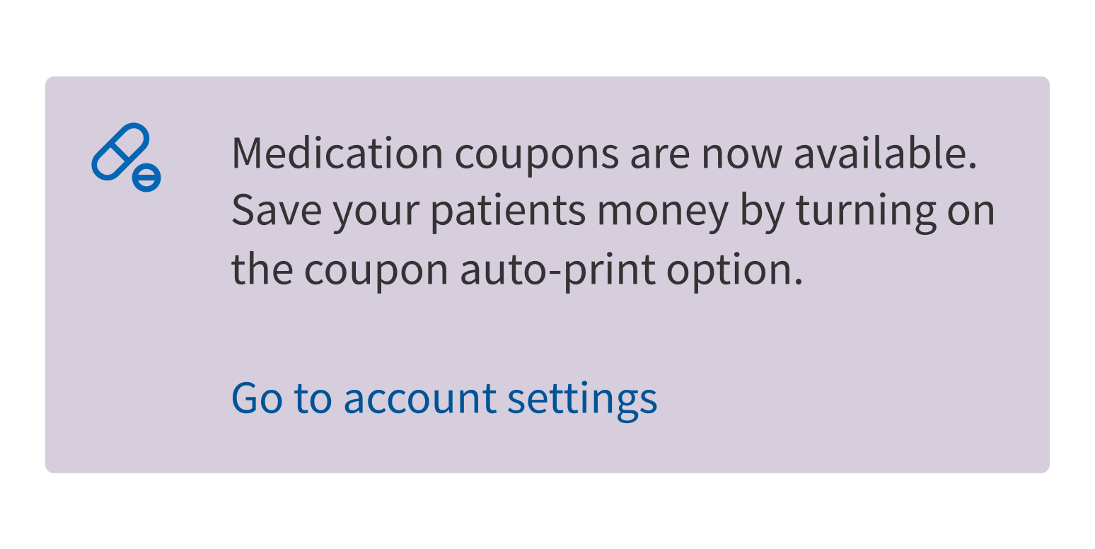
Use it for time-sensitive alerts.
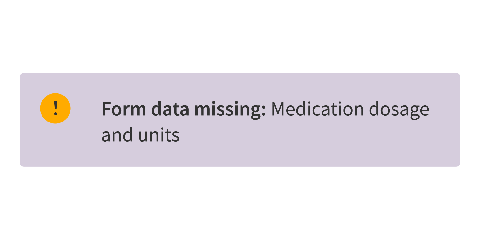
Signpost’s large, colorful layout gives it a lot of visual weight. This makes it good for guiding users through an onboarding flow or calling attention to new features, but it also means that it should be used infrequently or displayed for only a limited time (like the first week after a new feature is released).
Signpost has 3 content areas:
- Media slot (optional): Displays an icon, illustration, or image to the left of the text
- Content: Displays Signpost’s main message
- Link (optional): Displays a link at the bottom of Signpost for additional information or resources
Style
Design details
By default, Signpost has 24px padding, which can be turned off.
Placement and hierarchy
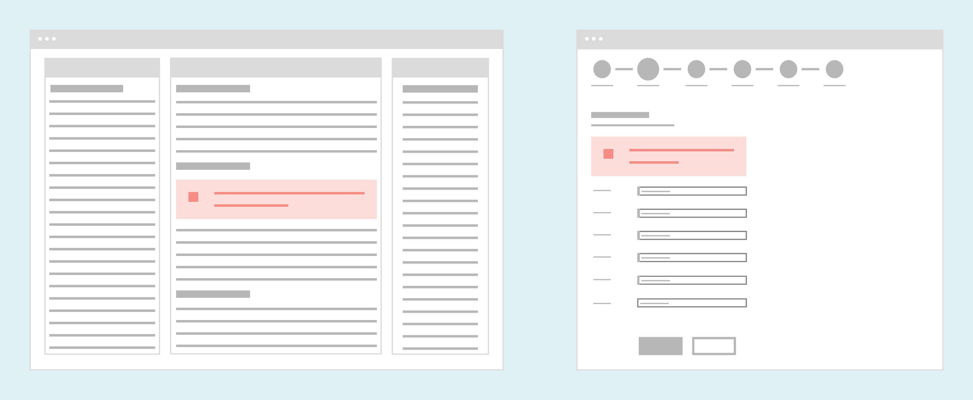
A page-level Signpost sits below the global navigation at the top of the page and header, but not above any left-hand sidebar. Signpost resizes fluidly with the page body area.
A section-level Signpost sits at the top of the relevant section’s content, below the heading, and spans the full width of the parent container.
Content
Signpost calls attention to helpful information or displays encouraging messages about using new features. It should be friendly and informative. Signpost is not meant for workflow instructions. If your Signposts explain a workflow, consider adjusting the design or copy to make the workflow more intuitive.
Use Signpost for helpful tips and tricks.
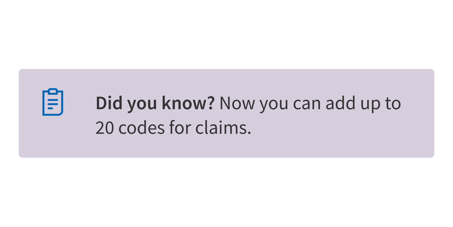
Use it for instructions that should be part of the page.
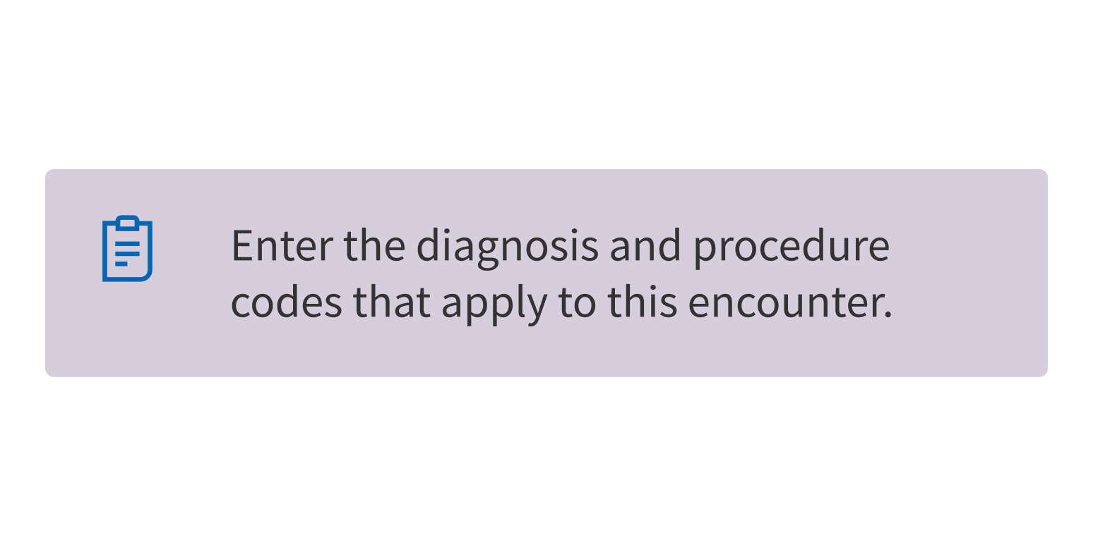
Media options
Signpost’s media slot can contain an icon, illustration, or image:
- Icons are preferred. They’re small, visually consistent, and easy to access in the Forge icon library. Don’t use the solid-color alert icons (Info, Success, Attention, and Critical) in Signpost; these are used by Banner, which is better for alerts.
- Illustrations should be simple, because they’ll be scaled down to fit in a small space. For visual consistency, use Forge’s secondary palette.
- Images should be as small as possible. There is no size limit, and Signpost expands to fit the image.
Text and formatting
- Use sentence case for the content area.
- Signpost doesn’t include a built-in heading, but you can add one, if necessary. Signpost’s content allows for custom markup, including formatting that can style text as a heading. Use title case for headings (“New Visit Notes”, not “New visit notes”).
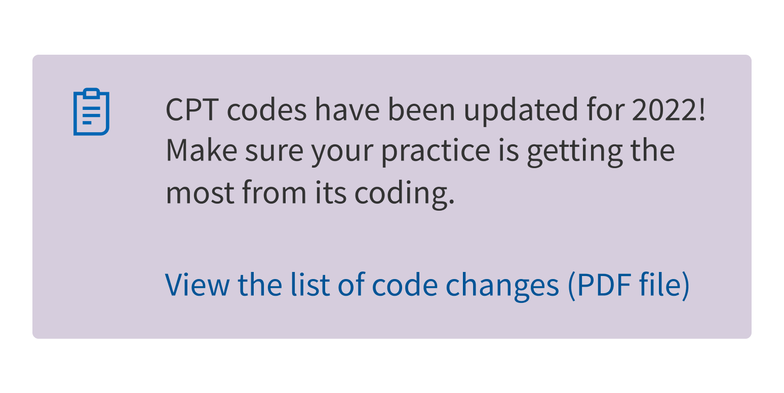
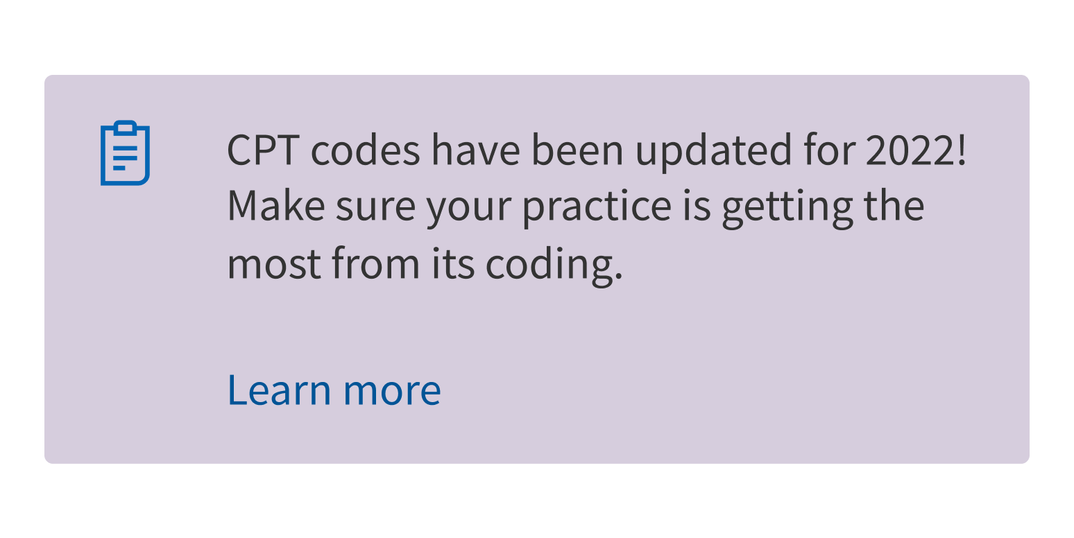
- Use sentence case for the (optional) link. The link should take users to a separate page with additional information. Link text should state what the link opens, especially if it’s an external website or a new application.
Use clear, specific link text.
Use vague or unclear link text.
Demos
Coding
Developer tips
Optional link
Signpost can include a link at the bottom of its content. Use the link prop and provide the full HTML <a> tag, as in this example:
link={<a href="https://www.cms.gov/medicare/cms-forms/cms-forms">Full list of CMS forms</a>}
Repository
Implementation links
Signpost directory in Bitbucket
Implementation details
It is strongly recommended to familiarize yourself with the Forge source code. While this documentation is a best effort to document the intent and usage of a component, sometimes some features only become clear when looking at the source code. Also, looking at Forge's source code may help identify and fix bugs in either your application or Forge itself.
Storybook files
Forge maintains at least one storybook file per component. While the primary audience for these files is typically the Forge team, these storybook files may cover usages of the component not covered by a demo. The storybook for the latest version of forge can be found at go/forge-storybook-lts.
Testing library
Forge strongly encourages using testing-library to write tests for your application.
"The more your tests resemble the way your software is used, the more confidence they can give you."
If you're having trouble testing a Forge component using testing-library, it would be a good idea to see how Forge tests its own components. For the most part, Forge tries to use screen.getByRole as much as it can, as that API provides the best feedback on a11y compliance. Forge discourages the use of document.querySelector and screen.getByTestId as both APIs encourage using implementation details to test your component, and discourage adding roles to your component.
With that being said, many of Forge's components were not built with accessibility in mind. These components do break the recommendations listed above.
Import statements
In Nimbus applications
athenaOne serves the Forge bundle independently from your application's bundle. Importing Forge components directly from '@athena/forge' takes advantage of this feature.
import { Signpost } from '@athena/forge'
In standalone applications
Importing components using the exact path to the module takes advantage of webpack's tree shaking feature. Webpack will include only that module and its dependencies.
import Signpost from '@athena/forge/Signpost';
To use this import guidance, Typescript applications must use typescript >= 4.7.3, and should add this setting to their tsconfig.json file:
{"compilerOptions": {"moduleResolution": "Node16",}}
If this setting doesn't work for your application, use this import statement instead:
import Signpost from '@athena/forge/dist/Signpost';