Icon
A visual symbol that represents a common item, concept, or action to communicate or reinforce meaning for users.
The Basics
What it is
Looking for the full list of Icons? See it here, in the Demos.
Icons are the small graphic elements that most apps and web pages use to quickly convey meaning or add context to interfaces. Used on their own (as in a toolbar or bottom nav, for example), Icons can fit several actions in a small area. When used with a Button, link, or other component, Icons help set and reinforce user expectations.
How it works
- By default, Icon is only minimally interactive. The user can hover over it to display a tiny popup containing the Icon’s name (the native browser
<title>tag). - Icon’s default color is blue. When the Icon is disabled, it’s gray.
- Icon can be interactive when:
When to use
- To convey information in small spaces where extra text doesn’t fit, like Table cells
- To add a visual element that helps users understand copy quickly
- To visually differentiate items in a list
- To trigger an action like print or close (when used with Button)
When not to use
- Just to make a page more visually appealing; Icons are for context, not decoration
- For large sections where an illustration or image would work better (Forge icons are designed for display at specific sizes and are too small for a large container)
- For uses that aren’t aligned with the Icon’s definition, like using the ModalPopup Icon to represent a copy action (see the Icon Table for Icon names and meanings)
What to use instead
Use Button with text if users won’t understand an action from just an Icon.
Use ComboButton to group related Buttons that use Icons.
Use StatusTag for text-based statuses.
How to use
Icons add visual cues to web page text, making it easier to scan. Their consistent aesthetics also strengthen brand identity. However, Icons can add visual complexity to a page without improving usability. A Button or link with clear label text doesn’t need an Icon to communicate the action or destination.
When considering using Icons in your design:
- Ask yourself which communication is better for users: an Icon or text? If it takes more than a few seconds to think of the right Icon for your use case, you probably shouldn’t use one.
- If you decide to use an Icon, look for it in the Forge Icon set. Can’t find it? You might not need one. Don’t try to force it with an Icon that isn’t designed for your use case.
- If you still want to use an Icon but can’t find the one you need, reach out to the Forge team for guidance (or help creating a new one).
If using Icons for items in a collection (like a List or Menu), apply them consistently to all items in the list or section.
If using Icons, apply them to all items in the list or section.
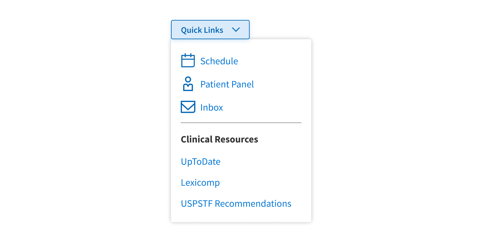
Apply Icons to just some of the items in the list or section.
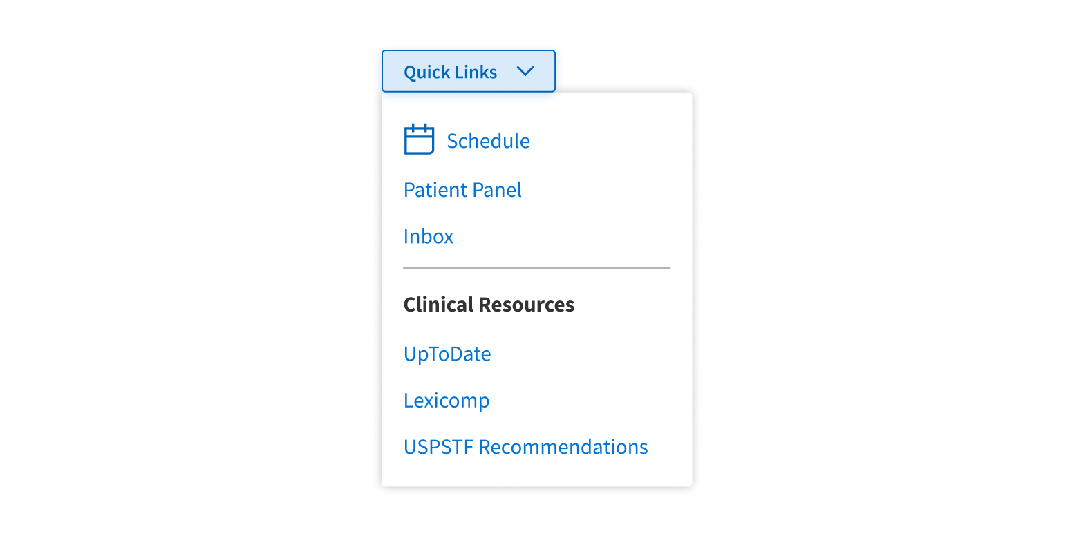
Icons as Buttons or links
Icons can be set to function as a Button or a link when clicked, as in a mini toolbar of actions represented by just Icons. For this use case, use an Icon-only tertiary Button. It includes all of Button’s interactive states and can be set to act as a button or a link, which is important for accessibility and semantically correct HTML.
The one limitation of this approach is that it removes Icon’s ability to display the Icon name on hover. If users might not know what your interactive Icon does, add a Tooltip.
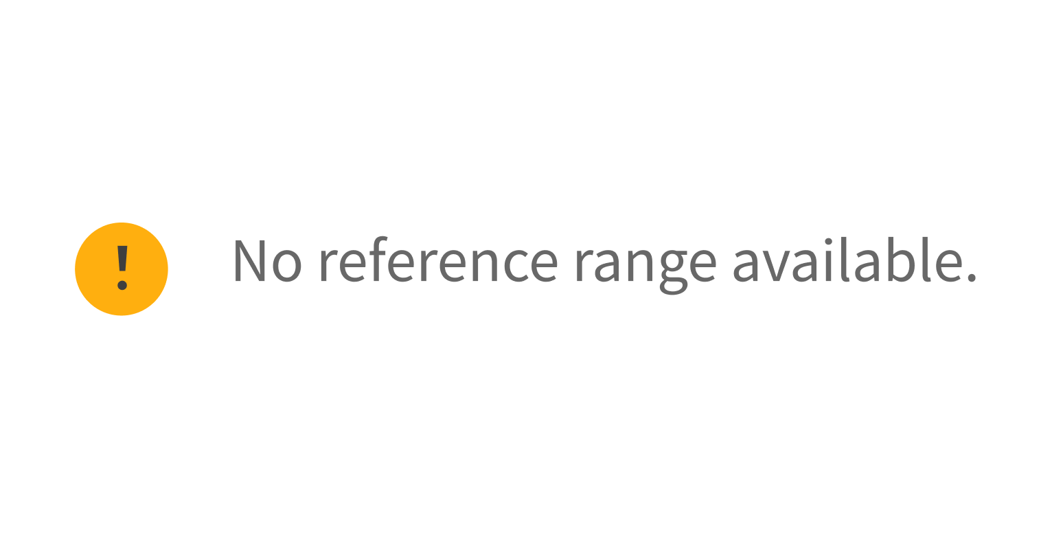
Alert Icons
There are 4 Forge Icons that are designated for alerts:
- Info
- Success
- Attention
- Critical
These Icons are styled differently from the others, with fill colors that correspond to the Forge alert types. They’re built into many of our alert components, like Banner and Toast.
- The Success, Attention, and Critical Icons can be used on their own, outside of components where they’re built in, but only for alert messaging.
- The Info Icon can also be used to trigger a Tooltip on hover. It’s often placed to the right of form labels, to explain what the form field is for.
Use a Forge alert Icon for alert messaging.
Use the Success, Attention, or Critical Icons for anything else.
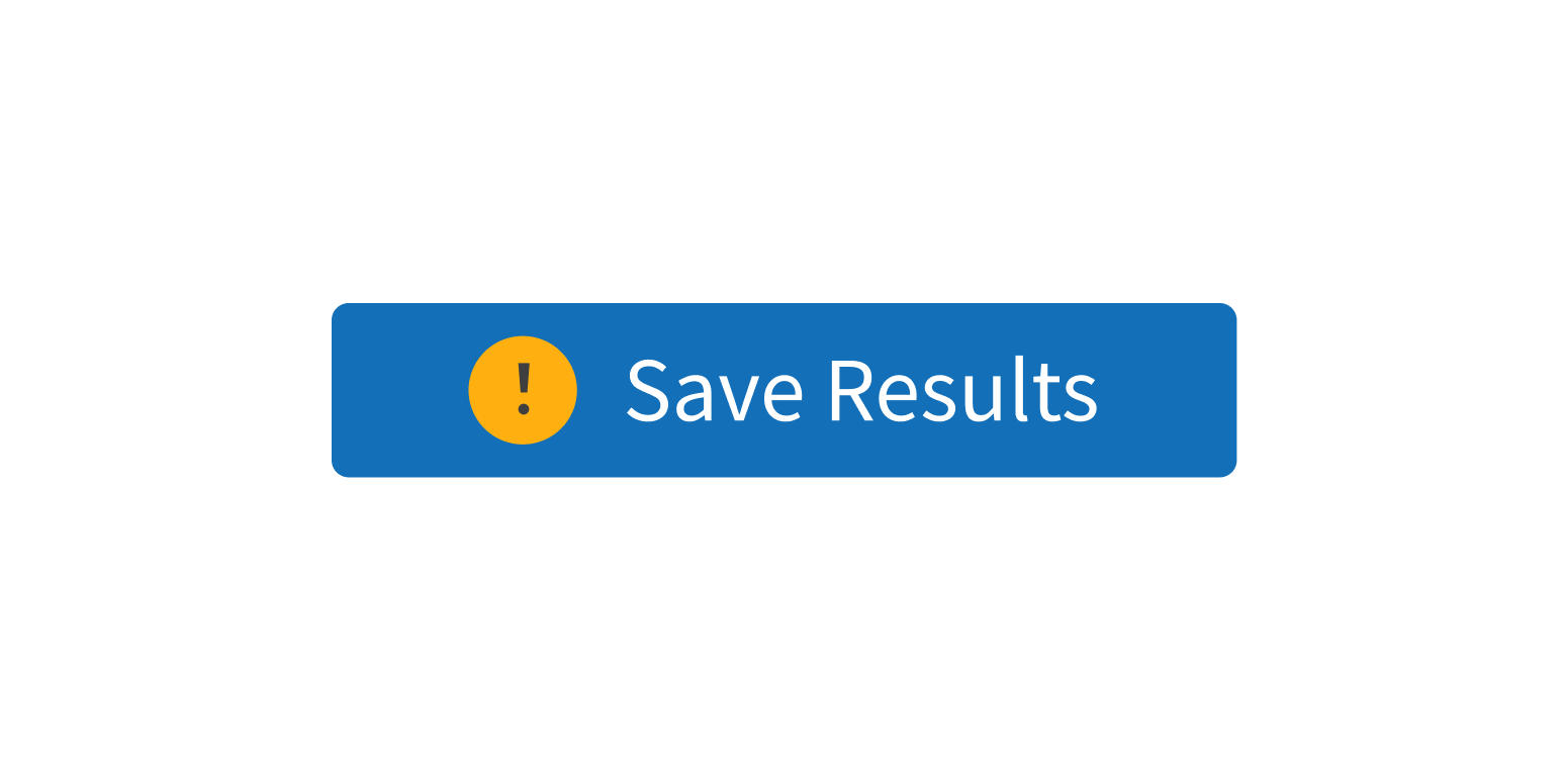
Using Icon without text
Many Icons have meanings that are commonly understood (like the Home icon for a home page), but some Icons that seem familiar can actually convey different meanings in different apps (think of a Heart or Star icon). For this reason, we strongly recommend using most Forge Icons with a descriptive text element, like Button label copy or a Menu item name.
If using a standalone Icon that users might not understand right away, consider these points:
- By default, on hover, every Icon displays the Icon’s name in a tiny popup (the native browser
<title>tag). This text can be customized for your use case. Note that users typically need to hover for a moment before the popup appears. - For instant feedback on hover, add a Tooltip to your Icon. The Tooltip should communicate either the Icon name or, for a Button or link, the action or destination. Use this approach for Icon-only Buttons, which don’t have the
<title>hover behavior built in.
See the Icon Table for guidelines about which Forge Icons can be used without text.
Pair Icons with descriptive text if their meaning may be unclear.
Use potentially unclear Icons without text.
Icon index with descriptions
This table lists the full set of Forge Icons and key information for using them:
- Component Name is the keyword to set the icon in the code.
- Description is the icon’s meaning or intended use.
- Label Required? indicates whether the icon can be used on its own without any text. These are Forge best practices and are not enforced by the code.
- Yes: Always use text with this icon. The meaning might be unclear, the icon might not be commonly used, or it might be unique to Forge.
- Maybe: Text is recommended for this icon. It’s commonly used but not always understood. If there’s no room for text, consider adding a Tooltip that states the icon’s purpose.
- No: This icon doesn’t need text (though it might still be helpful). It’s commonly used and easily understood on its own.
Style
Design details
Forge Icons vary in height and width, but each occupies a 24px square container for consistent spacing and layout. Place Icons at least 12px above or to the left of their label or associated content.
Placement and hierarchy
No additional information for this component.
Content
Use title case for any text that accompanies an Icon (“Add Diagnosis”, not “Add diagnosis”).
By default, users can hover over Icon and see a tiny popup with the Icon’s name. This is the native browser <title> tag. It can be edited to suit your use case (like changing the generic title “Document” to “Consult Note”). Use title case (“Print File”, not “Print file”). If your use case requires that the title not appear, you can set it to blank.
For an Icon-only Button with a Tooltip, use the same content you would use for the Button itself. Start with a verb and use title case.
Demos
Coding
Developer tips
The icon prop is required and takes a string with the Icon’s name. Icon names are case sensitive. See the Icon Table for icon names.
The Icon Table’s Label Required? column indicates which Icons should have descriptive text (because their meaning isn’t always clear enough for the Icon to stand alone, without text). This isn’t enforced in code. This is UX guidance and relies on teams to design and build with these recommendations in mind.
To resize an Icon, specify both the width and height props. Both props should be the same number to correctly resize the icon. If they don’t match, or if only one is specified, the Icon will just have its white space expanded instead.
When using Icon in another component, check whether the component has a prop for setting an Icon. Some Forge components (like Button) have an Icon option built in, so you don’t have to pass an Icon in as children.
Repository
Implementation links
Implementation details
It is strongly recommended to familiarize yourself with the Forge source code. While this documentation is a best effort to document the intent and usage of a component, sometimes some features only become clear when looking at the source code. Also, looking at Forge's source code may help identify and fix bugs in either your application or Forge itself.
Storybook files
Forge maintains at least one storybook file per component. While the primary audience for these files is typically the Forge team, these storybook files may cover usages of the component not covered by a demo. The storybook for the latest version of forge can be found at go/forge-storybook-lts.
Testing library
Forge strongly encourages using testing-library to write tests for your application.
"The more your tests resemble the way your software is used, the more confidence they can give you."
If you're having trouble testing a Forge component using testing-library, it would be a good idea to see how Forge tests its own components. For the most part, Forge tries to use screen.getByRole as much as it can, as that API provides the best feedback on a11y compliance. Forge discourages the use of document.querySelector and screen.getByTestId as both APIs encourage using implementation details to test your component, and discourage adding roles to your component.
With that being said, many of Forge's components were not built with accessibility in mind. These components do break the recommendations listed above.
Import statements
In Nimbus applications
athenaOne serves the Forge bundle independently from your application's bundle. Importing Forge components directly from '@athena/forge' takes advantage of this feature.
import { Icon } from '@athena/forge'
In standalone applications
Importing components using the exact path to the module takes advantage of webpack's tree shaking feature. Webpack will include only that module and its dependencies.
import Icon from '@athena/forge/Icon';
To use this import guidance, Typescript applications must use typescript >= 4.7.3, and should add this setting to their tsconfig.json file:
{"compilerOptions": {"moduleResolution": "Node16",}}
If this setting doesn't work for your application, use this import statement instead:
import Icon from '@athena/forge/dist/Icon';