Table
A structure that organizes and displays data in a sortable grid.
The Basics
What it is
Table structures and presents related data points in a sortable grid layout for quick comparison and analysis.
How it works
- Table appears on page load by default. Larger data sets can load progressively to reduce download time.
- Hovering on a row highlights it with a gray background color, to help the user scan across the Table.
- If the Table has sortable columns, those column headers have arrow icons for sorting. The user can click the sorting icons (or focus and press the Enter key or Space bar) to reorder the column data in ascending or descending order.
- If any rows are expandable, the user can click (or focus and press the Enter key or Space bar) the row’s expand control to show/hide an additional row below it. This functionality is not built in and requires additional code.
When to use
- To organize and display structured information
- To help users find and compare data points
When not to use
- For simple image- or text-based lists that don’t need as much structure
What to use instead
Use List to show simple data sets with less structure.
Use Card to display related items in a more visual layout.
How to use
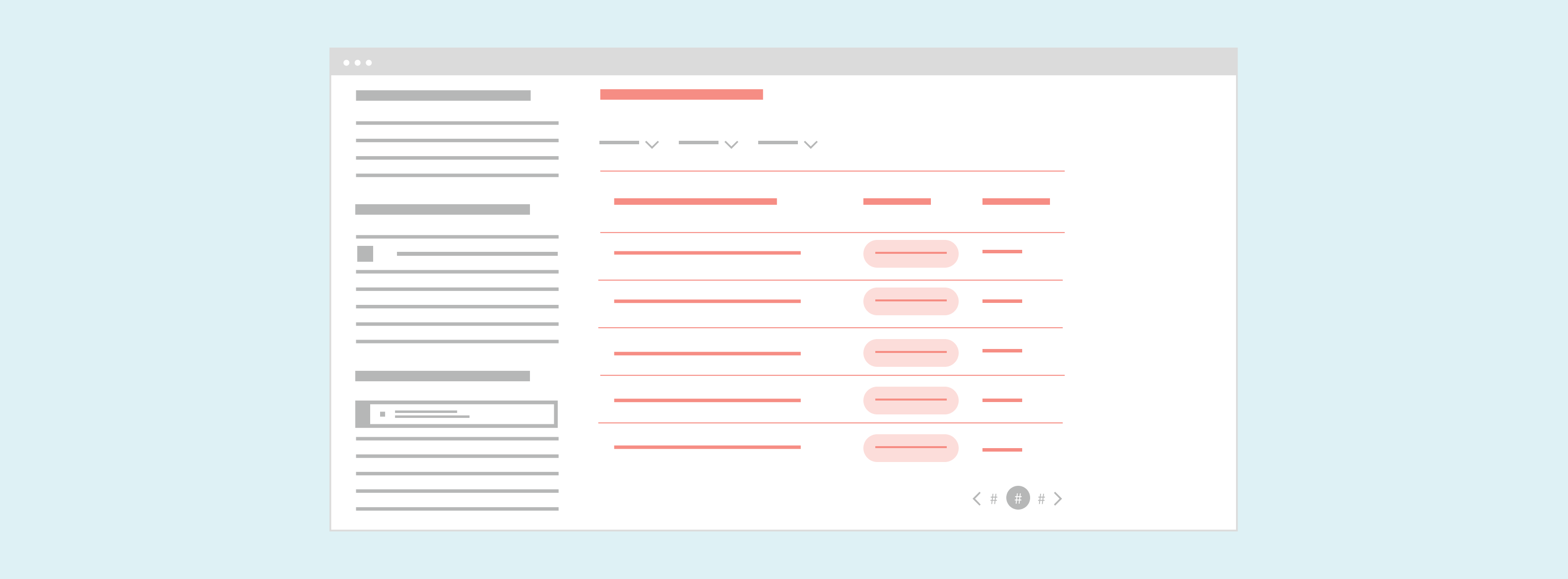
Table consists of 3 elements:
- Column headers are the descriptive titles that appear at the top of each column. Display your columns from left to right in a meaningful order, such as by importance or alphabetically. The first column should contain a unique identifier for each row (e.g., "Name" or "ID" in a table of patients) so users can scan data easily, even after it’s been sorted or filtered.
- Data columns are the table’s vertical sections. Each column displays data that corresponds to its column header. By default, text is left-aligned, and numbers are right-aligned for easier comparison.
- Data rows are the horizontal sections that span the data columns. Each row contains one unique set of data points.
Options
- Layout: Table offers 2 layout settings:
- Medium (default) is suitable for most tables.
- Compact is best for dense data sets with a lot of numbers, like a table of recent transactions.
- Sorting: Sorting can be enabled for individual columns. This lets users change the order of values in that column (e.g., sorting payment amounts from smallest to largest). This reorders all rows in the Table. The default sorting order is ascending and descending. You can also build custom handling for more complex data points (such as height, split into feet and inches).
- Row hover state: By default, Table includes a row hover state, which highlights the entire row when users hover over any part of it. This can be turned off.
Large data sets
Tables with large data sets (500+ items) can hinder page performance and usability. If your use case features a large data set, you can:
- Build filters and search functionality to help users reduce the data in view (usually with Multiselect, SingleSelect, RadioButton, or CheckboxButton)
- Paginate the Table content, breaking it into manageable chunks that users can navigate with Paginator
- Enable infinite scrolling, so that additional data loads when users scroll to the bottom of the Table
Your team must design and implement these options.
Expandable detail rows
Your Table design might need to make additional details available in the context of the table but not display these details by default (to reduce clutter). We recommend putting them in a hidden or collapsed row directly below the visible data row they correspond to.
Include a control for users to show or expand the row. A tertiary Button is best, with dynamic text (like “Show Details”/“Hide Details” or the Expand and Collapse Icons). The control should indicate what will happen when it’s used, like “Show Details” or the Expand icon while the extra row is hidden, and “Hide Details” or the Collapse icon while the row is visible. See the Expanding Detail Row demo in the Demos section for an example.
This functionality isn’t built in. Your team must design and implement show/hide behavior and the control.
Style
Design details
Table’s column widths are typically determined by the longest string in each column, which makes columns widths vary. This makes it easier for users to scan the Table, because it reduces extra white space in Table cells and shows data points closer together.
By default, Table’s width is the sum of its column widths. The Table width can be set to a specific size, but it shouldn’t be too wide, because this can add white space between data points that makes it harder to scan the Table. For this reason, don’t set small Tables to span the full width of a page.
Row height is set by the layout option:
- Medium (default): 36px row height
- Compact: 24px row height
Placement and hierarchy
When used, filters should be placed above or to the left of Table. Paginator should be placed below Table.
Content
Table doesn’t have a title built into its header. Add a title immediately above your Table to introduce its contents (e.g., “Today’s Schedule”, “Claims to Process”). We recommend a section- or subsection-level Heading. Use title case for this heading (“Today’s Schedule”, not “Today’s schedule”).
Use title case for column headers (“Date of Service”, not “Date of service”). Column headers are automatically displayed in bold. To avoid text wrapping:
- Keep column header text short. Leave out information that’s obvious from the context or the Table title. For example, if the Table title is “Patients”, use “Name” as a column header, not “Patient Name”.
- Use Table’s built-in option for forcing the column header text onto a single line. With this setting enabled, header text is automatically truncated with an ellipsis when the column width is smaller than the width of the header text.
Demos
Coding
Developer tips
The Table component is based on Reactabular's core reactabular-table package. Forge leverages third-party libraries when possible, while still achieving Forge design standards and presenting a unified API. Only the functionality described in the Forge documentation is officially supported for this component, even if an underlying third-party API can still be used.
Columns and rows
For the best Table experience, the most important props to get right are:
- The
columnsprop, where you define each column of the Table. This prop is an array of objects, where each object contains information likekey,displayName, and other properties for that specific column. For example, it’s important that columns meant to be sorted have theirsortableprop set to{true}. - The
rowsprop, which is the data set that populates the Table. It’s structured as an array, where one item in the array corresponds to one row in the table. Each item in therowsarray must contain keys whose values map to thekeyvalues in thecolumnsprop. Otherwise, the row data can’t be mapped to its correct columns. For example, if thecolumnsprop defines 2 columns with the keysfirstnameandlastname, then each item in therowsarray should have afirstnamekey and alastnamekey.
Templates
Columns can use a function to transform data for presentation purposes. For example, the function could turn entries into a link, add a currency symbol, or assign specific formatting.
Supply a function that returns a string or a React element to the template property in the data column definition object that gets passed to Table’s columns prop. This is a thin wrapper around Reactabular's formatter. See the Custom Sorting and Templates demo in the Demos section for an example.
Sorting
Enable simple ascending/descending sorting by passing {true} to the sortable property in the data column definition object that gets passed to Table’s columns prop. This should be set for each sortable column.
For more complex sorting, columns can define a reducer function to sort data in a custom order. The reducer function takes a complex row value and reduces it to a number or string for the column to sort on instead. For example, the function could combine multiple values in complex data to a single value for sorting (like height, split into feet and inches).
To apply this, set the sortable property in the columns prop’s data column definition to an object with a property reducer that takes the function. See the Custom Sorting and Templates demo in the Demos section for an example.
Table rendering
Unlike other components, Table re-renders only when the rows prop is changed. If you need Table to re-render on other attributes, you can override the Table’s shouldComponentUpdate prop. See the Reactabular documentation for more details.
Repository
Implementation links
Implementation details
It is strongly recommended to familiarize yourself with the Forge source code. While this documentation is a best effort to document the intent and usage of a component, sometimes some features only become clear when looking at the source code. Also, looking at Forge's source code may help identify and fix bugs in either your application or Forge itself.
Storybook files
Forge maintains at least one storybook file per component. While the primary audience for these files is typically the Forge team, these storybook files may cover usages of the component not covered by a demo. The storybook for the latest version of forge can be found at go/forge-storybook-lts.
Testing library
Forge strongly encourages using testing-library to write tests for your application.
"The more your tests resemble the way your software is used, the more confidence they can give you."
If you're having trouble testing a Forge component using testing-library, it would be a good idea to see how Forge tests its own components. For the most part, Forge tries to use screen.getByRole as much as it can, as that API provides the best feedback on a11y compliance. Forge discourages the use of document.querySelector and screen.getByTestId as both APIs encourage using implementation details to test your component, and discourage adding roles to your component.
With that being said, many of Forge's components were not built with accessibility in mind. These components do break the recommendations listed above.
Import statements
In Nimbus applications
athenaOne serves the Forge bundle independently from your application's bundle. Importing Forge components directly from '@athena/forge' takes advantage of this feature.
import { Table } from '@athena/forge'
In standalone applications
Importing components using the exact path to the module takes advantage of webpack's tree shaking feature. Webpack will include only that module and its dependencies.
import Table from '@athena/forge/Table';
To use this import guidance, Typescript applications must use typescript >= 4.7.3, and should add this setting to their tsconfig.json file:
{"compilerOptions": {"moduleResolution": "Node16",}}
If this setting doesn't work for your application, use this import statement instead:
import Table from '@athena/forge/dist/Table';