Menu
A dropdown list where users select an action or value.
The Basics
What it is
Menu enables users to select an action or value from a predefined list. It’s opened by clicking a separate trigger element, and it can contain titles, icons, and dividers.
How it works
- The user triggers Menu by clicking an element on the page, usually another Forge component like ComboButton, Button, or MenuTrigger (see Demos for an example of MenuTrigger).
- Menu opens below the trigger element, displaying the actions or values as Menu items.
- When the user hovers over a Menu item, the Menu item is highlighted.
- When the user clicks the Menu item, the action is triggered or the value is applied.
- To close Menu without selecting an option, the user can click anywhere outside the dropdown.
When to use
- To ask users to select an action or value from a list, like navigation links or filter values
When not to use
- For a short list of actions or values that can appear directly on the page, reducing the number of clicks
- For a long list of actions or values (e.g., a list of all possible actions) that would be difficult to navigate in a dropdown
What to use instead
Use ComboButton for short lists of related actions (can contain Menu).
Use Button for single or unrelated actions.
Use Select to ask users to select an option in a form.
How to use
Using Menu for navigation
Menu can be used to list navigation options, like links that open different web pages or jump to sections of the current page. Navigation elements in the page header or footer often trigger Menu.
If your Menu includes links to both other athenaOne pages and other websites (like reference websites for diagnosis codes), make sure that users can tell the difference between internal athenaOne links and external links. Consider displaying external links as a group, with a divider and title for visual separation.
Using Menu for actions or values
Menu items can be:
- Actions like Download, Share, and Print
- Values that trigger actions, like sort order options: A to Z, Most Popular, and Oldest First
Menu is often used to display options that are relevant in the given web page or to a specific element. For example, on a page that shows an imaging report, Menu might be used to display the actions that users can take on that report (Print, Email, Annotate).
If Menu items are actions, make sure that none of them are primary actions or are required to complete the workflow, because users can’t see these actions unless they trigger the Menu.
Titles and dividers
Menu can include non-clickable titles and dividers to help label and group the Menu items. This is helpful for clustering related items (like editing options and sharing options) and separating actions that you don’t want users to click accidentally (like Delete).
Style
Design details
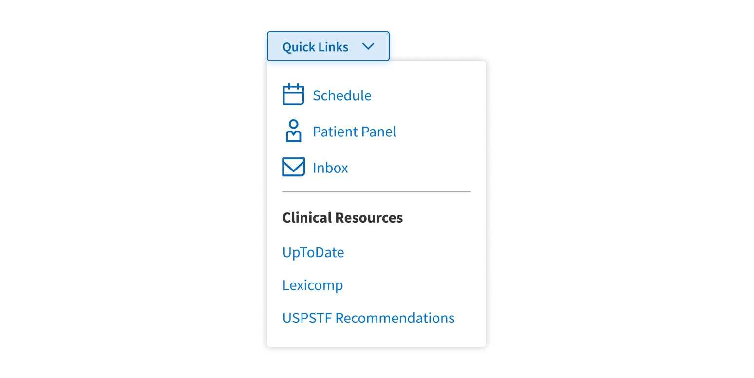
Menu is a small rectangular popover that displays a list of Menu items (text only or text with icons). Non-clickable titles and dividers help label and group items visually.
Menu opens below the trigger element, with its left side aligned with the left side of the trigger. There’s no vertical space between Menu and its trigger. Menu overlays and obscures any content below the trigger.
Placement and hierarchy
No additional information for this component.
Content
Trigger element
If Menu is triggered by an element with visible text (such as ComboButton, Button, or MenuTrigger – see Demos for an example of MenuTrigger), use title case for this text (“More Options”, not “More options”).
Label
Menu has a label, which is separate from any text in the trigger element.
- Displaying the label is optional. It appears above the trigger element.
- Even if you don’t display the label, it’s still required for accessibility reasons. Include label text in your design so developers can implement it in the code.
The label should complement the trigger element and describe the Menu content:
- Trigger element text is “Jump to page...”, and label text is “Navigation”.
- Trigger element text is “Select Filter”, and label text is “Filter Options”.
Menu items
If the Menu items represent:
- Actions, their text should convey what will happen when users select the item
- Values, their text should be the name of the value
Use title case for Menu item text (“Print File”, not “Print file”). Keep it short: item text doesn’t wrap or truncate automatically, so a very long Menu item could expand the Menu’s width past the edge of the window. Menu item text can include formatting and styling.
Menu items can include an icon to the left of the text. Make sure to use Forge icons according to their prescribed usage. If using icons, apply them to all Menu items in the list (or section, if you’re using dividers).
If using icons, apply them to all Menu items in the list or section.
Apply icons to just some of the Menu items in the list or section.
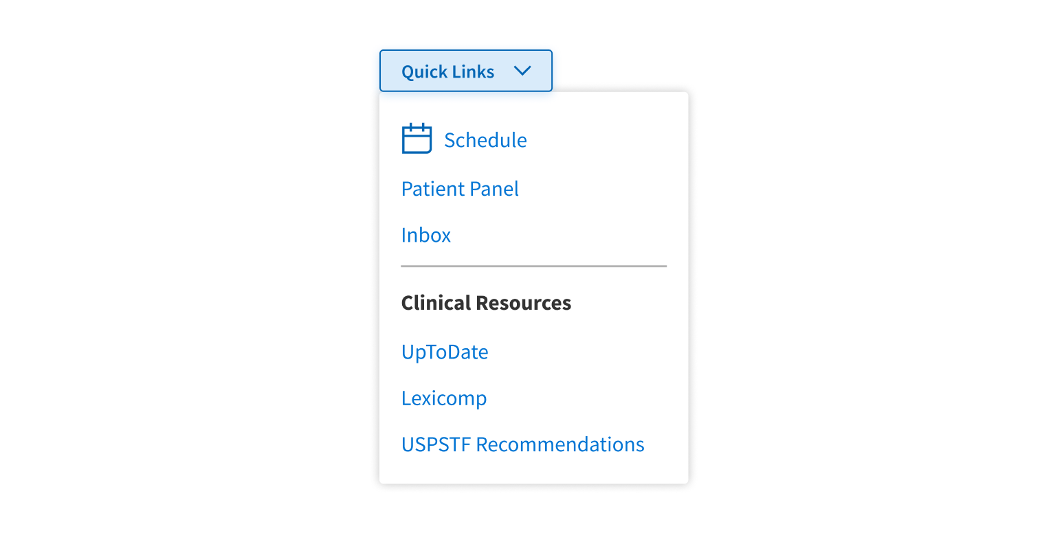
Demos
Coding
Developer tips
Menu trigger element
Menu can be triggered by any element that can be clicked, like a link, ComboButton, Button, or other Forge component. Set the code for this element as the value for Menu’s trigger prop. Clicking the element opens the Menu, and clicking anywhere outside the expanded Menu hides the Menu again.
A typical trigger is the subcomponent MenuTrigger (see Props tables), which is implemented by LabelButton (documented in ComboButton’s Props tables) but with special class names passed on to it. See the Demos for an example of how to use MenuTrigger.
Known issue
Menu’s size prop overrides the size prop of any component passed in by Menu’s trigger prop.
Menu items
Each item in the dropdown is a MenuItem (see Props tables), a subcomponent that’s a light wrapper around <hr> (horizontal break) or <span> elements.
Label
Menu has a label (the label prop), which is separate from any text in the trigger element and appears above the trigger element. The label is required for accessibility reasons, but displaying it is optional. If the design doesn’t show a label above the trigger element, treat the label as hidden. Use the hideLabel prop to hide it, and work with the designer to make sure that label is set with an appropriate value.
Repository
Implementation links
MenuItem directory in Bitbucket
MenuTrigger directory in Bitbucket
Implementation details
It is strongly recommended to familiarize yourself with the Forge source code. While this documentation is a best effort to document the intent and usage of a component, sometimes some features only become clear when looking at the source code. Also, looking at Forge's source code may help identify and fix bugs in either your application or Forge itself.
Storybook files
Forge maintains at least one storybook file per component. While the primary audience for these files is typically the Forge team, these storybook files may cover usages of the component not covered by a demo. The storybook for the latest version of forge can be found at go/forge-storybook-lts.
Testing library
Forge strongly encourages using testing-library to write tests for your application.
"The more your tests resemble the way your software is used, the more confidence they can give you."
If you're having trouble testing a Forge component using testing-library, it would be a good idea to see how Forge tests its own components. For the most part, Forge tries to use screen.getByRole as much as it can, as that API provides the best feedback on a11y compliance. Forge discourages the use of document.querySelector and screen.getByTestId as both APIs encourage using implementation details to test your component, and discourage adding roles to your component.
With that being said, many of Forge's components were not built with accessibility in mind. These components do break the recommendations listed above.
Import statements
In Nimbus applications
athenaOne serves the Forge bundle independently from your application's bundle. Importing Forge components directly from '@athena/forge' takes advantage of this feature.
import { Menu, MenuItem, MenuTrigger } from '@athena/forge'
In standalone applications
Importing components using the exact path to the module takes advantage of webpack's tree shaking feature. Webpack will include only that module and its dependencies.
import Menu from '@athena/forge/Menu';import MenuItem from '@athena/forge/MenuItem';import MenuTrigger from '@athena/forge/MenuTrigger';
To use this import guidance, Typescript applications must use typescript >= 4.7.3, and should add this setting to their tsconfig.json file:
{"compilerOptions": {"moduleResolution": "Node16",}}
If this setting doesn't work for your application, use this import statement instead:
import Menu from '@athena/forge/dist/Menu';import MenuItem from '@athena/forge/dist/MenuItem';import MenuTrigger from '@athena/forge/dist/MenuTrigger';