ComboButton
An interactive element where users choose an action in a set of related buttons.
The Basics
What it is
ComboButton is an interactive element that enables users to choose from a set of related actions at the same level of emphasis. It can have a Menu in it, to contain secondary actions and create 2 levels of emphasis.
How it works
- The user clicks or activates a button in ComboButton, which triggers an action.
- If ComboButton has a Menu in it, the dropdown menu displays secondary actions. These items should work like the buttons in the main button row: when clicked or activated, they trigger an action.
When to use
- To group related actions in a single, compact element
- To display a primary action and “hide” secondary, related actions in a menu
When not to use
- For toggling among choices, like “Yes/No/Maybe”
- For selecting options, because this component contains action buttons, not selectors
What to use instead
Use RadioButton for a selector where users can choose a single value.
Use CheckboxButton for a selector where users can choose multiple values.
Use Button for multiple unrelated action buttons.
How to use
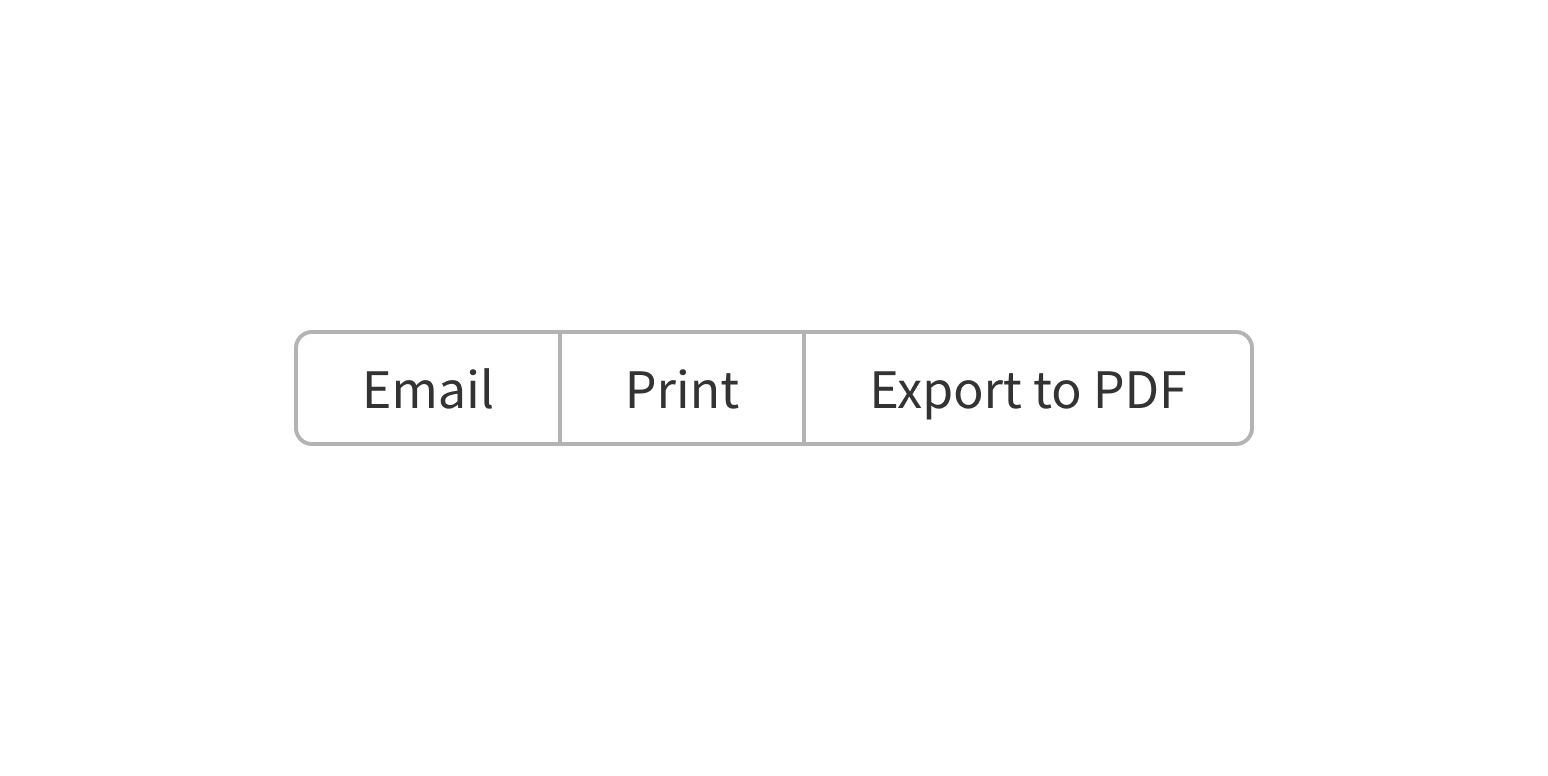
Use ComboButton when you have a set of buttons for related actions that should be grouped together, like buttons for related document actions (Download, Share, Print), instead of spread out. By visually grouping these actions in the same element, ComboButton shows that they’re related, while saving horizontal space.
Group related actions in the same ComboButton.
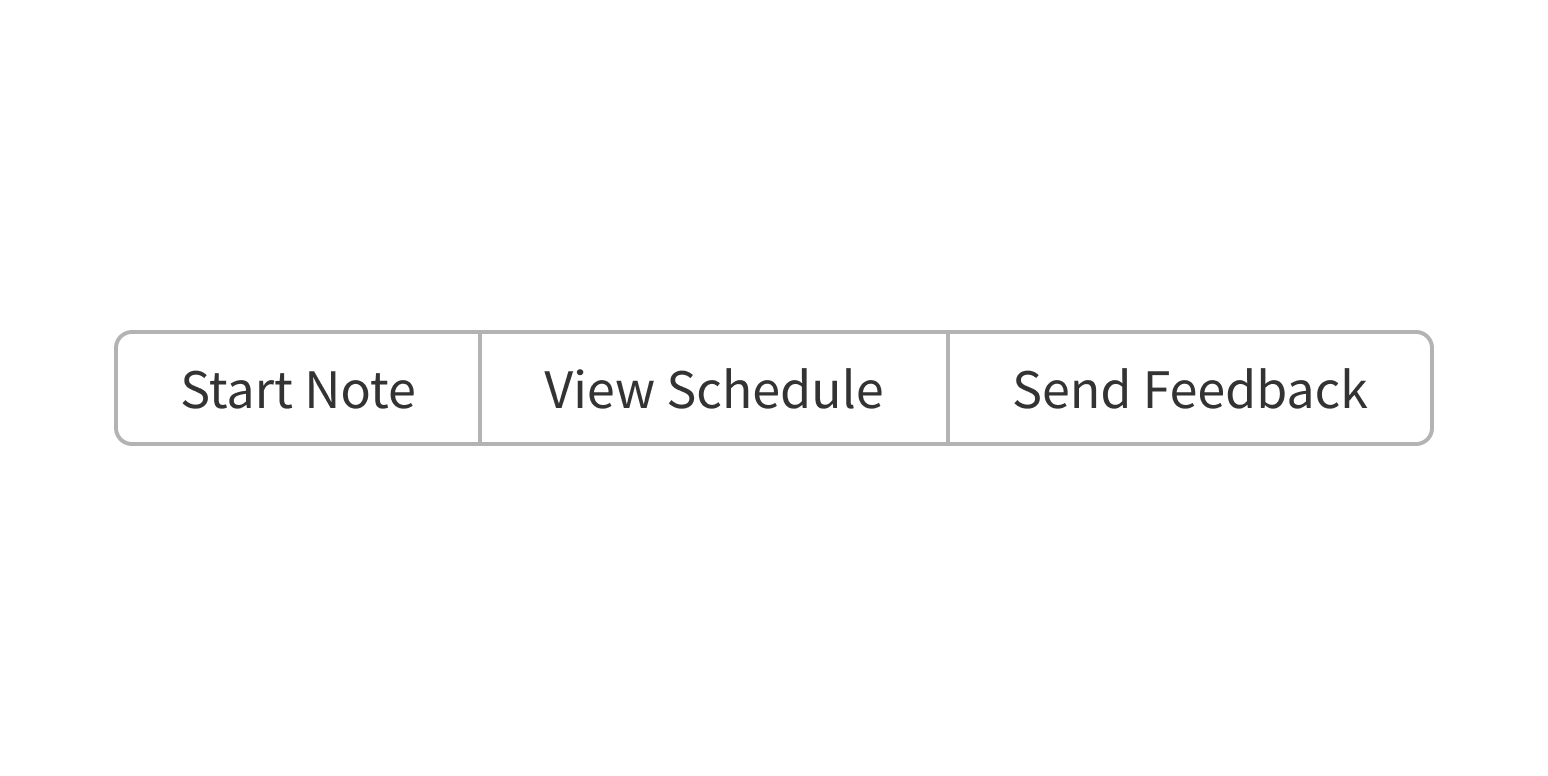
Group unrelated actions.
Use ComboButton with a Menu in it when there’s a primary action and related, secondary options that are used less frequently (like a Save button with a dropdown that contains options to “Save & Print” and “Save & Close”).
Style
Design details
The ComboButton group consists of 2+ buttons that are displayed horizontally by default. On screens smaller than the full width of the ComboButton, buttons are stacked vertically.
ComboButton is available in three sizes:
- Small
- Medium
- Large
Placement and hierarchy
No additional information for this component.
Content
ComboButton is designed to trigger actions, so use verbs for button text, not adjectives. Keep it short (1-2 words) to avoid wrapping and use title case (“Save File”, not “Save file”).
When using the icon-only version of ComboButton, make sure the meaning of the icon is clear without any text. The Icons guidelines page lists all Forge icons, their usage, and whether a label is required.
When using ComboButton with a Menu in it, the button that opens the menu should include the Expand icon and/or explanatory copy, like “More Actions”, “See More”, or “Other”. Use title case for menu text (“More Options”, not “More options”).
Demos
Coding
Developer tips
ComboButton takes an array of React elements; these should be LabelButton and/or Menu components. For documentation, see the LabelButton props table and the Menu component page. ComboButton doesn’t have many props of its own. Instead, most of its customization comes from the LabelButton or Menu components.
By default, a LabelButton is a button styled to look like a Button. This styling also prevents the internal corners of buttons from rounding over when placed directly side by side. Despite its name, a LabelButton does not automatically apply a label to the component.
Repository
Implementation links
ComboButton directory in Bitbucket
LabelButton directory in Bitbucket
Implementation details
It is strongly recommended to familiarize yourself with the Forge source code. While this documentation is a best effort to document the intent and usage of a component, sometimes some features only become clear when looking at the source code. Also, looking at Forge's source code may help identify and fix bugs in either your application or Forge itself.
Storybook files
Forge maintains at least one storybook file per component. While the primary audience for these files is typically the Forge team, these storybook files may cover usages of the component not covered by a demo. The storybook for the latest version of forge can be found at go/forge-storybook-lts.
Testing library
Forge strongly encourages using testing-library to write tests for your application.
"The more your tests resemble the way your software is used, the more confidence they can give you."
If you're having trouble testing a Forge component using testing-library, it would be a good idea to see how Forge tests its own components. For the most part, Forge tries to use screen.getByRole as much as it can, as that API provides the best feedback on a11y compliance. Forge discourages the use of document.querySelector and screen.getByTestId as both APIs encourage using implementation details to test your component, and discourage adding roles to your component.
With that being said, many of Forge's components were not built with accessibility in mind. These components do break the recommendations listed above.
Import statements
In Nimbus applications
athenaOne serves the Forge bundle independently from your application's bundle. Importing Forge components directly from '@athena/forge' takes advantage of this feature.
import { ComboButton, LabelButton } from '@athena/forge'
In standalone applications
Importing components using the exact path to the module takes advantage of webpack's tree shaking feature. Webpack will include only that module and its dependencies.
import ComboButton from '@athena/forge/ComboButton';import LabelButton from '@athena/forge/LabelButton';
To use this import guidance, Typescript applications must use typescript >= 4.7.3, and should add this setting to their tsconfig.json file:
{"compilerOptions": {"moduleResolution": "Node16",}}
If this setting doesn't work for your application, use this import statement instead:
import ComboButton from '@athena/forge/dist/ComboButton';import LabelButton from '@athena/forge/dist/LabelButton';