List
A content element for simple, unordered lists.
The Basics
What it is
List displays a set of list items in a column without the default bullets and spacing usually included by the browser, making it easy to use in many scenarios.
How it works
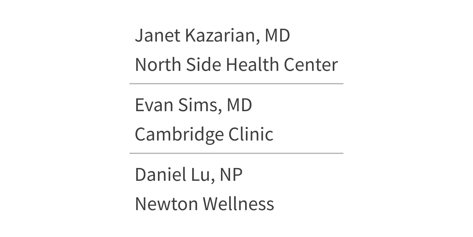
- The screen displays a collection of list items arranged vertically. Each item can contain custom HTML, like images and plain or formatted text.
- This component only displays content. It isn’t interactive.
When to use
- To use a list without the browser’s default CSS styling
- To show long or complex content with horizontal dividers
- To display a collection of items without numerals or bullets
- To show a list with helpful visual elements, like images of providers or medications
When not to use
-
For a bulleted or numbered list of items: use the HTML element
<ul>(unordered list) for a bulleted list or<ol>(ordered list) for a numbered list - For a list of selectable items, like a list with checkboxes in a form
What to use instead
Use SelectionList for users to select list items in a form.
Use Table for complex lists that need more structure.
How to use
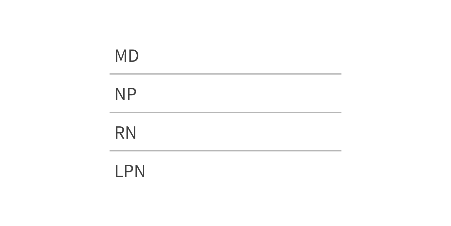
List can include dividers between items. This adds a light border at the top of all list items except the first. This makes it easier to read list items that are longer than 1 line of text or that include both text and images.
Use dividers when list items have multiple lines of text.
Use dividers with short text, as it introduces visual clutter.
Style
Design details
No additional information for this component.
Placement and hierarchy
No additional information for this component.
Content
Each item in the list can include custom markup, such as images and plain or formatted text (bold, italics).
Demos
Coding
Developer tips
Subcomponents
List uses the subcomponent ListItem (see Props for details). Include ListItems as List children.
The List component creates a <ul> element, and each ListItem wraps its children in an <li> element.
Styling
To add a divider between ListItem components, set List’s dividers prop to {true}.
In a grid, if the parent element already provides a gutter, set List’s padded prop to {false}.
List doesn’t include styles for aligning content in its list items (like center-aligning images and text). You must add these styles yourself.
Repository
Implementation links
ListItem directory in Bitbucket
Implementation details
It is strongly recommended to familiarize yourself with the Forge source code. While this documentation is a best effort to document the intent and usage of a component, sometimes some features only become clear when looking at the source code. Also, looking at Forge's source code may help identify and fix bugs in either your application or Forge itself.
Storybook files
Forge maintains at least one storybook file per component. While the primary audience for these files is typically the Forge team, these storybook files may cover usages of the component not covered by a demo. The storybook for the latest version of forge can be found at go/forge-storybook-lts.
Testing library
Forge strongly encourages using testing-library to write tests for your application.
"The more your tests resemble the way your software is used, the more confidence they can give you."
If you're having trouble testing a Forge component using testing-library, it would be a good idea to see how Forge tests its own components. For the most part, Forge tries to use screen.getByRole as much as it can, as that API provides the best feedback on a11y compliance. Forge discourages the use of document.querySelector and screen.getByTestId as both APIs encourage using implementation details to test your component, and discourage adding roles to your component.
With that being said, many of Forge's components were not built with accessibility in mind. These components do break the recommendations listed above.
Import statements
In Nimbus applications
athenaOne serves the Forge bundle independently from your application's bundle. Importing Forge components directly from '@athena/forge' takes advantage of this feature.
import { List, ListItem } from '@athena/forge'
In standalone applications
Importing components using the exact path to the module takes advantage of webpack's tree shaking feature. Webpack will include only that module and its dependencies.
import List from '@athena/forge/List';import ListItem from '@athena/forge/ListItem';
To use this import guidance, Typescript applications must use typescript >= 4.7.3, and should add this setting to their tsconfig.json file:
{"compilerOptions": {"moduleResolution": "Node16",}}
If this setting doesn't work for your application, use this import statement instead:
import List from '@athena/forge/dist/List';import ListItem from '@athena/forge/dist/ListItem';