ProgressIndicator
A graphic element that shows the progress of a process of known or unknown length.
The Basics
What it is
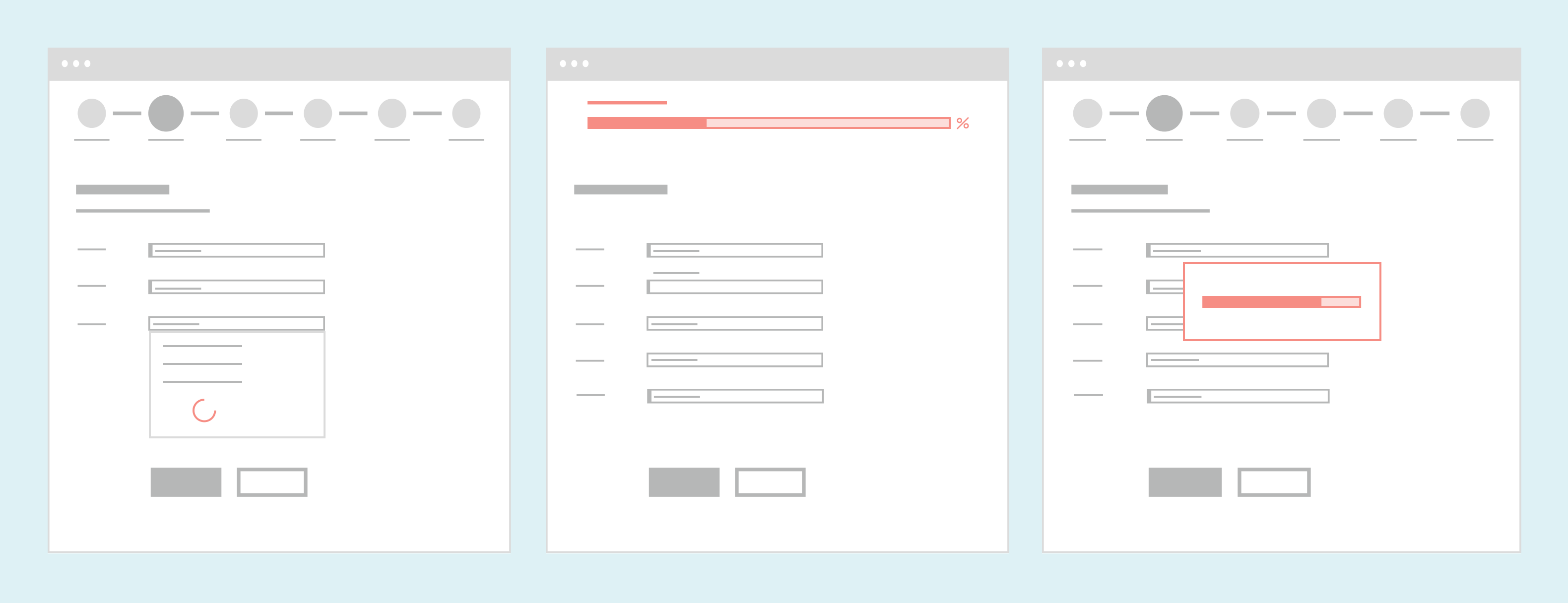
ProgressIndicator uses a circle or bar to show how much of a process has been completed. It can also be used to simply show that the process is still taking place (for processes where it’s hard to calculate how much has been completed).
There are 2 variations:
- Determinate shows how much of the process has been completed as a number (usually a percentage or elapsed time), and a visual element fills up as the process continues.
- Indeterminate shows that the process is underway but doesn’t display a numeric estimate of progress.
How it works
- ProgressIndicator appears while a process is occurring.
- The determinate variation shows the percentage completed, and the visual element fills as the process continues.
- The indeterminate version uses a repeating animation that doesn’t fill completely.
- When the process is complete, the page or section refreshes, and ProgressIndicator disappears.
When to use
- To show that a system process is taking place (like a form submission)
- To show how much of a process has been completed so far (like a long workflow)
- To provide a time estimate for a system process (like a file upload)
When not to use
- For very fast processes (it’s confusing and visually distracting to see ProgressIndicator only briefly and then have it suddenly disappear)
What to use instead
Use Stepper for workflows with 3-7 steps.
Use Loader for a similar component with a built-in overlay.
Use Button to show a button with a circular spinner animation inside it.
How to use
When choosing a ProgressIndicator, you’ll need to make a few decisions:
- Pick a variation:
- For an unknown wait time, use the indeterminate variation.
- For an estimated wait time or percentage completed, use the determinate variation. You can also use this variation for data visualization (like showing metrics on a dashboard).
- Choose a shape:
- For processes that are measured in seconds or for use in a tall container, use the circle.
- For processes that are measured as the percentage completed or for use in a wide container, use the bar.
- Pick a size:
- For a very small space like a list or table row, use the small circle. To save space, this variation doesn’t display the percentage completed.
- For all other use cases, use the medium circle or bar.
Style
Design details
No additional information for this component.
Placement and hierarchy
Placement is based on the recommended use for each variation:
- Indeterminate circle should be placed in the page section or element that’s loading.
- Determinate bar should be placed at the top of the workflow window when tracking progress through a workflow.
- Indeterminate and determinate bar should have their own container when used to show that a page or file is loading.

Content
ProgressIndicator can display a description. The text should fit the variation:
- Determinate: Describe the type of progress shown (“Percentage complete”, “Time remaining”).
- Indeterminate: Use an action verb to describe what’s happening (“Loading patient data”, “Uploading files”).
Use sentence case for this description (“Loading medication list”, not “Loading Medication List”).
Demos
Coding
Developer tips
To use ProgressIndicator for data visualization, use the currentValue prop to pass it a number. The animation fills up to that number and then stops.
Screen readers
If ProgressIndicator is describing the loading progress of a region of the page, pass it an aria-describedby attribute and set its value to the ID of the area being loaded. Add the aria-busy={true} attribute to the region until it has finished loading.
Repository
Implementation links
ProgressIndicator directory in Bitbucket
Implementation details
It is strongly recommended to familiarize yourself with the Forge source code. While this documentation is a best effort to document the intent and usage of a component, sometimes some features only become clear when looking at the source code. Also, looking at Forge's source code may help identify and fix bugs in either your application or Forge itself.
Storybook files
Forge maintains at least one storybook file per component. While the primary audience for these files is typically the Forge team, these storybook files may cover usages of the component not covered by a demo. The storybook for the latest version of forge can be found at go/forge-storybook-lts.
Testing library
Forge strongly encourages using testing-library to write tests for your application.
"The more your tests resemble the way your software is used, the more confidence they can give you."
If you're having trouble testing a Forge component using testing-library, it would be a good idea to see how Forge tests its own components. For the most part, Forge tries to use screen.getByRole as much as it can, as that API provides the best feedback on a11y compliance. Forge discourages the use of document.querySelector and screen.getByTestId as both APIs encourage using implementation details to test your component, and discourage adding roles to your component.
With that being said, many of Forge's components were not built with accessibility in mind. These components do break the recommendations listed above.
Import statements
In Nimbus applications
athenaOne serves the Forge bundle independently from your application's bundle. Importing Forge components directly from '@athena/forge' takes advantage of this feature.
import { ProgressIndicator } from '@athena/forge'
In standalone applications
Importing components using the exact path to the module takes advantage of webpack's tree shaking feature. Webpack will include only that module and its dependencies.
import ProgressIndicator from '@athena/forge/ProgressIndicator';
To use this import guidance, Typescript applications must use typescript >= 4.7.3, and should add this setting to their tsconfig.json file:
{"compilerOptions": {"moduleResolution": "Node16",}}
If this setting doesn't work for your application, use this import statement instead:
import ProgressIndicator from '@athena/forge/dist/ProgressIndicator';