ShowHide
A container that shows or hides its content via animated transition.
The Basics
What it is
ShowHide is a container with content that’s fully or partially hidden but appears when users activate an interactive element, like a button or link. It’s used for content that needs to be available but doesn’t need to be fully visible on the page.
How it works
- The user clicks or activates an interactive element, like a “Show” or “Read more” button or link.
- The content area expands downward to display the full content.
- The interactive element's text indicates that the content area will collapse again when they click the button or link (e.g., “Hide”, “Close”).
- The user reads the ShowHide content and clicks or activates the interactive element again to hide the content.
When to use
- To display a content preview or excerpt, along with an option to show the full content (e.g., to display an excerpt of a radiology report, along with a button to view the full report)
- To display content that supports a workflow but doesn’t need to be fully displayed by default (e.g., to display a recent lab result, along with a link to view the full history)
- To reveal additional content as the user moves down the page (e.g., “View more articles”)
- To save vertical space on screens where it’s limited
When not to use
- For content that’s important to the workflow, because users might not view that content if it’s hidden
- For multiple content items that are related
- Inside another ShowHide
What to use instead
Use Accordion for multiple content items that are related.
Use Popover to show additional content in a popup instead of inline.
How to use
ShowHide is just a container. The interactive element that triggers the show/hide behavior isn’t included in the component; it must be added separately.
Technically, any interactive element can trigger the show/hide behavior, but we recommend using a tertiary Button, which resembles a link, plus an icon (included with the Button component). Together, the button’s text and icon should indicate what will happen when the button is used. For example:
- When the content is collapsed: “Show full details” + the Expand icon
- When the content is expanded: “Hide details” + the Collapse icon
Use the button text and icon to indicate what will happen.
Use the text and icon to reflect the content’s current state.
By default, all ShowHide content is hidden. You can adjust ShowHide to display part of the container, up to a set pixel height. This approach provides a content preview and gives users a visual cue that there’s more, so they can decide whether to read the full content.
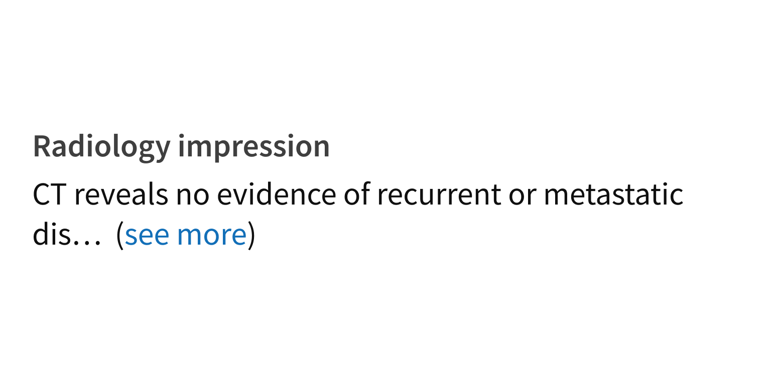
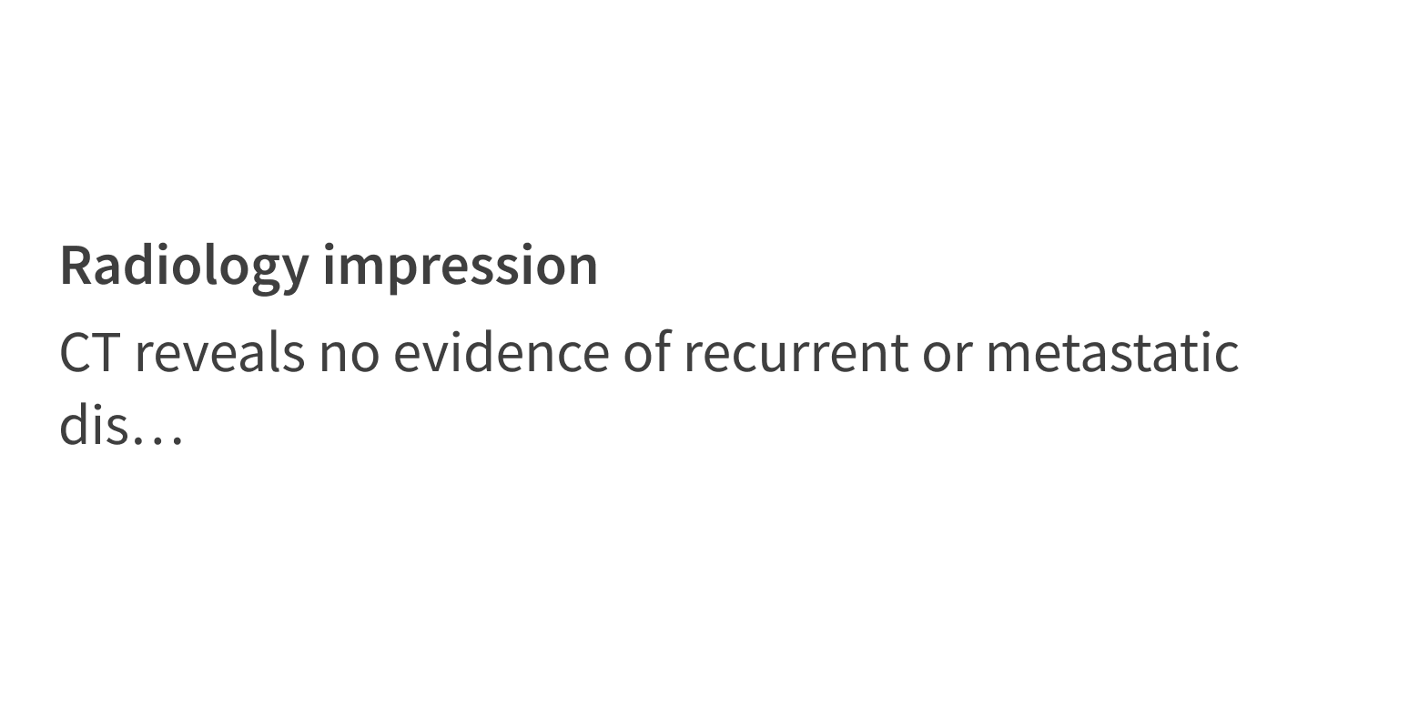
Another approach is to show a content excerpt, along with a button or link that displays the full content. This shows users the most important content, like a diagnosis or the interpretation section of a medical report. Use a clear visual cue to indicate that the visible content is incomplete, like a “Show more details” link or “... (see more)” at the end of the excerpt. This functionality isn’t built into ShowHide and must be implemented.
Include a visual cue to indicate that more content is available.

Show partial content without a visual cue that more content is available.

Style
Design details
Animation
ShowHide expands vertically only. The ShowHide animation is 1/4 of a second, regardless of content size.
Placement and hierarchy
No additional information for this component.
Content
For ShowHide’s interactive elements, use text that describes both directions of the animation. Think in terms of opposites. For example:
- “Show” and “Hide”
- “View More” and “View Less”
Use verbs and describe actions (“Show More”, not “More Details”). Use title case for buttons (“Show More”, not “Show more”).
Demos
Coding
Developer tips
The ShowHide container element is a div with hidden overflow. It allows for any content as children.
The interactive element that controls the show/hide behavior isn’t built in and must be implemented. When the content is visible, this element should have its aria-expanded attribute set to "true" (an accessibility best practice).
ShowHide includes 2 callbacks that fire when the show and hide animations complete: onShown and onHidden.
Repository
Implementation links
ShowHide directory in Bitbucket
Implementation details
It is strongly recommended to familiarize yourself with the Forge source code. While this documentation is a best effort to document the intent and usage of a component, sometimes some features only become clear when looking at the source code. Also, looking at Forge's source code may help identify and fix bugs in either your application or Forge itself.
Storybook files
Forge maintains at least one storybook file per component. While the primary audience for these files is typically the Forge team, these storybook files may cover usages of the component not covered by a demo. The storybook for the latest version of forge can be found at go/forge-storybook-lts.
Testing library
Forge strongly encourages using testing-library to write tests for your application.
"The more your tests resemble the way your software is used, the more confidence they can give you."
If you're having trouble testing a Forge component using testing-library, it would be a good idea to see how Forge tests its own components. For the most part, Forge tries to use screen.getByRole as much as it can, as that API provides the best feedback on a11y compliance. Forge discourages the use of document.querySelector and screen.getByTestId as both APIs encourage using implementation details to test your component, and discourage adding roles to your component.
With that being said, many of Forge's components were not built with accessibility in mind. These components do break the recommendations listed above.
Import statements
In Nimbus applications
athenaOne serves the Forge bundle independently from your application's bundle. Importing Forge components directly from '@athena/forge' takes advantage of this feature.
import { ShowHide } from '@athena/forge'
In standalone applications
Importing components using the exact path to the module takes advantage of webpack's tree shaking feature. Webpack will include only that module and its dependencies.
import ShowHide from '@athena/forge/ShowHide';
To use this import guidance, Typescript applications must use typescript >= 4.7.3, and should add this setting to their tsconfig.json file:
{"compilerOptions": {"moduleResolution": "Node16",}}
If this setting doesn't work for your application, use this import statement instead:
import ShowHide from '@athena/forge/dist/ShowHide';