Loader
A spinning icon and overlay that indicate that content is loading.
The Basics
What it is
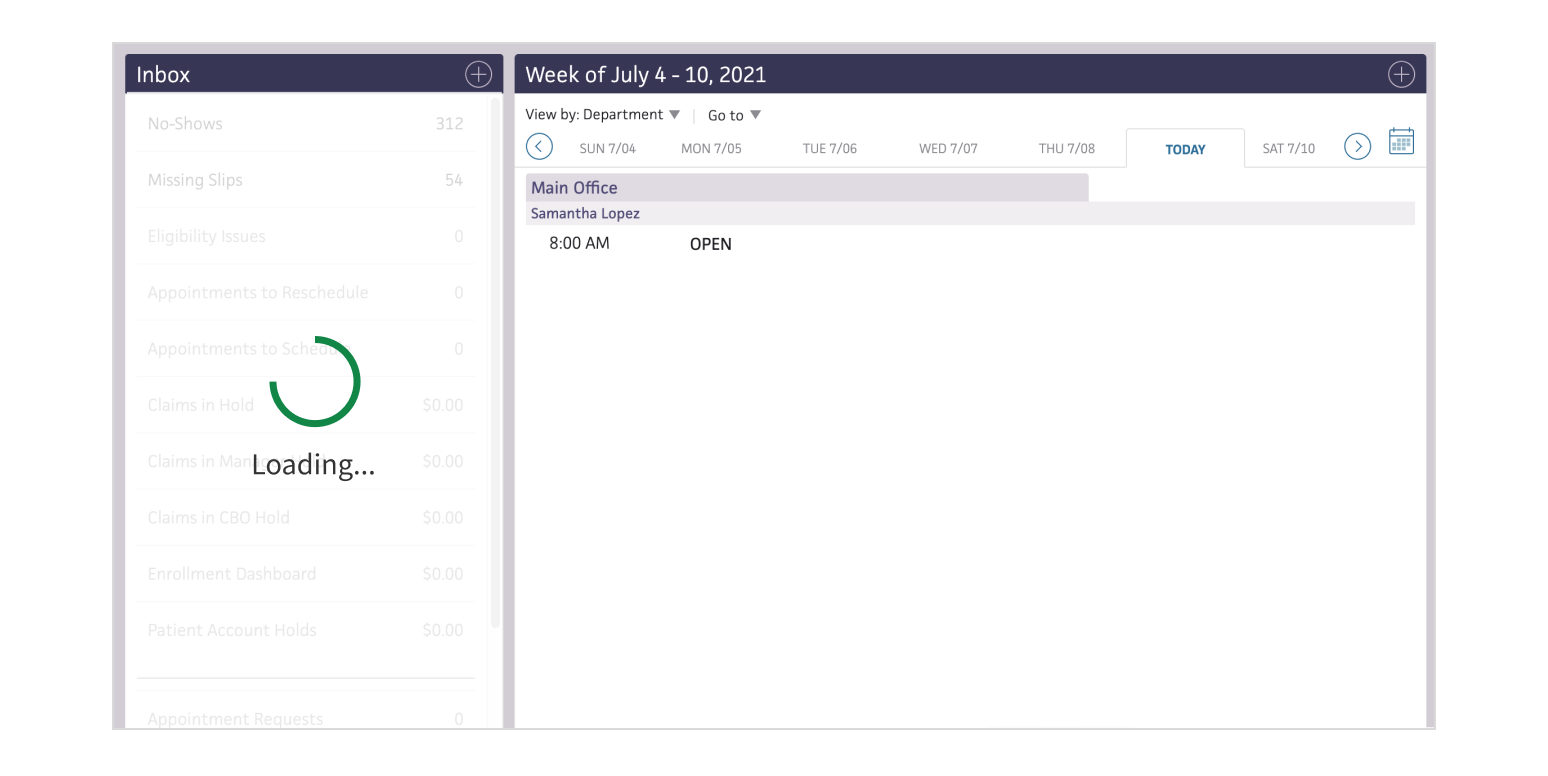
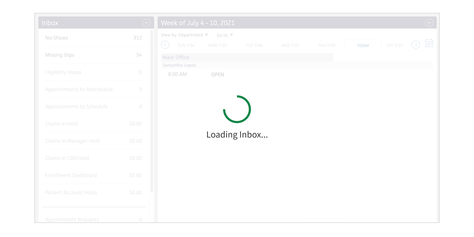
Loader is an animation and overlay displayed above page content while it’s loading. This helps reassure users that the app or site is working on their request.
How it works
- Loader appears while a page or section is loading.
- All in-progress content is blocked with an overlay to prevent the user from interacting with partial content.
- The animation loops while loading continues. Loader is indeterminate: it indicates that the loading process is still taking place, but it doesn’t measure progress (e.g., “20% complete”).
- When loading is complete, the animation and overlay disappear, and the user can interact with the content.
When to use
- When the loading time for a page or section is unknown
- To show that content is loading and block sections while content is loading asynchronously
When not to use
- When the loading time for a page or section is known or can be estimated
What to use instead
Use ProgressIndicator if the loading time is known or can be estimated, or to show a loading state without an overlay.
How to use
Use for specific sections of the page.
Apply a page-level Loader when only 1 section is loading.
Style
Design details
No additional information for this component.
Placement and hierarchy
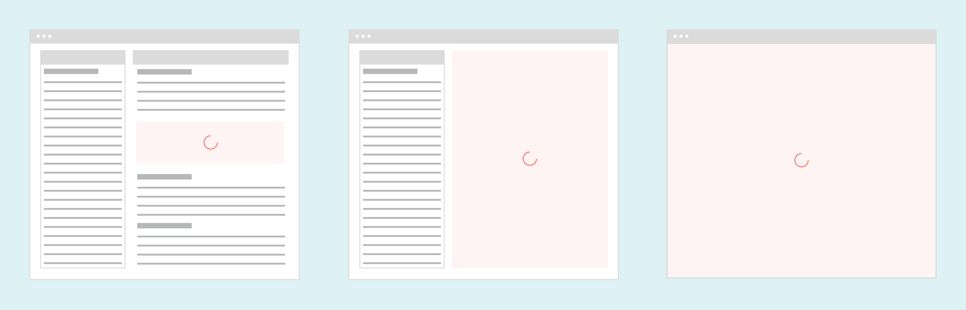
Loader’s behavior depends on how much of the content it covers. For a section that’s smaller than the viewport:
- Loader fills the entire width and height of the container that’s loading.
- The animation is centered horizontally and vertically in the container.
- This applies to pages built from multiple sources that load content at different times or if only part of the interface needs to reload.
For a section that’s larger than the viewport:
- The loading animation is centered over the visible area of the loading content.
- If the page scrolls, the animation stays in the same position relative to the viewport.
- This applies to sections of content taller than the viewport that allow scrolling while loading.
For full-page loading:
- The entire page and all its content are blocked during loading.
- For long pages, scrollbars stay visible under the Loader but can’t be used.
Content
Loader includes a label below the animation. Use an action verb that describes what’s happening (“Loading patient data...” or “Saving claims...”). Be specific when possible (“Loading medications...” instead of just “Loading...”).
Use sentence case for labels (“Sending orders...”, not “Sending Orders...”). End your text with an ellipsis (three dots) to indicate that a process is taking place.
Demos
Coding
Developer tips
When used for full-page loading, Loader should be the first child of the React application root element. If the application root has all page content as children, Loader overlays all content on the page.
If the React application is just part of the page, the full-page loading option may look different than you expect.
Repository
Implementation links
Implementation details
It is strongly recommended to familiarize yourself with the Forge source code. While this documentation is a best effort to document the intent and usage of a component, sometimes some features only become clear when looking at the source code. Also, looking at Forge's source code may help identify and fix bugs in either your application or Forge itself.
Storybook files
Forge maintains at least one storybook file per component. While the primary audience for these files is typically the Forge team, these storybook files may cover usages of the component not covered by a demo. The storybook for the latest version of forge can be found at go/forge-storybook-lts.
Testing library
Forge strongly encourages using testing-library to write tests for your application.
"The more your tests resemble the way your software is used, the more confidence they can give you."
If you're having trouble testing a Forge component using testing-library, it would be a good idea to see how Forge tests its own components. For the most part, Forge tries to use screen.getByRole as much as it can, as that API provides the best feedback on a11y compliance. Forge discourages the use of document.querySelector and screen.getByTestId as both APIs encourage using implementation details to test your component, and discourage adding roles to your component.
With that being said, many of Forge's components were not built with accessibility in mind. These components do break the recommendations listed above.
Import statements
In Nimbus applications
athenaOne serves the Forge bundle independently from your application's bundle. Importing Forge components directly from '@athena/forge' takes advantage of this feature.
import { Loader } from '@athena/forge'
In standalone applications
Importing components using the exact path to the module takes advantage of webpack's tree shaking feature. Webpack will include only that module and its dependencies.
import Loader from '@athena/forge/Loader';
To use this import guidance, Typescript applications must use typescript >= 4.7.3, and should add this setting to their tsconfig.json file:
{"compilerOptions": {"moduleResolution": "Node16",}}
If this setting doesn't work for your application, use this import statement instead:
import Loader from '@athena/forge/dist/Loader';