Tree
A navigation and selection element for hierarchical lists.
The Basics
What it is
Tree is a list with multiple levels of hierarchy, used to navigate quickly among items or to select items at any level. It’s made of parent and child nodes; children nested in the same parent node should be related.
Typically, Tree is used to navigate among separate web pages. It also has a checkable variation, which enables users to check individual list items or a parent node, which checks all its available children.
How it works
- To open and view the children of any parent node, the user clicks or activates the Expand icon or uses the right arrow.
- To select a node, the user clicks or activates the list item text or uses Space or Enter.
- When selected, nodes are marked as active.
- To close a node, the user clicks or activates the Collapse icon or uses the left arrow.
In the checkable variation:
- Checking a parent node automatically checks its children. Users can click or activate the parent’s checkbox or use Space.
- If some children are checked, their parent node is partially checked (its checkbox contains a horizontal line instead of a check mark).
- When all children are checked or unchecked, their parent node’s state reflects that overall state.
- Disabled nodes can’t be expanded or checked.
When to use
- For navigation among separate web pages or sections on the same page
- To enable users to set filter options at different levels
- To ask users to select items in a nested list
When not to use
- For displaying long content
What to use instead
Use Accordion to display long content with 2 levels of hierarchy.
Use Menu for navigation among web pages at the same level.
Use Tabs for navigation among sections on the same page.
How to use
Hierarchy
Don’t use more than 3 levels of hierarchy in Tree. A deeper hierarchy can lead to display issues like wrapping text and excessive indentation. After 6 levels of hierarchy, Tree stops automatically indenting child nodes.
Display options
Tree can be set to show dividers above and below each parent node. If your Tree has many parent nodes, use dividers to help differentiate them.
You can also set certain nodes to be expanded and/or checked by default on page load. This is useful for setting filters based on stored queries, but it can also be helpful when users first load a website or filtering feature with nothing selected yet. Expanding the starting parent category for website navigation or pre-checking certain filters can help users get started and move quickly through a task.
Expanding a node by default works best when the expanded node is the first one in the Tree. Otherwise, users might be confused to see that a random node partway down the Tree is expanded by default.
Set a parent node to be expanded if it��’s frequently used.
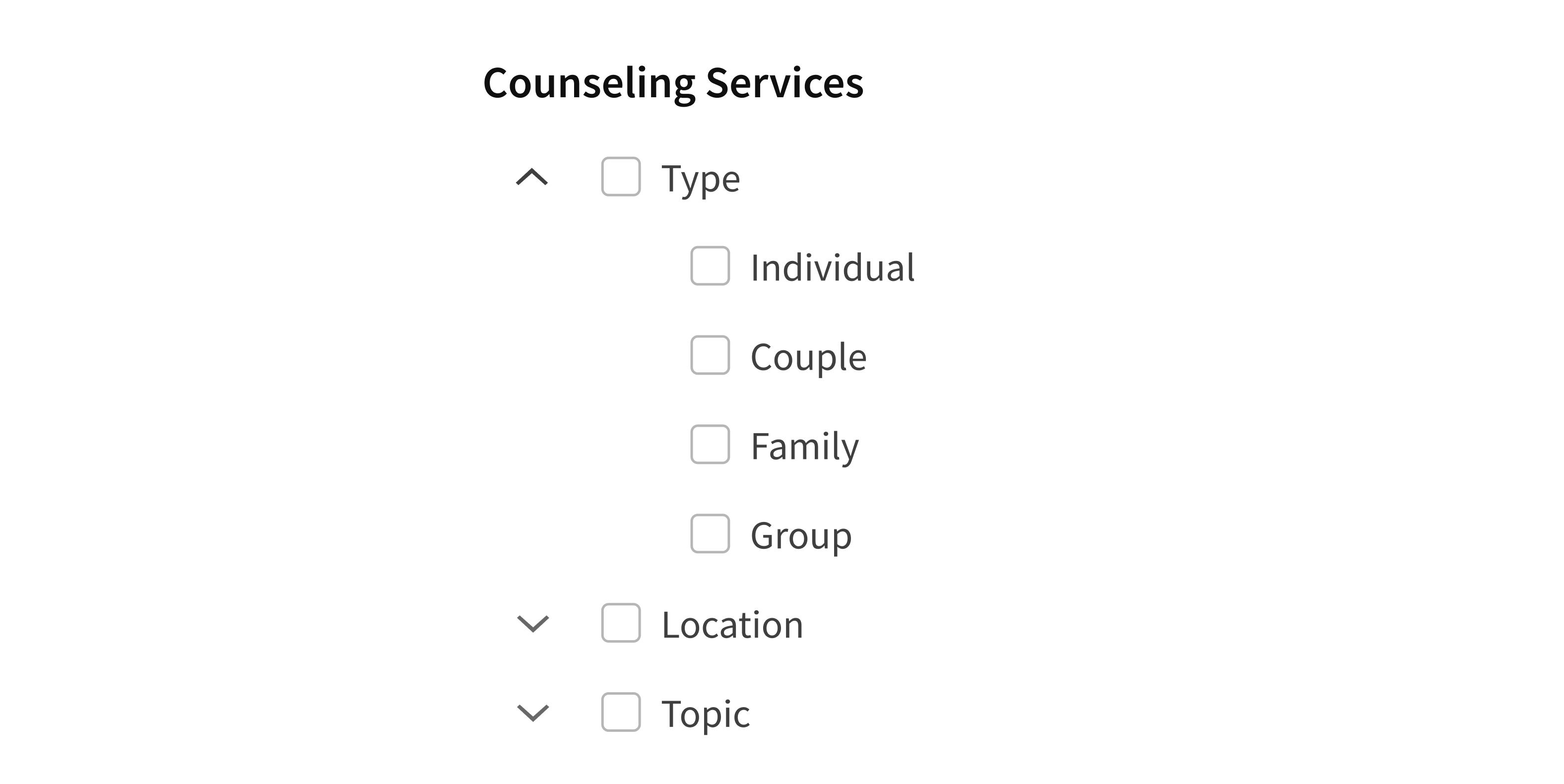
Set all parent nodes as expanded for a Tree with many nodes.
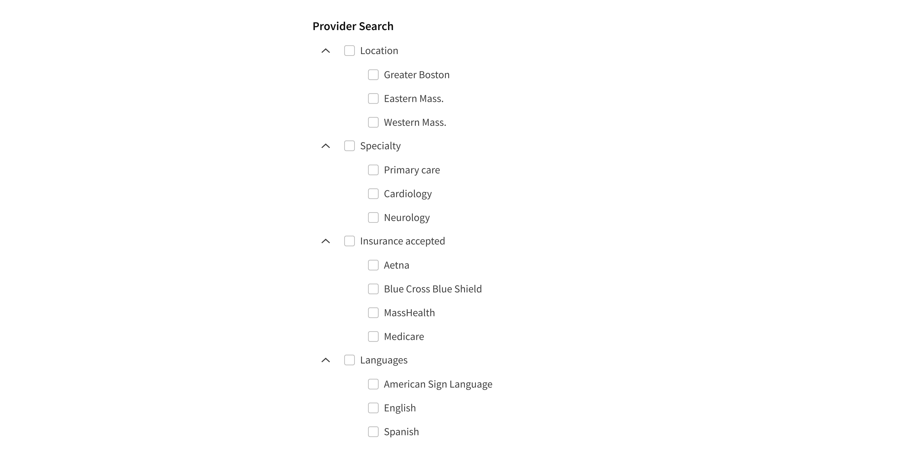
The content of each Tree node can be plain text or custom HTML, which can include text formatting, links, and icons. Don’t add other interactive elements, which can interfere with selecting a node.
Links should be used for navigating among separate web pages or sections on the same page.
Icons should be used mainly to add context and help differentiate parent nodes. Avoid also using icons for children, because this can lead to visual clutter.
If using icons, apply them to all nodes in the same level.
Apply icons to just some of the nodes in the same level.
Checkable variation
Tree’s checkable variation adds checkboxes to the nodes. When used, this variation applies to the entire Tree. Tree should not contain a mix of checkable and read-only nodes.
If all of a parent node’s children are checked, then the parent’s checkbox is checked. The exception is if any of the children are disabled. In this case, there’s no way to check off all the children, so the parent checkbox can only ever be partially checked, never fully checked. This is a deliberate design decision by the Forge team.
Style
Design details
Animation
Tree nodes expand vertically only. Each node opens or closes smoothly when changing state. This visual cue tells users that the parent and child nodes are related. This animation uses the ShowHide component. It takes 1/4 second (250ms), regardless of how many children the node has.
The Expand and Collapse icons rotate 180 degrees to preview the action that will take place when the parent node is clicked or activated. This transition takes 1/2 second (500ms).
The timing and animation for Tree can’t be customized.
Placement and hierarchy
If used for primary navigation, Tree should be placed to the left of the content area. For secondary, same-page navigation, Tree should be placed to the right of the content area.
When Tree is used for filtering, it should be placed to the left of the data or content.

Content
Node content can be plain text or custom HTML, including formatted text, links, and icons. Don’t put interactive elements in nodes; this can interfere with node selection.
When content hits the right edge of the container, it wraps instead of truncating. For this reason, when using Tree in a narrow container (like a left-hand navigation section), node labels should be informative but as short as possible. Avoid text that’s long enough to wrap. The text for a parent node should clearly describe the category of the children it contains.
Group related children under a label that makes sense for the group.
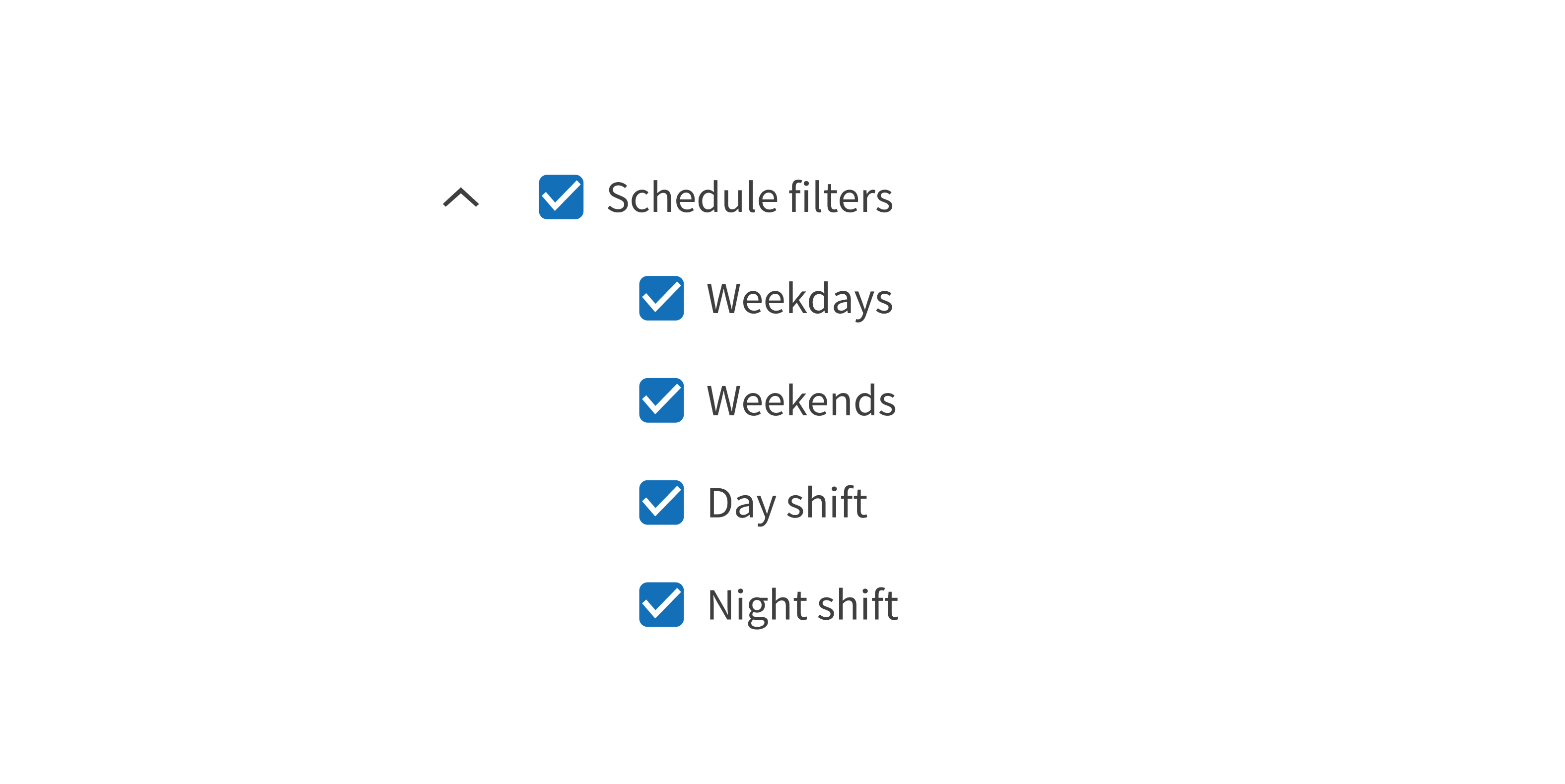
Group unrelated child nodes.

Demos
Coding
Developer tips
Each element in Tree must have a unique ID. This is required for the expanding and collapsing behavior to work correctly.
Any content can be passed into a Tree node, including a navigation link. Use the renderTitle prop and pass in <a href>link</a> for Tree-based navigation.
In the checkable variation, if a parent node is checked by default and contains child nodes that aren’t defined in the defaultChecked list, those child nodes are implicitly checked even though they aren’t included in the defaultChecked list.
If a child node is the default selected node, Tree automatically expands the path of the selected node even if that node ID isn’t included in the defaultExpanded list.
If using React testing library, a data-testid attribute can either be explicitly defined or is implicitly defined as the node ID.
Tree is made up of individual TreeNodes that can be configured with the Tree's data prop. Use data to set the Tree contents; don’t use TreeNode itself. The data prop takes an array of objects of type DataNode, which is an abstraction of TreeNode’s props. All the properties of each DataNode match the corresponding prop on the TreeNode API (see Props for details), except for children. The children prop in each DataNode takes an array of other DataNodes, while the children prop of the TreeNode component takes an array of actual TreeNode components.
Repository
Implementation links
TreeNode directory in Bitbucket
Implementation details
It is strongly recommended to familiarize yourself with the Forge source code. While this documentation is a best effort to document the intent and usage of a component, sometimes some features only become clear when looking at the source code. Also, looking at Forge's source code may help identify and fix bugs in either your application or Forge itself.
Storybook files
Forge maintains at least one storybook file per component. While the primary audience for these files is typically the Forge team, these storybook files may cover usages of the component not covered by a demo. The storybook for the latest version of forge can be found at go/forge-storybook-lts.
Testing library
Forge strongly encourages using testing-library to write tests for your application.
"The more your tests resemble the way your software is used, the more confidence they can give you."
If you're having trouble testing a Forge component using testing-library, it would be a good idea to see how Forge tests its own components. For the most part, Forge tries to use screen.getByRole as much as it can, as that API provides the best feedback on a11y compliance. Forge discourages the use of document.querySelector and screen.getByTestId as both APIs encourage using implementation details to test your component, and discourage adding roles to your component.
With that being said, many of Forge's components were not built with accessibility in mind. These components do break the recommendations listed above.
Import statements
In Nimbus applications
athenaOne serves the Forge bundle independently from your application's bundle. Importing Forge components directly from '@athena/forge' takes advantage of this feature.
import { Tree, TreeNode } from '@athena/forge'
In standalone applications
Importing components using the exact path to the module takes advantage of webpack's tree shaking feature. Webpack will include only that module and its dependencies.
import Tree from '@athena/forge/Tree';import TreeNode from '@athena/forge/TreeNode';
To use this import guidance, Typescript applications must use typescript >= 4.7.3, and should add this setting to their tsconfig.json file:
{"compilerOptions": {"moduleResolution": "Node16",}}
If this setting doesn't work for your application, use this import statement instead:
import Tree from '@athena/forge/dist/Tree';import TreeNode from '@athena/forge/dist/TreeNode';