Accordion
An element where users can expand and collapse individual pieces of content in a larger container.
The Basics
What it is
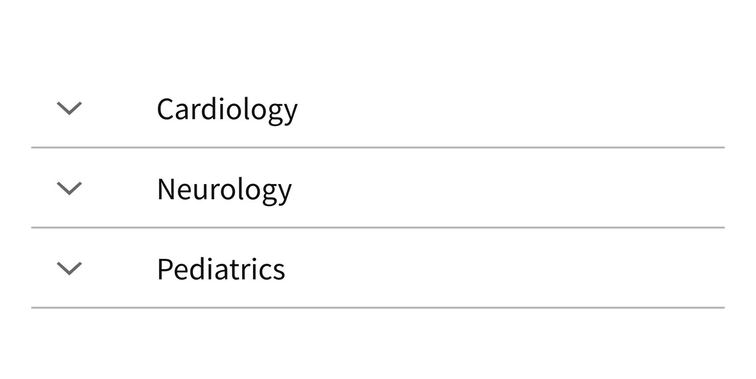
Accordion is used for a collection of conceptually related pieces of content, like frequently asked questions. It consists of a list of headers. Clicking a header expands and collapses the related panel of content immediately below it. Collapsing content panels shortens pages, reduces complexity, and improves scannability.
How it works
- To open an Accordion content panel, the user clicks or activates the panel's header.
- The user can navigate through headers with the Tab key and then expand a panel using the Enter key.
- As the panel expands, its icon flips 180 degrees to point up.
- When a header is selected, screen readers read the header text and describe the panel as expanded or collapsed.
- Once expanded, panels remain expanded unless the user or the application closes them.
- To close a panel, the user clicks or activates its header, or they can press the Space bar.
- As the panel collapses, its icon flips 180 degrees to point down again.
When to use
- To help users find specific information in a collection of content
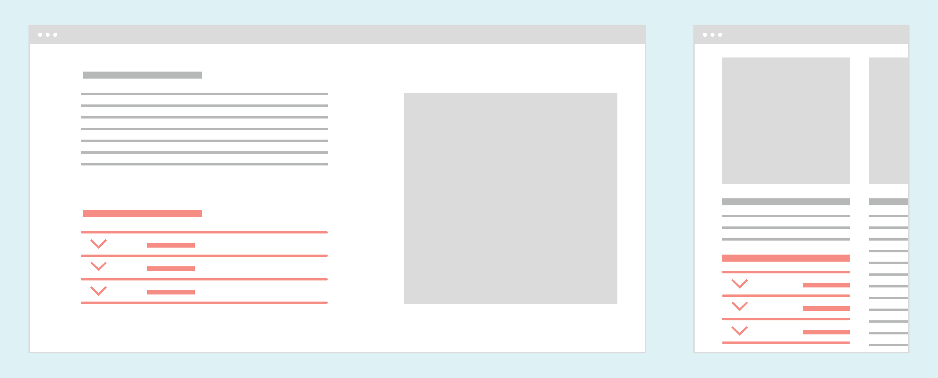
- To make it easier to read long content on mobile devices
- To present a step-by-step flow on a single page, with a content panel for each step (e.g., a questionnaire)
- To group a list of related content items, like FAQ or help content
When not to use
- For important information that users won’t see if they don’t expand a panel
- For screens where a simpler page structure would work instead, like headings and body text
- For a single content item
- For website navigation
What to use instead
Use Tabs for content that would take up too much vertical space.
Use ShowHide for unrelated content items or a single piece of content.
Use Tree for website navigation, such as a left nav.
How to use
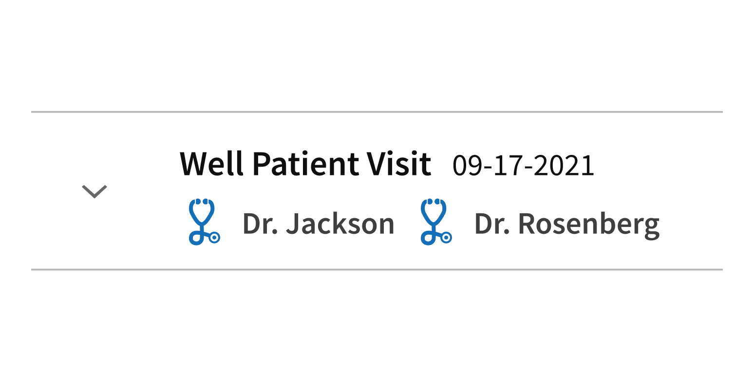
Include visual elements for added context in headers.
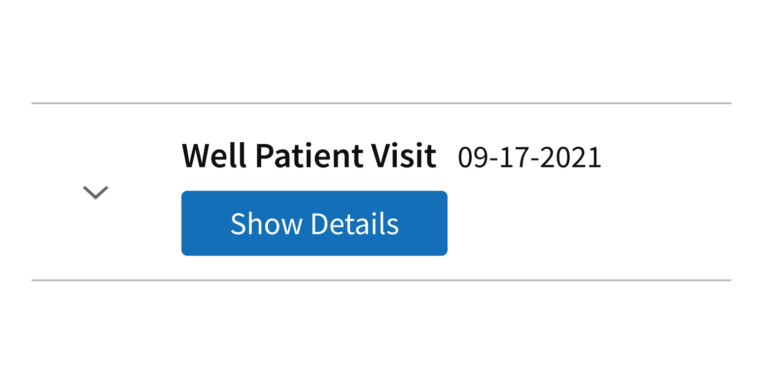
Use interactive elements in headers.
Group related information.
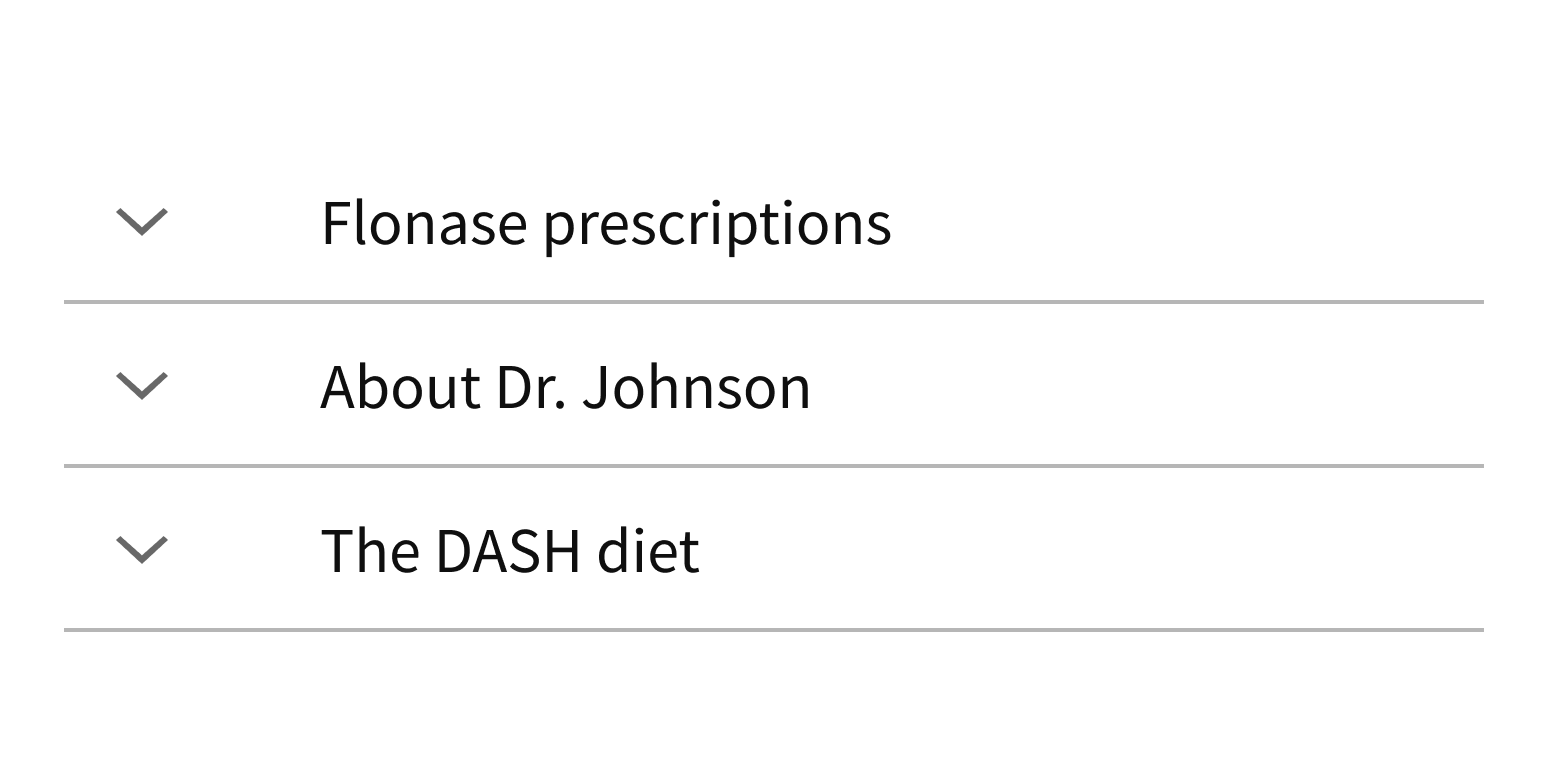
Combine unrelated content items.
Panel content
Technically, panels can contain any type of content, but we recommend text, images, or forms. More complex elements can cause visual clutter because of the many horizontal dividers in Accordion.
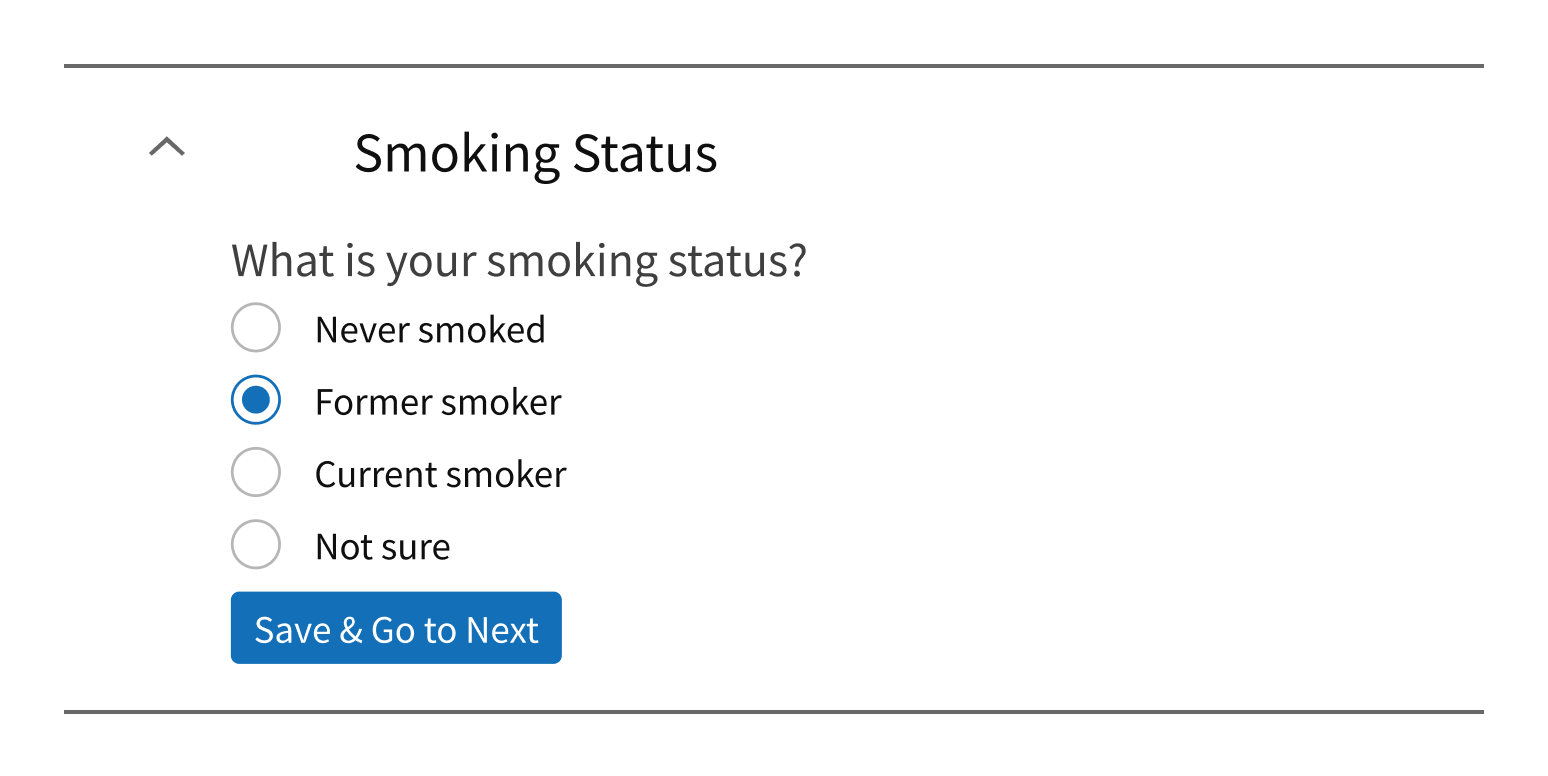
Include text, images, or forms in content panels.
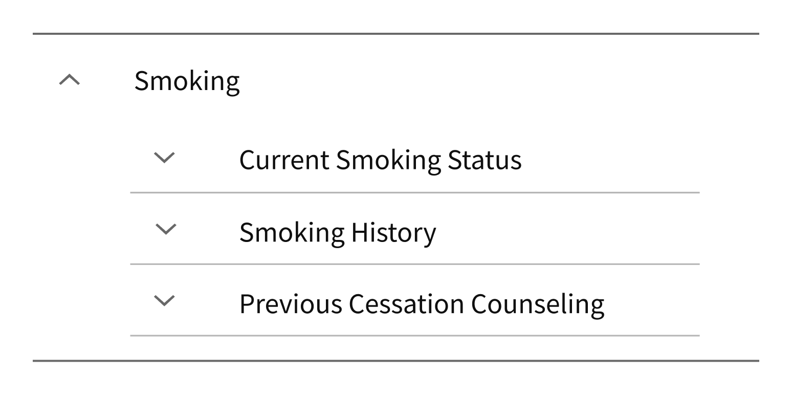
Use more complex elements, like another Accordion or a table.
By default, Accordion panels are collapsed when the page loads. Individual panels can be set to display as expanded on page load. If using Accordion for a multi-step workflow, use this setting to expand the first panel on page load and prompt users to start the workflow.
Item headers
Accordion headers contain an Expand or a Collapse icon that indicates whether the panel can be expanded or collapsed. The icon is built in and rotates as the panel changes state. It can't be removed or customized.
You can add visual elements like icons or images to headers, but because the entire header is clickable, these elements should not be interactive.
Style
Design details
Animation
Accordion expands vertically only. Each panel opens or closes smoothly when changing state. This visual cue tells users that the header and content panel are related.
The Expand and Collapse icons rotate 180 degrees to preview the action that will take place when the header is clicked or activated.
The whole transition takes 1/2 second (500ms), regardless of content height.
Placement and hierarchy
Content
Item headers
The header content of each Accordion item can be simple content (heading text and optional custom content) or fully customized content.
Simple content
- Heading text, plus optional minimal custom content (such as an icon).
- Custom content should indicate status or other high-level information.
- Width limit for custom content is 1/3 of the header width.
- Minimal work required for developers: this approach uses built-in settings.
Fully customized content
- Helpful for displaying images, formatted text, and other complex content or markup.
- More work required for developers: they need to create all the custom content.
- Buttons, links, and other interactive elements are not allowed.
Demos
Coding
Developer tips
Subcomponents
Accordion uses the subcomponents AccordionItem and AccordionItemHeader (see Props for details).
Implementation
Accordion implements the List component under the hood to generate appropriate semantic HTML. Similarly, the subcomponent AccordionItem implements List’s subcomponent ListItem. Use the AccordionItem subcomponent to implement each Accordion content item.
Expanded states and rendering
By default, the AccordionItem children is not rendered (i.e., instantiated and rendered) while the AccordionItem is collapsed. This helps keep the initial render of Accordion quick. Set the mountedWhileHidden prop to {true} if it’s important for an AccordionItem child component to be available even while its AccordionItem is collapsed.
Each AccordionItem tracks its own expanded state. To make an item expanded on initial render, set the defaultExpanded prop to {true}. You can also explicitly control when it expands by using the expanded and onExpandedChange props to provide the current expanded state and to set the expanded state, respectively.
When an Accordion header is selected, screen readers read the header text and describe the content panel as expanded or collapsed. When the content is expanded and visible, this element should have its aria-expanded attribute set to "true" (an accessibility best practice).
Item headers
Keep the headingTag value the same (e.g., all 'h3') for all AccordionItems that belong to a single Accordion. The AccordionItem subcomponents are at the same level of the heading hierarchy within that Accordion. This makes the HTML semantically correct and is an accessibility best practice.
The header of each AccordionItem can include simple content (heading text and optional custom content using the headingText and headerSlot props) or fully customized content. Use an AccordionItemHeader subcomponent to contain custom content. This content can include visual elements like icons or images, but it should not include interactive elements like buttons and links (because the entire header is clickable).
Repository
Implementation links
Accordion directory in Bitbucket
AccordionItem directory in Bitbucket
AccordionItemHeader directory in Bitbucket
Implementation details
It is strongly recommended to familiarize yourself with the Forge source code. While this documentation is a best effort to document the intent and usage of a component, sometimes some features only become clear when looking at the source code. Also, looking at Forge's source code may help identify and fix bugs in either your application or Forge itself.
Storybook files
Forge maintains at least one storybook file per component. While the primary audience for these files is typically the Forge team, these storybook files may cover usages of the component not covered by a demo. The storybook for the latest version of forge can be found at go/forge-storybook-lts.
Testing library
Forge strongly encourages using testing-library to write tests for your application.
"The more your tests resemble the way your software is used, the more confidence they can give you."
If you're having trouble testing a Forge component using testing-library, it would be a good idea to see how Forge tests its own components. For the most part, Forge tries to use screen.getByRole as much as it can, as that API provides the best feedback on a11y compliance. Forge discourages the use of document.querySelector and screen.getByTestId as both APIs encourage using implementation details to test your component, and discourage adding roles to your component.
With that being said, many of Forge's components were not built with accessibility in mind. These components do break the recommendations listed above.
Import statements
In Nimbus applications
athenaOne serves the Forge bundle independently from your application's bundle. Importing Forge components directly from '@athena/forge' takes advantage of this feature.
import { Accordion, AccordionItem, AccordionItemHeader } from '@athena/forge'
In standalone applications
Importing components using the exact path to the module takes advantage of webpack's tree shaking feature. Webpack will include only that module and its dependencies.
import Accordion from '@athena/forge/Accordion';import AccordionItem from '@athena/forge/AccordionItem';import AccordionItemHeader from '@athena/forge/AccordionItemHeader';
To use this import guidance, Typescript applications must use typescript >= 4.7.3, and should add this setting to their tsconfig.json file:
{"compilerOptions": {"moduleResolution": "Node16",}}
If this setting doesn't work for your application, use this import statement instead:
import Accordion from '@athena/forge/dist/Accordion';import AccordionItem from '@athena/forge/dist/AccordionItem';import AccordionItemHeader from '@athena/forge/dist/AccordionItemHeader';