Visual Design Principles
Simple high level principles for visual design
Application of Process Fluency
In their 2003 publication, Winkielman et al. explored how the ease with which information is processed (processing fluency) can influence our evaluations and judgments. The authors propose that high fluency is associated with positive affect, leading to more favorable evaluations Here are the main findings:
- Positive Affect and Fluency: High processing fluency is associated with positive affect, leading to more favorable evaluations of stimuli1.
- Empirical Evidence: The study provided empirical evidence showing that people tend to rate objects more positively when they are easier to process1.
- Boundary Conditions: The researchers also discussed the boundary conditions of this effect, noting that the relationship between fluency and positive affect can be influenced by various factors.
This all starts with a basic series of well-defined and measurable principles whose intention is to maximize Processing Fluency, and there are three main facets of pulling this off:
- In making sure that Forge components, patterns, and layouts adhere to best industry practices, including usability and accessibility standards.
- Involves the creation of guidelines, and complementary tools, that help shape designer understanding of how to best put Forge assets into practices.
- Focusing on the understandability and usability of Forge itself by its end users, the athenahealth design community.
Together, these three things will not only form the maturation of a successful design system, but they will also add value and success to all products that apply Forge in their solutions.
The principles included here were selected as meaningful and measurable concepts that can be applied to maximize this goal. Each of them unpacks into various universal best-practices that can be applied to digital interface design, and includes descriptions, examples, and suggestions on how to measure.
1. Make design elements familiar
Use regular, easily recognizable shapes, expected patterns and simple interactions
Examples:
If a screen has a button, and there is a button in Forge, then that screen should use the Forge button component, unless otherwise justified by local context.
How to measure:
The percentage of the elements on the screen that can be from Forge are from Forge (or another acceptable shared repository of components).
2. All design elements must carry information
By conserving visual cues to those that carry information that will help the user complete their tasks, you reduce cognitive overhead, distractions, and help users stay on task.
Examples:
Remove as much stuff as you can that does not inform the user.
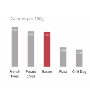
Put in lots of extra decorative elements simply because you think it looks good.
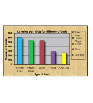
How to measure:
The data-ink ratio is the ratio of elements in a visual representation conveying information relative to the total area of a composition that is not whitespace. The data-ink ratio is calculated as 1 minus the proportion of the graph that can be erased without loss of data-information. Data-ink Ratio Explained
3. Use contrasts to express the nature of information
Use differences to call out the importance of information (Difference include size, spacing, shape, orientation, balance, and the various dimensions of color). By emphasizing critical data points, trends, or insights, users can quickly grasp the significance of the information and make timely and accurate decisions. This can have a direct impact users’ perceptual fluency, improving how effectively information is understood.
Examples:
Size and spacing:

Shape:
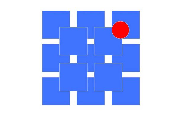
Orientation:

Color:

How to measure:
Use points to evaluate (1) clarity of first task, (2) clarity of actions, (3) proximity of associated elements, (4) distance between information and interactions, (5) consistent hierarchy of designation elements, and (6) appropriate use of white space. Each item can get up to 5 points and the final score can be an average of the raters in the review.
You can also use a checklist of, but not limited to, the “must-have qualities” of contrast ratios, consistent use of legible font sizes, and appropriate use of color.
4. Use structure to guide attention
Alignment
Alignment is critical in reducing the perceived complexity of an interface and will make the human eye more effective at scanning and navigating information. When elements are aligned, they create a visual connection with each other that communicates a story.
“Alignment serves to put elements together in a visible and readable arrangement. Alignment is the sister or extension of proximity. It specifically refers to positioning items in such a way that they line up with each other.” (https://visme.co/blog/elements-principles-good-design/)
Example:
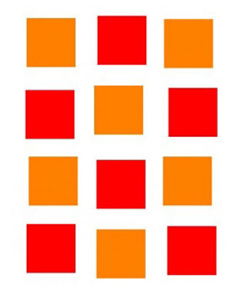
Minimize verticals and horizontals by aligning elements based on hierarchy position.
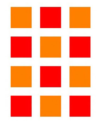
Non-alignments make scanning harder.
How to measure:
Count the number of verticals and horizontals that can be reduced. It might be helpful to get a second set of eyes for this task. Proximity Things that are positioned together belong together.
Proximity
Proximity tells the user critical information about the relationship between things that will speed up tasks by chunking items and giving their eye less to move between. It is also important to maintain alignment between screens of a workflow to create an expectation on where the user should look after each transition.

This doesn’t just apply to the information on the screen. It also applies to the controls a user will need to act on the information they are seeing. Minimize the distance between the controls needed to act on information relative to the information needed to drive a decision.
“Proximity preserves unity and maintains the continuity of visual elements. It creates the relationship and connection among the elements on a page. Proximity provides a focal point, which is the center of interest or activity.” (https://visme.co/blog/elements-principles-good-design/)
How to measure:
Count the number of elements on the screen whose concepts are represented in more than one place on the same screen. Meaning, the information needed to make a decision is in one area and the action to take based on that information is in another area. Also, The lower the number the better.
Hierarchy
Hierarchy helps build expectations around how items relate to each other. Maintaining a simple and consistent hierarchy will help users understand nested information. Learn more: https://medium.com/thinking-design/key-principles-of-visual-hierarchy-in-ux-design-c17395949ed
How to measure:
Consistent and correct presentation of all content on a screen relative to the intended hierarchy. (Total # of Hierarchy inconsistencies without justification) / (total # of qualifying elements).
5. Use mapping as a contextual anchor
Whenever possible, map the color, layout, and other visual cues on the screen, to metaphorically connect to the nature and/or structure real world tasks and context.
Example:
When a clinician performs an assessment on a patient, they use a method called “Cephalo-caudal”, which means “from head to tale”. This means that the assessment starts at the patient’s head and works down their body to their feet.
When designing a form to capture the assessment, you should start with the fields related to the head and continue down your form in the same manner as the task proceeds. Here is an example of a form designed to map to the way clinicians are trained to do assessments, taking advantage of what they already know:

How to measure:
There isn’t really a great way to measure this. However, if you can find parallels that you can exploit in the domain you are designing for, the user will have an easier time performing their tasks.
Mapping may not always be this literal. Mapping your designs to existing workflows, known context or tasks, and other representations of users’ mental models can also be helpful in making design choices.