Labeling for Automated and AI-Generated Data
Guidance for how to label information on the screen that is either automated or comes from an AI source.
Introduction
There are many things that we can do to create better experiences for our users through the smart application of automatic and AI-assisted technologies. Some of these can happen under the hood of our product, while others need to be explicitly labeled for compliance reasons. In this document we will review the details and provide the best means of representing them on a screen.
NOTE: To assure that the advice given on this page is as accurate and complete as possible, we are currently working with Compliance on the content for this page related to AI-Generated Data. Once that is finalized it will be added.
Automated Data
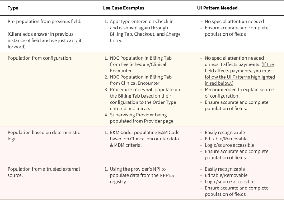
Automated Data refers to data that is delivered to the user in a way that does require a specific initiation or request on their part. In its simplest form, this would include things like pre-populating information in a field from something that was previously entered. In this case, there is no requirement to indicate that there was any automation involved.
Another kind of Automated Data is the population of information based on deterministic logic, from either an internal or trusted external source. In this case, it is important that the data is easily recognizable for what it is, is editable/removable, provides access to its logic/source, and is ensured as an accurate and complete population of fields. Here, a designer must employ appropriate labeling and iconography to inform the user of what is happening.
These guidelines have been developed with Compliance to ensure safety and accuracy in our work. The table below outlines more specifics around each type of Automated Data and their requirements:

Visual Representation
Automated Data (when required) will use a variant of the bolt icon and appropriate labeling.
The Bolt icon now has an info-purple variant specifically for use with Automated Data use cases. A new filled Alert variant has also been added for these purposes.
Refer to the ‘in app content labeling page’ in Figma libraries for these components.
Tooltips and Popovers
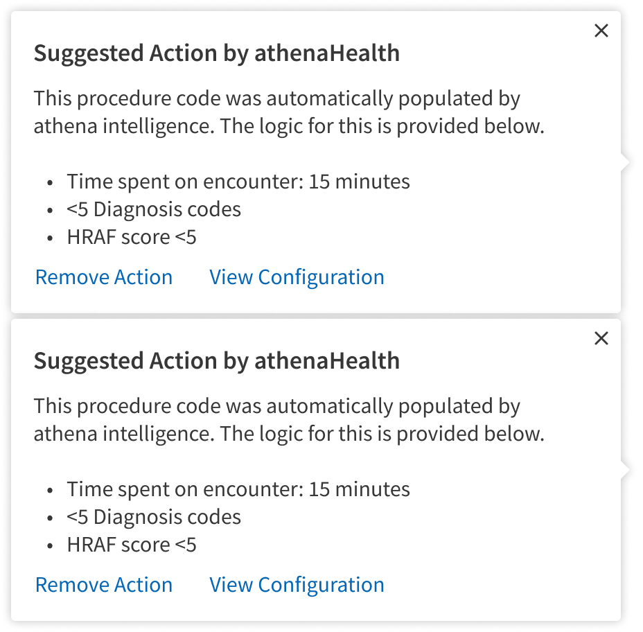
When there isn’t enough room for a descriptive label, or there is more information to help the user than is practical to show on the screen to help them understand the use of Automated Data, the use of Popovers and Tooltips is indicated.

To remain compliant, users must be given the option to remove or edit the automation. You can allow the change without interference or if needed, you can show a modal to capture a reason for change.
If the automated data is removed then the automated data branding should be removed as well.

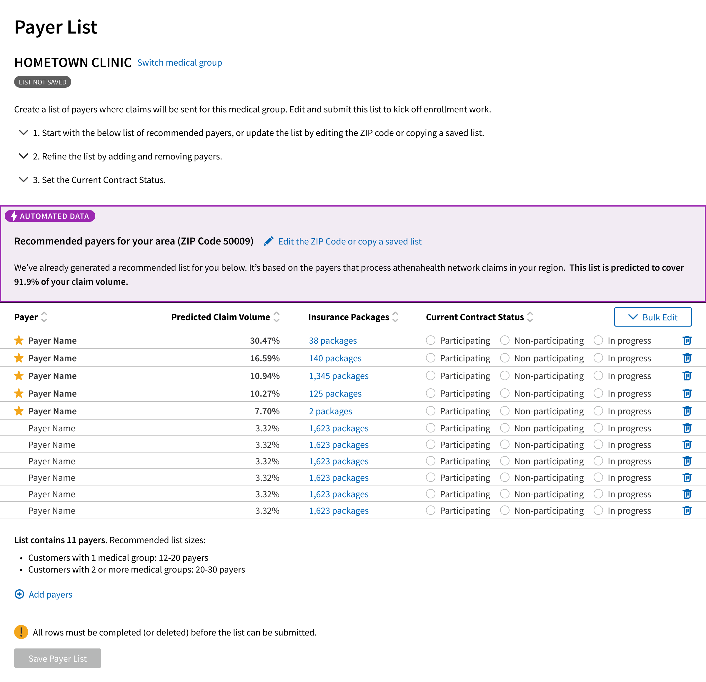
Here are examples where Tags have been integrated into a highlighted are to draw more attention to the Automated Data.
Note: For AI-Generated Data an info icon with a Tooltip or Popover is sufficient, while Automated Data must be removable and editable.

This is an example of the Automated Data Label highlighting a section and applying strong visual hierarchy.

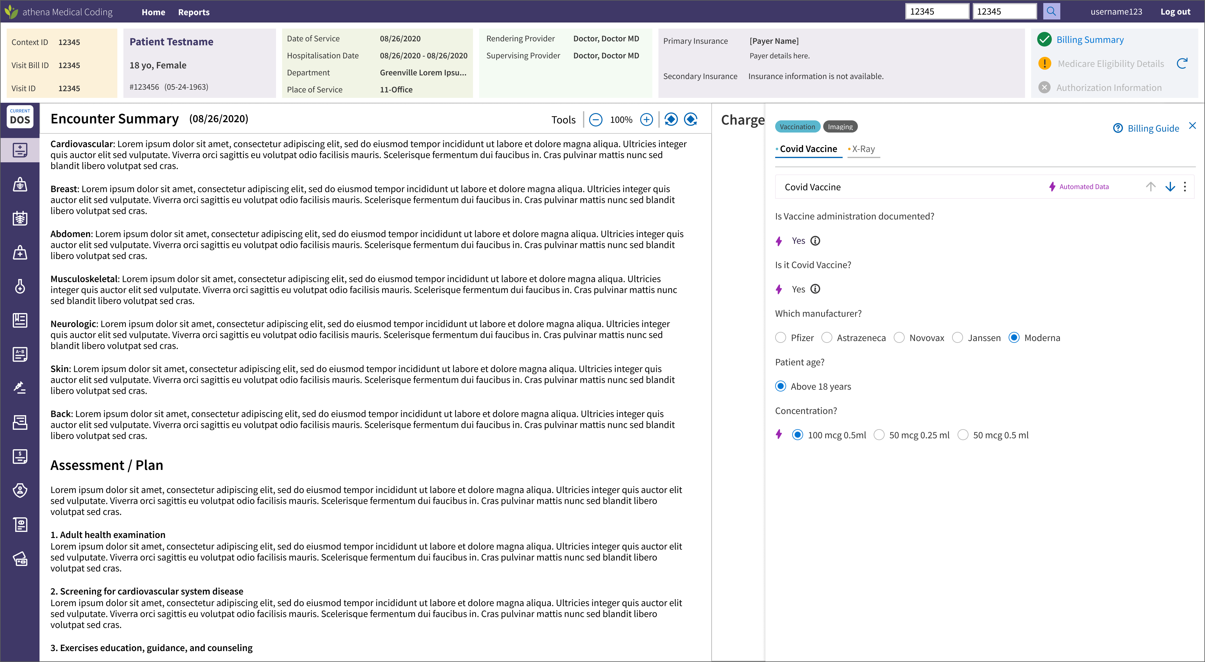
This is an example of the Automatic Action Label highlighting a section and applying lower visual hierarchy.
Note: In this instance, not all fields related to the automation, so this designer opted to use the Bolt Filled icon to clarify which fields were automated. This meets compliance needs as it is explicit in communicating which fields have been automated.
