SingleBarChart
A chart that shows rectangular bars of varying heights, proportional to the values of the data it represents.
The Basics
What it is
A bar chart is a visual representation of data that uses horizontal or vertical bars to show values from a dataset. The bars start from a baseline of zero, and each bar's length corresponds to a value, displaying individual data points. Note that this guidance focuses on the SingleBarChart. Besides the SingleBarChart, we will also offer a GroupedBarChart component in the future. The GroupedBarChart will allow you to compare multiple datasets within each category.
This component is design only and has no associated code.
Bar Chart type
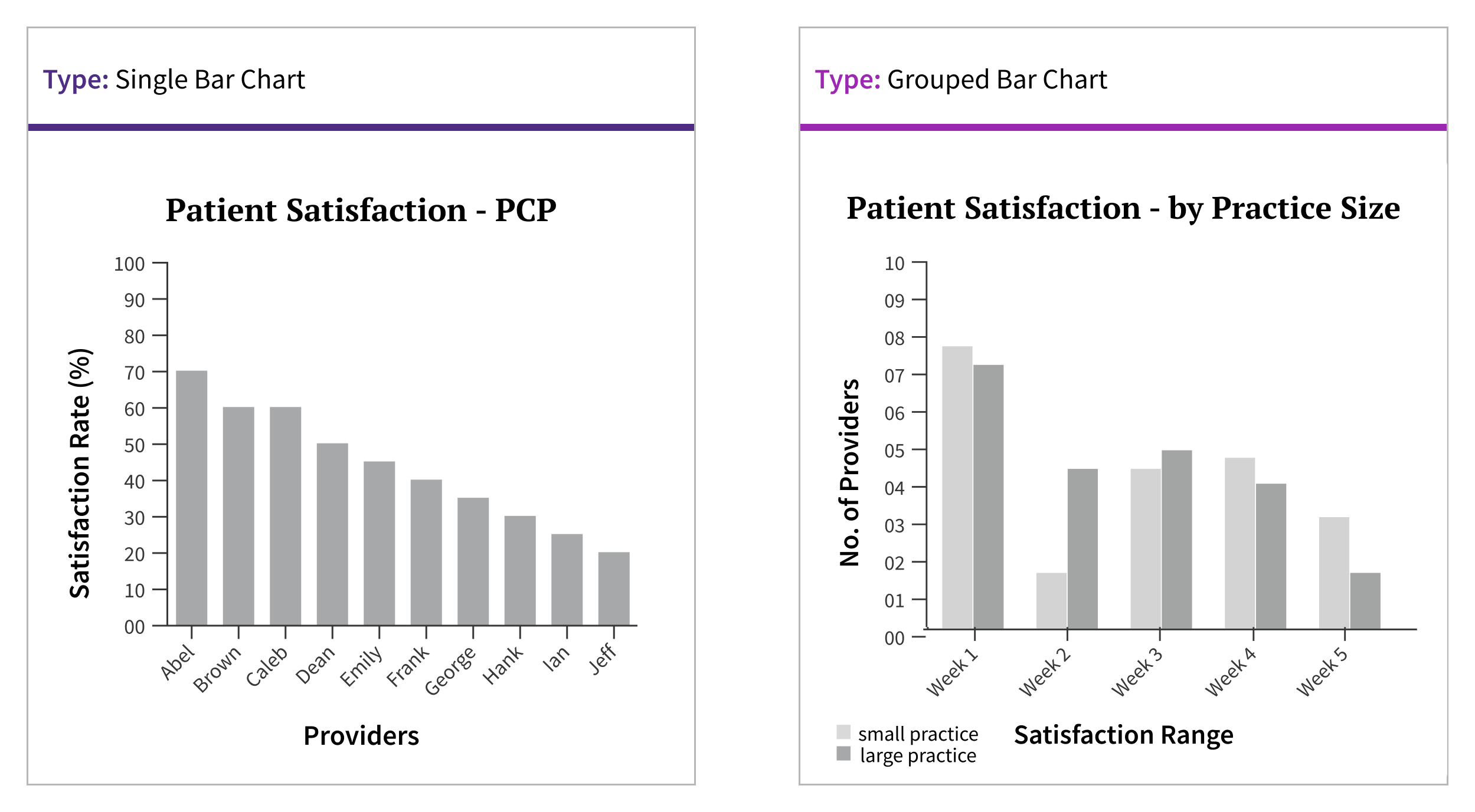
There are two main types of bar charts: the SingleBarChart, which this guidance focuses on, and the GroupedBarChart. In a GroupedBarChart, bars are clustered together to compare values of different groups within each category. When deciding on a bar chart type, consider the range of data points (also known as data series) being visualized. A single series is best represented by a SingleBarChart. To compare multiple series, you can visualize them as multiple individual charts or as a GroupedBarChart.
How it works
As a type of data visualization, bar charts are displayed on a Data Card. Bar charts appear on page load without requiring any user action. The elements of a bar chart should load in the following sequence:
- anomalous data
- card title
- goal/threshold (if applicable)
- remaining data
- remaining non-data pixels
Bar Chart interactions
Filters may be present at the page or card level, and changing these filters should cause the bar chart to update accordingly.
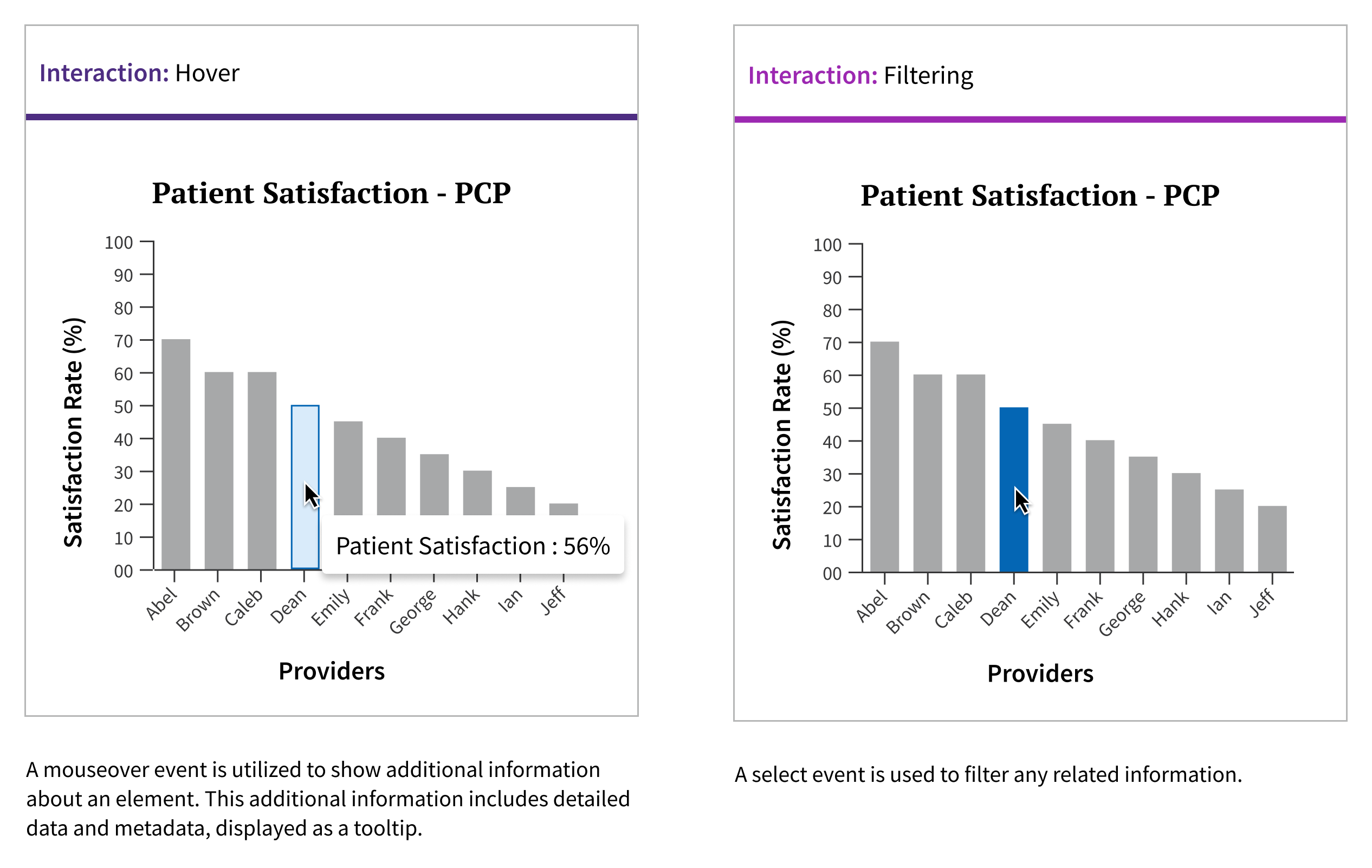
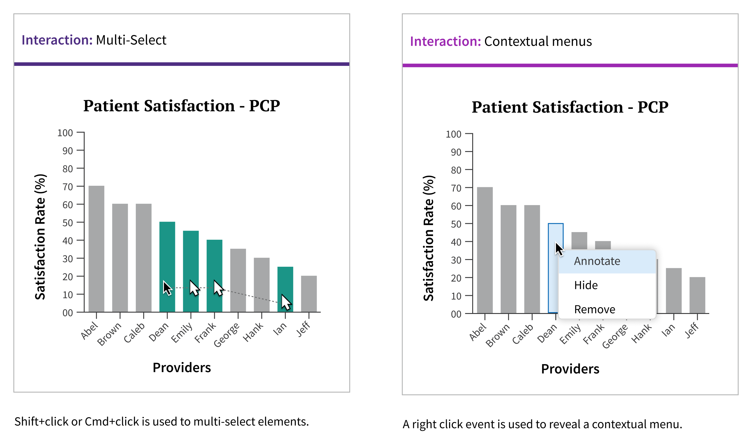
Bar chart visualizations should support interaction behaviors, such as click and hover events. Hovering over a bar should display details about the data represented by the bar, while clicking on a bar may lead to a deeper level of data, such as launching a new chart or displaying additional data.
When to use
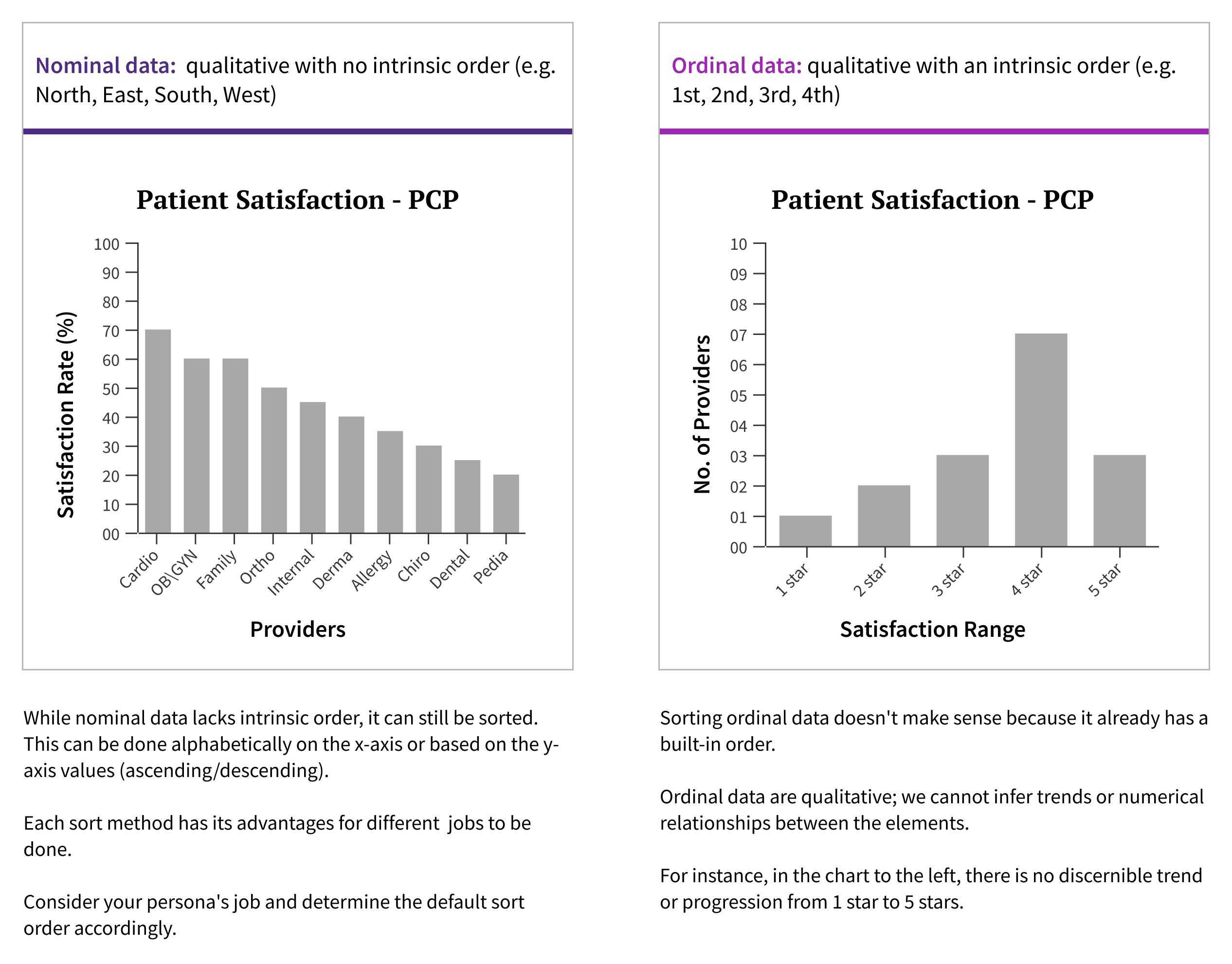
- For comparing categorical data.
- For displaying measures linked to discrete items on a nominal or ordinal scale.
When not to use
- For large datasets: Excessive bars can be difficult to interpret and may create visual interference.
- For a single data element:Using a bar chart for a just one data element makes no sense, as there is no basis for comparison. However, bar chart may show a single bar if a filter is applied, displaying only one data element.
- For datasets with a wide disparity in data values:The granularity of smaller data elements can be difficult to parse.
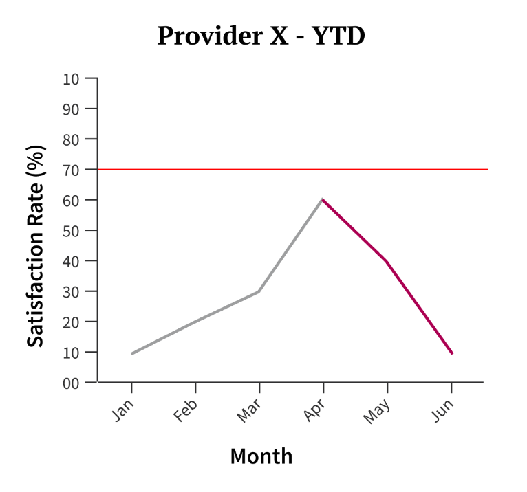
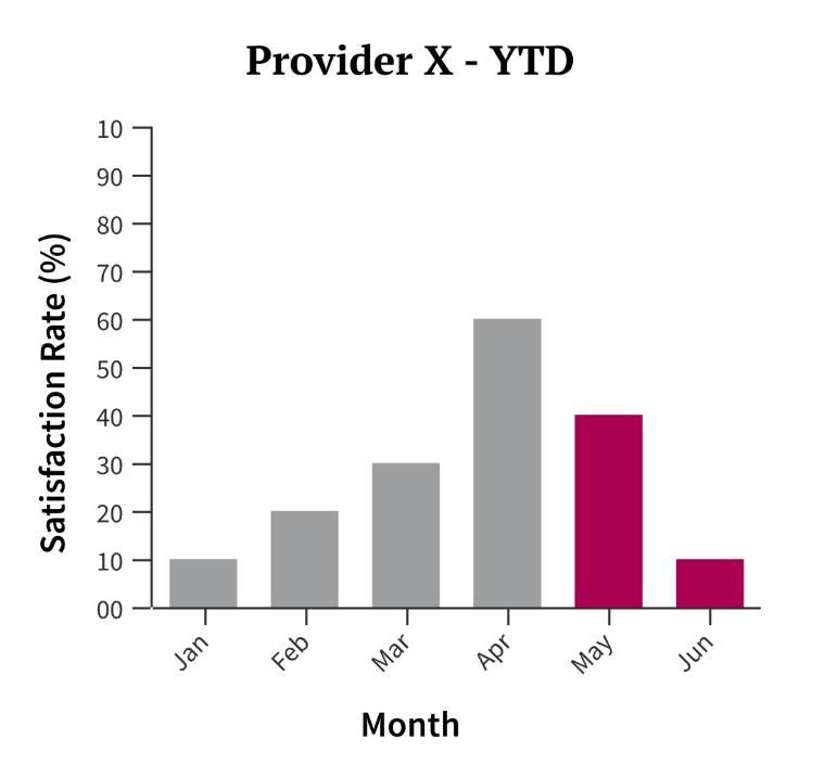
- For data emphasizing change over time: a bar chart is better suited for comparing discrete categories or data points.
What to use instead
For interval data:
use a line chart.
use a SingleBarChart for interval data.
How to use
Bar charts are most useful when you have more than 5 categories or data points to compare.
Vertical bar charts should have a maximum of 15 bars, while horizontal bar charts should have a maximum of 24 bars.
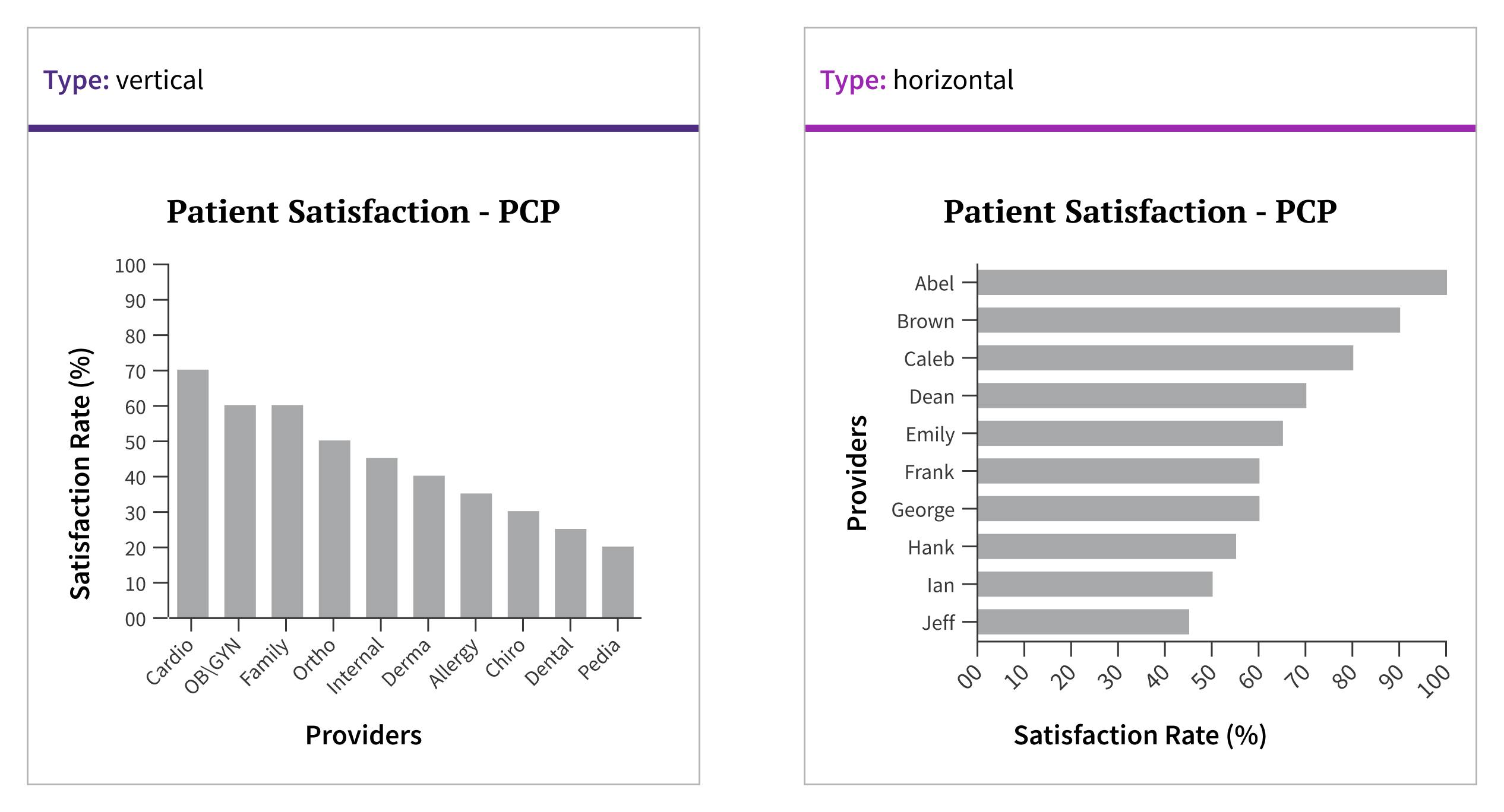
When deciding on bar orientation, consider the following:
- Screen real estate: Ensure the chart fits well within the available space.
- Enhancing ease of comparison: Use the same orientation for charts that encourage comparisons of similar data across two different charts.
- Preventing confusion: Avoid using different orientations for charts with disparate data points.
- Avoiding visual fatigue: Choose horizontal orientation when you have long category labels, ensuring they are easily readable and reducing strain on the viewer.
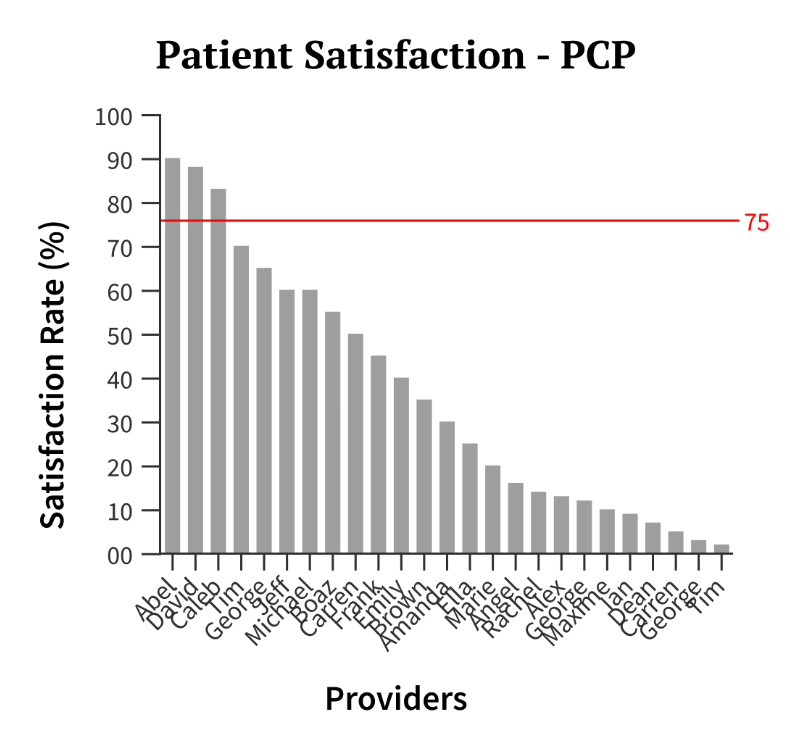
When the number of categories in the data set is too large
consider mapping the data to discrete categories.
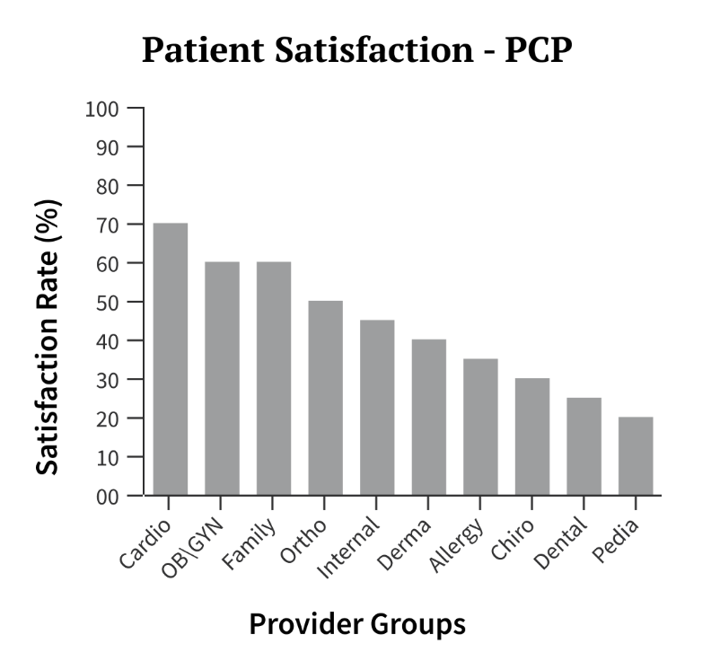
use > 15 bars in the horizontal orientation or > 24 in the vertical orientation.
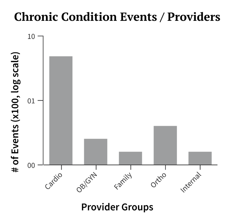
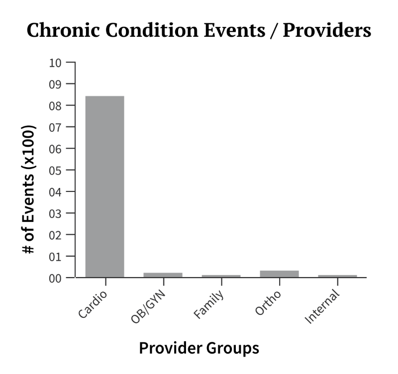
For data with wide disparities in values
consider a logarithmic scale. Convert to a ratio or percentage.
use a scale that makes your data elements unreadable.
Style
Design details
Sizes
There are no size constraints. The component is fully responsive.
Placement and hierarchy
Orientation
A bar chart can be oriented horizontally or vertically, with the default being vertical. Horizontal orientation is recommended when axis labels are too long for vertical charts or when the data set exceeds the maximum number of bars (15) for a vertical chart.
Content
Data Elements
Bar heights are determined by the values they represent.
Bar widths in vertical and horizontal bar charts are dynamic and will expand to fill the available space.
The spacing between each bar is 50% the width of the bar.
In bar charts with 5 or fewer bars, maintain a consistent width for each bar, equivalent to what you would use for a chart with 5 bars. For example, if your chart contains only 3 bars, simulate 2 'invisible' bars to fill the space and avoid overly wide bars.
For 5 or fewer bars
maintain the width/spacing as if you were displaying 5 bars. Add implied bars to fill space.

use excessively wide bars when displaying fewer than 5 bars.

Non-data Elements
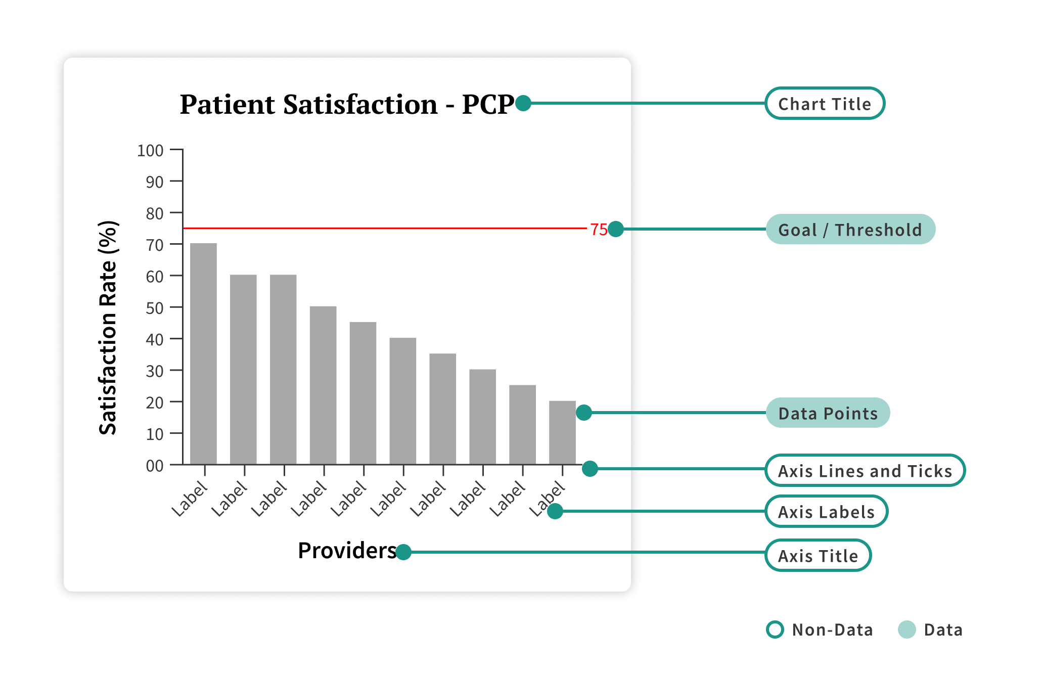
SingleBarChart is a data driven component and its content is provided by the datasource that is linked to the visualization. Non-data elements include: chart title, axis titles, and axis labels.
Chart Title: Provide a concise and descriptive one-line name for your SingleBarChart. This title should be left-aligned.
Axis Titles: Inform the consumer about the value scale or the commonality of the data series being compared. These titles should be one line and only a few words.
Axis Labels: Represent the individual scale value or the discrete data point that makes up the data series. These labels should also be one line. X-axis labels can be oriented to fit longer titles or reduce overlap. The default orientation is horizontal text (0º), but you can change it to 30º, 45º, or 90º.
Goal/Threshold and Gridlines
In a data visualization, it's typical to have one goal or threshold, but two are possible. The first goal or threshold is usually represented by a solid line, while the second is represented by a dashed line. If both are used, the solid line should indicate the maximum or primary goal and should not exceed the value of the secondary goal.
Each goal or threshold should be accompanied by an annotation indicating its value. These lines are placed on top of the bars.
By default, gridlines representing the value scale used to calculate bar heights are hidden to reduce visual noise from non-data elements. Gridlines can be displayed if desired.
Color
In a SingleBarChart, all bars should be displayed in a single color – Forge gray-dataviz-60.
An exception to this is when a bar represents anomalous data, which refers to data that exceeds or fails to meet a goal or threshold. In such cases, anomalous data should be displayed in Forge orchid-dataviz-100 to highlight its difference from the other bars.
Bars should be filled with color only, without outlines.
The goal or threshold should also be displayed in the orchid-dataviz-100 to create a high contrast with the other bars.