LineChart
A type of chart that shows changes over time or another continuous scale, using data points connected by line segments from left to right.
The Basics
What it is
A line chart, also known as a line graph, is a data visualization component that displays data points as individual markers connected by line segments. It is used to represent trends, changes over time, or continuous data points, making it easy to observe patterns and relationships.
This component is design only and has no associated code.
Line Chart type
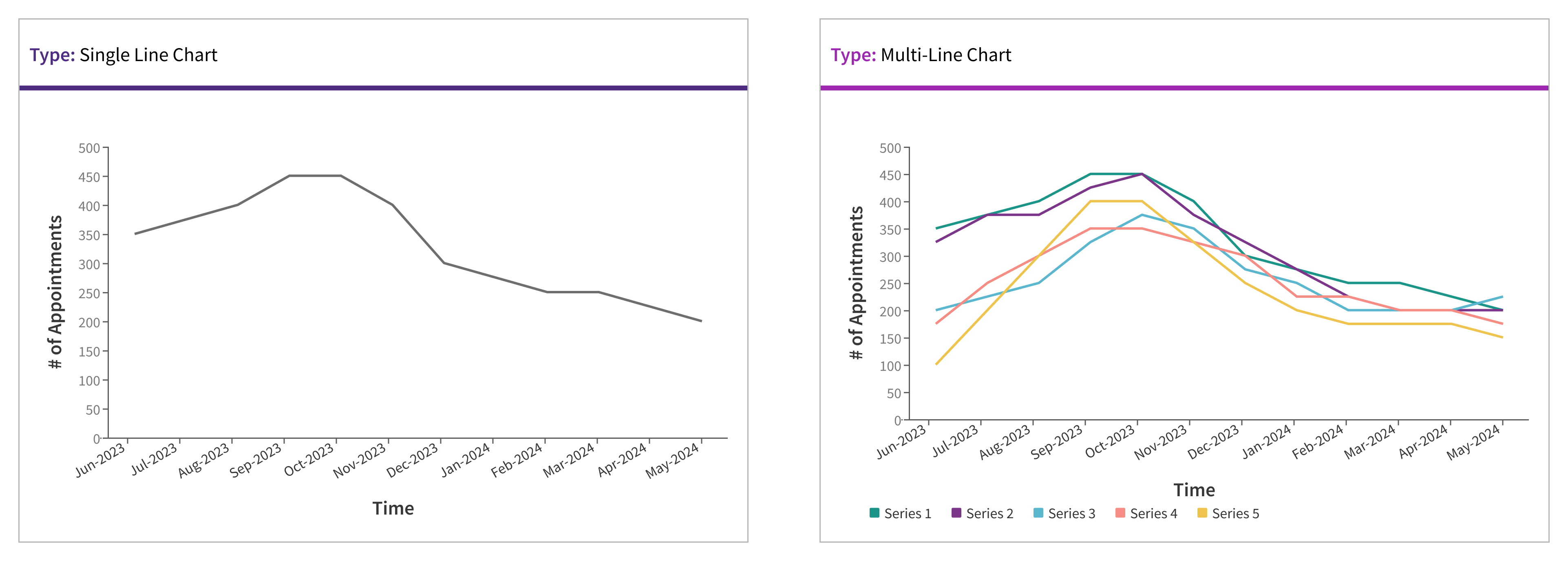
There are two types of line charts: single line charts and multi-line charts.
Single Line Chart: Displays a single data series, making it straightforward and easy to read.
Multi-Line Chart: Plots multiple data series on the same chart. Each series is distinguished by different color hues and a color key at the bottom of the chart.
How it works
As a type of data visualization, line charts are displayed on a Data Card. Line charts appear on page load without requiring any user action. The elements of a line chart should load in the following sequence:
- anomalous data
- card title
- goal/threshold (if applicable)
- remaining data
- remaining non-data pixels
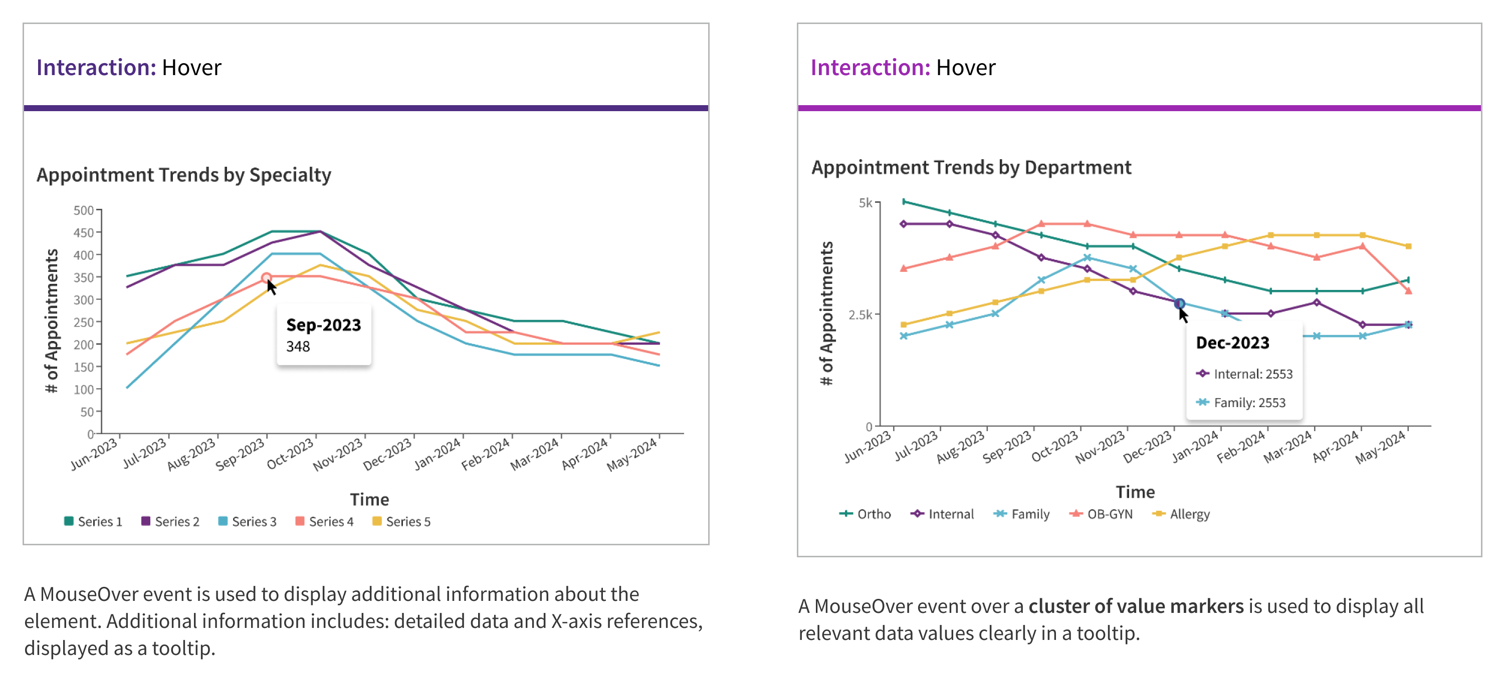
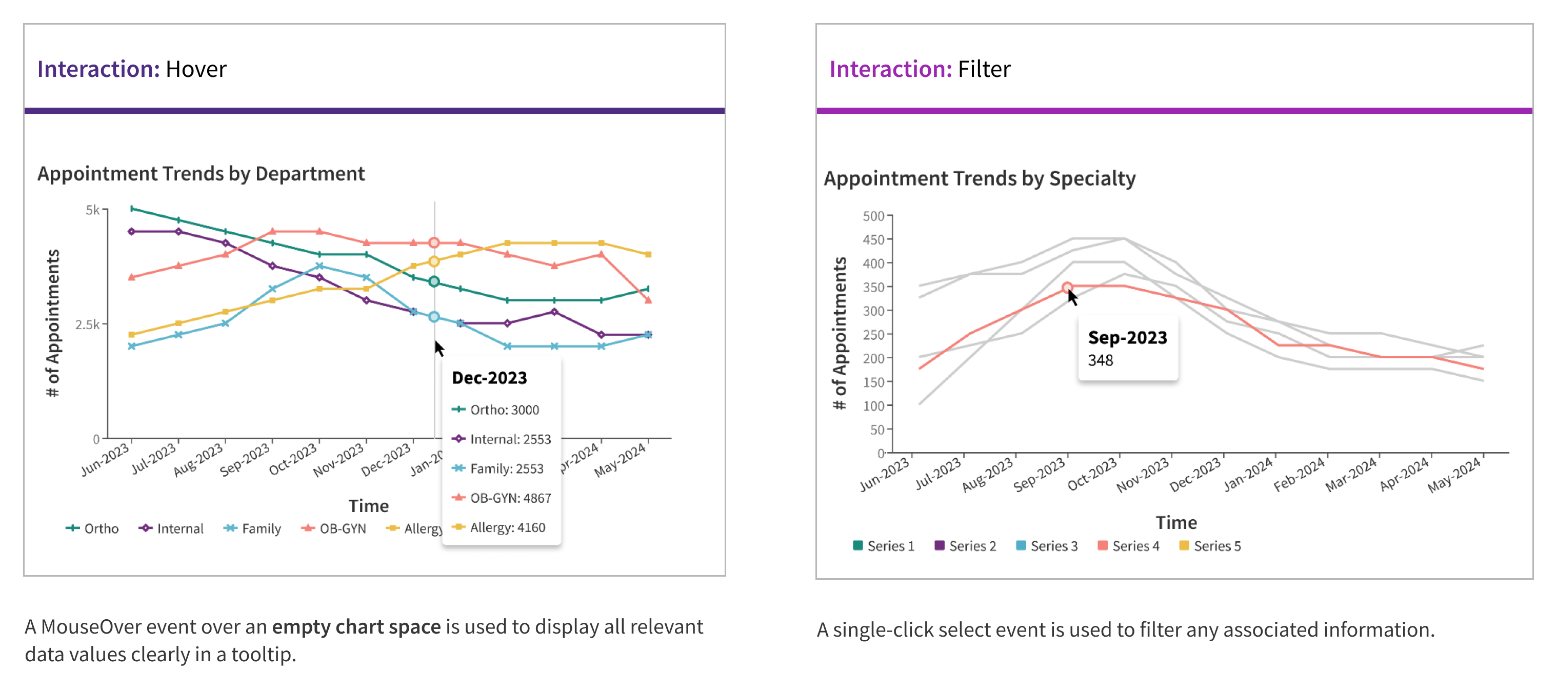
Line Chart interactions
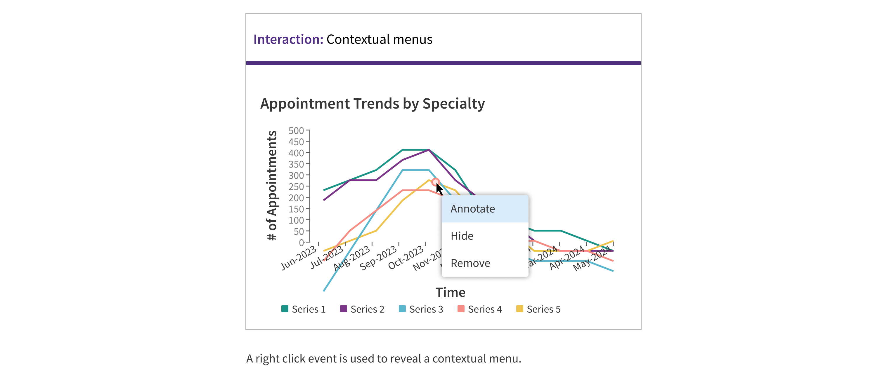
Filters may be present at the page or card level, and changing these filters should cause the line chart to update accordingly.
When to use
-
Time series data: Ideal for representing data collected at regular intervals, such as patient blood pressure readings over weeks, average rate of patient ED admissions, or claims closure rates for practices over the year. This helps in visualizing how a specific metric changes over a continuous period.
-
Trends and patterns: Useful for identifying trends, patterns, or fluctuations in data over time or along a continuous variable. Effective for observing long-term trends, seasonality, outliers, rising and lowering patterns, and fluctuating vs. smooth patterns.
-
Multiple data series: Effective for displaying and comparing multiple data series on the same chart. This helps in visualizing trends and relationships between different datasets within a single context, such as comparing patient recovery rates across different treatments or tracking performance rates for a practice against other practices in the network.
-
Interpolation: Use to estimate values between known data points, aiding in data analysis and prediction. This feature helps in understanding and predicting trends in data where some values may be missing or need estimation.
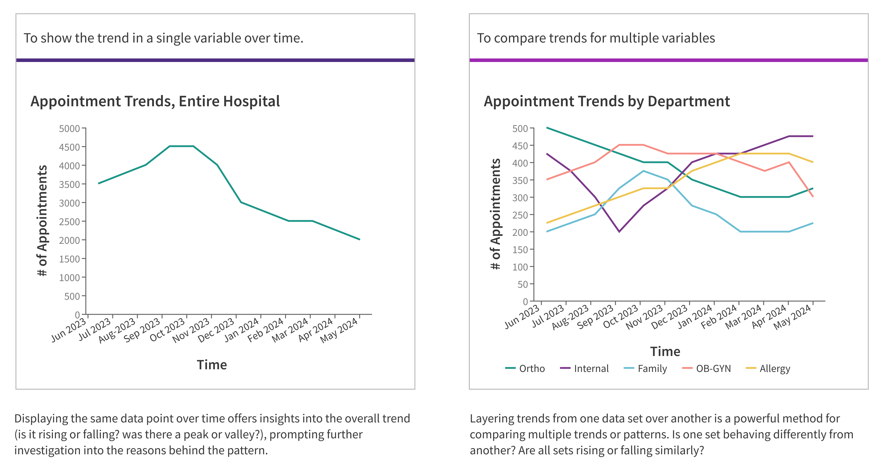
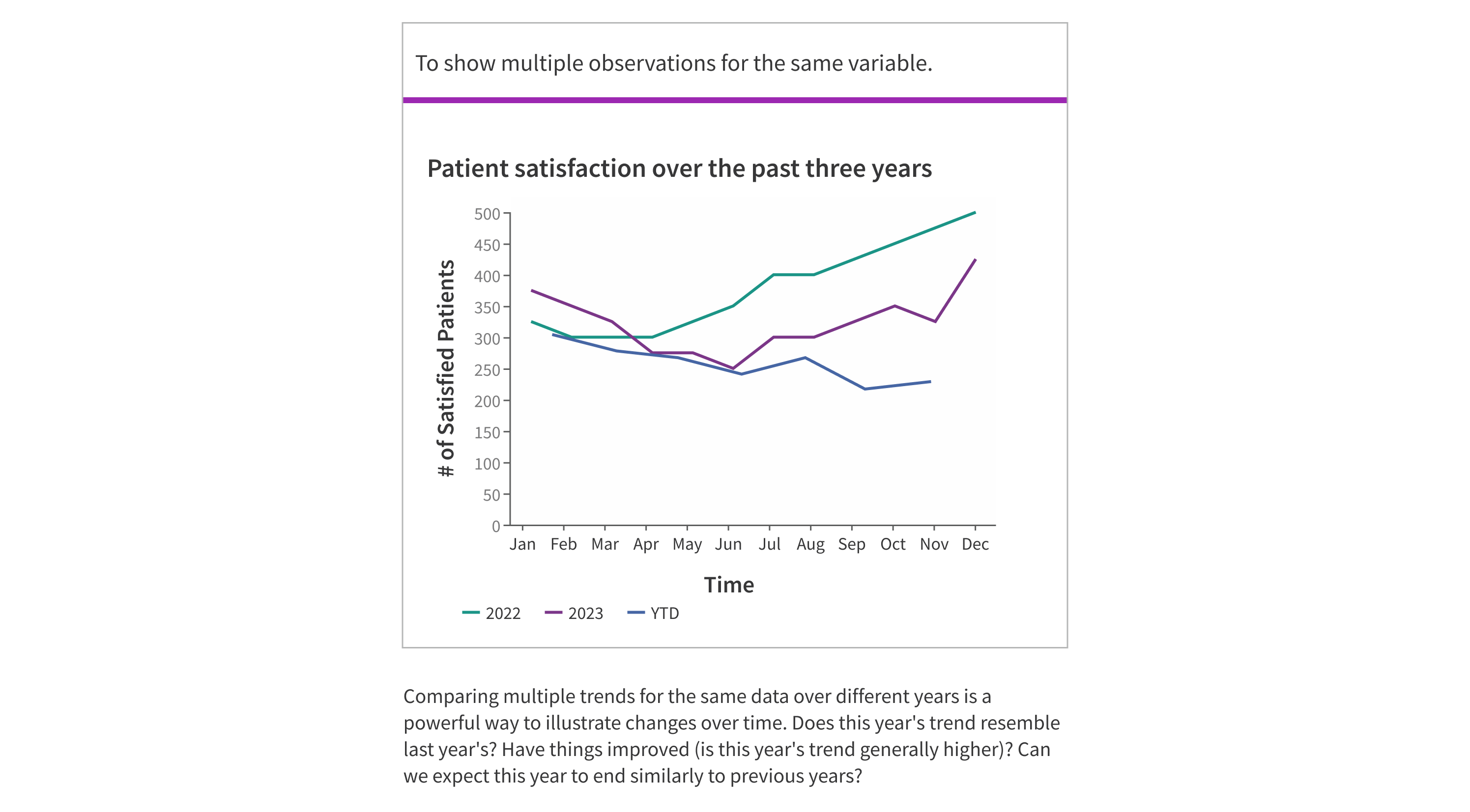
Here are some of the most common examples of how line charts are used:
When not to use
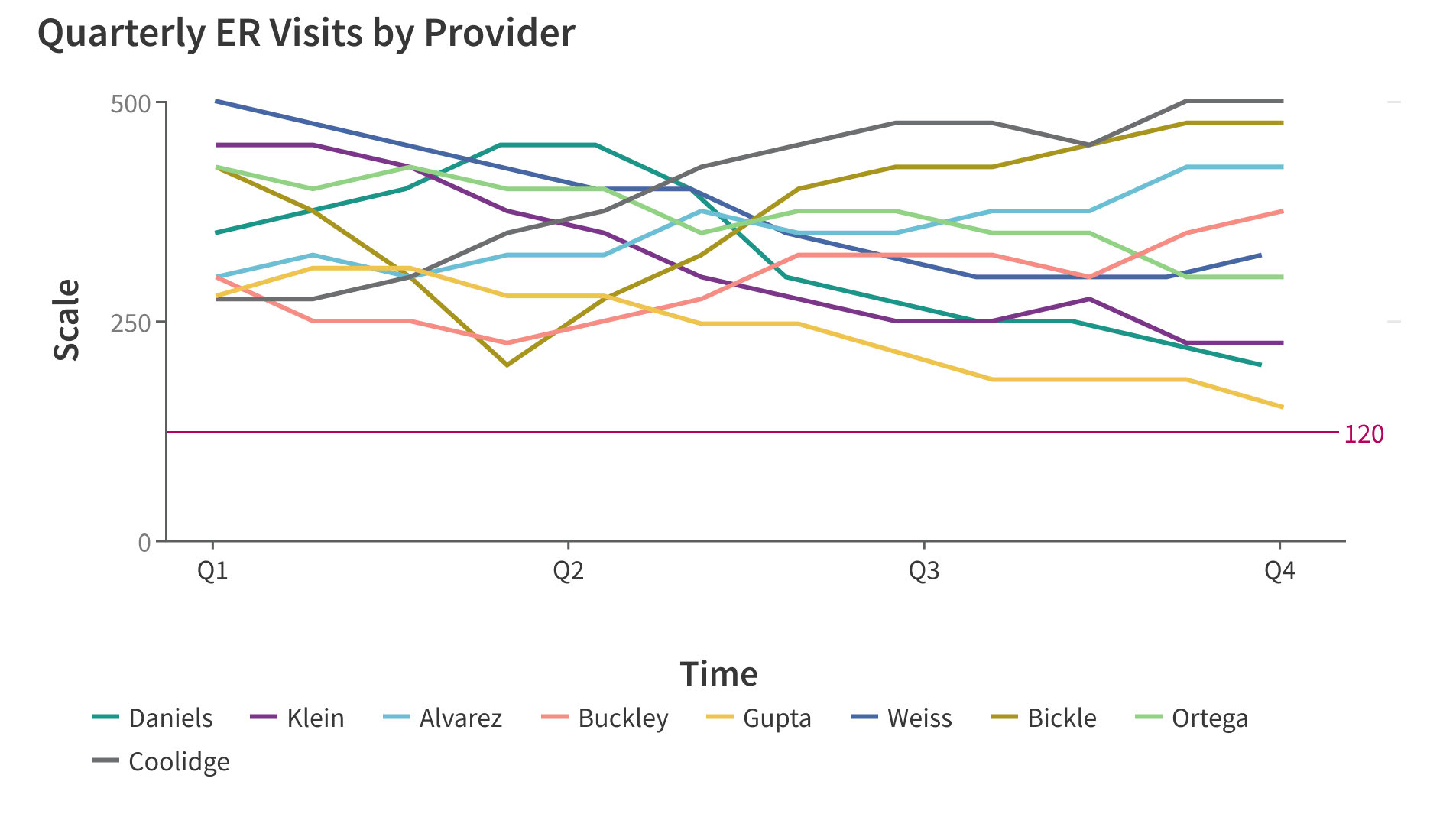
- For large datasets with excessive data points: Avoid using line charts for datasets with more than 5 lines. Consider small multiples, data aggregation, or filtering non-anomalous data for clearer presentation.
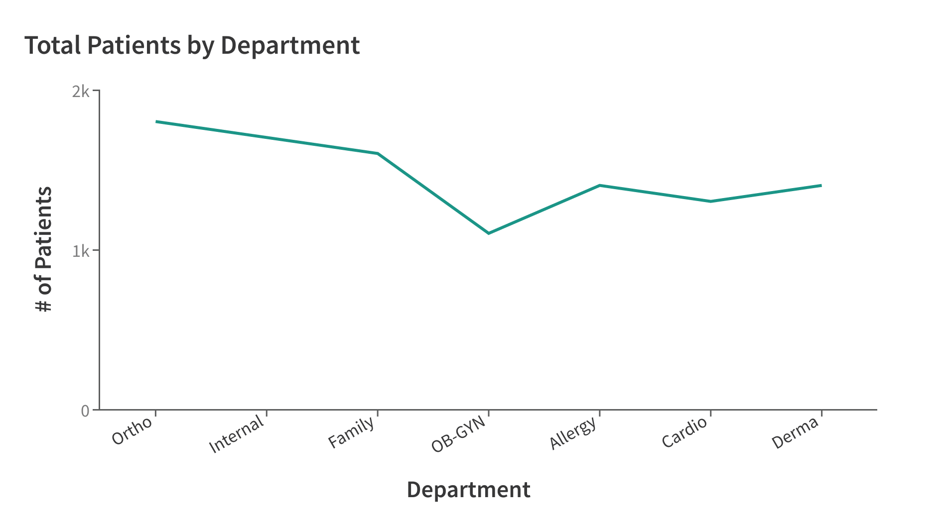
- For nominal datasets: Nominal data consists of categorized variables that cannot be ranked or measured in a specific order (e.g Red, Green Blue), so using a line chart to represent this data would be confusing.
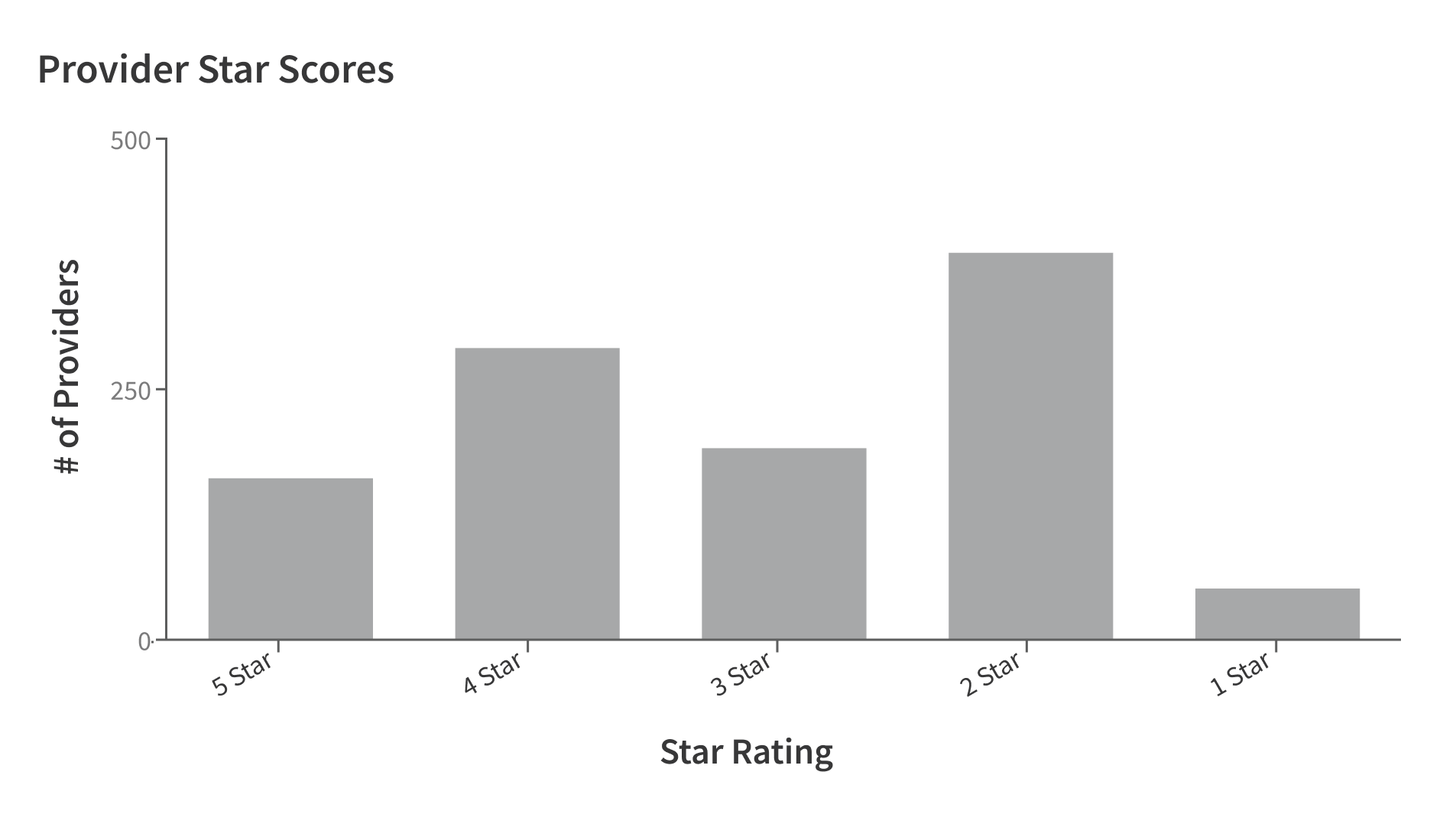
- For ordinal datasets: Ordinal data includes categorized variables that can be ranked but not measured in a specific order (e.g. A, B, C) so using a line chart would be inappropriate as it could imply a relationship between variables.
What to use instead
For large data sets:
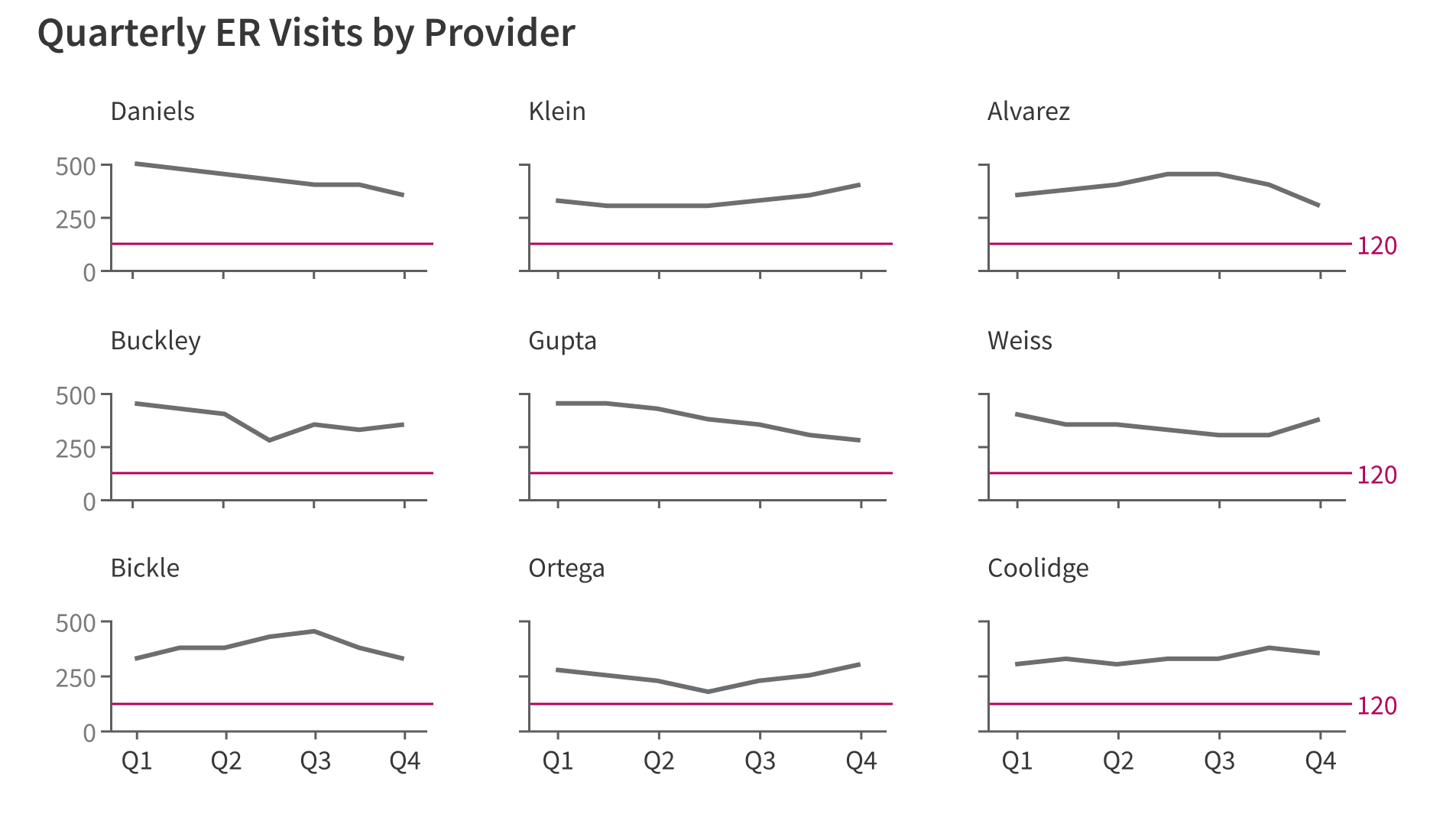
use small multiples to display large datasets to optimize for comparison and pattern recognition.
display more than five data series to avoid the chart becoming confusing to read.
For nominal data:
use line charts for nominal data sets to not imply continuity between unrelated data points.
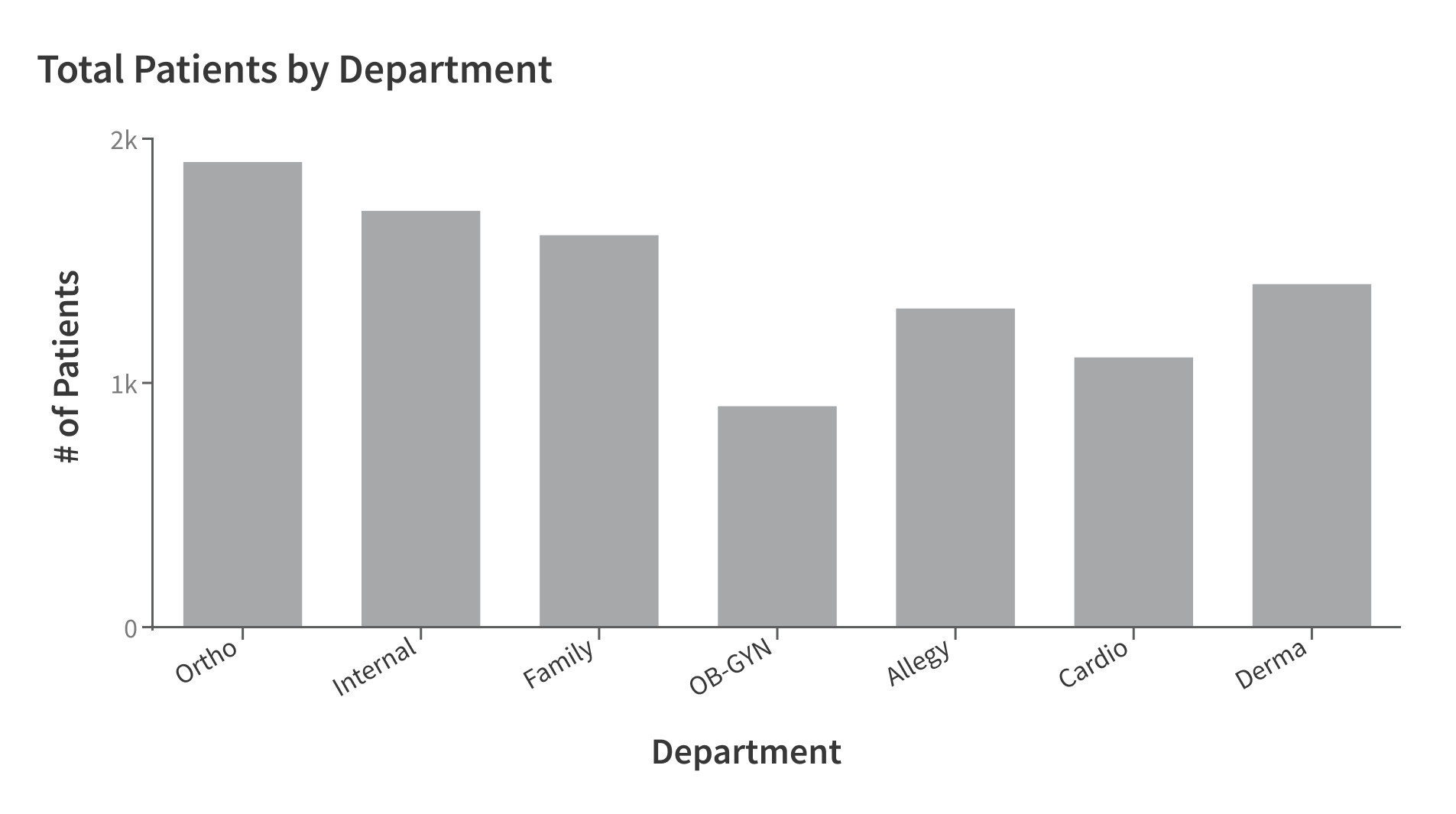
use a single bar chart for nominal data sets to create distinction between categories.
For ordinal data:
use a single bar chart for ordinal data sets to optimize for comparison across categories.
use line charts for ordinal data, unrelated points should not be displayed as a trend.
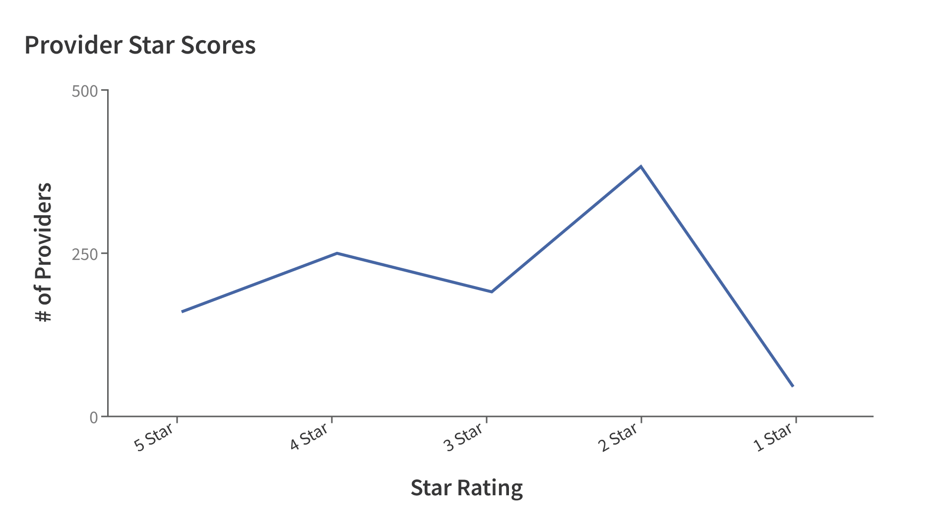
How to use
Line charts should be used for at least two time-based data points connected by a single line.
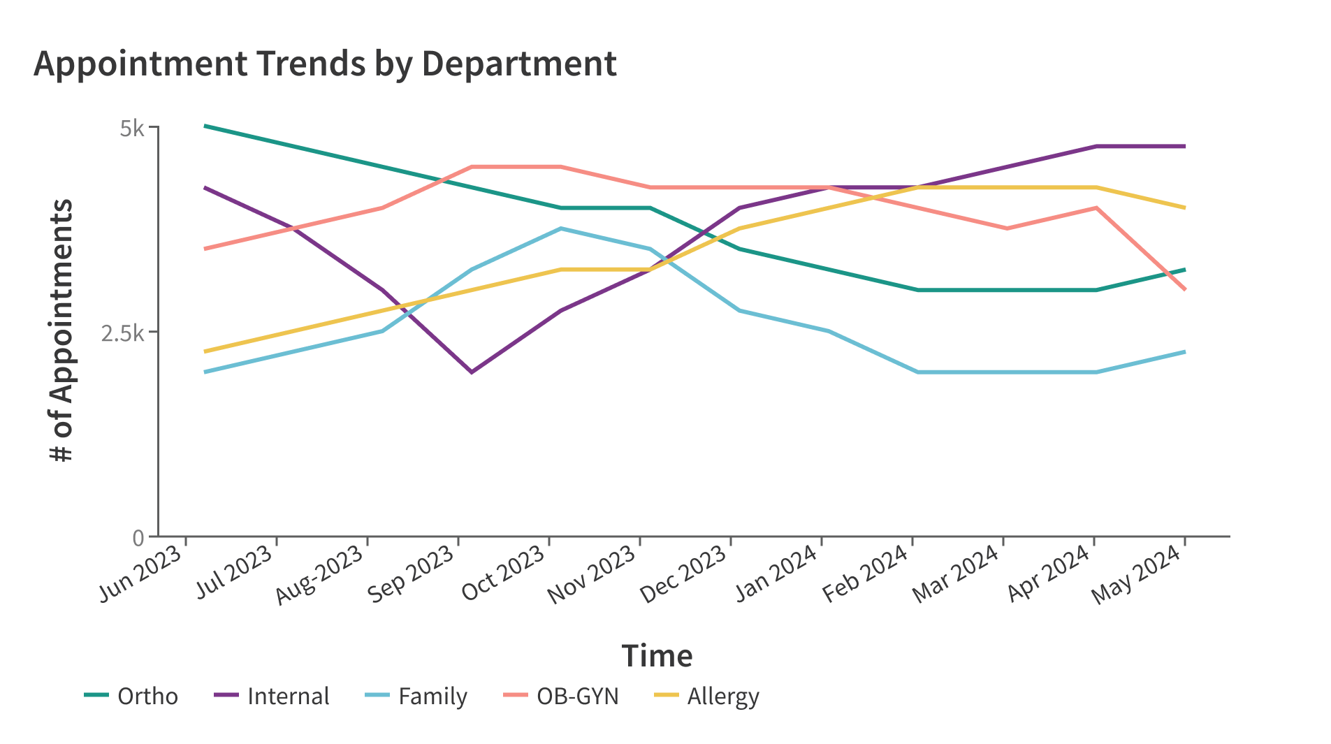
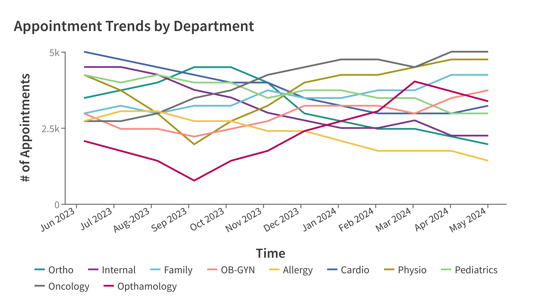
Line charts can display a significant number of data points effectively, but if your data does not require comprehensive trend analysis, limit line charts to a maximum of five lines to ensure that users can easily understand the relationships between the different data sets.
Use caution when using line charts with data that has widely varying scales, as smaller data values can be difficult to distinguish. Consider changing the y-axis scale to a logarithmic scale to better represent such data. For example, a line chart showing the incidence of chronic conditions over time, where four conditions hover around 5,000 events per month, and the fifth condition typically registers fewer than 10 events per month.
limit the number of lines to five or fewer to ensure readability of the chart.
use more than five lines to avoid the chart becoming confusing to read.
Style
Design details
Sizes
There are no size constraints. The component is fully responsive.
Placement and hierarchy
Orientation
A line chart displays data moving from left to right and will always be in a horizontal orientation.
Content
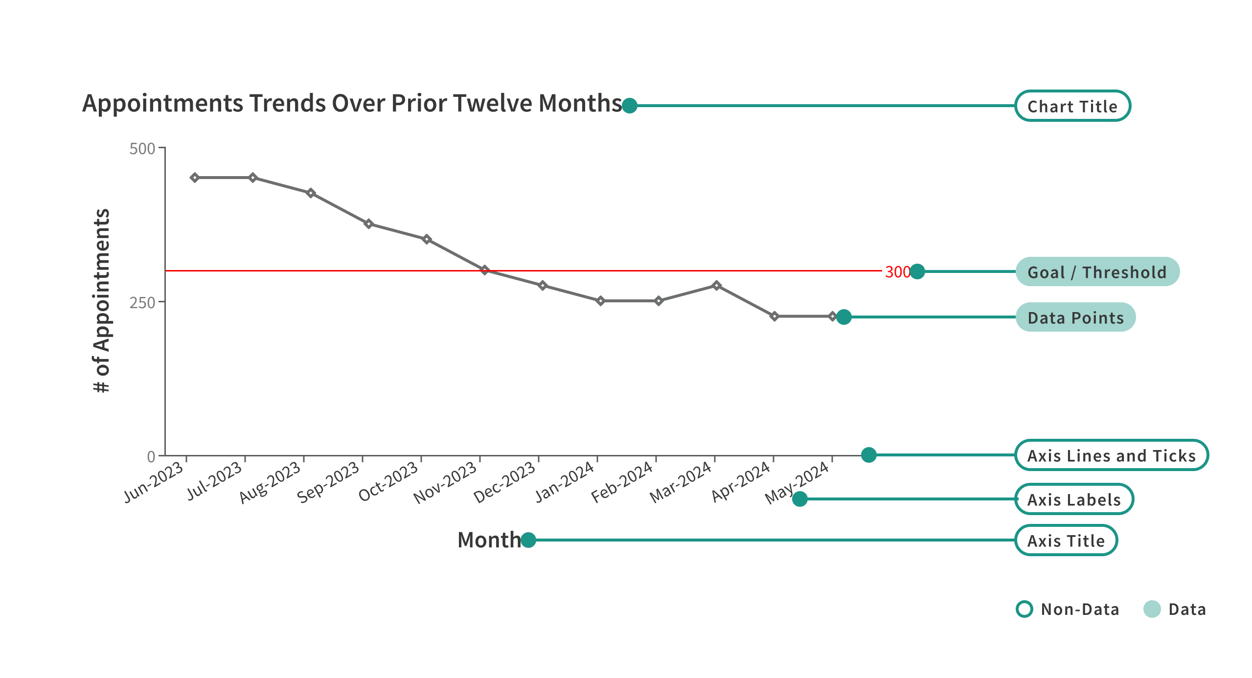
The [data series] Lines
Data series are represented by individual solid lines with a 2px stroke. Series lines are solid strokes because dashed or dotted lines are harder to distinguish. To further differentiate between series lines, use color or data value markers - small, unique shapes at each vertex representing the value of the line. Value markers must be applied either to all series or to none of the series.

Data Elements
Each vertex of the line represents a single datum in the data set.
Non-data Elements
Chart Title: Provide a concise and descriptive one-line name for your line chart. This title is left-aligned.
Axis Titles: Inform the viewer about what the axis represents, such as the value range or the data categories being compared. These titles should be brief, ideally one line with only a few words.
Axis Labels: Represent the individual values or data points in the series. These labels should also be one line. X-axis labels can be oriented to fit longer titles or reduce overlap. The default orientation is horizontal text (0º), but you can change it to 30º, 45º, or 90º.
Goal/Threshold and Gridlines
Typically, a data visualization includes one goal/threshold, to illustrate a desired or target value for the data. The line chart offers the option to include an additional threshold. The first goal/threshold is represented by a solid line, while the second is shown with a dashed line. If both are used, ensure they represent the upper and lower bounds for the desired data values.
Each goal/threshold should have an annotation indicating its value. The threshold lines are displayed on a layer above the other components to make them easier to select.
By default, gridlines are hidden to reduce visual noise from non-data elements. Gridlines should remain hidden except when the line chart is wider than half the screen. In the cases of wide charts, gridlines aid the user in scanning y-axis values for the lines.
Color
For line charts with two lines, use gray and black.
Color is primarily used to differentiate the various data series. Data markers (symbols on the data points) are available to further distinguish the data series to assist people with visual disabilities.
Each data series has a default distinct stroke color and data marker shape:
| Series order to be displayed | Line color | Data marker shape |
| Series 1 |
Forge Jungle 100 | vertical line ( | ) |
| Series 2 | Forge Purple 100 #7B3689 |
diamond ( ⬥ ) |
| Series 3 |
Forge Peacock 100 |
diagonal cross ( x ) |
| Series 4 | Forge Coral 100 #F68D84 | solid triangle ( ▲ ) |
| Series 5 | Forge Yellow 100 #EEC44F | solid square ( ◼︎ ) |
The orchid color, at 100% saturation, is reserved for the display of anomalous data. Anomalous values are shown in orchid, while the remaining values retain their standard color.
The target or threshold color is designed to be high-contrast relative to the line colors.